- Home
- InDesign
- Discussions
- Re: Color Theme Tool vs Color.Adobe.com
- Re: Color Theme Tool vs Color.Adobe.com
Color Theme Tool vs Color.Adobe.com
Copy link to clipboard
Copied
Why is there such a difference between the colors generated out the same image with both color.adobe.com and InDesign's own Color Theme Tool?
After much experimenting, I can only conclude that the Color Theme Tool is far from "matching" color.adobe.com in quality.
I may be missing something obvious, after all this time.
Here's a simple example, an sRGB image I picked the other day on Facebook.
The Document Intent is "Print" ("Web" in the above screen capture), so the Color Theme Tool generates CMYK colors, out of the sRGB image. That's expected.
Granted, color.adobe.com generated themes are encoded in CIE Lab space.
To do a fair comparison, I made sure to "Proof" colors, so that the CIE Lab colors don't overly look "bright" as compared to their InDesign counterpart.
Don't get me wrong, I think the Color Theme Tool is a neat little addition to InDesign's toolbox but, as it stands, according to my limited understanding, it systematically "dumbs down" the colors of ANY image, regardless of the Document Intent (I experimented both ways, Print and Web, tried all the settings in the Color Theme Tool options).
The cherry on the icing, if I may say so, with the implementation on color.adobe.com, is the fact that, upon completion, it's plain to see where the "tool" sampled the colors from, as shown here:
Copy link to clipboard
Copied
Here's a fresh, new experiment this morning.
The Document Intent is Web.
I used the Shift key along with the Color Theme Tool to capture this single color in the mad hatter's hat.
I get the 6 harmony rules.
Generated swatches are in RGB space.
For curiosity, I took a sample of the same area with the old Color Picker tool -- see swatch on the right, top.
Why does the color has to be "dumbed-down" from what it is, in the image? Why? Why? Oh why?
It's as though the color *has* to be converted to the Working CMYK space *first", before being converted to RGB.
Copy link to clipboard
Copied
In Indesign, do you have your display performance set to high quality display before you do an image sampling?
Copy link to clipboard
Copied
Good suggestion Jeffrey!
I'm glad to report that it brightened the swatches a bit. Worth it.
So, the "main" RGB color I get from sampling the image with the Shift key down, with the Color Theme Tool is 209 114 122.
Using the old or "regular" color picker, that value is 240 104 126, dazzlingly bright by comparison.
Something else is going on...
Copy link to clipboard
Copied
Jeffrey's suggestion led me to take a closer look at that Mad Hatter image, in Photoshop...
Clearly, the area I'm sampling from with the Color Theme Tool, has suffered heavy JPEG compression (typical 8x8 square pattern).
It makes sense to think that both the regular Color Picker and the Color Theme Tool are NOT sampling a 1x1 pixel area but a larger one from which they must be "averaging" the color. I don't how large it is (5x5% 11x11? 20x20?).
So I selected an area in the Mad Hatter's hat, in Photoshop, and used the Average filter on it, to make sure that, upon "picking" in InDesign, it would have a uniform area to select from.
That resulted in a small improvement in brightness overall -- lesson learned, but still, a far cry from the original RGB color.
The original Photoshop "area" is RGB 245 119 143.
After sampling with the Color Theme Tool, using the Shift key down, it becomes RGB 213 128 140, still "darker"?
The green and blue component are "close" (125 vs 119 and 140 vs 143) but the red is out of line (213 vs 243).
Copy link to clipboard
Copied
I think I'm slowly getting the gist of this tool...
Here's a fresh screen capture to illustrate:
This would have to be confirmed by an Adobe InDesign engineer but I am forced to conclude that the little Color Theme Tool floating palette is not color-managed? Meaning, it's colors are being displayed in the Monitor space without first being converted to the Document RGB space. That's what I think is the culprit in all I have seen over the last couple of days.
How did I come to this conclusion? Using a "screen color picker" much like the Digital Meter which comes bundled with the Mac, I noticed that the RGB values being displayed *inside" the Color Theme Tool palette were identical with the objects to which I applied the tool's colors. In the above example, if you hover over, say, the center swatch in the tool, InDesign display a ToolTip with the RGB values on that swatch. In this case, the "aqua" patch in the palette is shown as R=168 G=212 B=217. This happens to be the exact RGB recipe for the "aqua" object on the first row of squares (Colorful), center, exactly the same.
As I was mousing around the image with my slick "screen color picker", that's when I noticed the discrepancy. In actuality, what InDesign is sending to the screen to display that center aqua patch is not 168 212 217 but rather 181 209 219!
It became clear, to me, at that point, that I was not comparing apples with apples, meaning, my beautiful NEC 27" wide gamut monitor is not rendering 168 212 217 the same as my Document RGB = sRGB "168 212 217", the colors I was seeing all along in the Color Theme Tool palette (or panel, chose your UI preferred terminology) were much more saturated than anything InDesign could show given the choice of sRGB Document RGB color space.
I think that's the reason for the discrepancy I'm seeing.
If that's indeed the case, then the Adobe InDesign engineering team has its work cut out for the next version...
Copy link to clipboard
Copied
But maybe the color theme tool doesn't sample actual pixels from the image, but creates the color palette via an algorithm based on an analysis of the image's color?
Copy link to clipboard
Copied
That hardly seems so, Rob.
I just did an experiment with the Color palette, to test how it is being color managed to the monitor profile :
Sadly, I wrote some of my comments in french.
It boils down to this, every UI elements is "normally" converted RelCol to the screen (monitor profile).
That's the same behavior as Photoshop and it's the only logical way to do this.
The problem with the Color Themes Tool palette is that, although the RGB values are correctly displayed and assigned, the appearance of the palette itself is NOT being managed.
Take the case of 100% Magenta above (Cyan and Yellow did not make much of a difference...).
When I select the "Convert to RGB" option in the Color Theme Tool option, given that the "Document RGB" = sRGB (in my case), a RelCol conversion should result in R=229 G=0 B=126. And this is the RGB value BEING displayed. That's correct.
What is NOT correct, though, is that this RGB value is dumped without any further color management to the video card!!!
Creating a visual discrepancy between the expected and the actual.
On a wide gamut monitor like mine, the difference is even greater.
I think I'm going to turn this into a bug request after all...
Copy link to clipboard
Copied
I think I'm going to turn this into a bug request after all...
I wouldn't expect there will be a change as long as the application version is linked to the web version. As I mentioned this problem has existed since Kuler was developed 10 years ago and when it appeared as a ID panel. If the appearance of the color theme panel was color managed (as the other ID color panels are), then the theme swatches viewed in ID would no longer match the web version because it would be extremely difficult, if not impossible, to port the Adobe color management system over to the web app. In the current web app there's nothing close to profiled CM happening.
Copy link to clipboard
Copied
I already logged the bug report... It is a genuine bug. The colors are not managed correctly to the screen.
I'll let you know what the engineering team response is, if any.
As you noted, it's entirely possible they decide not to touch the current implementation not to break the continuity between the web site.
Meanwhile, I'll set my monitor for sRGB emulation, that will get rid of the mismatch.
The engineer that was responsible for color, at the time, a few years ago, within the InDesign team, was very smart.
We'll see. I'll take a look at the web site again...
Copy link to clipboard
Copied
Sadly, if I set my monitor for sRGB emulation then everything works, the web site colors stop appearing overly saturated and the Color Themes Tool swatches within matches the generated colors....
There is no option on color.adobe.com to "manage colors" in any way, shape or form.
It's a free for all.
You know, it looks very much like the rest of the "color management" literacy in the industry, it's pretty low. People just looks at their monitor and don't make a big fuss about what they see. I call that a tendency toward mediocrity. Press operators don't know the difference between good and bad colors, whatever comes out of the press is not their responsibility anymore. Same with many graphic designers I met, they have no idea what they're doing.
So the monitor is 'king" -- long live to the monitor.
Copy link to clipboard
Copied
It is a genuine bug. The colors are not managed correctly to the screen.
I'll let you know what the engineering team response is, if any.
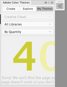
More likely a limitation of a web based panel. There's nothing subtle about this so it won't be news to anyone at Adobe. Without a connection I even get 401 page not found errors inside of my app panel, here it is from Photoshop.
Copy link to clipboard
Copied
I did not stumble on 401 yet...
Isn't it interesting, what goes on behind Photoshop's and InDesign's Adobe Color Themes panel.
Here are some further observations.
First, a comparative screen capture :
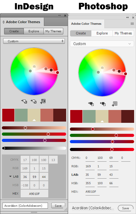
The relative appearances of the palette is the same, except for the gray background which is lighter in Photoshop. (Could be my "Interface preference"?)
It is logical to expect that the RGB, Lab and CMYK numbers respond to the ICC profiles assigned to the document but they only the CMYK numbers do change with changes in Assigned profiles? For some reason, the RGB numbers are forever stock on sRGB? And that's true of both Photoshop and InDesign.
Another "feature".
Copy link to clipboard
Copied
but they only the CMYK numbers do change with changes in Assigned profiles?
The response is only temporary—as soon as you save a theme everything falls apart because of the link to the web app.
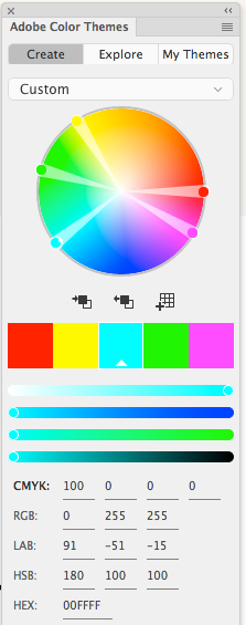
So again it doesn't take any elaborate testing to see there's no CM with saved themes. Build a theme with CMYK primaries, save it, and reload.
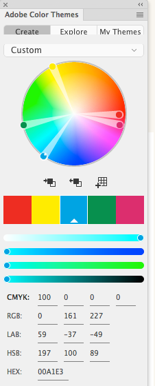
Above theme saved. 100% cyan would never convert to 0|255|255
Copy link to clipboard
Copied
100C in any CMYK color space would never map to RGB 0/255/255, only in Adobe's twisted color profiles world, Rob.
0/161/227 is bang on Coated GRACoL to sRGB, Rel Col with BPC.
Copy link to clipboard
Copied
0/161/227 is bang on Coated GRACoL to sRGB, Rel Col with BPC.
Right but the point is those values don't get saved unchanged. I can save them CM'd to the Swatches panel but not to the Theme panel.
only in Adobe's twisted color profiles world, Rob
No, it would never happen with Adobe's CM—at least if the CMYK profile was captured from a press sheet. I'm using the example to show that the online app isn't using the Adobe CM system because of the interaction with a web browser.
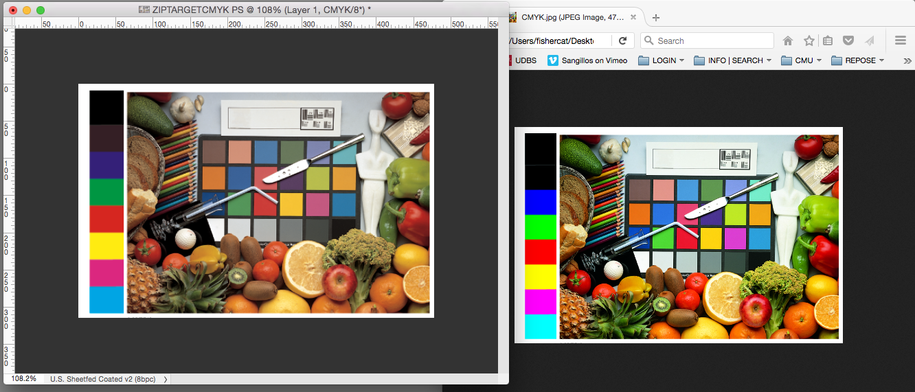
Some browser's will honor embedded profiles, but there's not the comprehensive CM system in place needed to make conversions in a web app. So it's either not possible or too expensive to code. If you view a CMYK image in Firefox or Chrome you get the same effect. PS vs. Firefox:
Copy link to clipboard
Copied
The behavior I would want is for the values to update based of Color Settings and Assigned profiles.
Copy link to clipboard
Copied
As far as the web site is concerned, I wish there was some kind of Color Preferences, saved with our "Adobe Account", in "Libraries". I think it would make a lot of sense.
So, if I load an image on the web site to create themes from, if the image has an embedded profile then use that as a Source for the CMYK and Lab conversion. If it does not have, fall back on sRGB or give the user some UI to chose the default.
It could be an "extension" of Bridge "Symchronized" Color Settings.
Copy link to clipboard
Copied
Too bad browsers have such a poor level of color management support.
Between you and me, it's not a question of "complexity", triggering an ICC profile conversion in the background is not the end of the world. But given Adobe's proverbial "hands off" approach, they would never want to create anything for which they'll get tons of support questions since the majority of users will not have a clue.
At least, in adobe.color.com, they should make explicit somewhere what the RGB and CMYK color space are. RGB is sRGB -- no brainer but I have not looked at what CMYK is.
Copy link to clipboard
Copied
On Windows 10, Edge does not have any color management capabilities ![]()
Copy link to clipboard
Copied
On Windows 10, Edge does not have any color management capabilities
Right neither does Dreamweaver.
In HTML code, color can only get spec'd as RGB and the major browsers display it as sRGB. If you want you can color manage images and some, but not all, browsers will honor the assigned profile. Images with no profile embedded get displayed as sRGB. So in the end web designers generally should use sRGB as the editing space.
Copy link to clipboard
Copied
I agree, all designers ought to standardize on sRGB for web design.
Find more inspiration, events, and resources on the new Adobe Community
Explore Now
