fredl65064644
Known Participant
January 3, 2022
Answered

Duotone images are not showing in PDF created from InDesign

  • January 3, 2022
  • 5 replies
  • 2789 views

I have an InDesign doc with duotone EPS images linked. The links are good. The duotones were created in Photoshop using a dark grey and a brown. They are saved as EPS. The two colors show in the InDesign color palette as spot when the images are placed. I can see the images in InDesign and in Adobe Acrobat when exported as PDF. But if I use a browser, or don't use Acrobat, the images are blank. Why?

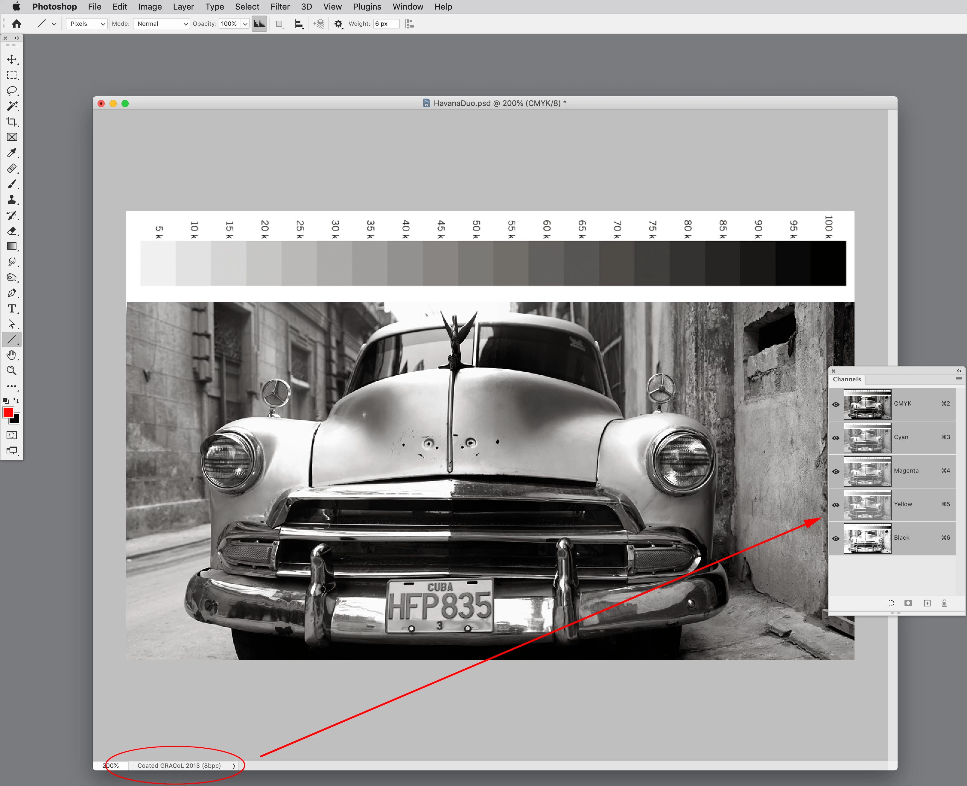
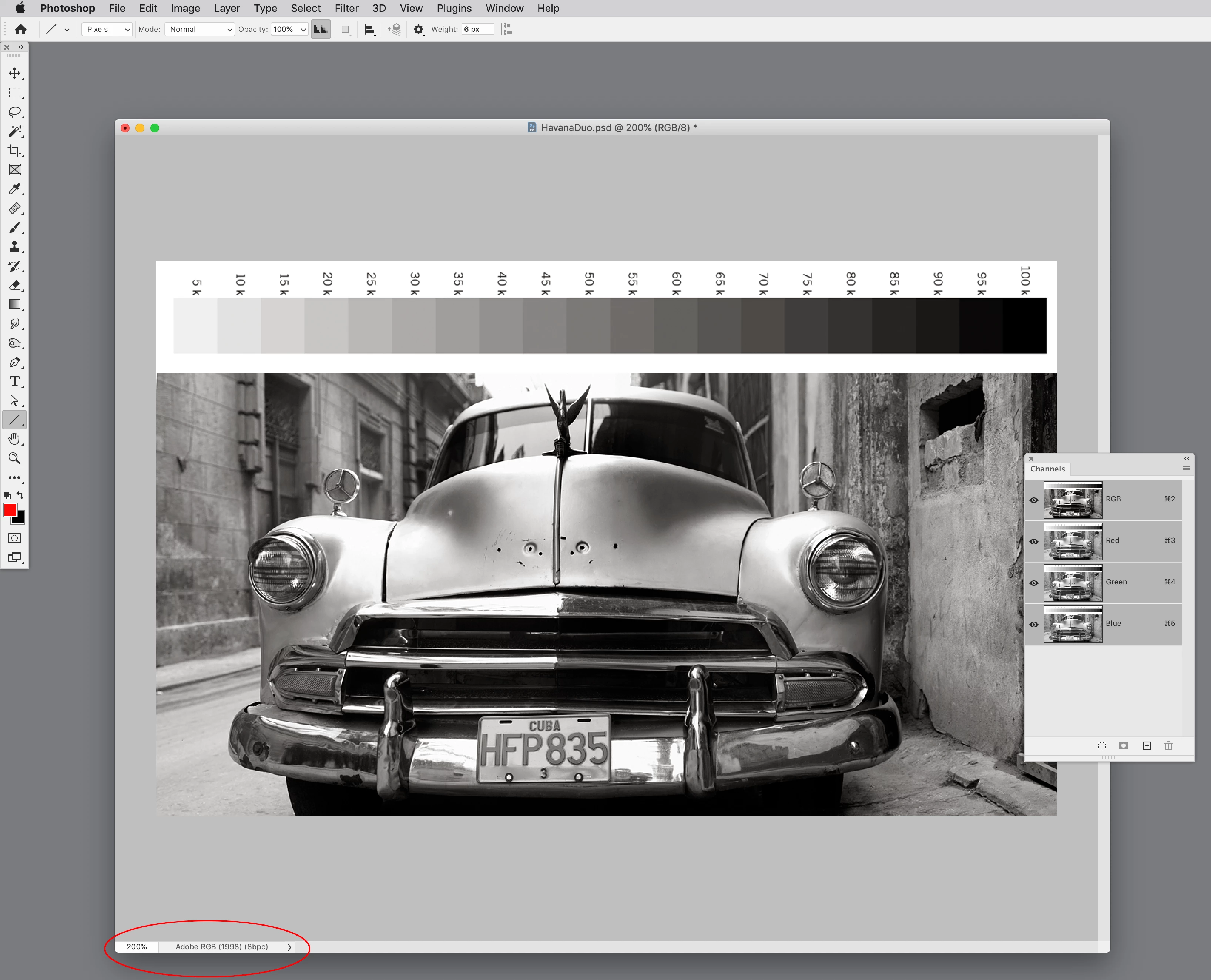
Also, the tone of the images are completely different (less black) if saved as a PSD rather than EPS. They look exactly the same if reopened in Photoshop, but in InDesign the PSD images have much less black, as if the black part was not being saved. What is the issue here? Is it a matter of layers? (These images only have one layer.)

Any help appreciated. 

    This topic has been closed for replies.
    Correct answer rob day

    makes sense but doesn't articulate the subtleties involved in managing the gradient editor


    There are many ways to create faux duotones—if you prefer editing in actual Duotone Mode, making a color managed conversion to either an RGB space or a print CMYK space can easily be done via Color Settings and Image>Mode. A managed Photoshop conversion would probably cause fewer color problems than placing the Duotone in InDesign, and trying to force a conversion on export via Ink Manger or from Acrobat after the export.


    If the conversion is to CMYK, the color appearance won’t change as long as the duotone colors are in the destination CMYK gamut (that wouldn’t be an issue with Black + Brown). If you are not sure about the final press profile, converting to RGB and delaying the final conversion to CMYK would be the better approach.


    I can make the conversion from the Duotone’s Spot Dot Gain 20% to either RGB or CMYK via Image>Mode>RGB or CMYK by setting my Color Settings’ Working Spaces to the desired destination profile. The Relative Colormetric Intent setting maintains the color appearance:


    The color is in gamut so the appearance is maintained on a conversion to either RGB or CMYK:


    5 replies

    rob day
    Community Expert
    Community Expert
    January 3, 2022

    Hi @fredl65064644 , the preview of Spot color tints and duotones can’t be fully color managed. InDesign doesn‘t have a Spot Working Space and Duotones can’t be saved with a color profile, so the two applications handle the display of duotones differently. In Photoshop the Color Settings’ Spot Working Space handles the Duotone preview. Here’s the Spot Working Space set as Black Ink - ISO Coated V2 300% vs Dot Gain 30%—you can see the Working Space is only affecting the soft proof preview and not the output values:


    If one of your channels is named Black and you place the duotone in InDesign the duotone’s Black channel will display on the CMYK Black plate and the document’s assigned CMYK preview will affect the preview, but not the output numbers. This is similar to the way InDesign handles grayscale objects, read more here:


    https://community.adobe.com/t5/indesign-discussions/greyscale-jpegs-or-psd-images-are-going-much-darker-when-dropped-in-on-indesign/m-p/11152264


    Here the top duotone is Process Black plus PANTONE Warm Gray 3, and the bottom duotone is PANTONE Black 6 plus PANTONE Warm Gray 3. 


    If the document’s assigned CMYK profile is changed it affects the CMYK black plate’s preview and the top image preview changes without affecting the Separation output values:


    fredl65064644
    Known Participant
    January 4, 2022

    Rob,
    Very helpful links and illustrations--thank you for taking the time. These should be on the Adobe web site; their advice on creating faux duotones (https://creativecloud.adobe.com/cc/discover/article/make-it-in-a-minute-duotone-effect-in-photoshopmakes sense but doesn't articulate the subtleties involved in managing the gradient editor--I found it neither quick nor simple, and ended up not using it but rather going with Photoshop's "Duotone" image mode. 
    I believe that as long as I match the color profiles and convert the spot colors imported with the images I may be able to get the tones I'm after using a PSD import format (which imports into InDesign as "duotone", as opposed to EPS, which doesn't have an identified color space). Your illustrations point that out, and the link you provided about the overprint preview was revealing.
    Thanks!

    rob day
    Community Expert
    rob dayCommunity ExpertCorrect answer
    Community Expert
    January 4, 2022

    makes sense but doesn't articulate the subtleties involved in managing the gradient editor


    There are many ways to create faux duotones—if you prefer editing in actual Duotone Mode, making a color managed conversion to either an RGB space or a print CMYK space can easily be done via Color Settings and Image>Mode. A managed Photoshop conversion would probably cause fewer color problems than placing the Duotone in InDesign, and trying to force a conversion on export via Ink Manger or from Acrobat after the export.


    If the conversion is to CMYK, the color appearance won’t change as long as the duotone colors are in the destination CMYK gamut (that wouldn’t be an issue with Black + Brown). If you are not sure about the final press profile, converting to RGB and delaying the final conversion to CMYK would be the better approach.


    I can make the conversion from the Duotone’s Spot Dot Gain 20% to either RGB or CMYK via Image>Mode>RGB or CMYK by setting my Color Settings’ Working Spaces to the desired destination profile. The Relative Colormetric Intent setting maintains the color appearance:


    The color is in gamut so the appearance is maintained on a conversion to either RGB or CMYK:


    Mike Witherell
    Community Expert
    Community Expert
    January 3, 2022

    Would it help if you exported your PDF and along the way clicked on the Ink Manager and turn on the switch for "All Spots to Process"?

    Come to think of it, why not upgrade those EPS graphics to .PSD graphics and replace them in the layout? Then afterwards, try the Export to PDF and see if it makes any difference.

    Mike Witherell
    fredl65064644
    Known Participant
    January 3, 2022

    Actually I was originally using PSD for the output but the result was losing the duotone--the black just wasn't coming through. So I switched to EPS, which reflected what I was seeing onscreen. I am not techy enough to know why the two formats are showing a different result. 
    I hadn't thought of the ink manager conversion--at this point I have changed the two spots in InDesign to process, so the spots no longer exist. If I try some other type of import (which will cause the spots to show up again) I will try that and see if it makes a difference. 

    Thanks!

    Randy Hagan
    Community Expert
    Community Expert
    January 3, 2022

    My guess about your disappearing images is that your web browser(s) and other PDF generator work solely with process color — RGB and or CMYK folor reproduction models, respectively.


    By definition, duotones are made up of spot colors, outside of the processing range of applications working solely with process color models. InDesign and Adobe Acrobat are print-centric tools which incorporate mdels for processing both process and spot color models. Web browsers do not, focusing exclusively on RGB. Your alternate PDF generator (say, Microsoft Office's PDF generator or Apple's Preview Export to PDF function) processes in RGB (default) and/or perhaps CMYK for composite printer output. Not spot color.


    In short, you're built to lose here. If you're working with transferring your PDFs to process color models, duotones aren't going to make the trip.


    As for the differences between color reproduction (Onscreen? In composite color printing/proofing?), they generally have something to do with different definitions for color settings — either in the source documents or in PDF generation. You need to ensure that everything is copacetic to get consistent results as your images pass from one program to another.


    What is your intended use for the final PDFs? knowing that would help us share a course of action that best meets your needs. But no matter what the final output is going to be, your course of action will most likely include translating your spot-colored duotones to some process color model for anything except multi-pass print reproduction.


    I don't know if this helps, but I hope it does provide insight into your situation.


    Randy

    fredl65064644
    Known Participant
    January 3, 2022

    Dave, 
    Preview settings are good--even optimized. The use of the browser was only to replicate the issue that the photographer was having viewing the PDF--he was seeing blanks, because he doesn't have Acrobat (old school). 

    Randy,
    What you say makes a ton of sense, and my attempt has been to recreate the original duotone with a faux duotone, but it's quite possible I've gone about it the wrong way. I scanned the printed images in grayscale (the photographer doesn't have electronic files) and applied the duotone in Photoshop; I didn't scan them as is (printed in duotone) because I felt the effect would just get mudied and the contrast lost. 
    The ultimate form will be a printed page, via a commercial printer using CMYK, no spot colors. I have checked the profiles in Photoshop and InDesign--both are using SWOP uncoated v2, which should be good for the destination, since this is printing on uncoated paper. I have taken the two spot colors and changed them in InDesign to process. 
    The resulting PDF is showing the result I want, so I am trusting that the printer's RIP will reflect that--hard proofs will tell. Now just to find a way to allow the photographer to view the soft proof prior to sending off. 
    If what I've said sounds wrong or doesn't make sense, please feel free to respond. What you've noted thus far has been helpful fo rme in trying to troubleshoot.

    Fred

    rob day
    Community Expert
    Community Expert
    January 3, 2022

    The ultimate form will be a printed page, via a commercial printer using CMYK, no spot colors.


    Then there‘s no reason to use the Duotone Mode in Photoshop—convert to RGB and embed the RGB profile when you save the file.

    davecourtemanche
    Inspiring
    January 3, 2022

    How are you saving the eps files out of PS? What is the preview setting? That may be the issue. I've had a lot of challenges with duotone eps files out of PS, so I ended up going to psd files with better results (I believe, it's been a while). I hear what you're saying about the rendering in ID, but what does the final PDF look like? If that matches up, that would be the way I go and not worry about the ID rendering. Also, web browsers and other, non-Acrobat PDF viewers can do many weird things to PDF files, duotones may be a victim of that.


    Lastly, why worry about rendering in a web browser. The only reason I'd be creating duotones & using the PSD eps file is to be able to create duotones or tritones for printing in PMS colors. If it's just a look you're going for, convert the duotone to RGB when done and use that. Otherwise you're just adding layers of hassle for a simple look. 

    Peru Bob
    Community Expert
    Community Expert
    January 3, 2022

    I've moved this from the Using the Community forum (which is the forum for issues using the forums) to the InDesign forum so that proper help can be offered.

    fredl65064644
    Known Participant
    January 3, 2022

    Darn! Thank you. I did a search and then posted, thinking I would automatically be in the correct forum. Wrong.