- Home
- InDesign
- Discussions
- Re: Expected Appearance of placed Photoshop RGB co...
- Re: Expected Appearance of placed Photoshop RGB co...
Expected Appearance of placed Photoshop RGB content in InDesign CC 2023
Copy link to clipboard
Copied
- Create New "Print" document in InDesign
- Transparency Blend space becomes CMYK
- Import sRGB image created in Photoshop on Page 1
- Should the user expect the imported RGB image to "match" Photoshop's appearance?
Copy link to clipboard
Copied
Sometimes. If the profile is embedded in the image, and if the page contains NO TRANSPARENCY, it should look the same. The user should also be prepared for the image to be converted to CMYK, since they have asked for transparency blending to be in CMYK. What is not obvious, but must be learned, is that everything on the page is converted if there is ANY transparency, to provide consistent colour.
Copy link to clipboard
Copied
Dear Legend,
Thank's for your clear reply. I wish this behavior would be "documented" somewhere, for mere mortals like me. I wouldn't have thought that the presence of any placed element comprising some level of transparency/blend mode would throw the whole page into CMYK simulation? I'll take a look. And, yes, the behavior is hard to follow.
Copy link to clipboard
Copied
I wouldn't have thought that the presence of any placed element comprising some level of transparency/blend mode would throw the whole page into CMYK simulation?
Hi Roger, InDesign doesn’t have a single document color mode, it lets you mix objects with different color modes on the same page—AI and PS have single document color modes, so they don’t need a Transparency Blend Space. ID needs a Blend Space because eventually, depending on the output destination, the entire page or spread will need to be flattened into a single color space.
For example, if you are working for a web destination, your InDesign page will likely have to be exported to a flattened JPG or PNG web image format—the entire page or selection, not just the objects with transparency, will get flattened to a single color space on the JPEG/PNG image export.
For example here I have Lab, RGB, and CMYK color fills blended together, with my Blend Space set to RGB. With Overprint/Separation Preview turned off I get a preview of a flattened export to document RGB:
If the destination is print, the page will still eventually get flattened when it is RIP’d—the entire page will have to be RIP’d into a single color space. Also the Blending mode Effects behave differently depending on the color space—you can see that in Photoshop if you try the Difference Blending mode in an RGB vs. CMYK document. So, if I change my document Blend Space to CMYK, the Lab color, which is set to Difference behaves differently, and the entire page previews in the document’s CMYK space, reflecting what will happen when the page is RIP’d:
Copy link to clipboard
Copied
Also, more to your original question, besides the Blend Space and Overprint Preview settings @Test Screen Name mentioned, the InDesign Color Settings Color Management Policies could also affect the display of a placed RGB image whether it has an embedded profile or not. It’s important to note the CM Policies are saved with the document when it is created–the Color Settings’s Policies don’t affect an existing document.
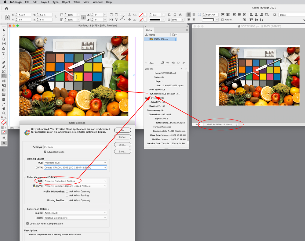
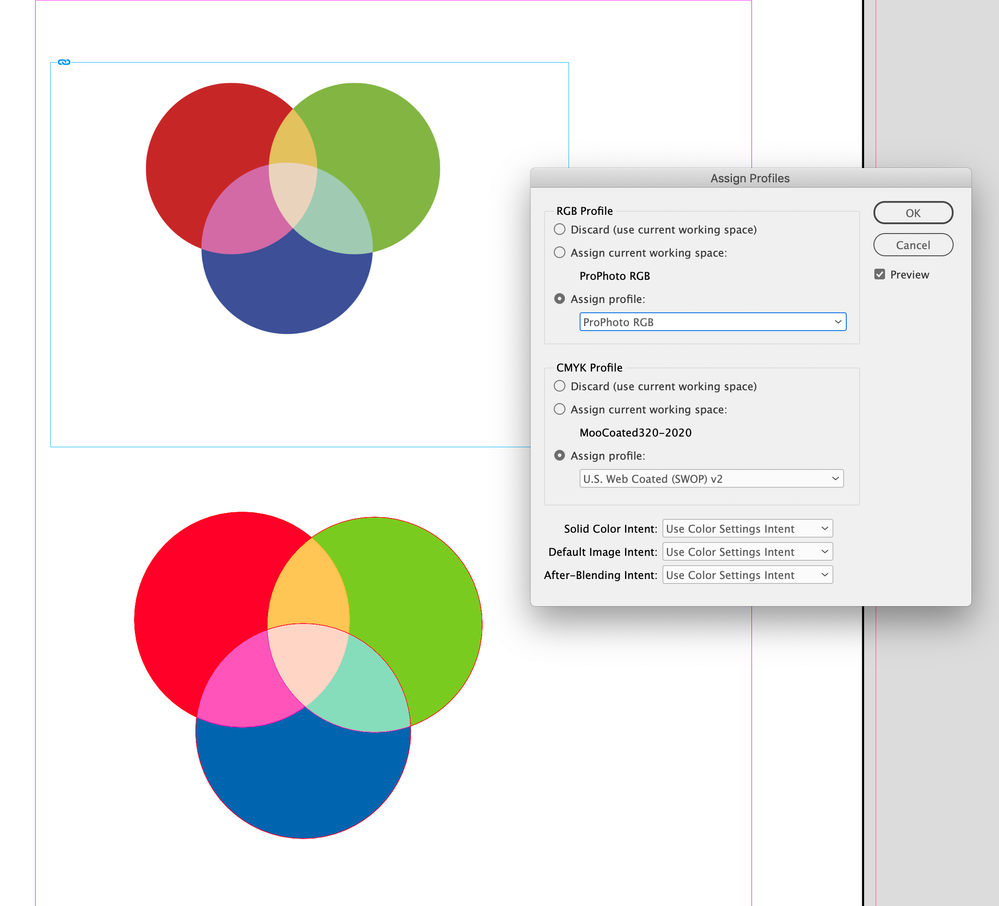
If my document’s saved RGB Policy is set to Preserve Embedded Profiles, and the placed image was saved with the sRGB profile embedded, it will display as sRGB even when my ID document’s RGB profile assignment is different—ProPhoto RGB in this case:
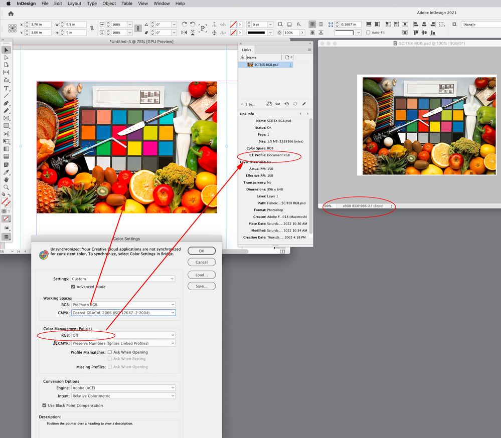
If the document was created with the RGB Policy set to Off, then the InDesign document would be created with no RGB profile assignment, placed RGB images would have their profiles ignored, and the profile assignment would fallback to the Color Settings’ Working RGB Space. Here the doc’s RGB Policy is Off, and my current RGB Working Space is ProPhoto:
Copy link to clipboard
Copied
Dear Rob,
I appreciate the pain you took to document all your excellent points. Believe me, I'm pretty good with all that stuff myself, policies, honouring placed images embedded profiles and transparency blending. I'm not afraid of rolling my sleeves and dig in all that dirt with my students since color management is one way I've earned a living in the print world for many years.
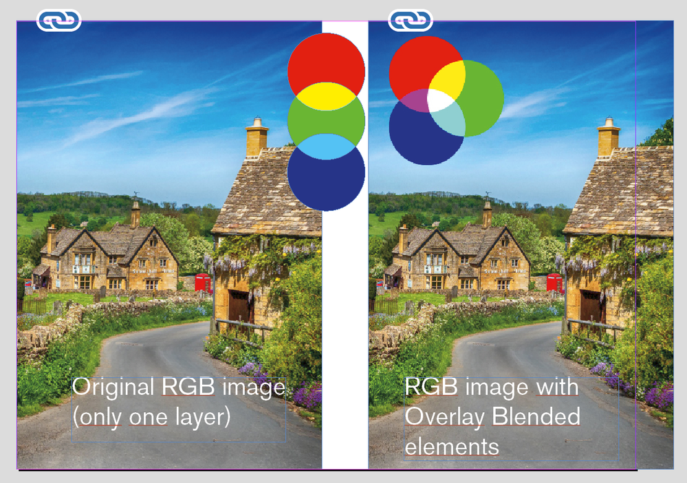
With your kind help and that of others, I now understand that ALL page elements are "promoted" the Document CMYK space as soon as any page elements has any "transparency" attributes turned on, as in my lowly "RGB additive synthesis" Overlay mode demo.
I pay very close attention to my Color Settings in all four CC applications starting with Photoshop, Illustrator, InDesign and Acrobat. Bridge works fine on its own, using my monitor profile as the Destination for any selected image, matching Photoshop's rendering to the screen.
The thing I still don't understand and I tried a "Chat support" session with Adobe about it, yesterday -- what a waste of time, it was --, is IF the whole page is thrown into "CMYK", why are the native elements handled differently? Why not ALL page elements be treated the same?
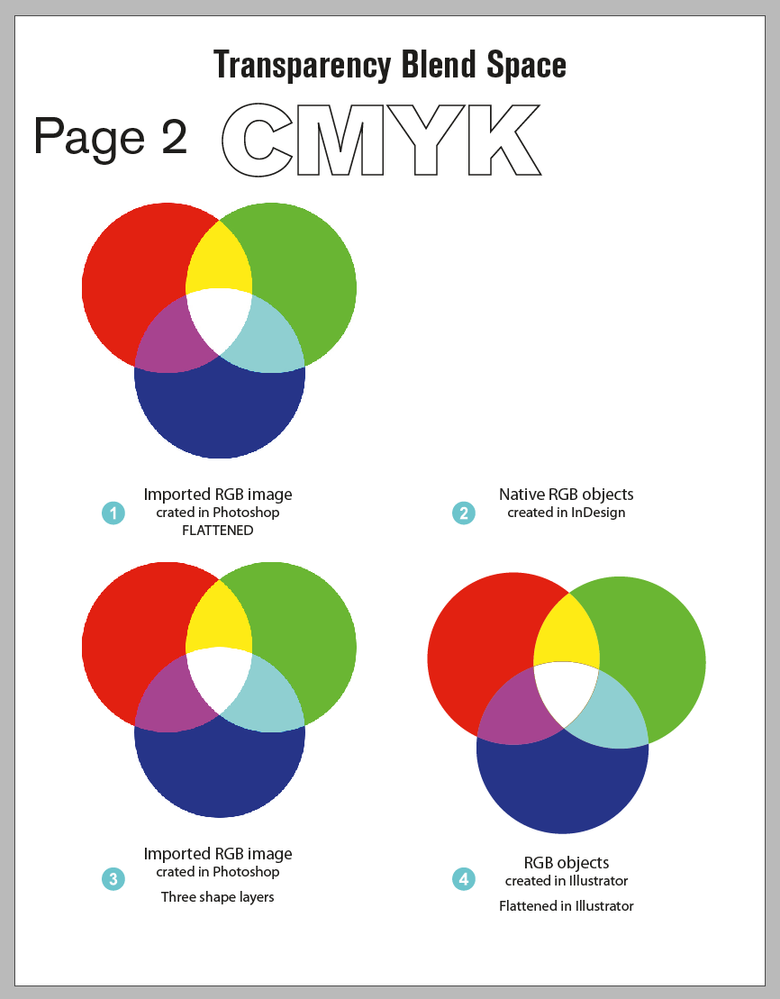
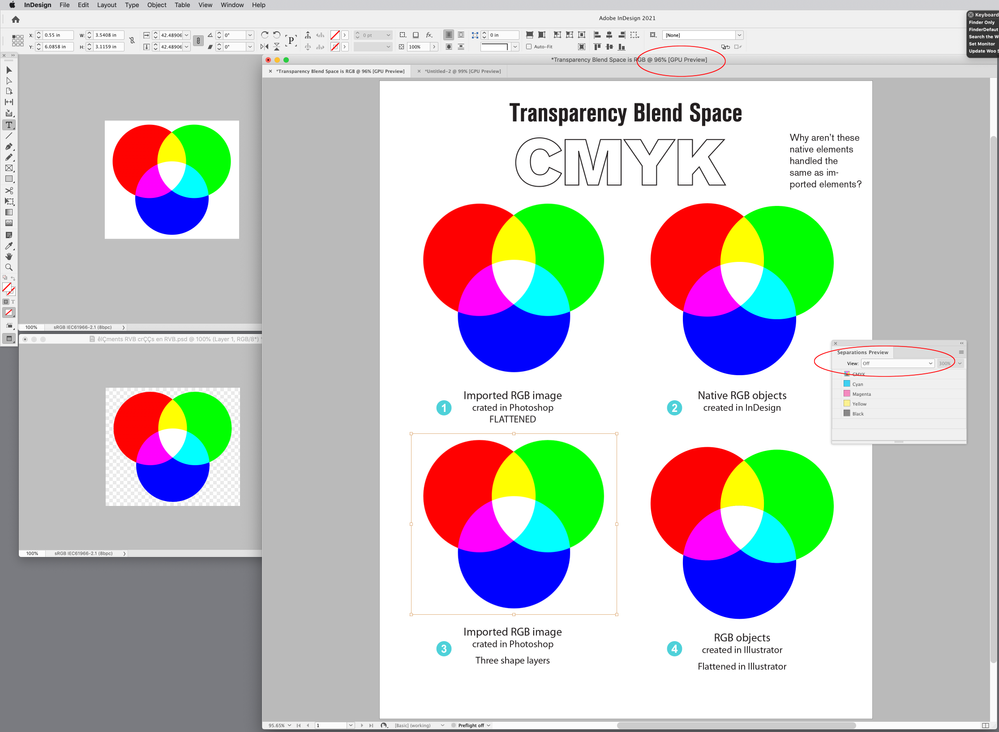
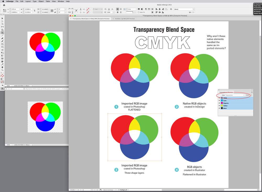
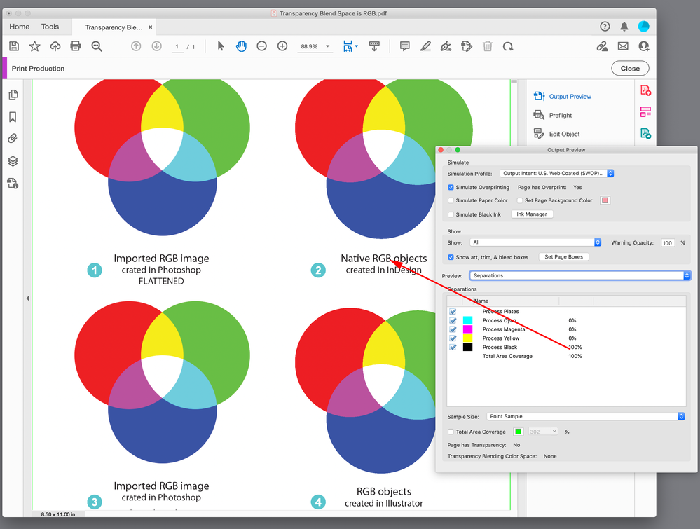
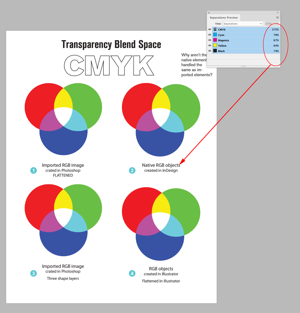
Here are two screen captures that document this behavior, from two consecutive InDesign pages (wish I could attach the document here?), "Page 1" and "Page 2".
On Page 1, there are four elements, three elements are imported Photoshop RGB images, and 1 element, top right-hand corner, is "InDesign" native elements, created in RGB.
You see the difference? Why on eartg is the "native" element NOT rendered the same as the imported elements?

According to your understanding, as soon as any page elements has any transparency attribute, the whole page is thrown into CMYK, if that's the Document Blend space.
Well, if that was the case, Page 2 below, ought not to be shown in the CMYK Blend space since I deleted the "Native" element? In other words, nothing on this page has any transparency :
You see what I mean?
My problem is I don't know how to interpret InDesign's behavior?
And, the same goes for Illustrator. Here is an RGB document with three different RGB elements shown with Proof Colors (CMYK) :
- Left is a placed RGB Photoshop image
- Center is a native element, three circles with an unflattened Overlay blend mode
- Right is a native element "flattened" into separate, non-blended vector elements :
Obviously, here again, the "native" element appears to be flattened in RGB space BEFORE being rendered into CMYK. Would you agree that this is the case?
If that is the expected behavior, for some reason, I don't agree that this is "correct"? To me, ALL elements on the page should be equally treated. And that's not what I am finding, Rob.
Copy link to clipboard
Copied
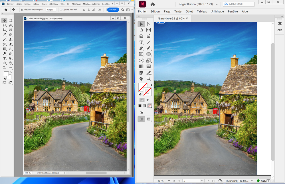
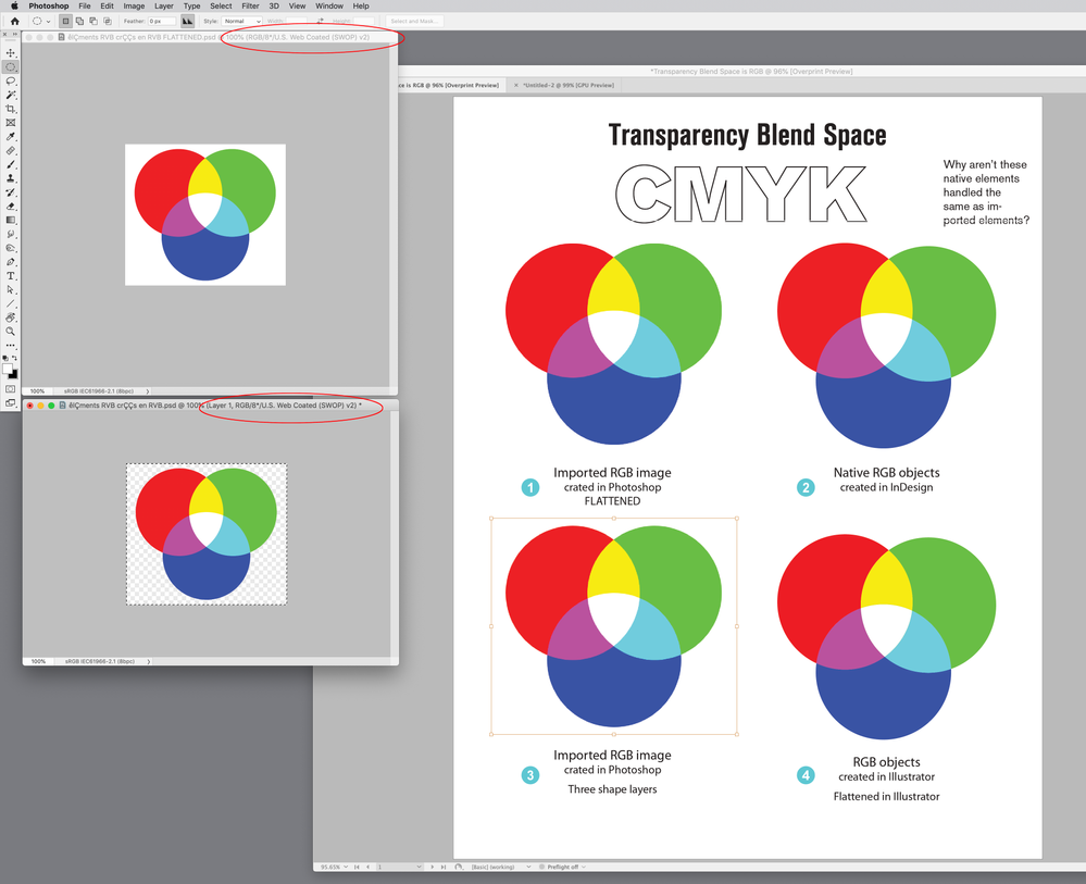
I keep coming back to my expectation that, placed RGB images in InDesign ought to display the same as viewed in Photoshop, GIVEN THE SAME Color Settings, and that seems to be the case, regardless of "Print" vs "Web" Transparency Blend space, Here is a screen capture from my desktop showing the same RGB image in both Photoshop and InDesign :
That behavior, to me, is "logical".
Next, what if I was to add my infamous RGB graphic to the Photoshop's document, and place THAT into InDesign, how would that display? Well, regardless of whether I have Proof Colors selected or NOT, the choice of Transparency Blend space is all that matters, clearly, CMYK Document Blend space selectively process "native" vs "foreign" elements, and there is no UI to effect that behavior, Mr. Day? Here's another screen capture :
I really don't know what to say?
Copy link to clipboard
Copied
Well, expectation isn't always reality...! InDesign is only trying to show you what the effect is going to be of printing or exporting to PDF. When you export to PDF, the ORIGINAL COLOURS might travel to the PDF along with the transparency requests, not converted, just wrapped up -- so InDesign has to match what it knows the PDF will do.
The distinction here between "native" and "placed" elements, which is not really defined in the rules for transparency. But there are two things that could happen with placed elements.
1. The placed elements are fully incorporated into the InDesign document, as separate elements, with blending rules, and blended in with everything else.
2. The placed elements are pre-blended to make a single object (with opacity, but no external blending rules).
My money would be on #2, because InDesign can't in general decompose a placed file into graphical elements. Indeed, the very reason you used a placed graphical element is likely to be because InDesign wasn't capable of doing those graphics! This is what in PDF transparency is called an "independent transparency group". The behaviour you see is consistent with placed graphics being an independent transparency group. Independent transparency groups are very important, because in general a graphic with transparency was made to blend with itself to make a finished graphic, not to be combined with transparency in other apps later on (even if it were possible).
Copy link to clipboard
Copied
I would need to see the pages and placed images. You should be able to attach INDD and PSDs to a reply, see Drag & drop here... below the reply, or use a file sharing service like Dropbox or your CC account.
It looks to me like your placed RGB examples include transparency, check your Link Info
Copy link to clipboard
Copied
Here is a sample InDesign page.
Copy link to clipboard
Copied
Hi Roger, it looks to me like it is the collision of blending spaces—your Photoshop files are blending in sRGB and your ID page is blending into Document CMYK (US Web Coated SWOP in your sample page).
If I set your InDesign document’s Blend Space to RGB, and turn off Overprint/Separation Preview, everything matches:
If I then turn on Separation Preview I get a Document CMYK soft proof—the expected output to US Web Coated SWOP. Again everything on the page matches:
If I soft proof the Photoshop sRGB files to US Web Coated SWOP, ID and PS match:
You can work with an RGB Blend Space for print but the Export gets tricky, because the black only text can get converted to 4-color when the page is exported to CMYK and flattened (e.g., PDF/X-1a)
You can protect the Black text by exporting to PDF/X-4 with no color conversion and flatten the pages using AcrobatPro’s Flattener tool. Export to PDF/X-4, with flattening in Acrobat after the export:
Copy link to clipboard
Copied
Rob,
Thank you for your detailed feedback, as usual 🙂
Question: the fact that the imported Photoshop file is "sRGB" should not come into the picture since the InDesign "Document RGB mode" is also sRGB.
I have long found out that, if I select "RGB Transparency Blending space", then everything is converted the same TO CMYK. I don't debate that.
My point is why, on earth, when "Transparency Blend space" is set to CMYK, why are the "native" sRGB elements handled differently from the "imported" sRGB elements?
Of course, if I was to adopt an "RGB Transparency Blend space" in all my InDesign documents, there would never be a "problem" since, clearly, ALL RGB content is handled equally, all seemingly flattened in RGB space, first, before converting to CMYK.
I am stilll not clear on why, in CMYK blend space, are the "native" RGB elementsd being treated differently from "imported" RGB elements? That remains a mystery to me, greater than the Pyramids ....
Copy link to clipboard
Copied
Question: the fact that the imported Photoshop file is "sRGB" should not come into the picture since the InDesign "Document RGB mode" is also sRGB.
Right, the but if you are trying to get a match between ID and PS blended colors you can’t mix profiles. It’s easier to see when the colors are not on the edge of the gamut:
Same values conflicting profiles
My point is why, on earth, when "Transparency Blend space" is set to CMYK, why are the "native" sRGB elements handled differently from the "imported" sRGB elements?
You can’t set a CMYK Blend Space in a Photoshop RGB image, so there isn’t a comparison. I think it’s because InDesign doesn’t have a single document color mode.
Of course, if I was to adopt an "RGB Transparency Blend space" in all my InDesign documents, there would never be a "problem" since, clearly, ALL RGB content is handled equally, all seemingly flattened in RGB space, first, before converting to CMYK.
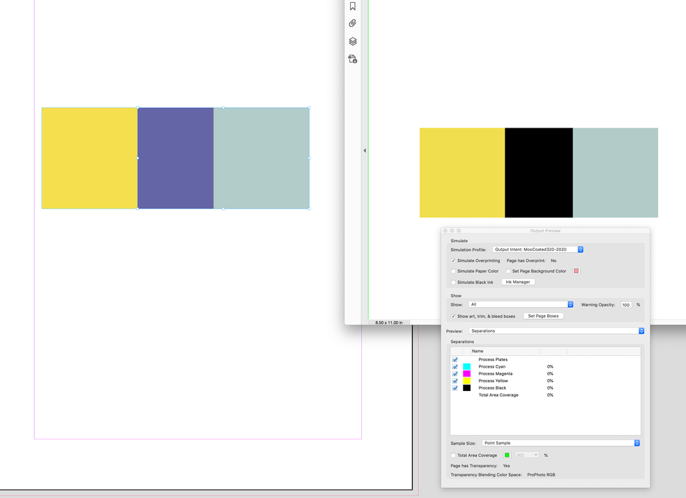
You could have a problem with CMYK builds you want to protect. You can see that if you check your 0|0|0|100 Black text in Separation Preview with the RGB Blend Space:
Also, a PDF/X-4 Export with live transparency can do this in Output Preview without an intervention. Blending is Exclusion:
Copy link to clipboard
Copied
Well, I'll be damned? 100 Black turning into "four color black" as a consequence of Transparency Blending in RGB? Wow! So much for RGB blending -- no question.
I suppose there are "ways" around this if only using smart options in Prinergy that can keep Black from turning into four color? I'll have to inquire but I'm still convinced there is something "wrong" with the way "native" elements are treated relative to how "imported" elements are treated? Between you an me, Rob, I think it's pretty "dumb" on Adobe's part to ignore simple cases like "Keep Black from turning into four color Blacks" when document transparency blend mode is RGB. I'm probably fighting a dead case... But to me, Adobe is not off the hook until we get an explanation of why it behaves this way, not only in InDesign but also in Illustrator.
Copy link to clipboard
Copied
Rob,
It breaks my heart that the user has to settle for an "inferior" flattening of RGB elements to avoid CMYK element reseparation (i.e. 100K)? In my examples, flattening in RGB retains much of the original saturation and "purity" compared with plain, flattening in CMYK space.
Copy link to clipboard
Copied
If using the AcrobatPro Flattener tool isn’t clear I can post a more detailed example.
flattening in RGB retains much of the original saturation and "purity" compared with plain, flattening in CMYK space.
I would rethink your use of sRGB as the RGB editing space.
Copy link to clipboard
Copied
No thank you, dear Mr. Day. sRGB is plenty for most of the "everyday" imagery that abounds on the werb and that people publish year around. I can't tell you how many times I simply changed from AdobeRGB to sRGB in my color correction work and, suddenly, most of my work is done. Most users have no clue about color management and that situation is not about to change. There is nothing inherently wrong with sRGB.
Copy link to clipboard
Copied
I suppose there are "ways" around this if only using smart options in Prinergy that can keep Black from turning into four color?
As I described above, you have to export as PDF/X-4 with no color conversion, and then flatten using AcrobatPro’s Flattener tool.
It goes beyond CMYK black only—the use of a small RGB space like sRGB will ruin the CMYK primary color builds on a CMYK-sRGB-CMYK conversion. If you export live transparency to the PDF/X Standard, which is designed for offset printing and includes an Output Intent profile, the flattening effect on color become ambiguous with Acrobat’s Output Preview turned on.
Copy link to clipboard
Copied
there would never be a "problem" since, clearly, ALL RGB content is handled equally
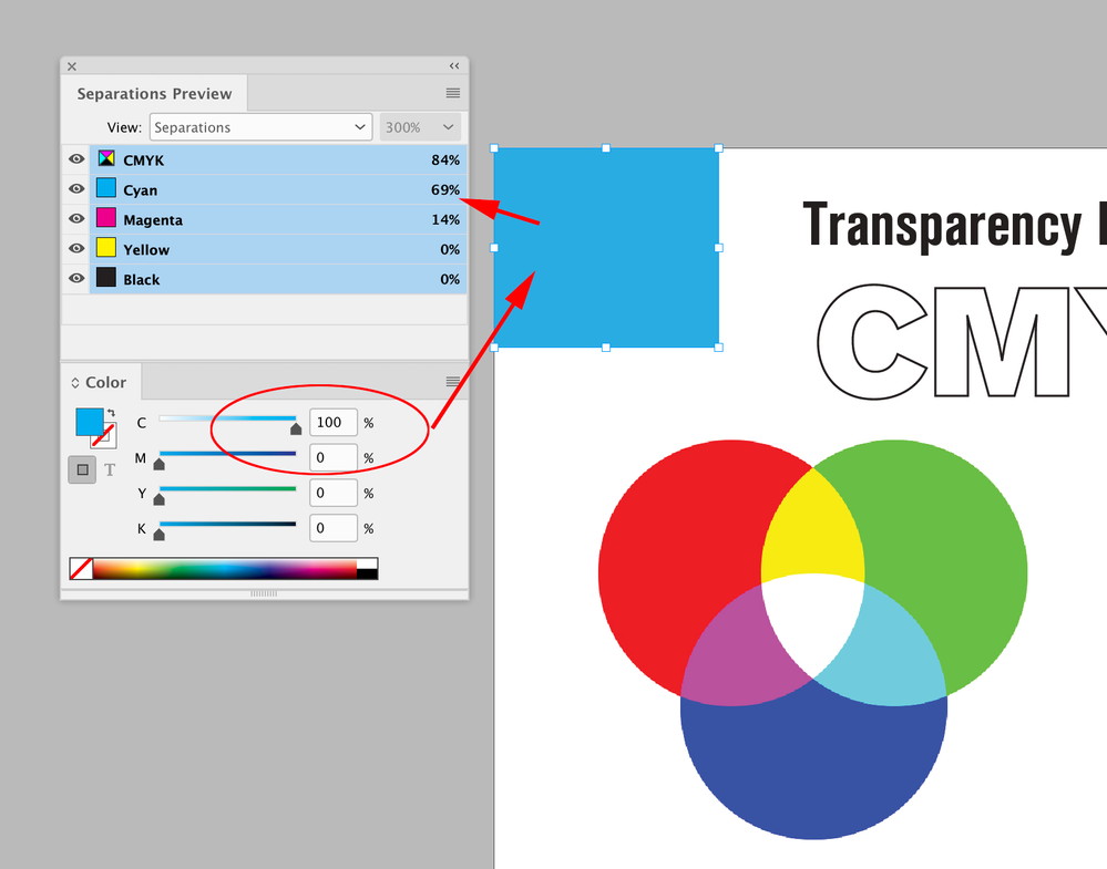
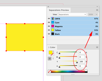
You also might have a problem when your RGB editing space is sRGB—sRGB clips a large chunk of the CMYK gamut. You can see the problem if I fill a rectangle with 100% Cyan, which is so far outside of the sRGB gamut it would get clipped on the conversion and output as 69|14|0|0 CMYK:
Copy link to clipboard
Copied
Rob, your point about "RGB editing space is sRGB—sRGB clips a large chunk of the CMYK gamut" is debatable... at least in my view.
The large chunk of gamut clipping you and many typically refer to, in the litterature and elsewhere, occurs mostly in the "cyans", as you know from a 3D examination of both sRGB and typical CMYK gamuts.
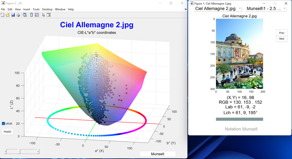
Yet, I found in my ongoing study of "popular RGB imagery" that the majority of RGB colors used in landcapes, portrait, what have you, rarely -- if ever -- venture into the "cyans". It is suprising. There are lot's of greens, really not all that saturated. a lot of reds, oranges, yellows, blues, purples, pinks, flesh tones, naturally. I spent a fair deal of time, this summer, studying the matter in Matlab (wish I could share my little script and sets of images).
Copy link to clipboard
Copied
—sRGB clips a large chunk of the CMYK gamut" is debatable... at least in my view.
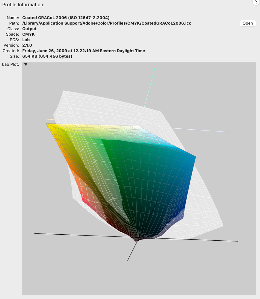
Apple’s ColorSync Utility will show 3D plot space comparisons. It’s pretty obvious when you compare sRGB with a common offset space like Coated GRACoL. The white plot is sRGB and the color outside of the white would be unavailable on a conversion from sRGB to GRACoL. It would get considerably worse with bigger print spaces e.g., Inkjet
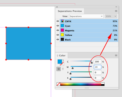
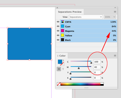
The clipping is obvious in the Separation numbers when I check CMYK fills with the blend space set to sRGB:
Copy link to clipboard
Copied
Rob,
Your points are well taken, rest assured, but they are the "typical" points most people I know make? ColorSync utility is fine to get an idea of "relative" gamut sizes, I won't dispute that. But sadly, ColorSync is unable to show an RGB image as a series of points INSIDE an ICC profil 3D projection.
I developped a small Matlab script to study exactly the business of "clipping". I have yet to run into an image that uses a lot of the (typically) "Cyan" colors that are presumably outside the typical CMYK gamut. It has to do with the nature of the imagery that people capture everyday? And I'd beg to know your experience and others, Rob?
Copy link to clipboard
Copied
I have yet to run into an image that uses a lot of the (typically) "Cyan" colors that are presumably outside the typical CMYK gamut.
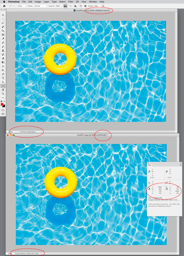
sRGB wouldn’t always be a problem, but here‘s an example where I can clearly see significant clipping in the CMYK output values.
The top image has ProPhoto assigned, and the bottom image is a copy, converted to sRGB via Convert To Profile... I have both soft proofing to Coated GRACoL.
Right away you can see the conversion from ProPhoto to sRGB has destroyed the details in the water, and it will get worse with the conversion to GRACoL. I’m sampling a blue and yellow color that gets crushed by the sRGB conversion—99|15|0|0 outputs as 78|29|0|0, and 0|2|100|0 outputs as 4|0|89|0. Not only does it look bad, there would be no way to color correct the sRGB version and get the needed 100|15|0|0 output value because it is not in the sRGB gamut.
Copy link to clipboard
Copied
You found a great image, Rob. Have you tried converting to GRACoL directly from ProPhoto?
Copy link to clipboard
Copied
Rob. Have you tried converting to GRACoL directly from ProPhoto?
Sure it converts with the same appearnce and output numbers I’m showing in my capture above:
-
- 1
- 2
Get ready! An upgraded Adobe Community experience is coming in January.
Learn more


