- Home
- InDesign
- Discussions
- Re: filling a text outline with more text
- Re: filling a text outline with more text
filling a text outline with more text
Copy link to clipboard
Copied
I'm trying to fill the word home, which I turned into an outline, with the text of a song in Indesign.
The first two letters fill completely, the 3rd fills about half way and the 4th fills just the top line. It doesn't matter how I manipulate the text inside the outline it still does the same thing (size etc makes no difference) The only thing that changes it is creating two or more columns but this obviously ruins the effect I'm after.... an ideas?!
Copy link to clipboard
Copied
I'd like to try to replicate this. Is the word all caps, or something else?
Copy link to clipboard
Copied
I'm using all caps the word is HOME and I'm using Rockwell Extra Bold font.
I type the word. - create outlines - then try to fill!
Copy link to clipboard
Copied
Try the following steps:
Type the word HOME text.
Select the frame that holds the text.
Type> Convert to Outlines.
Object > Paths > Release Compound Paths.
Now, select each one and choose Object > Paths > Make Compound Paths.
If the O is filled in, sse the Direct Selection tool to select the object for the inside of the O.
Choose Object > Paths> Reverse Path.
Select all the objects and choose Object > Content > Text Frame.
Use the Text tool to link the text frames.
Click inside the H and flow the text.
Adjust the text. Justified text looks the best. Especially make sure none of the paragraphs are set to no break, or to appear in next column or page.
Copy link to clipboard
Copied
Or even better, could you take a screen shot.
Copy link to clipboard
Copied
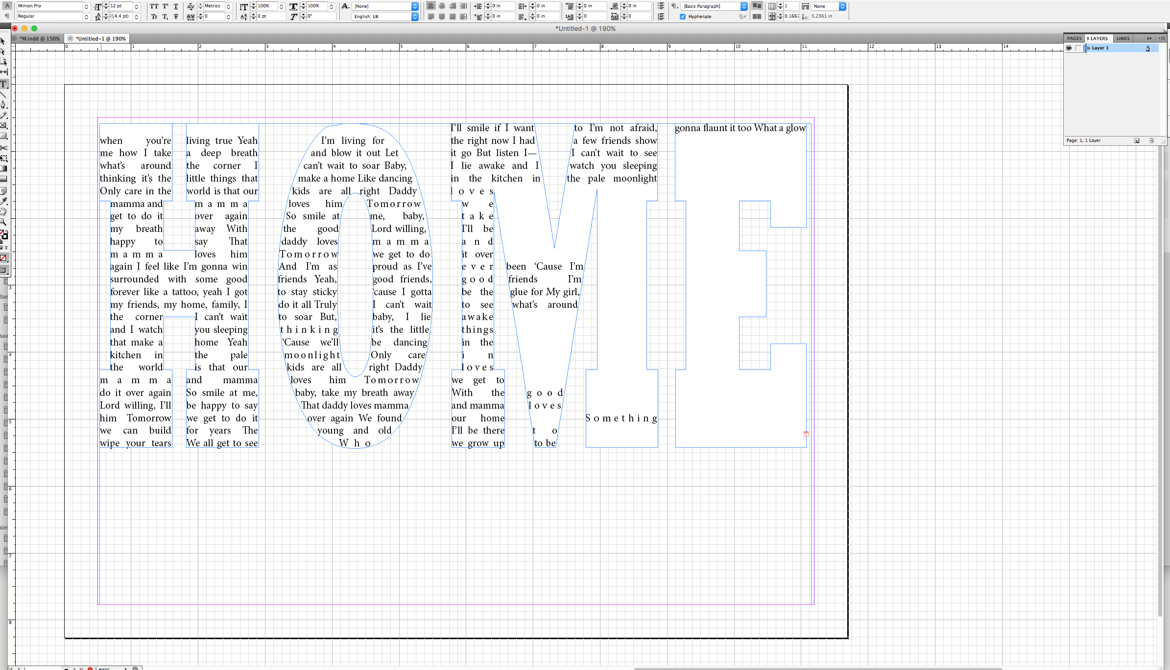 Here you go!!
Copy link to clipboard
Copied
You don't have any text-wrap frames underneath, do you?
Copy link to clipboard
Copied
Hi, no I don't.
I just tried to recreate it in a new file. I create a large text box. Write HOME, then I change the color of the text to paper so that it is white and then create outline. I then drag the outline to approx size I want and try and fill it with text. This is what happened this time!!
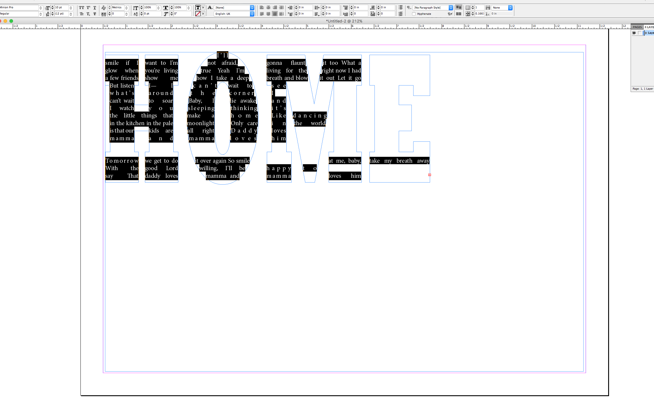
Copy link to clipboard
Copied
Maybe not enough space at home for text too big! ![]()
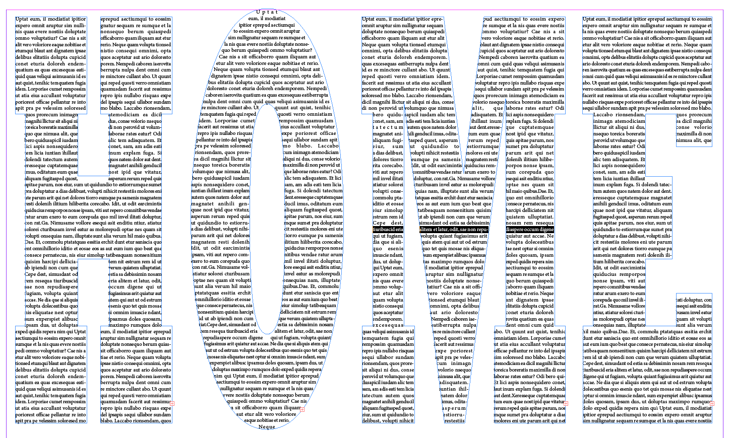
(^/)
Copy link to clipboard
Copied
Hey Obi-Wan - Nope!!! Are you on CS5 or newer? It maybe that I have an old version!
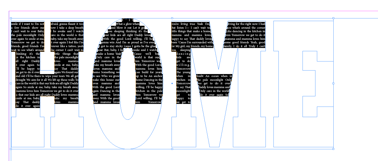
Hi BarbBinder..... I could do that, and you're right, they may not read it.... but the perfectionist in me knows that it should be possible!!
Copy link to clipboard
Copied
Hi Obi-wan,
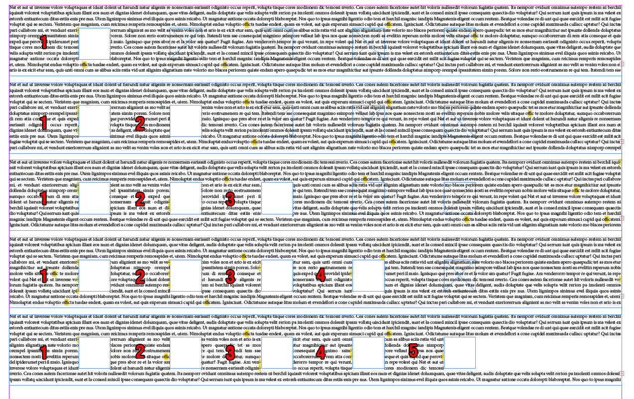
I think the OP likes to run one single line of text through all the shapes at one y-position. If the end of shape "E" is reached, the next line of text should be start at the "H" shape and so forth until the whole shape of the word "HOME" is filled. I don't think this is doable with one text frame.
I think, that's the limit, for older versions of InDesign and also for CC 2017:
The text can only run through a maximum of 5 segments in a row of a composite shape.
The OP's screenshot is clearly showing this in reply # 6.
Screenshot from InDesign CC 2017:
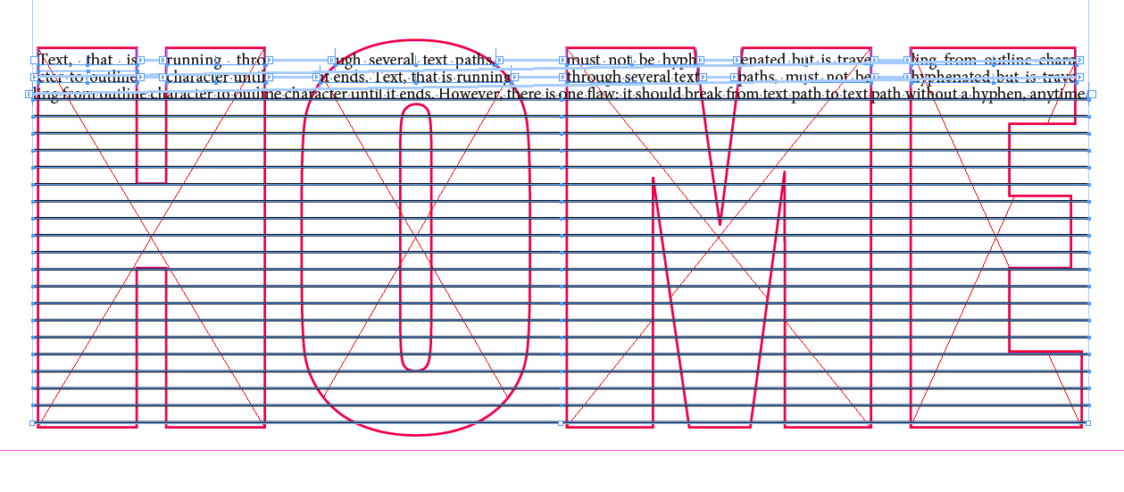
Workaround:
Text that is running segment by segment, line by line through threaded text paths.
Where every character could break to another line best without hyphenation.
Screenshot where the first two "lines" of text are threaded text paths.
The third one is also a text path, but it is not segmented yet.
Segmenting should be done before converting straight graphic lines to text paths.
Tedious work, but doable:
Regards,
Uwe
Copy link to clipboard
Copied
Another workaround:
Use threaded text frames instead of text paths.
That's much better…
Advantages:
1. Text frames are better to control in size and position
2. Use text wrap of the shapes. Text wrap can affect text frames, but never text paths ( a big minus on using text paths ).
3. Because of advantage 2 we need a smaller number of text frames compared to the number of text paths I had shown in my post before.
4. The text of a text frame could run according to the baseline grid of the document to maintain the distance from "line" to "line". That cannot be done with text paths.
One problem you should tackle:
1. Hyphenation
Should be avoided or only made with discretionary hyphens, because hyphenated words will interrupt the reading experience.
2. Discretionary hyphens are "real" characters, that can be formatted.
E.g. with: FillColor "None", can be made very small: 0.1 in point size and could be scaled to 1% if needed.
Regards,
Uwe
Copy link to clipboard
Copied
Hi guys,
I would like to thank you all for your help. I actually used a combination of two answers (I think!) I kind of stumbled on it but it works nicely. So many thanks!
Simon
Copy link to clipboard
Copied
Hi Simon: For someone else reading the thread in the future, trying to figure out a similar problem, it would be helpful to specify what worked for you. And screen shot of the finished product would be a bonus! ![]()
Copy link to clipboard
Copied
Of course, I'm sorry, it's the first time I've ever tried a forum... crazy unbelievable I know, but true!
Ok, so I've tried to recreate what I did in two different ways but can't get it right again!
I type home. Then create outlines, but then when I go to object paths, both the make compound path and release compound paths are greyed out. It doesn't matter which box I select or which tool I use to select it, I can't release the compound path. STUCK!
So then I wrote each of the letters separately, lined them up and converted them to text. I then get the two boxes on the outline of each one, which in theory means I should be able to link them, however that doesn't seem to work either.
When I managed it first time it's because I was somehow able to release the compound paths. I then simply used the direct selection tool to thread the frames together and voila I was there! There's a box on the left and right of each text frame. In theory you can simply click on the right box of the H and the left box on the O and they are then threaded.... for some reason I can't even do that today!
I will keep playing with it and see if I can come up with a fix. I've read some of the adobe supports on it and can't see what I'm doing differently.
Copy link to clipboard
Copied
Ok, so you are stuck on one of Sandee Cohen's steps. Maybe she can stick her head back in if she isn't in class.
Copy link to clipboard
Copied
If you don't hear from her, you can click on the link that shows her name (in the forum web interface), and click the Message button to send her a personal message.
Copy link to clipboard
Copied
I type home. Then create outlines, but then when I go to object paths, both the make compound path and release compound paths are greyed out. It doesn't matter which box I select or which tool I use to select it, I can't release the compound path. STUCK!
Change to the Selection tool BEFORE you Convert to Outlines. Then you should be in line with my steps.
If you're still stuck, I'll do a video.
Copy link to clipboard
Copied
Hi Sandee,
Done and done!!!
Thank you so much! Such a little thing to make so much difference!
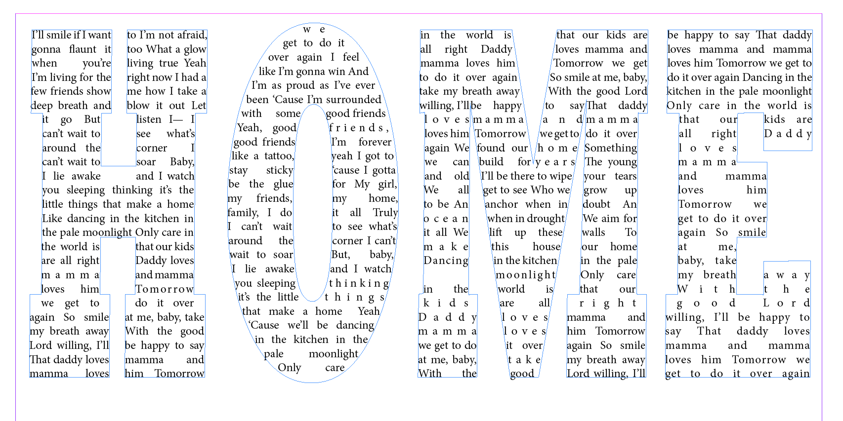
So here was my process.
I created a text box and then typed home. I changed font and size and then selected paper so that it was 'clear'.
Then I clicked the select tool and selected the type and created outlines and then was able to release the compound path.
I then moved the outside of the O to the back so that I could select both the inside and outside of the O and made a compound path with it. I didn't do this process with the other letters.
I then selected the outlines and went to object>content>text and used the selection tool to click on the small box on the right of the H and then the left box on the O to thread the text. I continued in the same way for the O to M and M to E. Then I pasted in my text and adjusted it so that it looked good!
Copy link to clipboard
Copied
I'm so glad it worked.
You skipped my step to Reverse the Path, but of course you didn't need it!
Quite brilliant you are!
Copy link to clipboard
Copied
Just for fun I did a video:
Copy link to clipboard
Copied
Perfect!
Copy link to clipboard
Copied
Obi-Wan's looks perfect, but I'm getting what you are getting unless I put each letter into it's own text frame, then convert to outlines, then fill each one with text. It's a different text flow from what you are doing—the text runs down each letter individually rather than horizontally across all 4, but I don't think anyone is actually going to try to read the lyrics while inside the letters, right?
Copy link to clipboard
Copied
It really should be for each letter. 
Copy link to clipboard
Copied
Sandee,
Tu triches ! C'est plus rigolo avec du Rockwell ! ![]()
(^/)
-
- 1
- 2


