Guide to H&J Violations?
Copy link to clipboard
Copied
Hello again-
Just started experimenting with using the H&J Violations flagging feature. (6" x 9" book document.)
However, it seems, at a glance, to work more toward making things even than making things "spaced well"; for example, we have a few lines that are pretty dense.
When I make adjustments such as decreasing word spacing, it doesn't change, but the violation disappears.
However, if I set it to 100%, lots of dense lines become far more readable, but the whole page lights up with "violations"...
So... huh? 🙂
Being new to the tool I realize there's probably something I'm missing... Is there a relatively decent guide to making adjustments?
Copy link to clipboard
Copied
That creaking sound you hear in the background is the slow opening of Pandora's Box.
Adjusting copyfit by adjusting H&J settings is perilous. If you're doing it globally, it's not beyond the realm of possibility that any fix you make will create two worse ones elsewhere in the text thread. If you're doing it locally, on, say, a paragraph by paragraph basis, you can easily and quickly, create crude copyfit errors like the ones you describe to get "within spec." I wouldn't worry about H&J highlighted violations at all if the type color/copyfit looks right.
Even using sophisticated page production programs like InDesign, computers are stupid but eminently logical machines. They have no idea of how things should look; all they can measure are arbitrary numerical definitions translated with bits and bytes. Computers do perfect things well. When you need to make things a little imperfect to make things look better, the job relies on human skills to define the difference between mathematically right and visually correct. Consider your design sense as built-in job security.
By my experience, juggling word and letter spacing has minimal impact with small adjustments and horrific results when you dial them up too much. And the line between them varies from very fine to non-existent.
I recommend first completely laying out the book. Don't worry about copyfit until you've laid out every page, created your index and table of contents, and completely, entirely edited and proofed the book. Dialing in little copyfit corrections, then editing copy in the book and changing the page/section breaks, then going back to fix the copyfit again and again will backfire spectacularly. If you ask me, copyfit fixes should be the last thing you do before you ship the job for press.
But rather than fine-tuning the letter and word spacing, I suggest you fine-tune the sizing of the words (by adjusting character type width) themselves. Typographers hate this with a white-hot passion, but production artists use these little tricks all the time. You can read more about how to do this in the last post in the thread at the end of this forum link written by your sorta humble respondent here. Rather than applying this on a line-by-line basis, you can do this on a paragraph-by-paragraph basis and get greatly improved results with much finer adjustments than you could ever do messing with H&J fixes.
The only guides I can recommend for making adjustments to your copy to ensure better type color/copyfit are your own eyes and a refined design sense.
Hope this helps,
Randy
Copy link to clipboard
Copied
Or: all automated proofing tools are useful assistants, not the Laws of Robotics. 🙂
Copy link to clipboard
Copied
but the whole page lights up with "violations"...
Hi @turner111 , To avoid violations, I think you also have to consider the measure width, and whether you are willing to turn on hyphenation, and allow Spacing and Scaling adjustments.
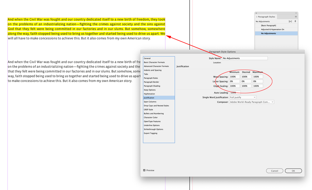
Here the top paragraph has hyphenation turned off and isn’t allowing any Word or Letter Spacing, or Glyph Scaling adjustments. With these settings all the justified lines will show violations because it is impossible to fully justify text without some kind of adjustment (violation):
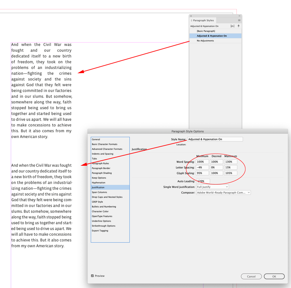
The problem with not allowing any adjustments becomes more obvious with a narrow measure—the top paragraph with no adjustment allowance has rivers of white space:
I can make an additional adjustment to the Desired Letter and Word spacing to get a looser setting without the rivers of white space:
Find more inspiration, events, and resources on the new Adobe Community
Explore Now


