

Hanging punctuation InDesign

Copy link to clipboard
Copied
Hanging puctuation in InDesighn does not work very well. Sorry to say, Quark XPress is far superior. Maybe I do something wrong – I do it by the book/manual – and it does not look good. Any tips from professionals?
Egil Haraldsen


 53
Replies
53
53
Replies
53

Copy link to clipboard
Copied
Discussion successfully moved from Adobe Creative Cloud to InDesign
May be you could start to explain what does not work well. I'm sure the experts in the InDesign - forum can help.
Copy link to clipboard
Copied
You’re right. Here is what does not work: I want to have the whole quotation mark outside the body of text. In InDesign I only get half of it outside. I use these marks: « ». Egil

Copy link to clipboard
Copied
Did you adjust it?
Copy link to clipboard
Copied
Yes, we adjust it so the font size and the punctuation is the same. Here are two screenshots. One from InDesign and the other from QXP.

Copy link to clipboard
Copied
That's a guide and is dependent on the font. Try increasing the number until it looks the way you want.
Copy link to clipboard
Copied
We have tried that and it never looks the way we want it. If we use these “, it works, but not with these «. And that’s the marks we use in Norway.
Copy link to clipboard
Copied
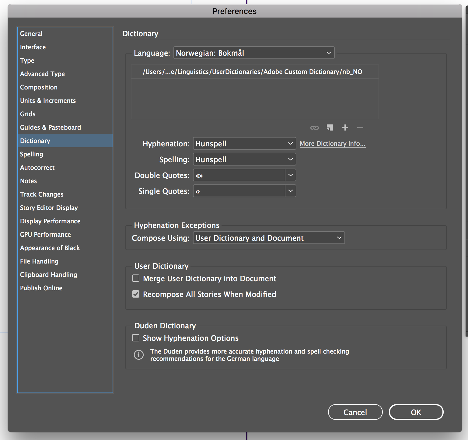
Is the language for the text set appropriately?
Copy link to clipboard
Copied
These are my settings.

Copy link to clipboard
Copied
KipTHuur wrote
These are my settings.
...
No, those are only the preferences for some language. If you don't apply the language to your text, these preferences will do exactly nothing. So, make sure this language is also applied to the actual text.
Copy link to clipboard
Copied
Tried it. Makes no difference.

Copy link to clipboard
Copied
Tried it. Makes no difference.
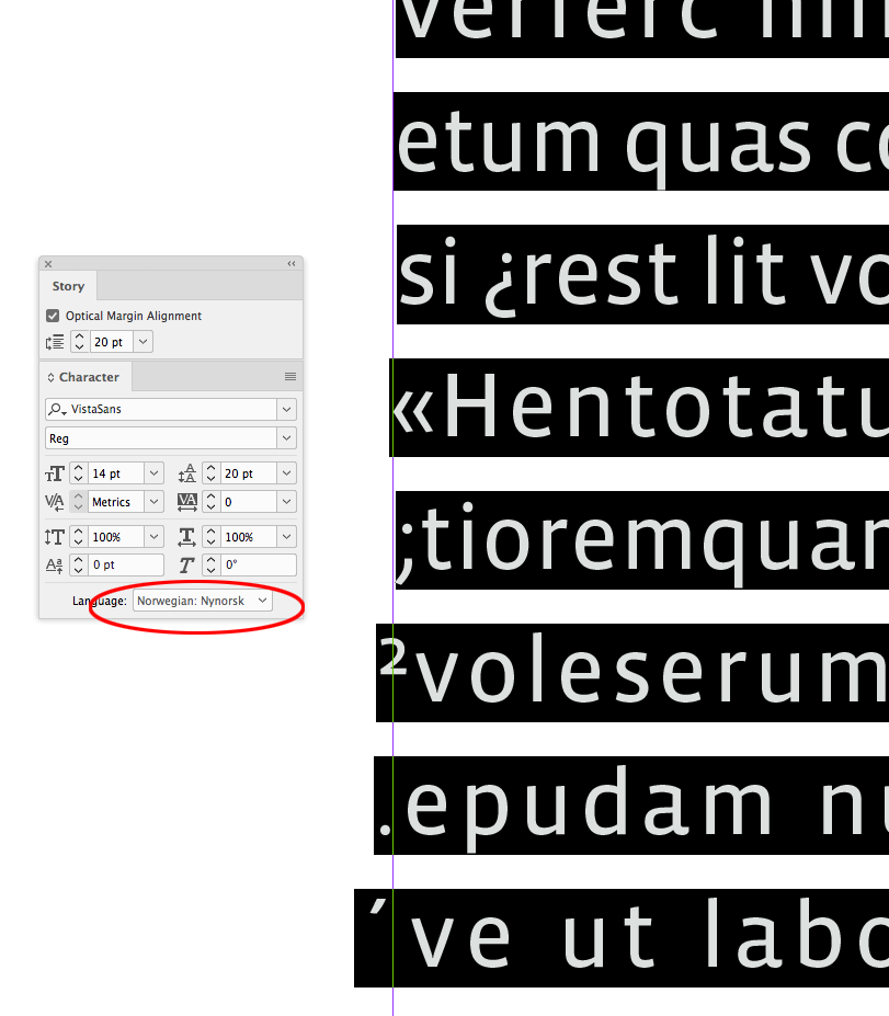
Right, because the adjustment is made based on white space and not punctuation or applied language.
Here I’ve turned off Hyphenation, and the applied language has no affect on the optical alignment of the characters—note that in all 3 cases the semi colon barely moves, but the superscript and period does.


Copy link to clipboard
Copied
Let it go. It won’t work. Not until Adobe makes a change in InDesign. So for now I stick to Quark XPress for bookdesign.
Copy link to clipboard
Copied
...as long as your happy with it! Go ahead.

Copy link to clipboard
Copied
Hanging punctuation, optical alignment for characters and drop caps, negative outdents for lists, they all fall in the category "troublesome" in InDesign. QuarkXPress offers indeed better features and options, but I wouldn't trade in all the other InDesign goodies which Quark doesn't have...
And I've never understood the rationale behind InDesign's approach for optical alignment. Some mysterious panel, with an even more mysterious setting, being applied to the range of a whole story ? This feature must have been thought out by the UX team at Devil's Design Day...
Copy link to clipboard
Copied
And I've never understood the rationale behind InDesign's approach for optical alignment. Some mysterious panel, with an even more mysterious setting, being applied to the range of a whole story ? This feature must have been thought out by the UX team at Devil's Design Day...
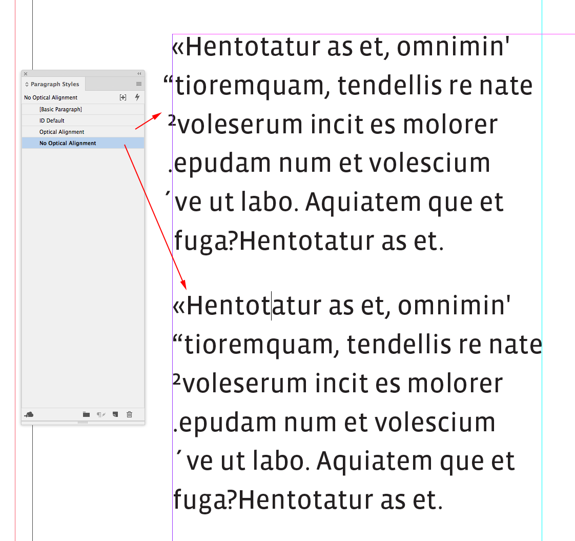
You can turn it on and off via the Paragraph Styles. See Ignore Optical margin in Indents and Spacing
Optical spacing—accounting for the extra white space around certain characters—is important in typesetting. Think kerning pairs. Bob’s right if you Google InDesign Hanging Punctuation, you’ll get articles on how to use Optical Margin Alignment—I read it on the Internet.
But just because users conflate optical alignment with literally hanging only and all punctuation marks, doesn't mean that you'll get that using OMA. If you think that's a good idea then it would be a feature request, not a bug report.
The reason a double angle quote, or the number 2 for that matter, isn't adjusted is because they have little surrounding white space. When there's more relative white space with any glyph, there‘s more adjustment.

Copy link to clipboard
Copied
Kudos for the very clear and elaborate explanation of what Optical Margin Alignment does. I'm sure it will help users understand very well now what it's actually about. I already knew and understand the concept of OMA, and how it tries to create optically less ragged and visually more pleasing margins.
But what I don't understand is its approach from a UX standpoint. No typographic designer thinks in "Stories". It would have been so much better if this option would be available as a setting under the Paragraph Style ! In stead of the need to switch it on by Story and the setting to switch it off on Paragraph level. The feature would probably have been much more common knowledge and obvious to use. And It would also be possible to use different values for different paragraph sizes.
And we still need negative outdents...
Copy link to clipboard
Copied
I'm also thinking that the feature is quite obscure and your explanations helped a lot to understand how it works.
My point in this is that it works for me even that I didn't grab the full story  behind. But it gives hell a lot nicer results with no or little effort. And that was all I was using it for until now.
What is missing in Indesign to fullfill OP's request are "hanging Quotes". I do not typeset books so that's not my interest at all. I could as well do hanging quotes with paragraph styles and inside of the frame...
Copy link to clipboard
Copied
I think the term hanging punctuation originates with metal typesetting, where a careful typesetter would adjust characters with extra negative space to avoid visual "holes" on the margins. Those were typically punctuation marks (but not all punctuation marks), so the easy descriptor was "hanging punctuation" and not "hanging glyphs with a lot of surrounding white space".
So it is easy to lose site of the original point and take the term literally. I don't think the careful metal typesetter would have hung a double angle quote, which would make the margin ragged in the opposite direction because the double angle quote doesn't have extra surrounding white space.
In the digital realm it's possible to give up the limited punctuation concept, and simply make the adjustment to all glyphs base on the space they occupy, and I think Adobe took advantage of that possibility from the beginning with OMA.
Copy link to clipboard
Copied
I remember the first time I used it back in 2001 with ID 1.5.
I loved the look of the type but my boss looked at me like I had two heads and made me “fix” it.
Copy link to clipboard
Copied
I remember the first time I used it back in 2001 with ID 1.5.
I’m guessing there's zero chance Adobe would consider replacing OMA with a literal hanging punctuation feature. From the beginning there was an effort to emulate and improve on the traditional metal typesetting craft, rather than imitate the transition to phototypesetting, which was cheaper but had limited capabilities and was becoming the norm.
Copy link to clipboard
Copied
Why would it have to be one or the other, Rob? Why not hanging characters in addition to?
While there likely are smarts behind OMA, there is also, seemingly, some hard coding aspects as to what characters OMA acts upon.
While I don't hang characters out quite as far as the OP may (about 40% on single/double guillemets), I use the heck out of this feature in Q. And the whole thing is entirely configurable. The good aspects of OMA are entirely reproducible in Q but the good aspects of hanging in Q (and now Affinity Publisher) are not reproducible in ID. So I do think it is a worthy request...but I wouldn't hold my breath as regards implementation.
Mike
Copy link to clipboard
Copied
Why not hanging characters in addition to?
What‘s the purpose? Do you think a question mark should hang?
Copy link to clipboard
Copied
What‘s the purpose? Do you think a question mark should hang?
Not necessarily. Nor exclamation marks. But...
Have you ever used this feature in Q? One can decide which characters hang and how much. Whether they hang to the left, the right, or both. Hanging characters are connected to p.styles as well. All of which makes it a user's (and or compliance to the client's) choice.
Isn't choice and configurability a good thing?
Copy link to clipboard
Copied
File a feature request. I think the OP reported it as a bug.

Find more inspiration, events, and resources on the new Adobe Community
Explore Now
 AdChoices