

- Home
- InDesign
- Discussions
- Re: Headlines and body copy not even in columns
- Re: Headlines and body copy not even in columns

Copy link to clipboard
Copied
Hello,
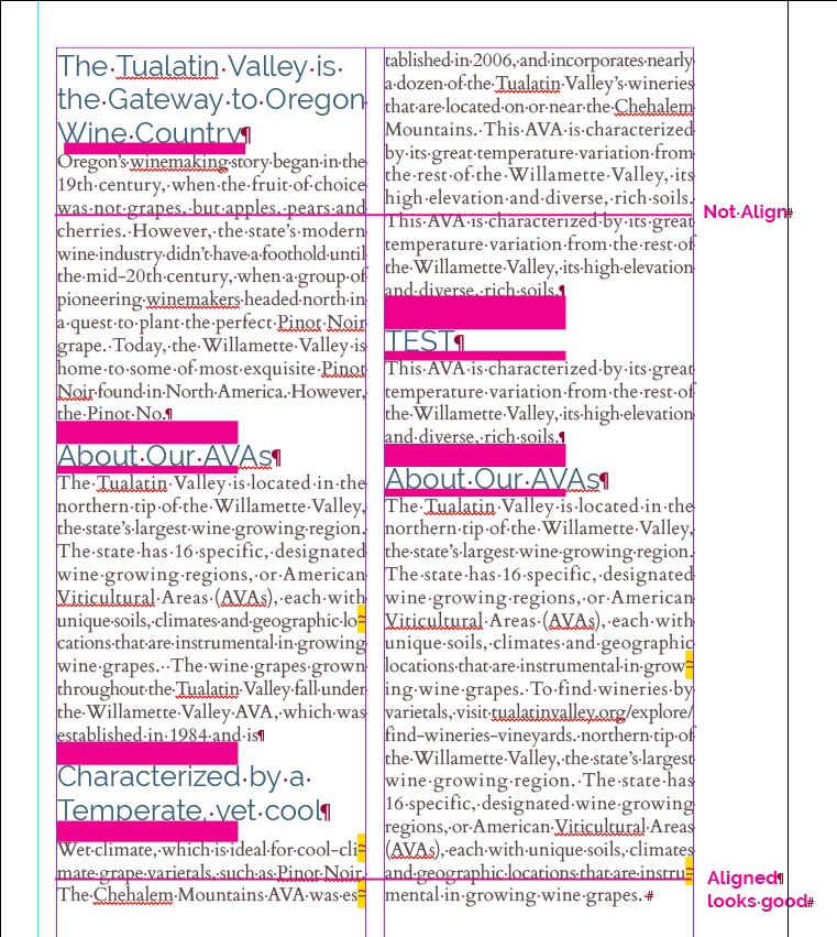
I have been trying to figure out how to make my body copy and headlines even. I attached a sample. The pink bars are the spacing issues I'm having as well as the text not lining up or even side by side. I'm using paragraph and text styles. The sans serif headline is Railway 14pt / 16pt (Optical). The Paragraph Style Option has Indents and Spacing all set to 0pt and Align to Grid: First Line Only
The copy is Cardo regular 9pt / 11pt (Optical). The Paragraph Style Option has Indents and Spacing all set to 0pt and Align to Grid: First Line Only.
All the text is Align to Baseline Grid.
Also I'm working in InDesign CC 12.0.0.81 and I'm using a Mac
If you could help me with this, I would greatly appreciate it. Thanks for your help and time.
 -Chris


 1 Correct answer

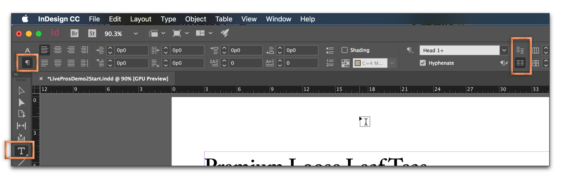
Here are the steps to aligning text to the baseline grid:
- InDesign > Preferences > Grids: Start: Relative to Top Margin; Increment Every=11pts (the body text leading)
- View > Grids & Guides > Show Baseline Grid (optional but helpful to understand why it isn't working)
- Set all the text to Align to Grid: All Lines
Now, recognize that when you align everything to the grid, when something doesn't fit (i.e., heads set at 16pt leading) they are going to hop down to the next grid line. You can live with tha
... 13
Replies
13
13
Replies
13
Copy link to clipboard
Copied
Here are the steps to aligning text to the baseline grid:
- InDesign > Preferences > Grids: Start: Relative to Top Margin; Increment Every=11pts (the body text leading)
- View > Grids & Guides > Show Baseline Grid (optional but helpful to understand why it isn't working)
- Set all the text to Align to Grid: All Lines
Now, recognize that when you align everything to the grid, when something doesn't fit (i.e., heads set at 16pt leading) they are going to hop down to the next grid line. You can live with that, or take heads off the grid.
If you go through these settings and still aren't happy with the results, post a screen shot with the baseline grid visible.
Copy link to clipboard
Copied
Hi Barb,
Thank you! Thank you! Thank you!!! Looks great!!!
I have spent the entire morning trying to figure that out. It works with the headlines much smaller. I have watched a bunch of videos about this. None of the videos mentioned going into preferences and changing the Grids setting. Thanks so much and have a great evening.
-Chris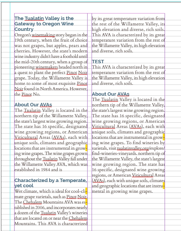
Copy link to clipboard
Copied
So glad I could help! 

Copy link to clipboard
Copied
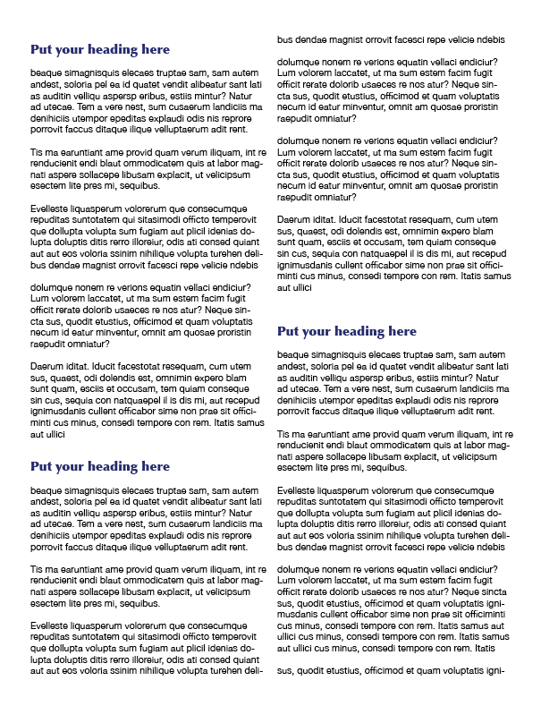
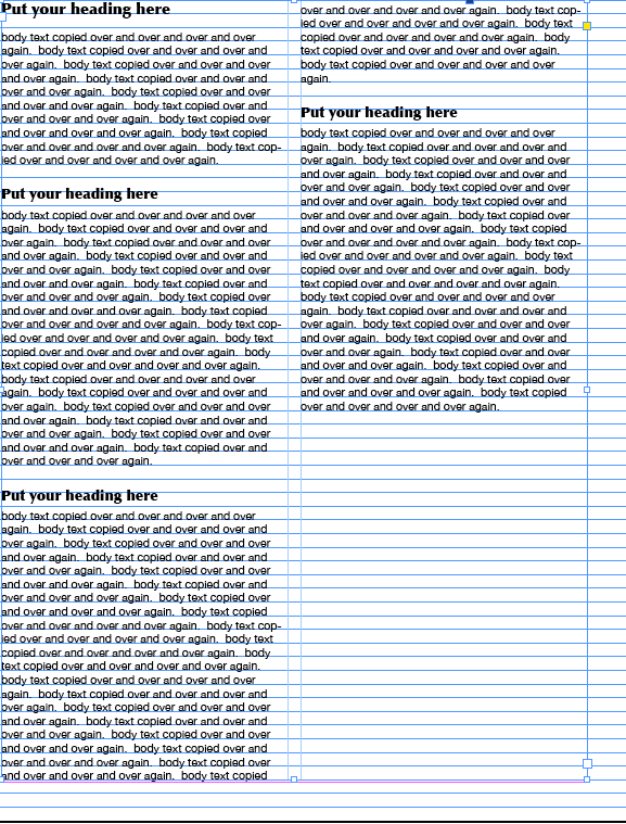
I'm having the same problem and just found this post. I'm an amateur designing a company newsletter. My question is: how do you take the headlines off grid? (Or, how do you create a grid that will work for both headlines and body copy? Is that the best solution? I don't understand how to do the math for that.) If I don't align them to grid, they look like this:
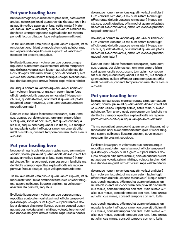
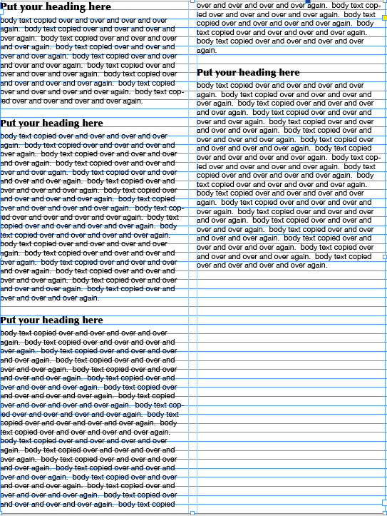
But if I do align them to grid, the headline spacing gets wonky, including InDesign putting extra space at the top ABOVE the headline:
I'm using InDesign CS5.5 on a Mac.
Thanks!
Copy link to clipboard
Copied
Hi Karen: you will want to keep this in mind:
Now, recognize that when you align everything to the grid, when something doesn't fit (i.e., heads set at 16pt leading) they are going to hop down to the next grid line. You can live with that, or take heads off the grid.
Either everything (body and heads) are on the grid, or you leave the body on the grid and take the heads off the grid. To take them off the grid, select one of the heads with the Selection tool, switch to the ¶ view of the Control Panel, and click the Do Not Align to Baseline Grid button. Then redefine your style so that all the heads follow suit. Or if you aren't using styles, repeat for each heading.
Copy link to clipboard
Copied
Hi BarbBinder,
Thank you so much for replying! I did what you suggested but it still didn't work. It aligned the body copy text, but it put inconsistent spacing before and after the headlines, even though I had applied a paragraph style to each headline that stipulated specific before and after spacing.
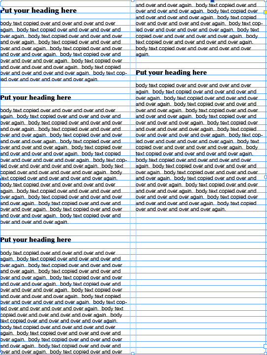
I had read elsewhere that to make the headlines work with a baseline grid set up for body copy, the space before plus the space after should equal a multiple of the leading that the baseline grid is set up for. I calculated the numbers and set up paragraph styles that put a specific amount of space before and after each header that should make it align overall with the baseline grid. Here's what it looked like before I aligned it to the baseline grid:
Here's what it looked like after I aligned it to the baseline grid. It seemed to work overall (ignoring the fact that the space before and space after looks horrible visually because I was only doing that to make the spacing work with the grid), but InDesign stubbornly puts a space before the first header at the top left of the page. This is despite the fact that the paragraph control panel shows zero inches in the space before field.
Like I said, I'm an amateur. I feel like I must be missing something obvious. Surely, using InDesign for this kind of work is extremely common. I can't understand why it's so hard to get this to work. I've been looking for online help resources but have found very little from Adobe on this. Maybe I'm searching for the wrong phrase.
Can you offer any other suggestions or do you know of any help resources on this specific topic?
Thanks so much!
Karen
Copy link to clipboard
Copied
I don't have a great resource for you. My knowledge here comes from my experience.
The first screen shot shows what you asked me for. The body text is on the grid, the heads are not. That's a perfectly acceptable way to go.
I can't address the third screen shot until you answer the following questions:
- What is the body text type size and leading? What is the space before and after set to?
- What is the head size and leading? What is the space before and after set to?
- What increment is the grid set to?
Copy link to clipboard
Copied
I appreciate your help.
I guess the first screen shot is okay, except that InD put extra spacing after the first header that it didn't put after the others. It seems like no matter what I do, the first heading gets messed up.
Here are the answers to your questions:
1. The body is Helvetica Neue, Regular, size 10.5, leading 12.6. The space before and after is set to zero.
2. The heading is Optima, Extra Black, size 14, leading 16.8. Usually the space before and after is set to zero (I normally use returns to create the space), except in the case where I tried to make the space before and after a multiple of the body leading, so I chose: space before, .2292, space after, .0625 (and used no returns).
3. The grid is set to 12.6.
Copy link to clipboard
Copied
And there is the issue with the first column in the last screen shot: the grid is set to 12.6. The leading for the heading is 16.8—which is larger the 12.6 —so it can't fit on the first grid line, and has to move down to the second grid line.
Baseline grids require trade-offs:
- If you want everything on the grid, all spacing must be a multiple of 12.6.
- If you want complete control over the spacing, then you don't use a grid.
- The compromise is your first screen shot: body on the grid, headings off.
If it were me, I'd go with the first screen shot.
Copy link to clipboard
Copied
Thank you. So, if you were doing this project, would you use a baseline grid? If you don't use a grid, what do you do to control the spacing?

Copy link to clipboard
Copied
Spaces are controlled with Paragraph Styles:
- Space before
- Space after
- Spanning Columns spacing
- Leading
- Single Text Lines in a frame (I would recommend it in only very few rare cases)
- Object Settings, Text Frame Options, vertical Alignment (specially if you choose vertical alignment)
I would recommend to use baseline grid alignment for main text and small headlines, but not for bigger headlines.
Copy link to clipboard
Copied
If it were me, I'd go with the first screen shot.
Copy link to clipboard
Copied
Thanks, everyone.

Find more inspiration, events, and resources on the new Adobe Community
Explore Now
 AdChoices