- Home
- InDesign
- Discussions
- Re: How to draw everything on baseline grid withou...
- Re: How to draw everything on baseline grid withou...
Copy link to clipboard
Copied
I want to size all my objects (text, images, everything) to exact document grid increments for the sake of easy drawing/resizing of objects on new pages.
So I activated snap to document grid.
I never need to display my baseline grid because I have set its height to my document grid cell height, so it's incorporated in my document grid.
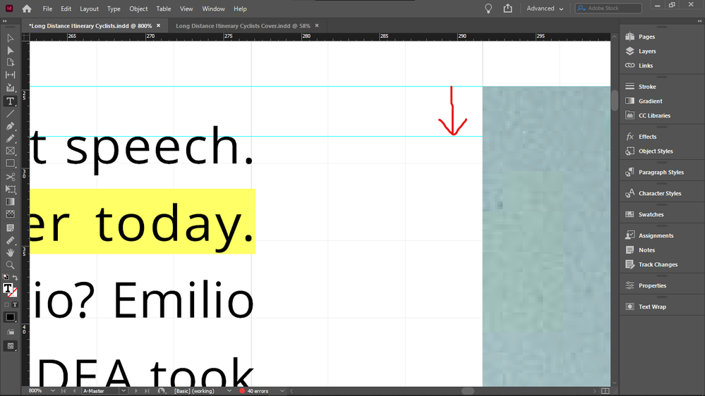
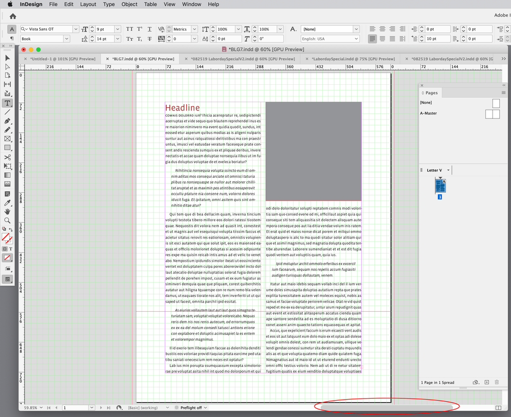
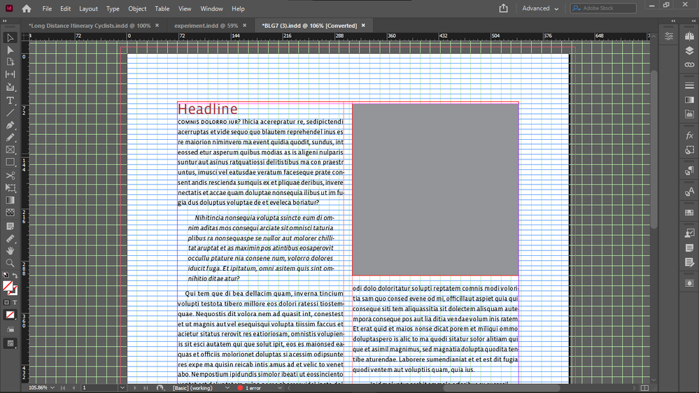
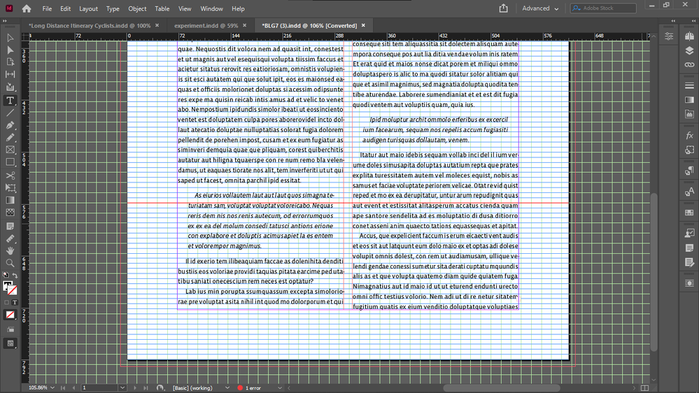
The irritating thing is that everything works well with the document grid increments objects (bottoms, sides) except the upper boundary of images.
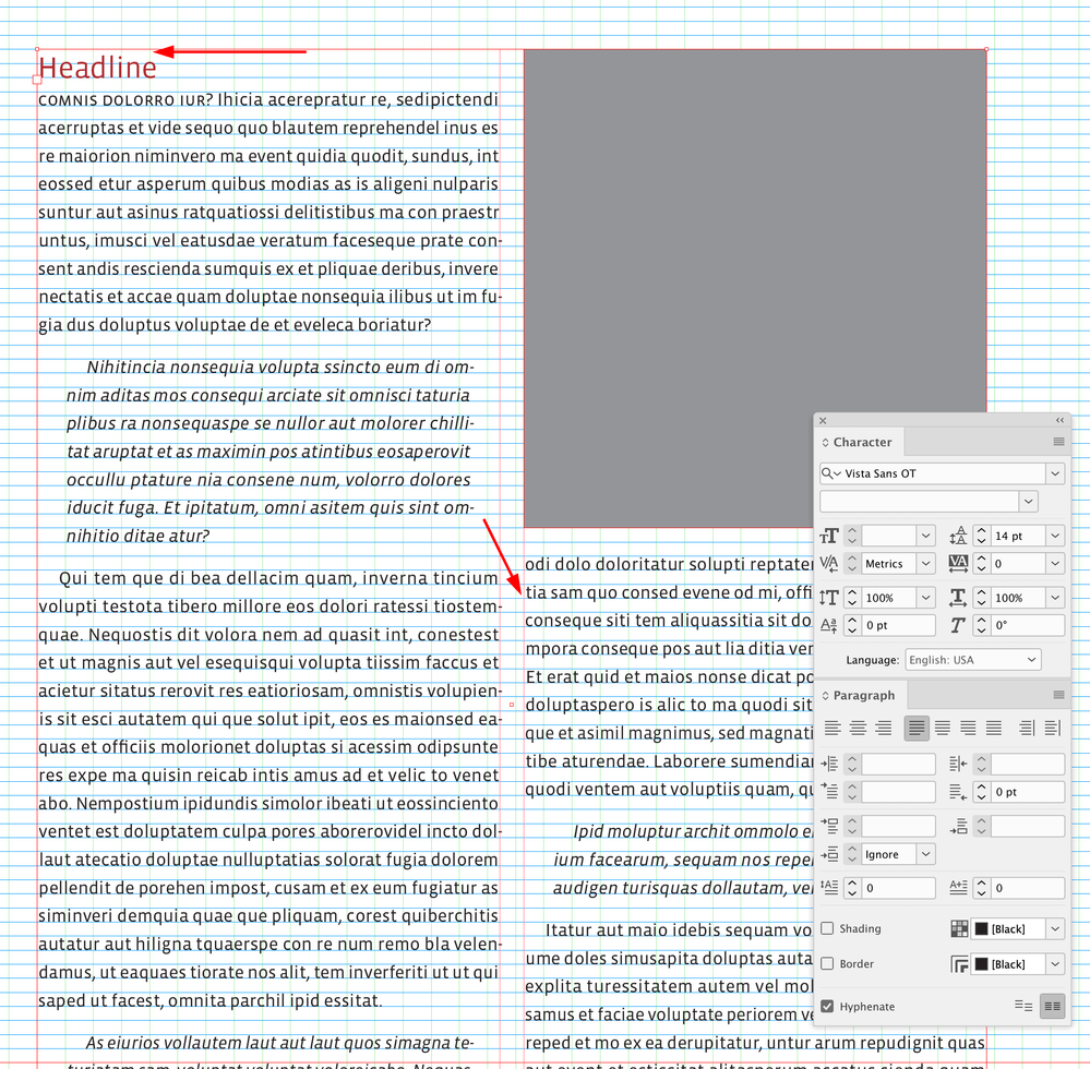
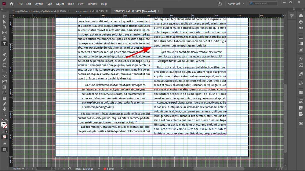
So I always have to crop the top of all images with text on the side down to the median line of the the text line on the top, to get them top-aligned, the cropping shown by the arrow:
So if I do crop them (and I have to, because the disalignment is visible), then all object boundaries are layign on the document grid, except the top of images that have text on the side - so this is quite disappointing.
Because the point is to not see any lines between document grid lines.
The disalignment is especially visible now when I doubled the size of my document grid blocks / and height of my baseline. I did that to be able to see always the real number of baseline grid blocks, no matter the zoom level - because I use them as units, when drawing/resizing my objects on the grid. When my grid block was twice as small, InDesign displayed 4 blocks as 1 block in Fit Spread In Window mode, and that is the mode I use for drawing / resizing / editing - except the top cropping of images I mentioned above.
Forcing my text into every second baseline (for this I must revert my document grid block / baseline grid height to half to get a reasonable leading - which I can't because I must see the real number of blocks at any zoom level) does not solve this issue either, because even if the baseline height is not that tall, the top disalignment betwen the text frame and image is still visible, and additionally, having text in every second baseline only, it causes the top offsets of elements under the text box to be taller, if the number of lines in the text box is even, because then the one at the bottom will be forced to stay empty, adding the impression of extra height to the top offset of the element below it.
Does anyone know such a fix for this issue, that would enable me to keep everything: my large baseline height / document grid cell dimension, not forcing text in every second baseline, and not needing to crop the top of images with text beside them after placing those images - that would create lines inside docuemnt grid cells, and that's what I wanted to avoid by drawing exactly on the document grid, so it wouldn't mess up my vertical math when calculating in my grid units (which I would like to use also as real units, for example when setting offsets, because remembering all the decimals and dimensions of say 3 document grid blocks is not practical).
Thanks.
 1 Correct answer
And it's very unlikely that you will get other text to align using this setting. Here's the only real solution to your request that everything line up on a grid AND there be no gap above text when next to an illustration at the top of a page:
Probably not what you want, again. But if it's not clear by now, what you want is basically impossible. You can have your precise grid that everything snaps to regardless of layout variations, or you can have that top-text/illustration alignment, but (ot
...Copy link to clipboard
Copied
And vertical align all text to top.
Copy link to clipboard
Copied
It seems that it's possible to increase font size even more while still keeping text in every second line, to get a 125% leading, perhaps.
Copy link to clipboard
Copied
Any future trouble this would cause? What could possibly go wrong?
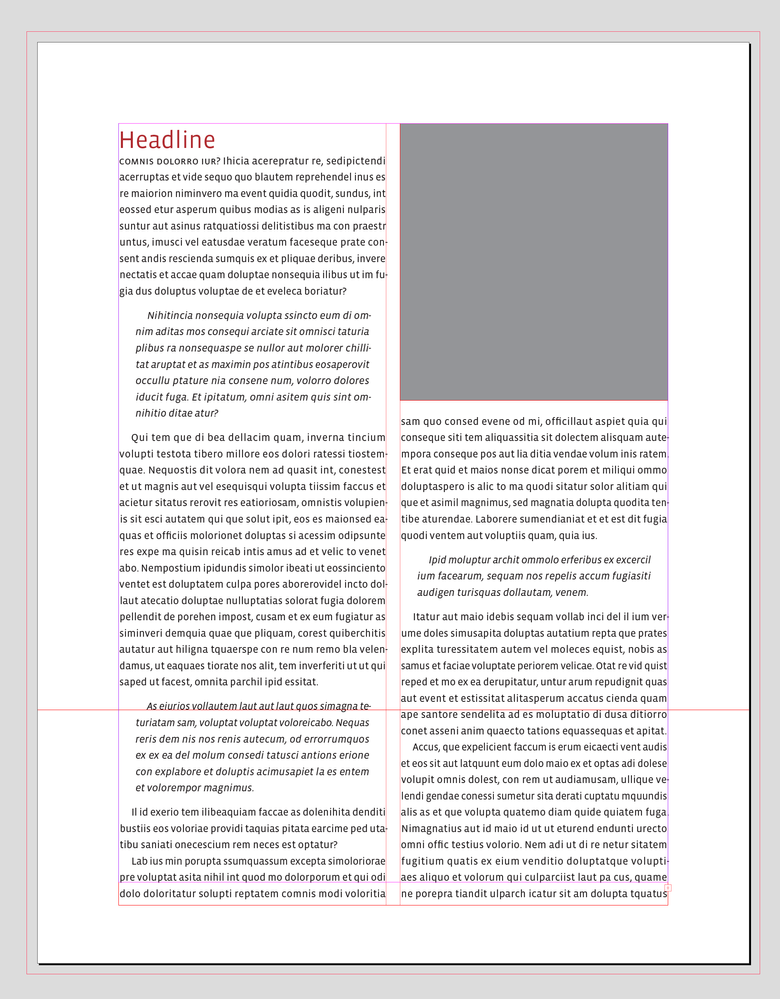
I was just responding to your question about what could go wrong—the 14pt leaded lines wouldn’t necessarily always align across a column with a 7pt baseline grid—I have a 7pt Space Above and Below the excerpt text. The head isn’t aligning with the image frame because its point size is larger than the leading, so its baseline aligns to the first available baseline that will keep it in the text frame.
Extending the text frame to allow an extra line makes no difference:
Copy link to clipboard
Copied
I realized I don't have to count the lines, I just expand the boxes one line to see if the text snaps to the right place. It should. Sometimes slightly changing box dimensions or remaking their original size also snapped text back to their place... I assume this is because the ratio that forces the text to the second line is not properly set for me - that amount works on a certain scale - which I don't properly understand on which scale that works, the difference must be set right I guess, to make the text properly populate the lines.
Copy link to clipboard
Copied
Can you post a link to a packaged zip of that page or the doc? I can play with it to compare it with my settings. For me it works, as you see on my screenshot.
Copy link to clipboard
Copied
You can download the package zip of that master page from my Dropbox and see if you can make up your page in my document so that it works like for me.
And if you post your packaged page, I can try to see if I can find out why it didn't work for you.
Copy link to clipboard
Copied
Copy link to clipboard
Copied
I installed your fonts but I am getting a blank screen after opening the file.
Copy link to clipboard
Copied
Looks like you are scrolled to the left of the page, viewing the pasteboard. Open your pages panel and double click page 1.
Copy link to clipboard
Copied
Ah, that's right, sorry, I didn't observe that. So I will try to put your content in my grid system see if works and if yes, send it back to you.
Copy link to clipboard
Copied
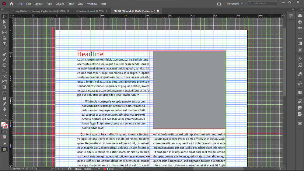
I found the issue with your heading, extend the upper boundary of your text box only a half baseline, it's going to snap.
The top heading will be top aligned.
I tried to turn on your document grid but nothing appeared.
Copy link to clipboard
Copied
Sorry, I can see your document grid now.
It's top aligned by extending the top boundary with almost a half baseline.
And that will fix your excerpt alignment as well.
You tried to extend it up one full baseline.
One baseline its two lines in your setup I don't know why.
Thats also why it snaps at a half baseline.
Copy link to clipboard
Copied
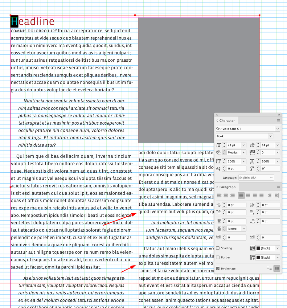
Change the head’s point size and it doesn‘t align anymore:
The 21pt head moved up excerpt not aligned
Copy link to clipboard
Copied
For this to work it seems that you have to keep all text with different fonts or different font size in their own object.
But that's good because then you can easily move them around, resize them, delete them, duplicate and fit them to the new page if you store them all in a master page.
Then you just apply the master to the new blank pages you create, and you compose the page from the master page objects.
The best way I found - and what I do, is that i lay a copy text box on the whole area between the margins, making it an odd number of rows, and I set up the columns.
And then I place all other text on the top of it in their own objects, headings, excerpts, images etc.
And I set a text wrap to all objects that are on the top of the copy text object.
And all vertical offsets you must set to an even number of rows to not mess up the odd rows requirement for all columns, for the perfect alignment to work.
For example your offset under your heading was only set to one row which is odd and it will result in an even number of copy text rows under it, because odd minus odd is always even, so it will break the alignment.
It should work if all your text types are in their own object.
I don't use several copy text object on a page, only one, because it makes writing easier in InCopy, because InCopy will recognize all the new columns created by the text wrap of the objects above the copy text object.
So i only have one copy text object (the one I am writing) per page.
Copy link to clipboard
Copied
Can you confirm that it's working if you keep all text with different font type or size in their own object?
Copy link to clipboard
Copied
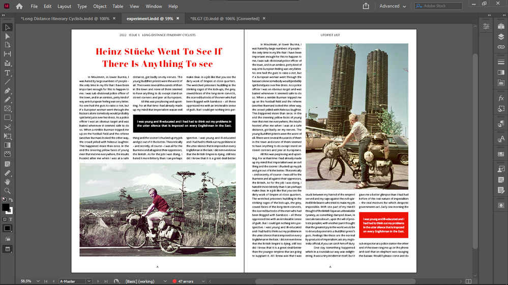
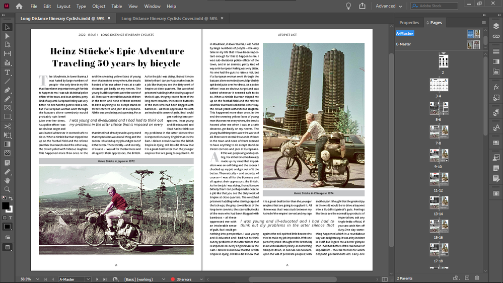
I made a sample spread with this line jump alignment with perfectly even spacings everywhere and with perfect alignments, including across the pages:
And the ZIP of the InDesign package:
sample_alignment_baseline_jump Folder.zip (dropbox.com)
It seems that this works, if the odd logic is strictly kept.
Copy link to clipboard
Copied
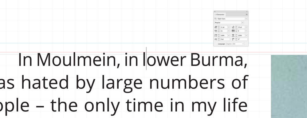
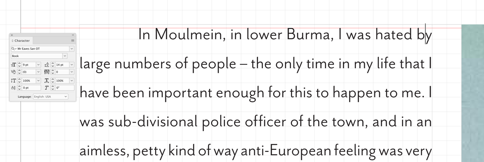
It’s working because you are willing to set all of the text at 9/14.031 (your Leading is set to 14, but the align to baseline grid is forcing 14.031) with no Space Above or Below. The distance from the baseline to the ascender line for Open Sans 9pt is 7pts, so changing the pont size or even the font will affect the ascent and the alignment:
11/14 Open Sans:
9/14 Mr Eaves
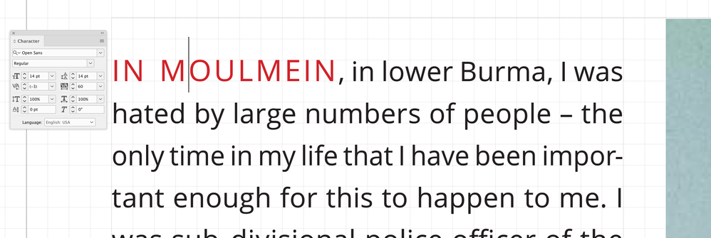
Any formating with a different font size might also have an affect—an inline small cap head:
Copy link to clipboard
Copied
I have no issue using drop caps, for example, it doesn't break this line jump system.
Inline small cap head? I will try that.
For example, on my left bottom picture I had to put the caption to the top, so I can have the text in the middle, on the baseline, putting it to the bottom of the picture wouldn't work.
And my excerpts have to sometimes move a half line up or down to get all spacings work perfectly (that's because of the odd lines logic of this system that affects everything), but that move doesn't matter.
So this is already a pretty standard spread, and it still works.
Will check it with the inline small cap head.
In this system the same text block shouldn't have different font sizes od styles.
I have never really seen that, not even in top magazines like The New Yorker.
Copy link to clipboard
Copied
But what other way then forcing text in every second line and make its median height equal with the baseline height (even a little taller) and keep the odd lines logic can you achieve perfect and even spacings so that all text is aligned to the baseline grid and that allows you to draw all your objects on exact document grid increments for the sake of clean workflow?
Because I could not achieve all this with the normal setup - text in each (base)line.
The two main problems with it was:
1. must draw objects in between document grid lines, often, which looks bad, plus doesn't work well with snap to document grid, which is too bad because snap to document grid makes drawing easy even on a zoomed out full screen workspace
2. the top of images and text beside were not aligned - to correct that I had to crop the top of images
3. because text height was not equal with line height, any text under bottom offsets made the offset be extended downwards with the distance: line height minus text median height. And same issue is with top offsets too, if the object with the top offset is text, and the object above is also text. So some vertical offsets are extended by a distance of line height minus text median height, but not all. Not all means that you cannot set a standard offset either, you have to set 2 standard offsets. One thinner to compensate the white space added, and that results with many lines not lying ont he document grid, and cannot use snap to document grid, must zoom in when editing.
So the line jump method eliminated all these issues.
Copy link to clipboard
Copied
Not just the vertical offsets, but all elements (text, images) + their offsets lying on the margins-to-margins copy text frame, must be of an even number of rows height, because no matter how many even numbers you subtract from an odd number, you will get an odd number for your copy text rows, so they will not mess up your alignments and vertical offsets - this is so far i found, all further advice welcome.
Copy link to clipboard
Copied
Excerpt also aligned.
Copy link to clipboard
Copied
Excerpt also aligned.
But the other text is not:
Copy link to clipboard
Copied
And after you extend you picture too a half baseline down, the lines under it will also be aligned.
This seems to be a play with odd number of lines.
Copy link to clipboard
Copied
Try to package a copy of it and link the packaged zip.
Copy link to clipboard
Copied
If you give the same same jump to second line setting to both your copy text and your excerpts (or make the excerpts boxes so you can also move them around easier) - forcing that everywhere requires same ratio between font size and line height I guess - and you play with the odd lines setup - make the excerpts odd lines too, and pretty much everything you can, it should work for you like for me, everything aligned, as shown on my screenshot previously - now curious if does this work for others too?

