- Home
- InDesign
- Discussions
- Re: I need less space around text inside text box ...
- Re: I need less space around text inside text box ...
Copy link to clipboard
Copied
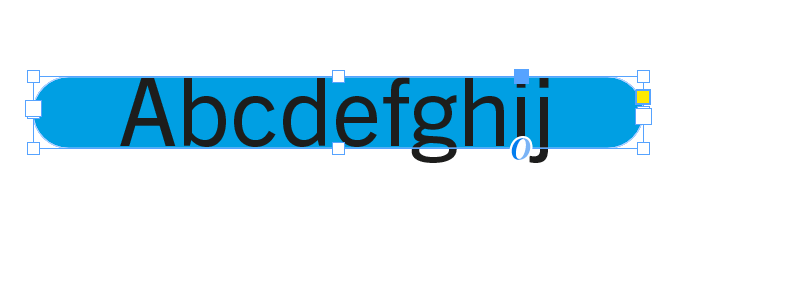
I'm trying (unsuccessfully) to figure out if there's a way to get the edges of a text box closer to the text itself.
In this case, I have a text box with rounded corners, which, based on my searches, has been a challenge for a while, and hasn't been resolved yet:
Is there a non-workaround way of getting the edges of the rounded frame closer?
thanks
<Title renamed by moderator>
 1 Correct answer
Or, instead working with a text frame, work with paragraph shading.
Copy link to clipboard
Copied
Reduce all text spacing; reduce any text frame spacing. I don't think anything else controls that margin.
Copy link to clipboard
Copied
Did you check all he text frame options? (inset, baseline options)
Copy link to clipboard
Copied
Yes, there isn't any... it's the spacing on the sides that seems to adhere to where the corners would begin if the text box were rectangular.
Copy link to clipboard
Copied
You can't do anything for the left and right spacing. @Willi Adelberger suggestion is the best way to get what you want.
Copy link to clipboard
Copied
In the frame's baseline setting try to change the first line start and chnge to cap's heights.
Copy link to clipboard
Copied
Or, instead working with a text frame, work with paragraph shading.
Copy link to clipboard
Copied
Looks like this is going to work the fastest / easiest way for now - thanks!
Copy link to clipboard
Copied
Have you tried pasting a square textframe inside a rounded corner textframe?
Copy link to clipboard
Copied
If the text frame is wide enough then you can make it as short as you want. But if it is so narrow the text comes close to the edge the text will be inside the curved sides and you will not be able to fit all the text in the frame. Also, since the text areae is not a rectangle you cannot use any Vertical Justification other than Top. You can stil use baseline shift or first line offset to centre the text.
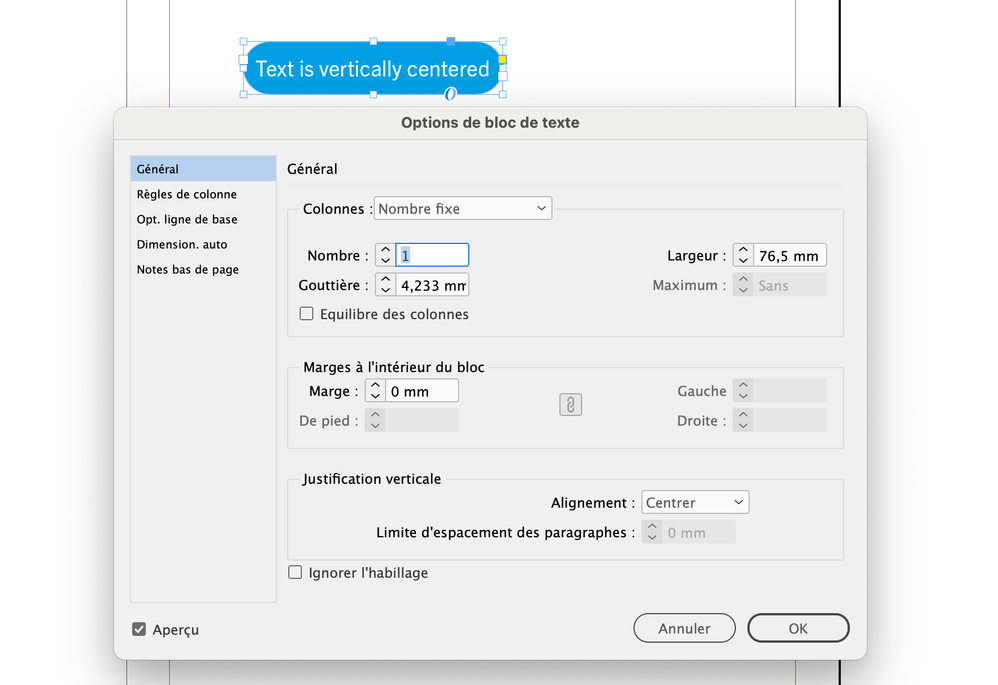
Another tip: Set Vertical Justification to Centre and set First Baseline Offset to Cap Height.
Copy link to clipboard
Copied
Also, since the text areae is not a rectangle you cannot use any Vertical Justification other than Top
I am not sure:
Copy link to clipboard
Copied
Scott contradicted himself one paragraph later, so I'm not sure if he's right or wrong. 🙂
Copy link to clipboard
Copied
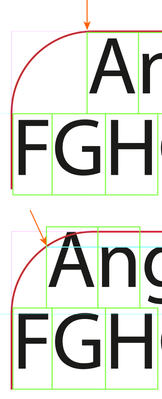
In the lower example the text is too close to the sides of the text frame and is affected by the curved edges, which is why the alignment for the text is the top of the frame. The only difference between the two frames is width.
Copy link to clipboard
Copied
Checking in: Experimenting with a thick stroke with rounded corners pasted inline below the text, and using baseline shift.
Copy link to clipboard
Copied
Did you try Paragraph Shading as I wrote above?
Copy link to clipboard
Copied
Yes! I think this may work. Figuring out a few things with Paragraph Border, but this may be the solution. Will report back...
Copy link to clipboard
Copied
InDesign can only place type according to the matrix of the glyph, which is a rectangle encompassing the ascenders and descenders, so when you have a rounded corner, the first character cannot fully appear on the first line until its top left gets past the edge of the frame (top example). You can try select a different baseline option between Cap Height, Ascending or x-height, and perhaps add a minimum to push it down so it can tuck closer to the left, at the expense of it being farther from the top edge.
The best may be using x-height as the baseline option (you'll still have to add a bit of minimum space to push it down a bit). In my second example, you can see the xheight (cyan line) now defines the top left starting point of the first character, and so it can get closer to the left. It's trial and error to get what satisfies you, and it's not without its problems: as you can see the top of the letter A is falling outside the frame now, so pick your poison!
Find more inspiration, events, and resources on the new Adobe Community
Explore Now


