- Home
- InDesign
- Discussions
- Re: InDesign: Anchored Image flowing off page
- Re: InDesign: Anchored Image flowing off page
InDesign: Anchored Image flowing off page
Copy link to clipboard
Copied
I'm having trouble with anchored images in InDesign.
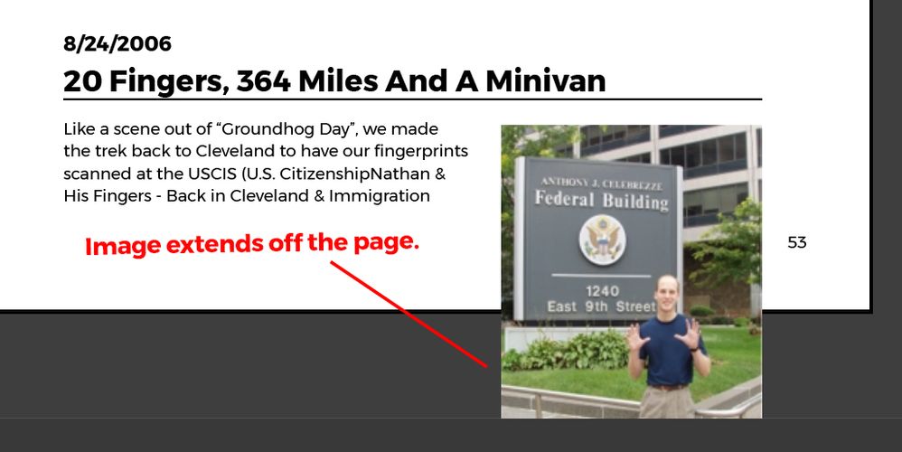
I want the anchored image to stay with a specific line of text. But if I do that, some images extend off the bottom of the page.
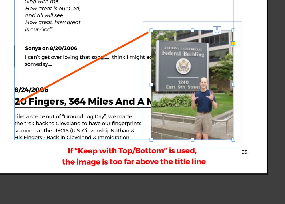
To fix that, I select "Keep within Top/Bottom Column Boundaries. This keeps the image on the page, but bumps it up so that it is no longer anchored with the line of text that I want it to be.
What I want InDesign to do is to keep the top of the image anchored and aligned to the title line, and then break that entire group to the next page if necessary in order to maintain the position.
Copy link to clipboard
Copied
in the future, to find the best place to post your message, use the list here, https://community.adobe.com/
p.s. i don't think the adobe website, and forums in particular, are easy to navigate, so don't spend a lot of time searching that forum list. do your best and we'll move the post if it helps you get responses.
<"moved from using the community">
Copy link to clipboard
Copied
How about adding a column break in front of the heading to force all of it to the next page?
~Barb
Copy link to clipboard
Copied
I need the image to stay anchored to the text exactly as it is in screenshot #1 above -- but without the image extending off the page. I'm hoping that InDesign can just create an automatic page break to move that entire text and image section to the next page so that everything stays aligned as it is.
(I find it puzzling that InDesign anchored images flow off the end of the page as a default. Why would users want that to happen?)
Copy link to clipboard
Copied
InDesign isn't really designed to maintain perfect page layout as content is extended. So as long as you are writing and building a long document — book — you just need to stay relaxed as downstream stuff moves out of perfect layout and alignment.
Put another way, you can spend endless time and aggravation keeping all your pages "print ready" even though you're nowhere near that point, or you can let some jumble exist as you keep building new material in. You only start fine-tuning image and text flow in the last steps, always working from a start point like a chapter break, downwards.
Copy link to clipboard
Copied
Yeah, I've just been letting it be messy for now.
I'm just really shocked that this is the case. Thanks for confirming it for me so that I don't spend more time looking for a solution that isn't there!
Copy link to clipboard
Copied
Nothing really to be shocked at, except by comparing ID to tools it's not. Even Word is not that great about flowing content down; it will do it more or less as you are expecting, but by leaving huge gaps and erratic wraparounds.
If you think about it, the logic needed to essentially recompose all following pages because you added a paragraph near the beginning would be pretty involved, and even at its best, it would be Word-like in that yes, it would reflow things, but not with anything like finished fitting.
All that said, you can set up page anchoring, object styles and paragraph styles to minimize extreme faults like images hanging off the bottom of a page, but only — again — by forcing other faults that will actually be more difficult to adjust, since you'll need to, for example, apply variant paragraph styles... which will then break again when you make further changes.
ID is more or less designed around the idea that all content comes from outside — that a long document would be imported, not written and developed within it. It works fine as a 'word processor' or development tool; I've written as many books in ID as I have imported content from something like Word. But to expect it (or, really, any tool like this I can think of) to maintain page composition as you add and rearrange material is to perhaps jump ahead to the AI-based version of 2030 or so. 🙂
Copy link to clipboard
Copied
I can do a manual page break if that's the only solution possible. But I'm working with a book document that is 200+ pages. And it's just a draft. So as the document gets edited, the text and images will need to flow automatically. Any manual page breaks will inevitably cause unintentded gaps as the document gets edited.
Surely I'm not the only person whose run into this problem. I'm hoping there's a more elegant / simple solution.
Copy link to clipboard
Copied
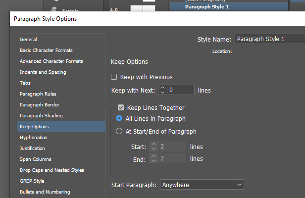
If there is MORE text, that goes to the next page - you could use Keep ALL Lines Together option:
The only other solution is through Scripting - are you on Mac or PC?
If you are on Mac - you'll have to wait for JS gurus as I prefer VB and could write you a simple script only if you work on a PC.
Copy link to clipboard
Copied
I'm on Mac. Thanks for the response!
Copy link to clipboard
Copied
@nathans92928531 said: "What I want InDesign to do is to keep the top of the image anchored and aligned to the title line, and then break that entire group to the next page if necessary in order to maintain the position."
Hi @nathans92928531 ,
you can do this with a couple of paragraph styles and a table that contains the article main text and the image in a graphic cell. See my attached InDesign document. Play with it and change the height of the graphic frame in the table. Or add and remove text to the first cell of the table.
Regards,
Uwe Laubender
( Adobe Community Expert )


