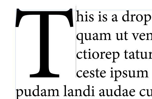
Ah, I think you're running into a common issue when trying to adjust the kerning between the CAP and the rest of the body text. Take a look at the figures below. If you click to the right of the CAP but near the baseline of the first line of body text, you'll get a giant cursor next to the CAP. Although this seems like what you would want, it doesn't work. Applying kerning using the shortcut just does nothing at all. But if you're a little more careful and you click directly to the left of the first body character, you'll get a smaller (normal) sized cursor and now when you adjust the kerning, it works like a charm. It's obscure, but once you know the trick, it's not too bad.


 3
Replies
3
Replies


 AdChoices