 Adobe Community
- Home
- InDesign
- Discussions
- Re: Table cell border becomes thicker in PDF?
- Re: Table cell border becomes thicker in PDF?
Copy link to clipboard
Copied
Hello,
I have another issue while making a calendar in Indesign..
I set the table cell border to be 0.05pt, but when printing PDF the lines look much thicker.
What am I doing wrong, and how can I fix this?
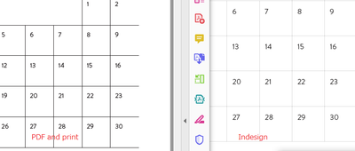
On Indesign, it looks like this:
On PDF, it looks like this:
 3 Correct answers
Are you seeing the heavier lines on-screen in Acrobat OR when you print the PDF?
Also, did you mean 0.05 pt or 0.5 pt? If you actually used 0.05 pt--that's too small for anything to print. Acrobat might be enhancing the lines so they are visible.
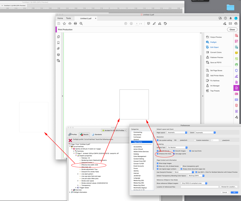
Look at Acrobat’s Page Display Preferences as @Dave Creamer of IDEAS suggests—.05pt equals .0007" or 1428 dots per inch. Your display doesn’t have enough resolution to accurately display a line that thin at 100%, so the two application’s ant-aliasing preferences affect the needed display adjustment:
The output is going to vary depending on the client’s printer and its settings. If the document color is CMYK black, and the output is to Grayscale, the text and line get a halftone, so you should probably use 0|0|0 RGB for your black when the print is going to be to composite printers—InDesign has a Black preference for exporting CMYK blacks as Rich Blacks:
Here is output from a Brother laser printer at 300dpi and 1200dpi scanned at high res from my document scanner. If you zoom in you can s
...Copy link to clipboard
Copied
Are you seeing the heavier lines on-screen in Acrobat OR when you print the PDF?
Also, did you mean 0.05 pt or 0.5 pt? If you actually used 0.05 pt--that's too small for anything to print. Acrobat might be enhancing the lines so they are visible.
Copy link to clipboard
Copied
I see the heavier lines both on Acrobat on screen and on print-out.
I remember that I changed the line to 0.05pt from 0.25pt because 0.25pt came out very thick...
Is there any way to make the line actually light?
I intend to provide this calendar both online and print to some people.
Copy link to clipboard
Copied
This is how different they look. The lines are set to 0.05pt.
Copy link to clipboard
Copied
Look at Acrobat’s Page Display Preferences as @Dave Creamer of IDEAS suggests—.05pt equals .0007" or 1428 dots per inch. Your display doesn’t have enough resolution to accurately display a line that thin at 100%, so the two application’s ant-aliasing preferences affect the needed display adjustment:
Copy link to clipboard
Copied
Rob, thank you, I now unchecked the Enhance thin lines in Preferences and now it looks thinner on both PDF and the actual print! Though it is not as thin as I hoped, it already looks much better - thank you!
Copy link to clipboard
Copied
A half point is 1/144 inch; a quarter point is 1/288 inch. There is no way they are printing out thick. Something else is affecting the file.
Did you check the Acrobat's preferences?
Can you upload a page from PDF?
Copy link to clipboard
Copied
Yes, it now seems to have worked but now I see that some Japanese fonts look a little unsharp.. not sure if it is my eyes or actually unsharp, but I did outline the fonts so it maybe it???
Copy link to clipboard
Copied
I think the resolution of the printer would also come into play—a laser printer running at 300dpi or even 600dpi would have to interpolate the line when the page is processed. Also if the line is outputting as a gray percentage (a CMYK to gray conversion in the driver?), the lines would get screened and fattened.
Copy link to clipboard
Copied
A friend who is printing this just sent me a pic of the test print - and it was acceptable! The lines were ok.
Should I make another thread for the fat Japanese text issue, or is this too minor thing to make a new thread..
?
Copy link to clipboard
Copied
The output is going to vary depending on the client’s printer and its settings. If the document color is CMYK black, and the output is to Grayscale, the text and line get a halftone, so you should probably use 0|0|0 RGB for your black when the print is going to be to composite printers—InDesign has a Black preference for exporting CMYK blacks as Rich Blacks:
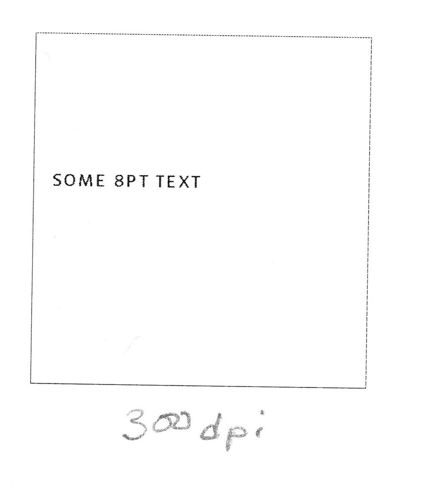
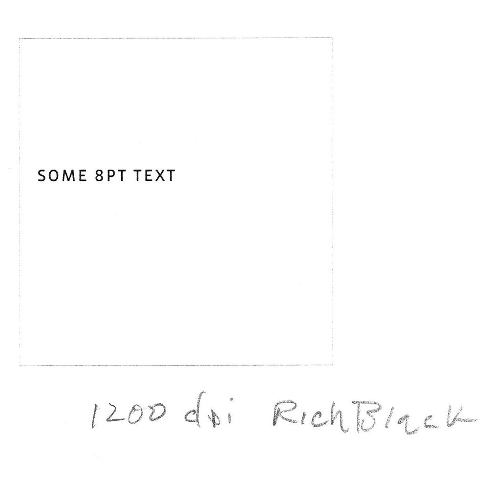
Here is output from a Brother laser printer at 300dpi and 1200dpi scanned at high res from my document scanner. If you zoom in you can see the halftone dots on the text, and at a high resolution the .05pt line all but disappears:


Copy link to clipboard
Copied
I see... I will check with a friend with a printer, and adjust it accordingly. Thank you very much for your help!
Copy link to clipboard
Copied
You might want to rethink the .05pt hairline. Another option is to use a .5pt–8pt line and set the stroke color to 50%–60% gray, so the calendar frame sits back, but doesn’t disappear at higher resolutions.
Copy link to clipboard
Copied
That is what we did in the end! 😄 Thank you, that looks like a good solution too!
Copy link to clipboard
Copied
That is great to know and very helpful, thank you so much!
Copy link to clipboard
Copied
In realistic scenarios, anything less than .25 pt is problematic
On a 300 dpi printer, that's essentially one-pixel wide (.24 pt), So anything spec'd less than .25 will still require 1 pixel (actually "dot") to print, so it will NOT get any thinner even you specify it.
On a typical home printer that may be 600 dpi, that means you could go half that size, but even there, anything less than .12pt will require at least 1 dot.
Also, printers (inkjet or laser) are only so precise, so a single dot of ink/toner will bleed and spread, especially on non-coated papers, making it look fatter than your intended line width.
All of this assumes you are printing a solid colour (i.e 100% Black); anything else will be halftoned and chances are will not even register.
Copy link to clipboard
Copied
I see... it was a good learing this time.
We kept the 0.05pt but decreaed the colour to 60%, and that worked out nicely 🙂
Copy link to clipboard
Copied
We kept the 0.05pt but decreaed the colour to 60%
The 60% black .05pt line doesn’t print at all on a 1200 dpi laser printer.
Copy link to clipboard
Copied
I think my friend has slightly lower printer. It came out nicely 🙂


