Type popping out of text frame
Copy link to clipboard
Copied
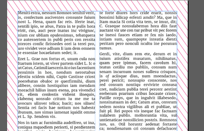
#InDesign #typography Some times type pops out of the text frame, what is this called? Is there a way to detect or automatically fix it. Does it matter?
I have looked at the app.selection[0].lines[0].endHorizontalOffset, which seems to be clipped to the text frame.
It was suggested that I look at the optical settings, but these did not change the appearance.
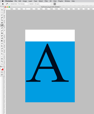
If I export the frame the type is clipped.
Is this a bug?
*I have a motive this question, I have a plugin that can detect this effect. But, I would prefer a script.
Copy link to clipboard
Copied
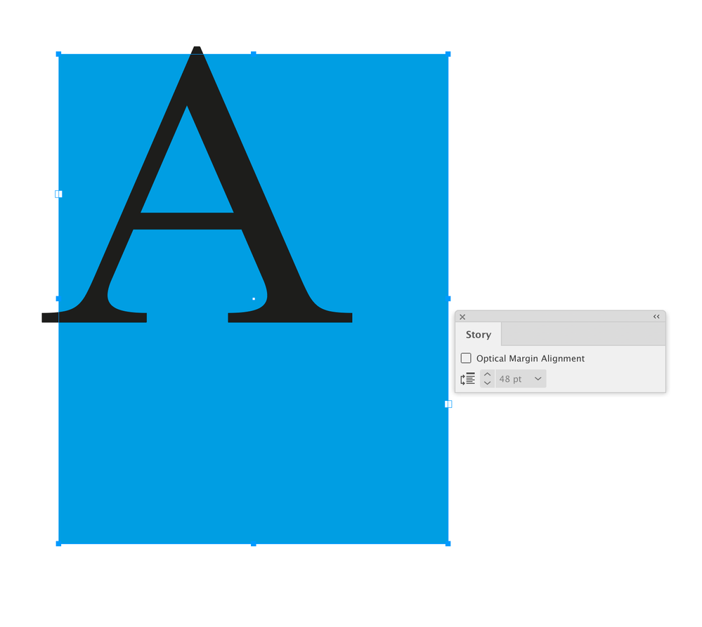
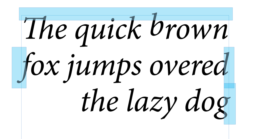
Hi @Pickory , The Story panel’s Optical Margin Alignment affects the amount of overhang, but even with it off there could be some:
The text fame can have an Inset Spacing of any amount set in textFramePreferences:
PNG Export:
Copy link to clipboard
Copied
Rob's answer goes into plenty of detail, but let me add this: it doesn't usually matter that edges and points of type extend past text frame edges. Frames are invisible and can be put anywhere needed within a layout. No end user is ever going to see or know that type is outside the layout frames like this.
The type control Optical/Metrics and others can help align fonts that have glyphs that stray outside neat character boxes, if that's the issue. But such alignment is usually invisible at readable type sizes, and micro-adjusting large, display or art type is just a given.
┋┊ InDesign to Kindle (& EPUB): A Professional Guide, v3.1 ┊ (Amazon) ┊┋
Copy link to clipboard
Copied
I notice and have to notice.
There's plenty of industries were there is a strict text free zones - even 1 pixel outside the text area is detected using software. This is a non-starter and has to be fixed for everything and everywhere.
Text free is text free. There are no half measures
I use the text inset like Rob has illustrated.
But when the font goes from regular to italic it can push outside the frames again.
Other characters - non-latin - can go outside the areas without any warning.
It's quite disappointing, a text frame is a frame - and you'd expect it to be contained within a frame - but it doesn't.
These pokey bits are frustrating.
Copy link to clipboard
Copied
Copy link to clipboard
Copied
Margins/columns etc.
Or columns in text frames.
Copy link to clipboard
Copied
Columns is going to be tricky. 🙂
Copy link to clipboard
Copied
I was hoping to find a script to detect and fix the pop outs.
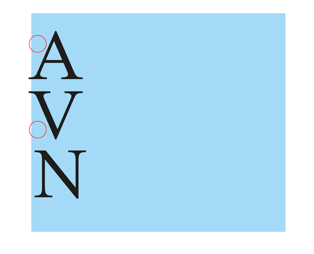
Is there a reason you don’t want to use a text inset? Is the problem characters going outside of the text frame or are you trying to meterically align the characters? For example you want the serifs of the A and V to align with the N’s serif:
Copy link to clipboard
Copied
> Currently I am only looking at text frames
Think about type on path. Anything that qualifies as text container.
While they are no page items, tables exceeding their frame may also need extra consideration.
Dependent on locale, have a look at Ruby.
Copy link to clipboard
Copied
I'll take your word for all this, starting with the need to have a sharp delineation between text/no-text, but this seems to be just a layout issue like many others. Use layout features to define text areas, and then further layout to keep text within them, using text frames, margins, etc. And use the various text alignment settings to keep text inside frames; and maybe in the end use fonts that don't have such egregious swashes and serifs. Yes, I suppose having to watch those details is an annoyance, but if you're going to start with such a strict imposed need, it's like many others related to this or that layout or printing or display requirement... or so it seems from over here. 🙂
Put another way, lots of layouts have strict "no print" or "no color" or such areas — packaging, labels, magazine pages. Is there a reason this issue is different from those?
┋┊ InDesign to Kindle (& EPUB): A Professional Guide, v3.1 ┊ (Amazon) ┊┋
Copy link to clipboard
Copied
Already do all that.
Guess the point is it's a text frames and you'd expect the text to stay inside that frame.
Is that much to ask for?
Copy link to clipboard
Copied
Well, yes and no. Most fonts do stay within a text area, especially if Optical alignment is chosen. It tends to be the fonts bordering on decorative (or used at relatively large deco/art/titling sizes) that have bits that go outside the usual glyph spaces. Fonts being fonts, they are not always constrained to tight limits for those swashes etc.; I can't really say if that's a flaw or a part of font styling.
I am having trouble finding an intersection between the demand for these very rigid text areas and any such font that exceeds it. It would seem that such very tight layouts would use, well, fairly plain faces. 🙂
┋┊ InDesign to Kindle (& EPUB): A Professional Guide, v3.1 ┊ (Amazon) ┊┋
Copy link to clipboard
Copied
Guess the point is it's a text frames and you'd expect the text to stay inside that frame.
Is that much to ask for?
I think as a general rule I want alignments to be optical — kerning pairs adjust the spacing to make it look optically even. With left aligned body text I want the alignment to compensate for the empty space of the A and V:
The exception might be a large, 2 line headline where I manually override the optical alignment by tracking a space character
Copy link to clipboard
Copied
It seems to me there is a key point not being mentioned. This is up to the font designer. They can design the font to "fit in its box" or to reach outside it. Font designers can make choices, and those choices can make them unsuitable for some jobs. Weird choices I have seen is a barcode font which when set at about 10 points, is about an inch high. More commonly, a font might be designed to fill its point size, meaning if it is set with a leading of zero, the fonts overlap.
Anyway, what is discussed here is horizontal design. Some fonts are designed to overlap glyphs, meaning they reach to the left of their starting position, to the right beyond their advance, or both. It should be easy to check a font by setting up a box and placing all the characters, large, flush left and flush right. An optical check will say whether the font is suitable for situations where setting part of a glpyh in the dead area is a no-no. A full check might use flush top and flush bottom to check it fits vertically too.
A more technical solution would check all the glyph metrics.
Copy link to clipboard
Copied
A more technical solution would check all the glyph metrics.
The scripting API lets you get the Ascent, Descent, Point Size, Baseleine, and from the baseline you can calculate the Cap- and X-height. You could get a character’s horizontal offset and compare it to the parent text frame’s x position—if it’s less then there’s an overhang, but to move the character i think you would have to insert a space and track it—in that case the optical alignment would be off and if the text reflowed there would be an unwanted space.
I’m still not following what the problem with a text frame inset would be?
Copy link to clipboard
Copied
The scripting or the C++ SDK API is not detecting the popping out part. This is the technical bit that has got me interested. Why can't I find the true line length.
I have tested the
app.selection[0].lines[0].endHorizontalOffset
against the frame bounds, it just not report the 'popping' out bit. It is truncated to the bounds of the frame.
( edited, I am probably looking in the wrong place 🙂 )
Copy link to clipboard
Copied
Have a look at ink bounds or inking bounds, e.g. within IWaxRunShape .
DynamicSpellCheckAdornment also goes thru some details, down to the wax glyphs.
Copy link to clipboard
Copied
I have tested the
app.selection[0].lines[0].endHorizontalOffset
against the frame bounds, it just not report the 'popping' out bit. It is truncated to the bounds of the frame.
.endHorizontalOffset works for me. Try this on a selected character overhanging the right text frame bounds:
app.scriptPreferences.measurementUnit = MeasurementUnits.POINTS;
var s = app.activeDocument.selection[0];

if (s.constructor.name == "Character") {
    var oh = s.endHorizontalOffset-s.parentTextFrames[0].geometricBounds[3]
    alert ("Selected Character Overhang\r" + oh + " Points")
} else {
    alert("Please Select a Single Character")
}
app.scriptPreferences.measurementUnit = AutoEnum.AUTO_VALUE;
Copy link to clipboard
Copied
I’m still not following what the problem with a text frame inset would be?
By @rob day
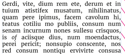
Even here - at the beginning have to set insets for top, bottom, left, right.
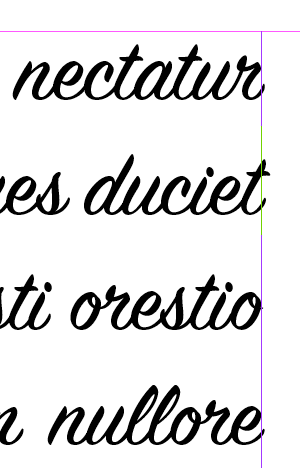
As accents, caps - dots on "i"'s go outside
Very basic example - all looks great and not going into text-free area.
This paragraph looks great - all insde the area now I have manually inserted 0.2mm on the right side.
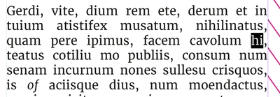
Deletion required
Knockon effect - as the italic 'of' as come back to end of line.
Now the italic f even with 0.2mm inset has popped into the text free zone.
My question is quite simple.
Why a text frame does not 'frame' the text.
Why does a text frame allow parts of a character to pop out of the 'frame'?
It's a frame - it should all be inside it.
What happens now - increase the text inset again is the greatest solution I could come up with.
This can cause complete text reflow - resulting in overset text - resulting in reducing leading, tracking, scaling etc. to fit the content.
Which means when comparing a simple text change of remove 2 letters, all paragraphs on all pages end up with different line endings due to increased text insets.
Is it really too much to ask to have text to stay within it's frame?
To me it's a bug - others say it's not.
Imagine the uproar if parts of a place .ai image popped outside its graphic frame.
Hope this illustrates, in a simple way, what the issue is.
Copy link to clipboard
Copied
As there is no control / way to detect it - it's a bug.
As a workaround - as long as the no text zone is blank paper - maybe setting "[Paper]" as a color of the TextFrame's edge would partially fix the problem?
Copy link to clipboard
Copied
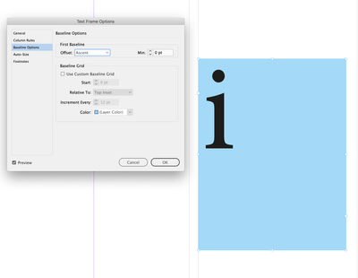
As accents, caps - dots on "i"'s go outside
That would depend on your First Baseline Offest preference—the xHeight, Ascent, etc, would be set by the type designer:
To me it's a bug - others say it's not.
You could try reporting it, but for me it’s a feature—I want the text to be optically aligned with the text frame’s bounds, so when it sits on a margin guide the text is optically aligned with the margin.
InDesign doesn’t have a hanging puncuation feature, but does have Optical Margin Alignment, which I think is better. I suppose there could be a feature request for when it’s turned off there’s no optical alignment and the outer most glyph bounds are used instead.
Copy link to clipboard
Copied
Yes, it's not a bug, it's good typography. Some people want text to be treated as graphics, working with the bounds of the graphical objects which are the glyphs. But text is not set based on the edges of the glpyhs, but on the glyph frame. The key measure is the ADVANCE of text. This is the designed spacing before starting the next character. In a typical font, characters start just after the left edge of the advance, leaving a white gap. They don't follow the exact same line, because - due to an optical illusion - the font would seem ragged if straight and curved edges align. Similarly, most fonts stop just before the edge of the advance. Fanciful and decorative fonts will overlap sometimes - this is not a design error, it's what the font designer wanted you to see, and you should choose fonts that work for you.
Now, there may be use in having a whole separate model which allows you to treat a block of text as if it were a collection of graphics and align it - as if it were outlined. Single words in logos may benefit from this treatment, especially for vertical alignment,. But absolutely, definitely, any such new feature must not affect the normal typesetting processes.
I point this out because if someone has this need (which is genuine, if minority) they need to understand InDesign isn't broken, and not ask for it to be fixed or changed - that will be thrown out as soon as anyone who knows typography takes a look. What you need to ask for is a new feature (perhaps it could be called "glpyh run graphic box alignment").
Copy link to clipboard
Copied
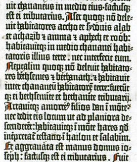
Good analysis. Without getting any more tangled up in semantic engineering, I concur that this whole argument seems to be over seeing the same, very established effect from two different perspectives and being upset because they're not the same. A text frame, whether digital or mechanical, is one thing; how certain letterforms behave at the edges of that frame, whether pixels or lead, is another. I suspect we'd find "popouts" in Gutenberg's work. 🙂
It's the notion of a strictly text-free zone that's new, and needs to be coped with.
ETA: Q.E.D. 😄
┋┊ InDesign to Kindle (& EPUB): A Professional Guide, v3.1 ┊ (Amazon) ┊┋
Copy link to clipboard
Copied
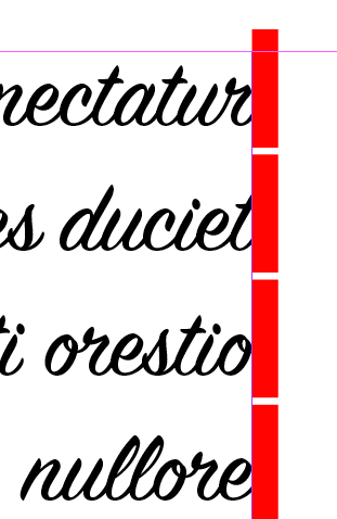
Popout detector might look like this.
The view would be dynamic, updates as you type or resize the frames.
Copy link to clipboard
Copied
Hi @Pickory, I've put together a hacky script that shows (using blue rectangles) where each line of text protrudes from the selected text frame. I know this is probably not much use to you (because it doesn't fix anything), but because I've just written a very similar to a script I may as well share it. As I said, it's a quick hack—it literally duplicates the text frame and outlines it—so if you can use the SDK, then that would be much preferable.
- Mark
/*
 * Reveal protruding lines of text frame.
 * Known limitation: because it duplicates the text frame,
 * this will sometimes cause a reflow if a paragraph using
 * a multi-line composer spans multiple text frames.
 * @author m1b
 * @discussion https://community.adobe.com/t5/indesign-discussions/type-popping-out-of-text-frame/m-p/13711048
 */
function main() {

    var doc = app.activeDocument,
        textFrame = doc.selection[0];

    if (
        textFrame == undefined
        || !textFrame.isValid
        || textFrame.constructor.name !== 'TextFrame'
    ) {
        alert('Please select a text frame and try again.');
        return;
    }

    var results = getProtrudingCharacterBounds(textFrame, layer);

    if (!results) return;

    // put the rectangles on this layer
    var layerName = 'Protruding';
    var layer = doc.layers.itemByName(layerName)
    if (!layer.isValid)
        layer = doc.layers.add({ name: layerName, printable: false });
    doc.activeLayer = layer;

    for (var i = 0; i < results.length; i++) {

        // draw a rectangle just for showing the results
        var rect = textFrame.parentPage.rectangles.add({
            geometricBounds: results[i],
            fillColor: doc.swatches[4],
        });
        rect.transparencySettings.blendingSettings.opacity = 30;

    }

    alert('Found ' + results.length + ' protruding glyphs.');

};

app.doScript(main, ScriptLanguage.JAVASCRIPT, undefined, UndoModes.ENTIRE_SCRIPT, 'Mark Protruding Text');


/**
 * Returns bounds of the protruding
 * parts of lines of text frame.
 * @param {TextFrame} tf - an Indesign TextFrame.
 * @returns {Array<Array>} - array of [T, L, B, R] arrays.
 */
function getProtrudingCharacterBounds(tf) {

    app.scriptPreferences.measurementUnit = MeasurementUnits.POINTS;

    // get the outermost textframe
    while (tf.parent.constructor.name == 'Character')
        tf = tf.parent.parentTextFrames[0];

    var bounds = tf.geometricBounds;

    // duplicate text frame
    var dup = tf.duplicate();
    outlines = dup.createOutlines();

    // add outlines of anchored text frames
    while (outlines[outlines.length - 1].textFrames.length > 0)
        outlines.push(outlines[outlines.length - 1].textFrames[0].createOutlines()[0]);

    // find the protruding outlines
    var found = [];

    outlinesLoop:
    for (var i = 0; i < outlines.length; i++) {

        var polygons;
        if (outlines[i].constructor.name == 'Polygon')
            // we get a Polygon if there is only one character in text frame
            polygons = [outlines[i]];
        else if (outlines[i].hasOwnProperty('polygons'))
            // a Group with polygons
            polygons = outlines[i].polygons;
        else
            continue;

        for (var j = 0; j < polygons.length; j++) {
            var r = getProtrudingRect(bounds, polygons[j].visibleBounds, 3);
            if (r)
                found = found.concat(r);
        }

    }

    // delete all the outlines
    for (var i = outlines.length - 1; i >= 0; i--)
        outlines[i].remove();

    if (dup.isValid)
        // sometimes the duplicate is left behind
        // eg. when there is a table in the text frame
        dup.remove();

    if (found)
        return found;

};


/**
 * Returns the protruding part of a rectangle.
 * @param {Array<Number>} r1 - [T,L,B,R].
 * @param {Array<Number>} r2 - [T,L,B,R].
 * @param {Number} [offset] - the amount to expand resulting rectangle (default: 0).
 * @returns {Array<Number>} [T,L,B,R].
 */
function getProtrudingRect(r1, r2, offset) {

    offset = offset || 0;

    var results = [];

    var top1 = r1[0], top2 = r2[0],
        left1 = r1[1], left2 = r2[1],
        bottom1 = r1[2], bottom2 = r2[2],
        right1 = r1[3], right2 = r2[3];

    if (
        bottom1 <= top2 || top1 >= bottom2 || right1 <= left2 || left1 >= right2
        || (left2 >= left1 && right2 <= right1 && top2 >= top1 && bottom2 <= bottom1)
    ) {
        // No overlap between the rectangles, or second
        // rectangle is completely within the first.
        return;
    }

    // handle cases where protrudes from both sides
    if (top1 > top2 && bottom1 < bottom2) {
        results = results.concat(getProtrudingRect([top1, left1, bottom2, right1], r2, offset));
        results = results.concat(getProtrudingRect([top2, left1, bottom1, right1], r2, offset));
        return results;
    }

    if (left1 > left2 && right1 < right2) {
        results = results.concat(getProtrudingRect([top1, left1, bottom1, right2], r2, offset));
        results = results.concat(getProtrudingRect([top1, left2, bottom1, right1], r2, offset));
        return results;
    }

    // Define the outside rectangle.
    var outside = [top2, left2, bottom2, right2];

    // Check for overlap on each side and adjust the outside rectangle accordingly.
    if (left1 > left2) {
        outside[1] = left2;
        outside[3] = left1;
    }
    if (right1 < right2) {
        outside[1] = right1;
        outside[3] = right2;
    }
    if (top1 > top2) {
        outside[0] = top2;
        outside[2] = top1;
    }
    if (bottom1 < bottom2) {
        outside[0] = bottom1;
        outside[2] = bottom2;
    }

    // expand by offset (just for better
    // visibility of tiny protrusions)
    outside[0] -= offset;
    outside[1] -= offset;
    outside[2] += offset;
    outside[3] += offset;

    return [outside];

};
Edit 2023-04-11: now puts indicators on a new, non-printing layer, to keep them separate from artwork. @Eugene Tyson.


