

- Home
- InDesign
- Discussions
- Re: [URGENT HELP PLS!] How to make texts no weird ...
- Re: [URGENT HELP PLS!] How to make texts no weird ...
[URGENT HELP PLS!] How to make texts no weird spacing in full justify?

Copy link to clipboard
Copied
Hi,
I was trying to make texts to have no weird spacing in full justify, couldnt work at all even when i google for tutorial..
i had tried paragraph option and it still dont work ..
this is the orignal in full justify,
even if i follow the tutorial -> Spacing in Justified Text
the text didnt change.
I had been stressing over it , how to keep it in normal magazine style in full justify without the weird spacing... UGH
please help! T___T


 16
Replies
16
16
Replies
16

Copy link to clipboard
Copied
It looks like you aren't using hyphenation. If you let some words break, you might get better spacing.
Copy link to clipboard
Copied
yes im not using hyphenation.
My boss wont like it.. she wanted me to do magazine that has no hypernation and texts must be in full justify... sigh

Copy link to clipboard
Copied
Then this is exactly what your boss wants. You might be able to tinker with tracking a bit, but you cannot over-do that either.
Copy link to clipboard
Copied
https://forums.adobe.com/people/%5BJongware%5D wrote
Then this is exactly what your boss wants. You might be able to tinker with tracking a bit, but you cannot over-do that either.
Yes, i had show her but she say got that empty spaces between words, she dont want it i had told her that it is a bit pretty diffcult but she says surely there has a way to remove the empty spacing in the full justify...
It is impossible to avoid these spaces if you do not hyphenate, especially if you have so narrow columns.
I see .. okay
Seem it really cant be helped and i'll slap these to her face~
anyways thank you guys

Copy link to clipboard
Copied
Why do you use the Single Line Composer - and not the Multi Line Composer? Mostly you will get better results with the second one. ( But without hyphenation you will still have such weird spaces - the narrow the columns, the more the spaces.)

Copy link to clipboard
Copied
Something that might help a bit is changing the glyph scaling to 97 100 97. Contrary to what purists might tell you, nobody will notice with body copy.

Copy link to clipboard
Copied
Your boss needs to be educated. It is either this or hyphenate.

Copy link to clipboard
Copied
she says surely there has a way to remove the empty spacing in the full justify...
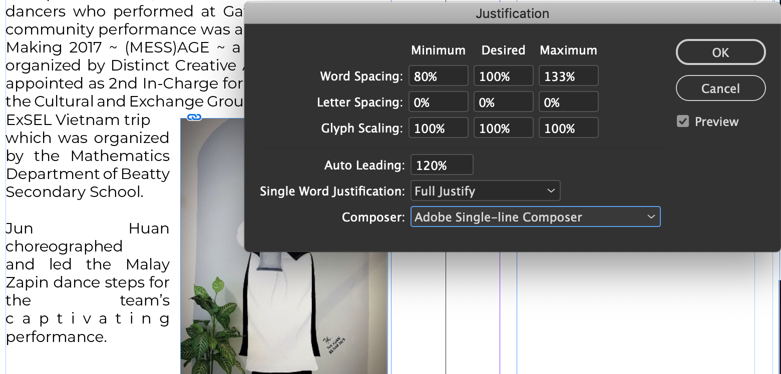
Try adjusting the Word and Letter Spacing as well as the Glyph Scaling:


And, your line measure is only allowing 3-5 words per line, so making the point size smaller would help—a larger point size doesn't always make text easier to read. Making the photo smaller would get you a wider measure.
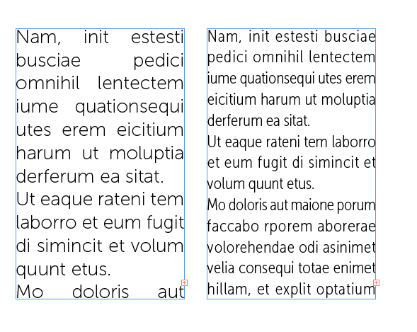
Also the font you are using doesn't set very efficiently because the character widths are so wide, a more condensed face would set better. Here's Typekit's Museo at 18pt vs Museo Condensed at 16pt with the Justification adjusted:

Copy link to clipboard
Copied
It is impossible to avoid these spaces if you do not hyphenate, especially if you have so narrow columns.

Copy link to clipboard
Copied
Get a new boss.
Copy link to clipboard
Copied
pixxxel schubser 05-Dec-2018 00:33 (in response to Vanessa Neo)
Why do you use the Single Line Composer - and not the Multi Line Composer? Mostly you will get better results with the second one. ( But without hyphenation you will still have such weird spaces - the narrow the columns, the more the spaces.)
I dont know..? i just follow what i found in google.. to be honest, i dont know what is the difference between single or multi..... 😕
Derek Cross 05-Dec-2018 02:30 (in response to Vanessa Neo)
Get a new boss.
Frans van der Geest (ACP) 05-Dec-2018 05:10 (in response to Vanessa Neo)
Your boss needs to be educated. It is either this or hyphenate.
HAHA I wish i could ... Yes, i had studied in interactive media designs and i had told her this or that but she thinks it is soooo easy and her way of thinking is quite old-fashioned and she love to see the proof whether it can work or not. she is quite stubborn.
BobLevine 05-Dec-2018 04:29 (in response to Vanessa Neo)
Something that might help a bit is changing the glyph scaling to 97 100 97. Contrary to what purists might tell you, nobody will notice with body copy.
Okay, i'll try that out. thanks!
rob day 05-Dec-2018 05:36 (in response to Vanessa Neo)
Try adjusting the Word and Letter Spacing as well as the Glyph Scaling:
Oh~ I'll try that too but i know her style, she dont like texts being too small or crowd. she like everything to be BIGGER.
Copy link to clipboard
Copied
she like everything to be BIGGER.
Tell her that it is not because it is big that it is legible.
You could also tell her that it is very very very difficult to put BIG suitcases in a tiny car trunk…
Copy link to clipboard
Copied
he dont like texts being too small or crowd
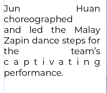
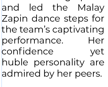
Where does she expect the words choreographed and captivating to go?

Copy link to clipboard
Copied
Arguing won't work. Try showing. Make samples. Here are some ideas for samples
Demonstrate that choreographed won't fit by forcing a fit by deleting characters in other words so your boss can see it is tight.
Use a different font
Move and resize the graphic
Do some copy editing
Make the font smaller or bigger
Flush right against the picture
Overrun the picture.
Ask which of these choices is preferred. You can't win an argument with a boss. That's part of their job description.

Copy link to clipboard
Copied
Full justification and a short line length is incredibly difficult to make work. You'll always end up with rivers of white space throughout the content especially with hyphenation turned off.

Copy link to clipboard
Copied
My guess is that the better setting would be Left Justify; not Full Justify.
I often suggest allowing Adobe Paragraph Composer
and ...
Hyphenation set to 9/3/4/1/1p6/off/off/off
along with...
Justification set to Word 80/100/120; Letter -5/0/5%; and Glyph 95/100/105; and single word set to align left.

Find more inspiration, events, and resources on the new Adobe Community
Explore Now
 AdChoices