Copy link to clipboard
Copied
It's greyed out because it's only applicable in situations where you are creating an old-school flattened PDF. They are automatically included in more modern PDF workflows that retain transparency settings hence it's greyed out, so your settings ARE in the PDF already anyway and just need to have Overprint Simulation toggled on/off accordingly in Acrobat under Print Production > Output Preview.
That being said, if someone is using a different viewer than Acrobat, you will have issues.
You might
...Copy link to clipboard
Copied
It's greyed out because it's only applicable in situations where you are creating an old-school flattened PDF. They are automatically included in more modern PDF workflows that retain transparency settings hence it's greyed out, so your settings ARE in the PDF already anyway and just need to have Overprint Simulation toggled on/off accordingly in Acrobat under Print Production > Output Preview.
That being said, if someone is using a different viewer than Acrobat, you will have issues.
You might consider using Multiply on your illustrator objects rather than simply selecting overprint.
Copy link to clipboard
Copied
In addition to the good information above, there is an Acrobat & Reader page display preference to Use Overprint Preview, this should usually be set to "Always". Also, some laser printers have a setting "Simulate overprinting", which can be helpful if effects like drop shadows are not rendering properly.
Go to View> Overprint preview in InDesign to show overprinting.
Note that exporting an interactive PDF will remove overprinting.
On your sample file, your icons from illustrator are showing a background fill color of none, which is allowing the 10% PMS 305 from InDesign to show through. You can fill the icon background with White, or a lighter screen of PMS 305 (and not overprint the fill) in Illustrator and if the solid elements of the icons were the desired tint, there would be no need to overprint or multiply.
Copy link to clipboard
Copied
Edit: actually, I don't think you can create a multi-spot color swatch in Illustrator, as you can in InDesign, so overprinting or multiply would be necessary, unless the icons were pasted into InDesign from Illustrator.
Copy link to clipboard
Copied
I unembedded and looked at one of the graphics and it's built in a unique way, but definitely works as intended.
Copy link to clipboard
Copied
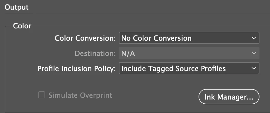
If you are trying to simulate the overprint so you can show the expected output, you have to make a conversion as well as flatten transparency. Here I’m converting to document RGB and flattening, so the overprint simulation will show in a browser—this Output setting converts the spot colors to process:
In Chrome a default PDF/X-4 export including the spots on the left, and the overprint simulation as process RGB on the right:
Also, it’s worth noting that there is no accurate color management for Pantone tints and tint mixes, so unless you get lucky be prepared for some color appearance shifting in the actual output with the 2-color spot printing.
Copy link to clipboard
Copied
At the risk of stating the obvious, do not send your RGB pdf to the printer and ask them to output two spot colors.
In practice, your commercial printer should not have any issues with proper viewing of a PDF with overprinting inks, If the PDF is only for screen viewing, it's usually best to create the file in RGB.
If you want one PDF to be used for viewing and printing, you can use multi-ink swatches in InDesign, which will avoid the issues with overprinting (although on-screen accuracy of spot colors is dicy).
Another option is to create a two layer PDF, the top layer for screen viewing (with the layer properties set to view but not print) and the bottom layer for printing (layer properties set to print but not view). If you use this (rarely used) technique, let your printer know. Also, remind them that the two spot colors need to be on separate screen angles.
Copy link to clipboard
Copied
Also, both spot colors are in the CMYK gamut, so I wonder if the added color and overprint complexity of spot color output vs. 4-color process is worth the effort? The 2-color separation is running large areas halftone screens so the advantage of a solid color ink isn’t there. The small red text is going to need a trap or overprint, so I don’t think it’s going to look any better than 4-color.
Copy link to clipboard
Copied
Also note:
I found if you want to "Simulate Overprint" with spot colors in your document, do not convert them to CMYK with the Ink Manager. Leave the conversion to RGB to the export function with Adobe PDF (Print) with the settings Rob suggested. If a browser should show the PDF do a conversion to sRGB in the Adobe PDF (Print) dialog.
Regards,
Uwe Laubender
( ACP )