Participating Frequently
March 1, 2024
Question

Colors look different between apps with a specific set of images.

  • March 1, 2024
  • 2 replies
  • 1140 views

I've been editing this gallery and encounted this issue with four specific images. The colors look different when exporting. I'm viewing the exports in Bridge but the colors look equally as wrong when looking through Windows Photo. (I always view my exports in Bridge but i wanted to verify different apps.) What's even more curious is that when I preview the RAW file on Bridge, the colors are equally as wrong. I then opened up the image on Camera RAW through Bridge and while the settings are the same, there is a clear difference, the colors are bluer/cooler. I've looked through several forums and did all the steps of calibrating my monitor to srgb, I made sure to export in srgb, i've even tried exporting in other color profiles. I noticed no change between the diff color profiles exports (the exports honestly looked the same whether they were srgb, adobe rgb, or prophoto). The only difference is between the applications, and is specific to those four sets of images, as with all the other images in the gallery so far, the colors look the same between apps. I will upload two differente images, one where the colors match between apps, and the other where the colors don't match. The exported images are being view through Windows Photo, but like I said, the colors look equally as wrong in Windows Photo, Bridge Preview, and Camera RAW hosted on Bridge. Some guidance would be great. Thank you!


Lightroom is updated to most recent version.

GPU Driver is also updated.

Monitor has been calibrated to srgb per a previous forum here.

Windows 10, nvidia rtx 3060, AMD Ryzen 7 5700G, 32gb ram, lmk if more info in needed


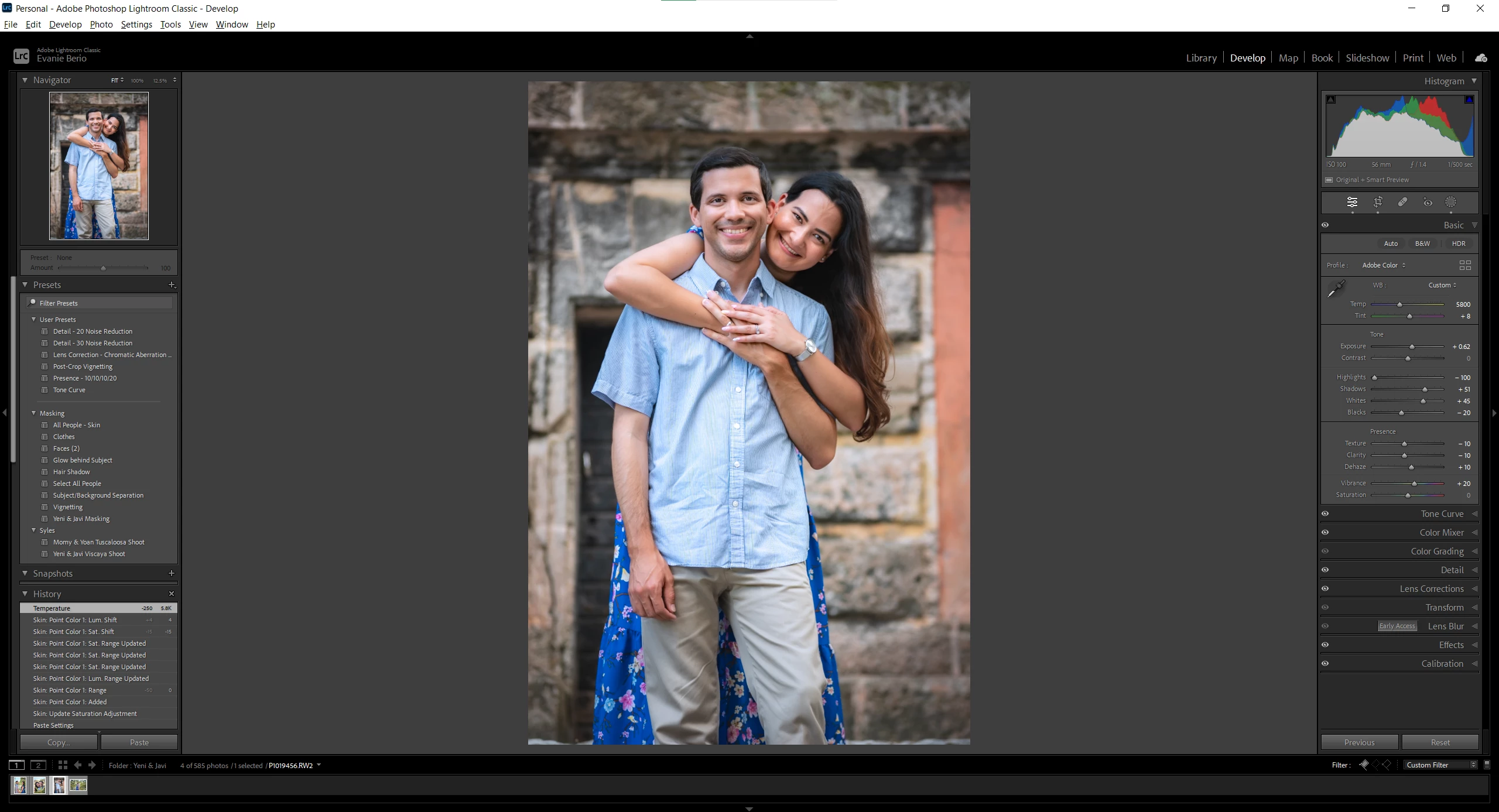
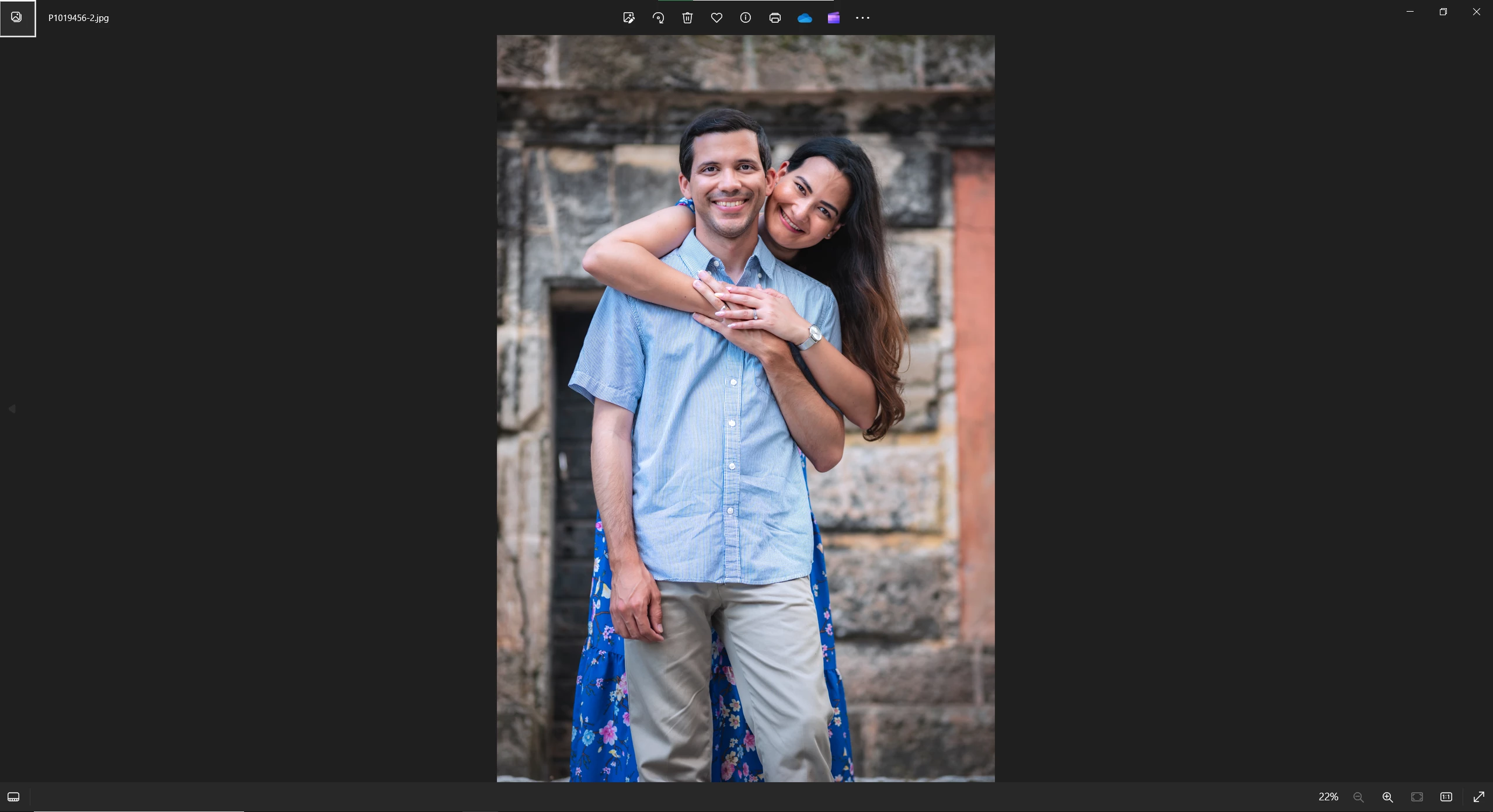
Image where color match:


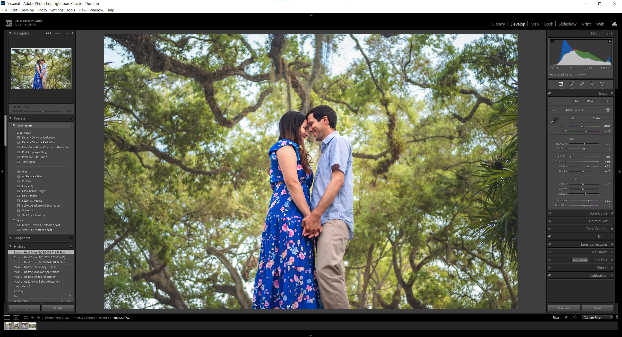
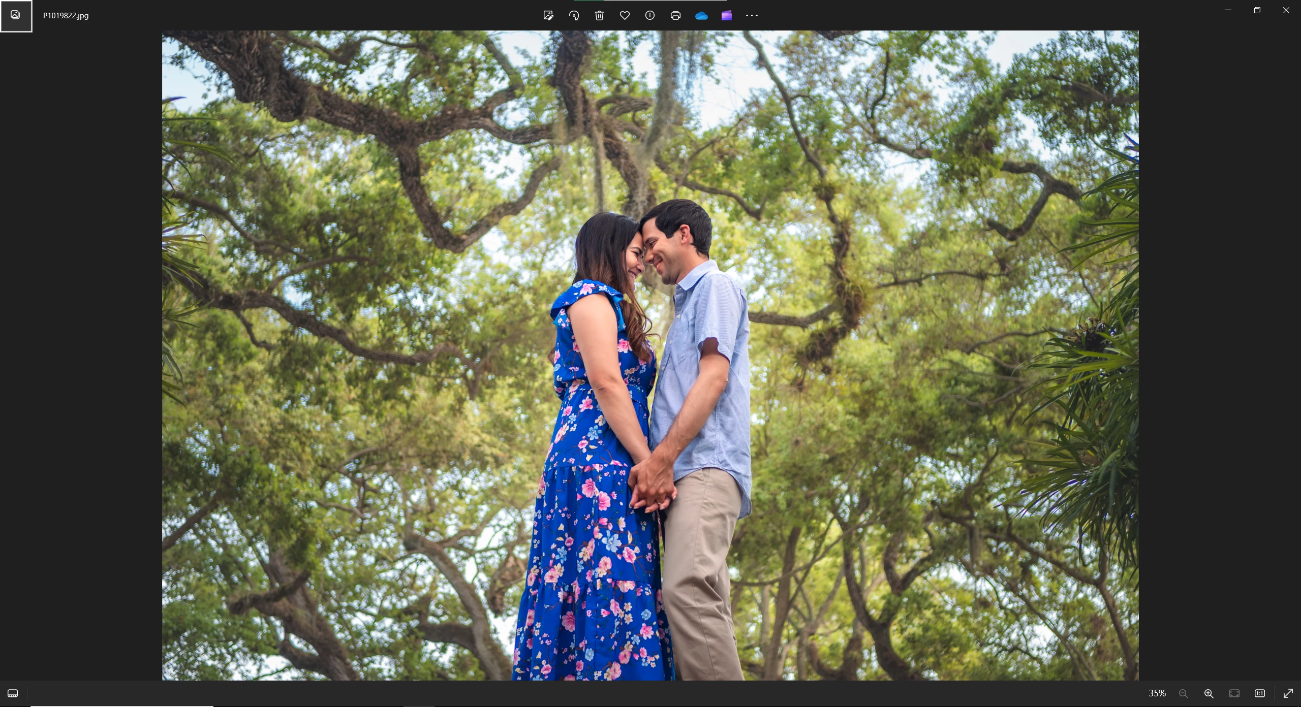
Image where colors don't match: 

The colors are more blue and slightly more magenta.

This topic has been closed for replies.

2 replies

Community Expert
March 2, 2024

A few things. One you don't actually want to use the sRGB profile for your monitor in general. That is just a trouble-shooting step to see if the monitor profile is corrupt. You should calibrate your monitor with actual calibration hardware otherwise the color is guaranteed to ALWAYS be wrong. The only exception is if you have a moitor that you can set to a reference mode that makes it behave like sRGB (or adobeRGB or display P3). Then you can indeed do what you did. 


For now, since you did the trouble shooting step, I can tell you what the color difference is due to and it is something that is seldom seen. The shirt the guy is wearing is a blue striped shirt with stripes that are right around the resolution of your screen. Very interestingly, this makes the overall color appearance very strongly dependent on how the image is scaled to the screen resolution. So even more interestingly, this is the cause why images can appear slightly different in contrast and tone when you export at different resolutions. If you take this image and export it at a resolution that is lower than the screen and open it in a different program, you will see that it better corresponds to the image you see in Lightroom. This applies not just to the shirt but anywhere you have a lot of detail (or noise) in an image. Unfortunately, every single program uses a different scaling algorithm and scale in different color spaces and gammas. Even inside Lightroom Classic, you will see subtle differences between Develop and Library because of this. Note that you will only see that if your display is lowish resolution to the point that you can vsually see pixels. If the display is high enough resolution that you cannot see individual pixels with your eyes, this won't happen.


evanie14Author
Participating Frequently
March 2, 2024

Ok, I sort of understood that. My monitor's resolution is 2.5K, I'm not sure if that falls under a lowish resolution (i don't think so but I ask just in case). I do know the images are in a higher resolution than that. It's interesting how you mention the guy's shirt, as I have noticed in muliple images across the gallery where the shirt looks either more teal or more indigo even when its images with the same background/pose, the shirt's appearance is the only thing that changes. I did imagine it was because of the stripes that the colors of shirt were changing and worked around it. But I'm still unclear as to why that changes the appearance of the whole image with only these specific four images (all four images have the same background/compostion, just slightly differnet poses). And, I guess I can work around this knowing the preview is not exact, but which ones are then representing the correct colors of the images. Because even inside lightroom, thanks to the other person asking about seeing the colors at 100%, I noticed that the colors look different when viewing the FIT preview and when viewing at 100%. The view at 100% matched exactly what I was seeing on the exported images. So which one is a better representation of the color, the FIT preview in lightroom or the exported images? 


As for my monitor's calibration, do you then suggest I go back to the default settings and change it out of srgb? I do know about calibration hardware, but I don't think I have the money to invest on that yet. If you know of some budgeted alternative, I'm open to suggestions. Thank you! 🙂

Community Expert
March 3, 2024

Wow, I definitely learned a lot from your detailed explanations. I truly appreciate you taking the time to help me here. Hopefully, soon I'll be able to upgrade to a 4k display as I also do video and that will be beneficial. I did do another expirement to check out the scaling issue you've presented. I exported both images in a lower resolution than my display's, but I've found the same results. The first images where the colors matched still match, and the second image where the export is cooler, still have those cool tones. So, I'm not sure that's the issue, which I now read you also agree with.


But I am glad you're also seeing how the skin tones are cooler, and that's it's not just me. Honestly, the whole image is cooler. I don't ever check output sharpening, so I know that's not a factor here. In terms of the GPU driver, in my previous research on forums and troubleshooting, I did find this solution but the problem persisted. I just tried it again one more time just in case but the problem still persists. I use the GeForce Experience app to update my driver, and I updated it yesterday with an update that came out a couple of days ago. Yet the problem still persists. That's why I've resolved to this forum to see if there's another solution I'm missing. Not sure if you have any other ideas...


I now remember a similar problem with a certain canon camera and what camera profile was used where exported images came out cooler than inside Lightroom. Have you chosen a different profile for these images? What happens if you choose one of the camera matching profiles or if you had a camera matching profile if you choose the Adobe default one?

Per Berntsen
Community Expert
Community Expert
March 1, 2024

First of all, if you do the comparison at 100% view, do you still see a difference?


"did all the steps of calibrating my monitor to srgb"

Please describe in detail what you did.

Also post a screenshot of the Windows color management dialog. (Devices tab)


evanie14Author
Participating Frequently
March 2, 2024

Thank you for answering. So when previewing the image in Bridge at 100% the colors stay the same. But when viewing the image in lightroom in 100%, once it finishes loading, the colors change. And the colors change to match what I see in Bridge. Then I zoom out to FIT, and the colors stay the same. But when I select another image and then go back to that one image, I see the correct colors I want. I then again zoom to 100% and once again the colors change to match Bridge. I'm now guessing there's some sort of bug with the FIT view in Lightroom that it is not relfecting the settings properly. Is there a reason why this happens? And is there a fix I'm missing? 


As the the monito's color space I followed the instructions of this discussion. It best explains it there, better than I would. But i followed step by step.

Lightroom color are different when exported. - Adobe Community - 11158536

This is how my monitors is calibrated.


Thanks for the help again.