• Global community
    • Language:
      • Deutsch
      • English
      • Español
      • Français
      • Português
  • 日本語コミュニティ
    Dedicated community for Japanese speakers
  • 한국 커뮤니티
    Dedicated community for Korean speakers
Exit
111

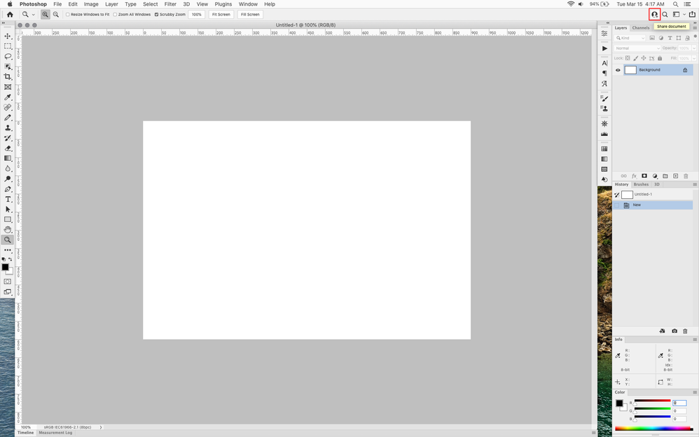
P: Photoshop 23.2.2 Share Button is distracting

Community Expert ,
Mar 15, 2022 Mar 15, 2022

Copy link to clipboard

Copied

In photoshop 2022 (version 23.2), photoshop implemented a Blue Share button in the

top right corner of the app workspace that is supposed to turn into a button of the sme color as

the other tool options bar icons.


With the latest 23.2.2 update the Blue Share button does not go away after first use as described

on this page under Easily find the Share button


https://helpx.adobe.com/photoshop/using/whats-new/2022-1.html


I reset the photoshop preferences as i do after every photoshop update by trashing the preferences folder.


Share button that the Blue Share button is supposed to appear as after first use


sh1.png


In the 23.2.2 update the button still stays as a Blue Share button after first use


sh2.png


Bug Fixed
TOPICS
macOS , Windows

Views

17.0K

Translate

Translate

Report

Report
Community guidelines
Be kind and respectful, give credit to the original source of content, and search for duplicates before posting. Learn more
community guidelines

correct answers 2 Correct answers

Adobe Employee , Aug 18, 2022 Aug 18, 2022

Updating status.


Please use Preferences > Interface > Neutral Color Mode to adjust the Share button's color.

To learn more, see Use Preferences to set a neutral color scheme for Photoshop


Status Fixed

Votes

Translate

Translate
Community Expert , Aug 18, 2022 Aug 18, 2022

Finally an option to change the blue button to not blue 😁

2022-08-18 11_34_22-Untitled-1 @ 50% (RGB_8).png

Votes

Translate

Translate
replies 206 Replies 206
206 Comments
Community Beginner ,
Jan 06, 2023 Jan 06, 2023

Copy link to clipboard

Copied

Even worse, the button pulses about once per second on my iMac workstation, even if I set the UI to neutral colour scheme. Truly distracting for a button I never use.

Votes

Translate

Translate

Report

Report
Community Expert ,
Jan 06, 2023 Jan 06, 2023

Copy link to clipboard

Copied

@Air Bob I just made it invisible 😀 a combination of amending the UIColor text file and enabling Neutral Color Mode

2023-01-06 16_36_43-Untitled-1 @ 50% (RGB_16).png


Votes

Translate

Translate

Report

Report
Community Beginner ,
Jan 28, 2023 Jan 28, 2023

Copy link to clipboard

Copied

I wish someone would update this at Adobe and solve this irritating issue.


Neutral Color Mode does not change the Share button's color. It blinks on both Apple Silicon and Intel powered machines even in the newest version. Users shouldn't need to make code configuration changes to solve this.


Suggesting a new feature something is fine, but this button is blinking so much it feels like Adobe is forcing this on us!

Votes

Translate

Translate

Report

Report
Contributor ,
Jun 21, 2023 Jun 21, 2023

Copy link to clipboard

Copied

@jane-e Photoshop version 24.5 here and even though I dismissed the Share pop up on my pevious version, after updating its back but no longer is the Dont Show Again option popping up. Any ETA on getting this fixed once and for all????

Votes

Translate

Translate

Report

Report
New Here ,
Dec 04, 2023 Dec 04, 2023

Copy link to clipboard

Copied

The "share" button sits right over the space that confirms a placement!  Please get rid of that.  It's useless. 

Votes

Translate

Translate

Report

Report
Community Beginner ,
May 24, 2024 May 24, 2024

Copy link to clipboard

Copied

LATEST

I agree, this was a silly feature, or at least the way it was implemented is very juvenile. I honestly can't think of a single scenario where I need to share SO urgently that I need a permanent floating blue button accessible at all times. Yes, Adobe, I saw your very dodgy response suggesting we just change the color of it. That is not a solution and frankly that kind of blatantly dodgy suggestion is frankly annoying. A floating button like that should never be placed in this type of UI. I literally have to minimize the window to see the Accept button in certain scenarios, and it also blocks other tools depending on my layout. This is the type of bush league UX that makes me seriously question what's going on behind the scenes.

Votes

Translate

Translate

Report

Report