

- Home
- Photoshop ecosystem
- Discussions
- Re: CMYK to SPOT COLOR (Dry Offset)
- Re: CMYK to SPOT COLOR (Dry Offset)

Copy link to clipboard
Copied
Hi!
I want to know how to transform a CMYK image into a predefined number of spot colors in a professional way. For printing in aluminium can.
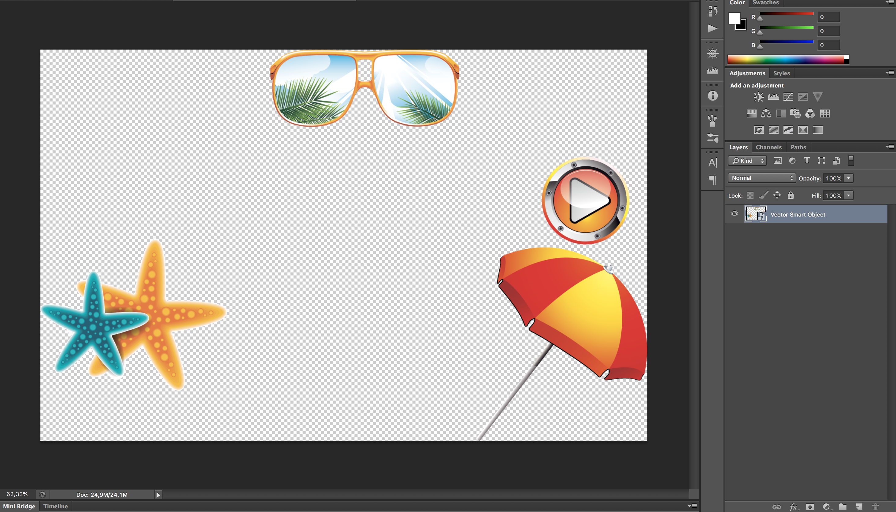
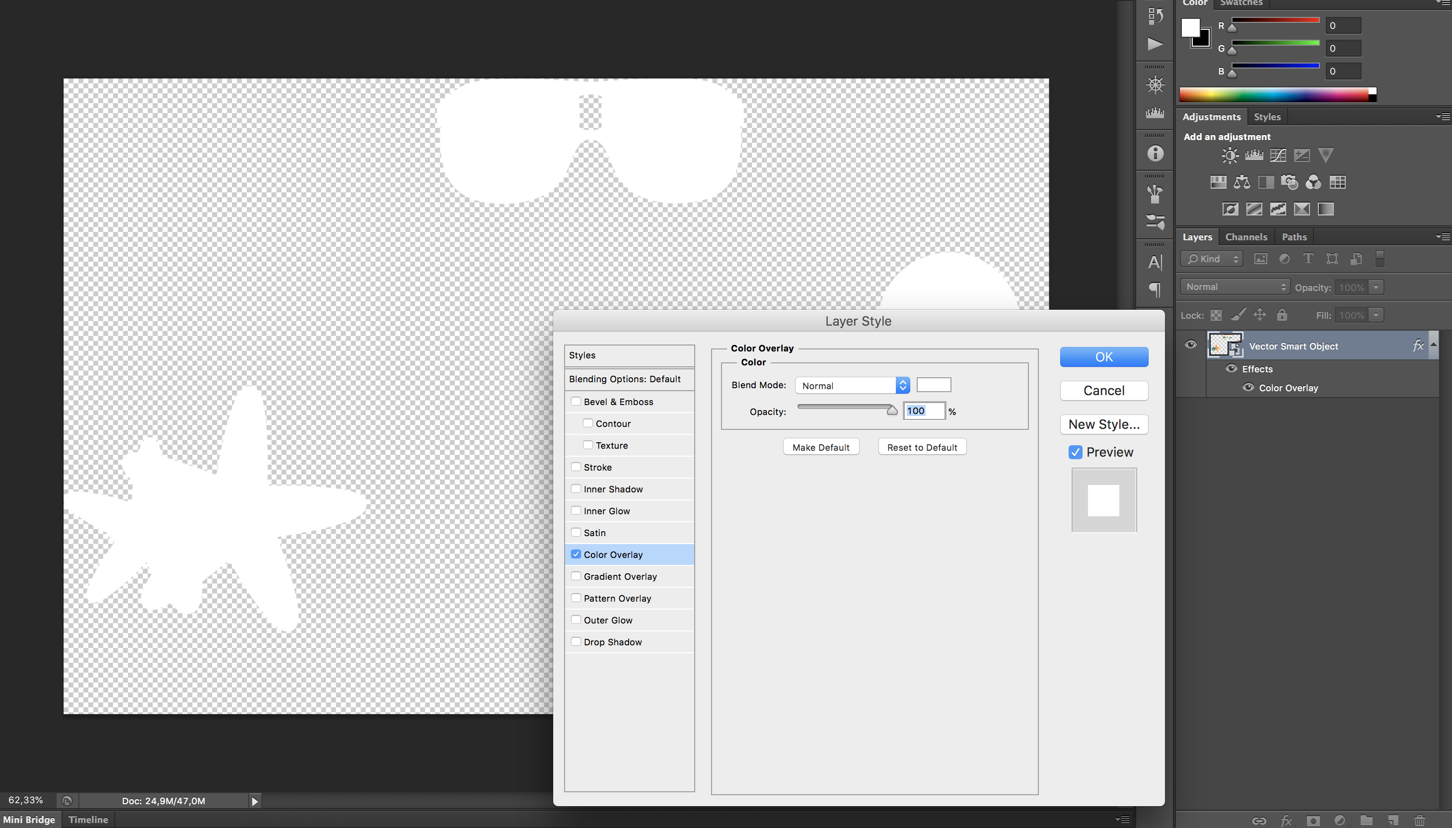
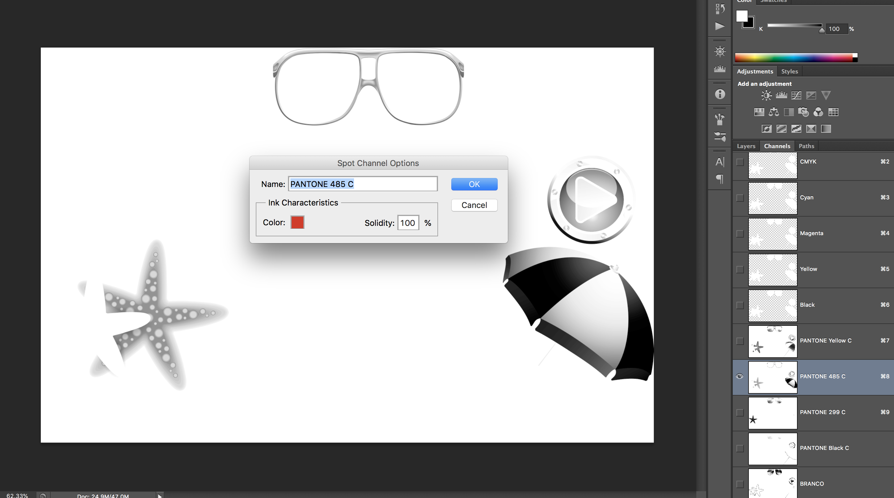
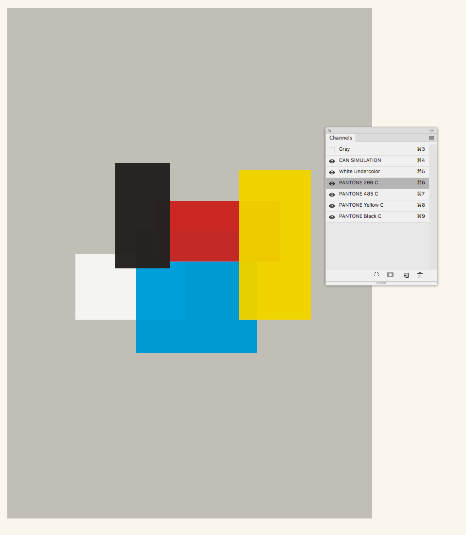
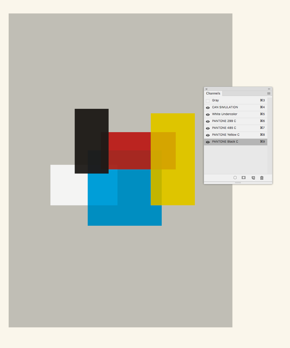
I have some screenshots from a file (ready for output) and its layers/channels. Does anyone knows this workflow? I don’t know how to do it and I’m trying to discover. The only thing I know is: the person has used 'apply image' to separate and create the spot colors and a pure white 'color overlay' on the cmyk channels.
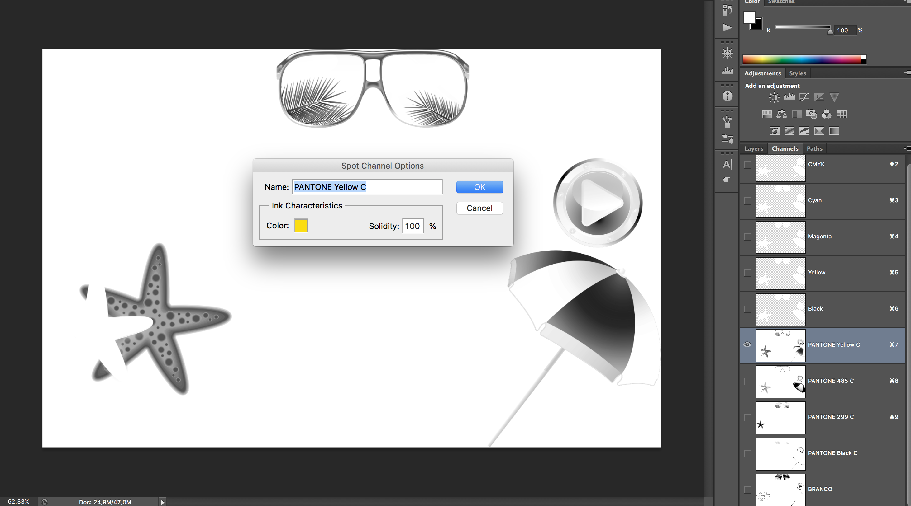
1- these are the layers (with a white color overlay and it’s cmyk channels:
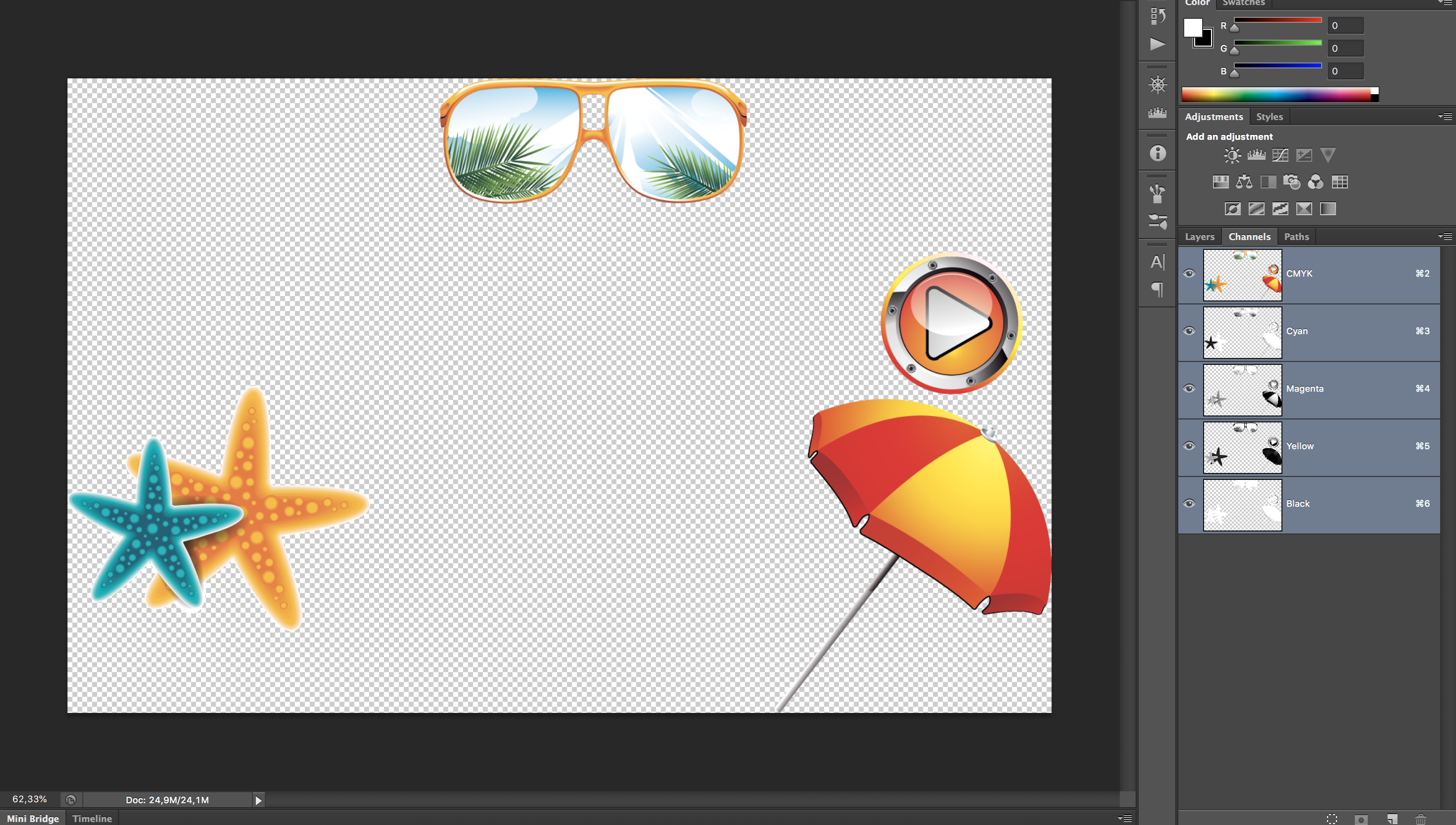
2- And here is: each channel with its correspondent spot color: (how can I reach this? how to use 'apply image' here? and why the pure white on the cmyk channels?)
Thanks for the help!!!


 1 Correct answer

I believe that the white effect on the CMYK is used to toggle a before/after preview on/off when building the spot plates and to also losslessly remove the CMYK from the final image.
An example... The spot red could be made from duplicating the magenta channel as a spot channel with the appropriate spot colour. Then the yellow plate could be added in darken blend to bulk up the channel. Various combinations of source and destination/target channels are used with blend modes, opacity, inversion, c
...Explore related tutorials & articles
 15
Replies
15
15
Replies
15
Copy link to clipboard
Copied
I believe that the white effect on the CMYK is used to toggle a before/after preview on/off when building the spot plates and to also losslessly remove the CMYK from the final image.
An example... The spot red could be made from duplicating the magenta channel as a spot channel with the appropriate spot colour. Then the yellow plate could be added in darken blend to bulk up the channel. Various combinations of source and destination/target channels are used with blend modes, opacity, inversion, channels used as masks etc. to add and remove colour. Apply image and calculations are similar tools for such CHOPS (channel operations).
Keep in mind that the “preview” may or may not be anything like the final printed result.
Copy link to clipboard
Copied
So I guede the key is a deep study of blend modes and a lot of trial and error, right? thanks!

Copy link to clipboard
Copied
Have you checked with the printer to make sure a 4-color spot separation is even possible? Reading Mike's link makes me think it would be very risky. Also, if 4-color is possible why bother with the spot colors, why not work with process CMYK? Doesn't seem like there's much of a gamut problem and soft proofing spot colors will be next to impossible.
Copy link to clipboard
Copied
yes, we have a printer that prints samples pf aliminium can, and coul print I think 6 special colors.

Copy link to clipboard
Copied
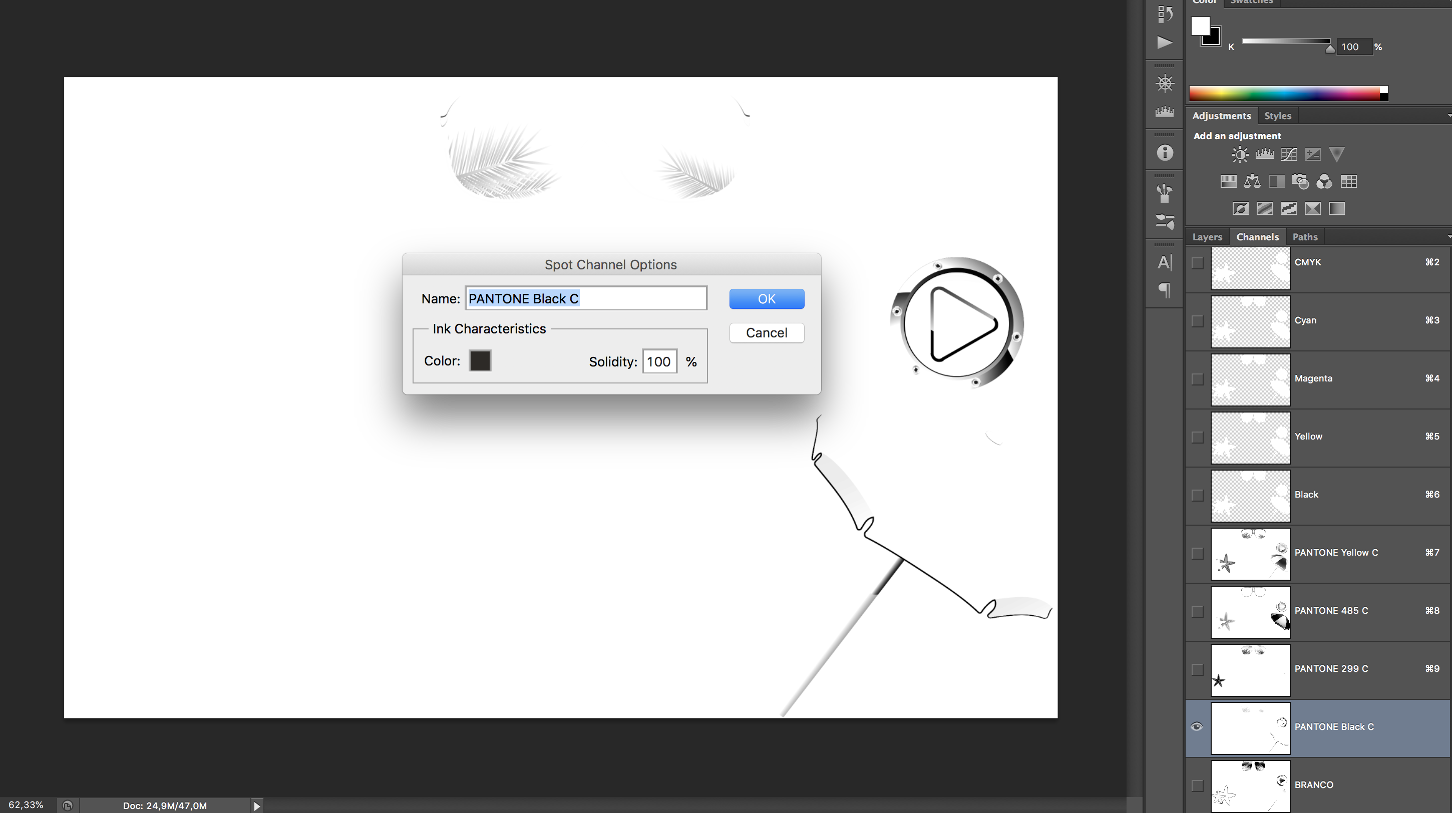
Command click a single process color channel preview to load a luminosity mask. Then make a new spot PMS channel that corresponds that selection. For a PMS Red I would usually use the magenta channel. Then delete the process channels when done, or make a curve adjustment layer on the top that sets CMYK to 0.
Then I run color corrections & calculations to get the tonal values needed. My preference has been to use calculations rather than apply image, but nothing wrong with apply image just seems calculations gives you an extra option for source outside of the final result.
Copy link to clipboard
Copied
Usually the reason for spot colors is to avoid or minimize halftone screens, or you are trying to get outside of the CMYK gamut. I'm not seeing either of those problems in this case—the red, yellow, and blue Pantones are in a typical CMYK gamut, and there will be halftone screens. The soft proofing in this case will be a nightmare because the spot color mixes can't be profiled. There certainly will be an unusual dot gain, and maybe a total ink consideration?
Copy link to clipboard
Copied
Interesting. I’ll try with calculations too. And when you use either apply image or calculations, you keep visualizing the results n black and white? (just revealing the channel you are working), or there is a way to see it in the real color that you want to achieve?
Copy link to clipboard
Copied
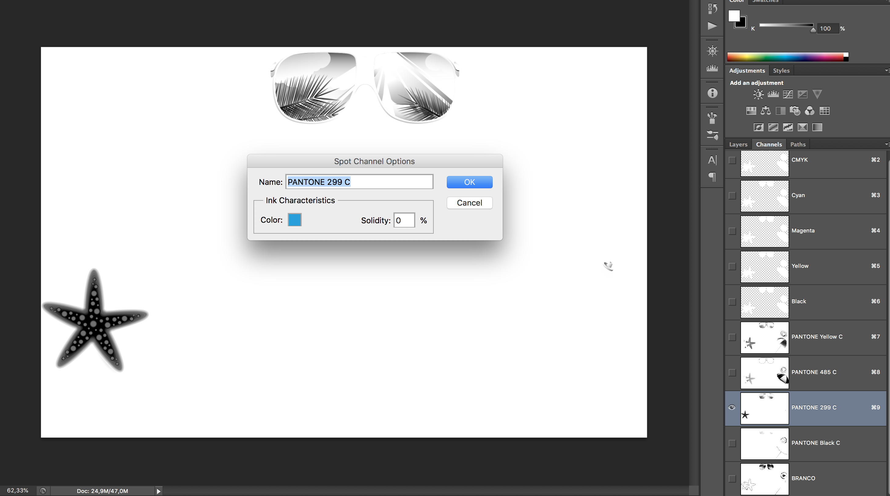
Once you created all spot channels and suppressed the CMYK what you see on a color calibrated screen is actually pretty close to what you will get. The RGB color gamut is pretty big and covers most of PANTONE. The colors you have are also very common and I work with them often 109 & 485. The 299 will look a little more saturated then C&M would have, but I think you will like than even better as most people do.
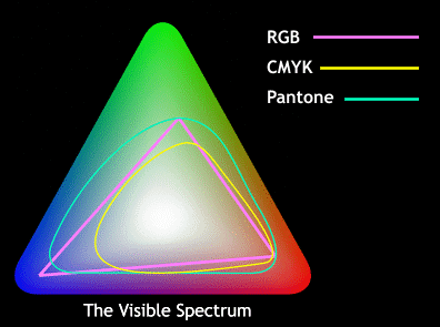
Teals to me are the toughest to match and the graphic above shows that. You may google and find other Illustrations of this comparison, but in my experience/opinion this is more accurate showing the teals in Pantone having a larger gamut than RGB and especially CMYK, blues and chartreuse also tough to match but not as bad as teal.
I sometimes do not even use calculations, never levels, but curves and channel mixer for this are most useful.
What I do not know 100% is exactly what the printer does where the inks overlap (color halftone areas which is most all your art), as they need to create a stay away so the inks do not touch and smear. They probably use some UCR or.stipple dot technique to create space between the inks. On press checks I go for those are the areas with most color shifts, as everything from humidity to ink viscocity will affect the dot gain and how close those inks come to touching, and minimizes plate pressure adjustments.
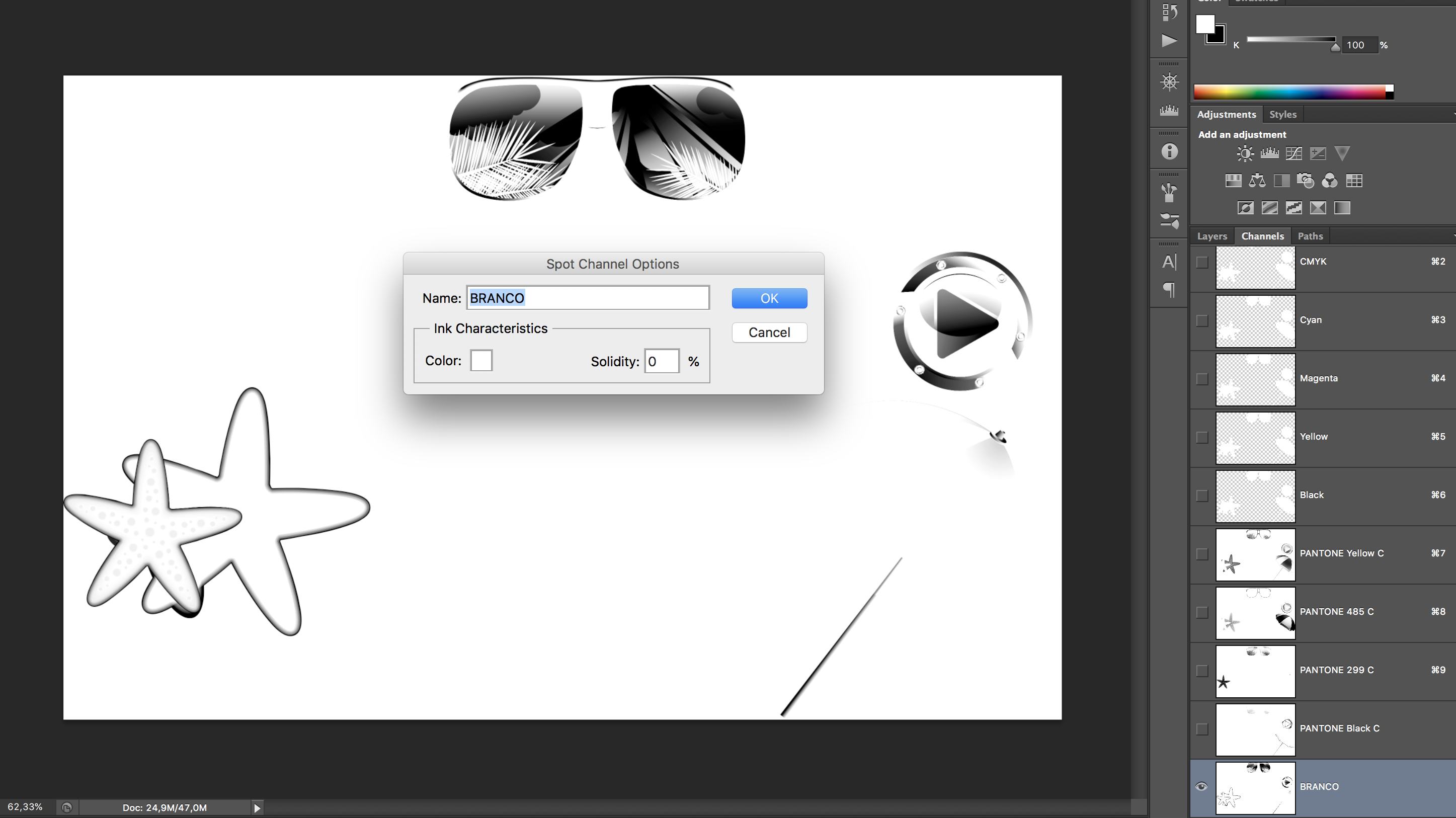
Not sure which printer you are working with, but likely it is Ball or some subsidiary of Ball under a different name as they are quite international and the major player/innovator in this print process. Branco is Portuguese if my guess is correct?
Copy link to clipboard
Copied
Yes. Branco is white in Portuguese. What I do at work is adjusting the text, every vector and creating holdbacks between the special colors. I dont work with these conversions so I don’t know how to answer your question. And I’m trying to learn how to convert these images by miself (and with the forum). I’m Brazilian and maybe my English is a little bit strange. Thanks for the help!
Copy link to clipboard
Copied
You are printing on an aluminum can, so you need a white plate to put under inks where you want that to be very readable (eg: UPC so that it scans).
Preparing art for aluminum can printing/dry offset is not something one does without experience as you need to make stay aways to keep 2 transparent inks from touching (with the exception of opaque white)
https://www.cask.com/wp-content/uploads/Aluminum-Can-Specs-Template.pdf
Copy link to clipboard
Copied
Man, this PDF resumes everything that I do at work. The only thing that I don’t master is converting colors, but I’m sure that with the help of all of you I’ll be able to do it. Thanks!
Copy link to clipboard
Copied
Does anyone knows where do I find more literature and/or courses about graphic specifications for aluminum and other substrates and processes?
Copy link to clipboard
Copied
Once you created all spot channels and suppressed the CMYK what you see on a color calibrated screen is actually pretty close to what you will get.
If the spot colors are by themselves, at 100% and defined as Lab values that were read from a printed swatch, then yes. But there's no way to profile mixed spot colors and tints the way you can with process CMYK, and the accuracy of the soft proof depends on the print profile as well as the monitor profile. In this case it would be hard to justify the spot colors because they are inside the CMYK gamut.
Photoshop does have a crude spot color dot gain setting, but there's no way to profile what that curve should actually be, or profile the appearance of the 4 solids when they overprint and mix.
Copy link to clipboard
Copied
Is the white printing as an under color? If that's the case I would think you would want an extra spot color to simulate the can color, that doesn't get output (you could prevent output via an ink alias over in InDesign), and with the white going down first as another spot ink
Also, the Solidity setting would have a significant affect on the preview—I'm guessing you didn't mean to set 299C to 0%. You would want to talk to the printer about the ink opacity and print order.
80%
50%

Copy link to clipboard
Copied
I know this is a very old post but I have found recently this plugin, just take a look
https://www.youtube.com/channel/UCoNki4ICUmgAaHj3auCbyIg/videos

Find more inspiration, events, and resources on the new Adobe Community
Explore Now
 AdChoices