Known Participant
November 26, 2021
Answered

Color Calibration Base On Existing Profile

  • November 26, 2021
  • 6 replies
  • 4407 views

Hello!


May I ask a question about color calibration on MacBook Air here, I know this is an Adobe forums, but as long as here are so many professional designers and photographers, seems I could get your help other than other forums.


Background:

In my Macbook Air, the screen color is yellow tint, so I tried to calibrate the white point.

However, I found that compare to external monitor, the color on Macbook is not that vivid as well.

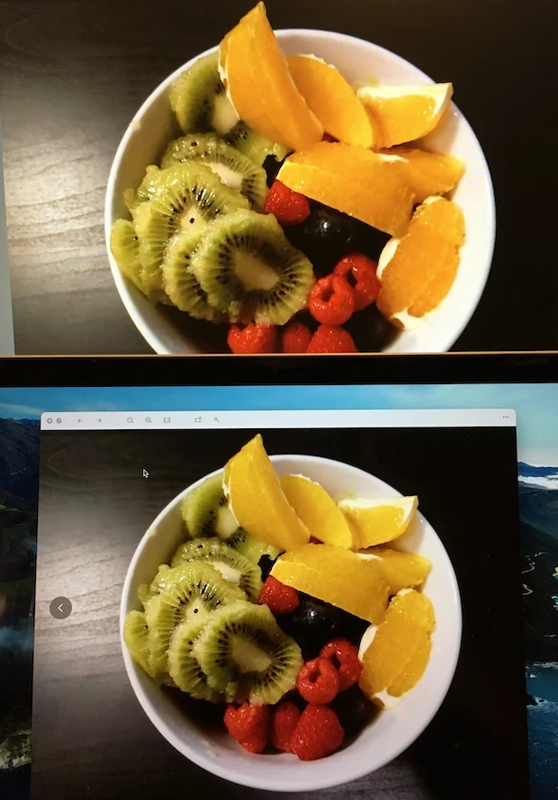
From following photo you can see: Upper one is external display, the bottom one is Macbook Air,  you can see the "Orange" color is so different. So does happen on other "amber, yellow" colors sets as well.


So, on the Macbook screen, I tried to apply a color profile: sRGB IEC61966-2.1, which is using on the external display, it makes the color more vivid - However, the problem is, the whole screen change back to yellow tint again.

From following photos you can see:

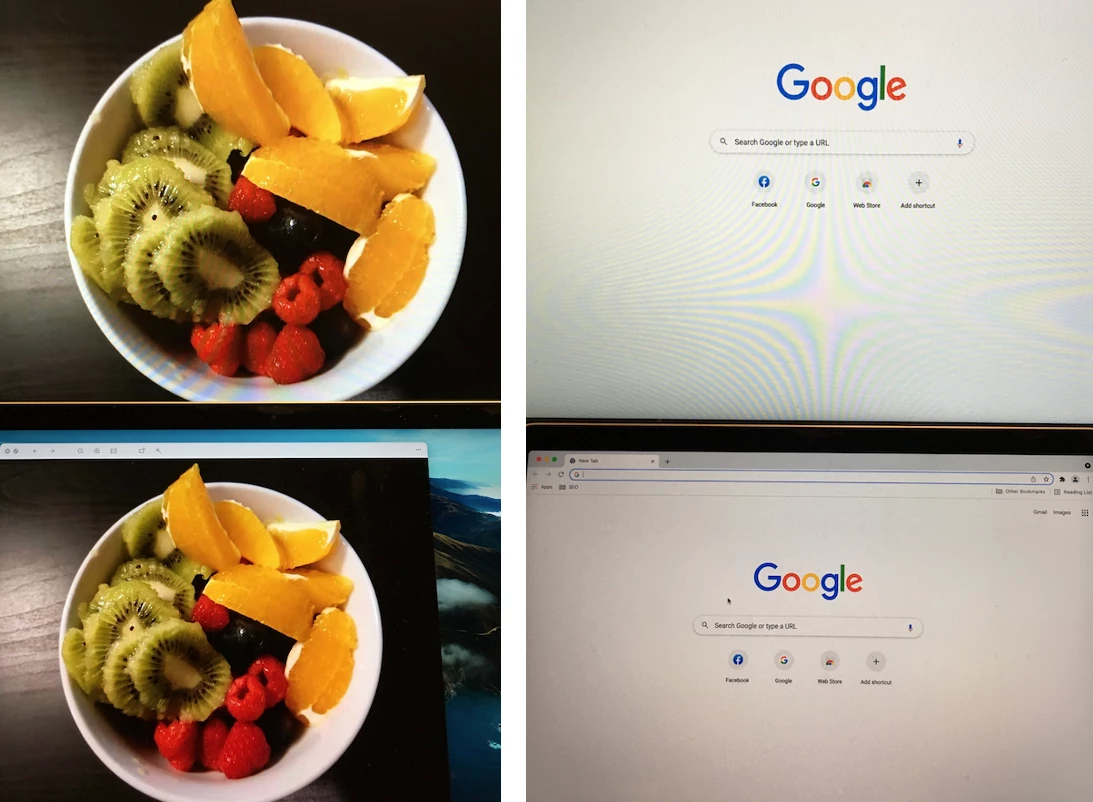
Left: After applying the color profile, the color is vivid on the bottom (Macbook) screen.

Right: After applying the color profile, the yellow tint come back on the bottom (Macbook) screen.


Steps:

As a result, I wanted to do the color calibration on the basis of sRGB IEC61966-2.1, which failed at the final step, what I've done:

1. Select current profile, then click "customize"


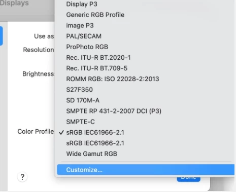
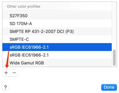
2. In the new window, select the profile again, then click Option + "+"


3. Calibrate followed by the steps: select the wanted white point

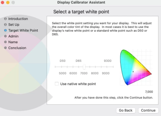
untile this step, the image showing on the screen is perfect: with vivid color (as sRGB IEC61966-2.1 is applying) AND the white point is updated - no yellow tint at all.


Problem:

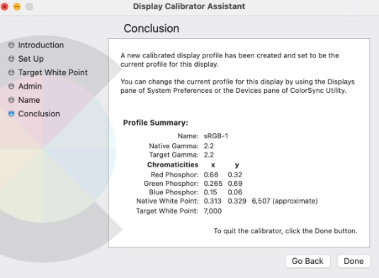
But then the problem comes in the final step:


4. After clicking "Done", I can clearly notice that, on the screen, the white point is calibrated (with no yellow tint), but, all vivid color saturation, vibrance are gone. It just feels like the new calibrated profile is not on the basis of sRGB IEC61966-2.1.


Please Help:

So, I am here to ask you help, could you please advise how to calibrate or create a new profile on the basis of existing one, only change the white point value?


Your inputs are appreciated.

Have a good day!


This topic has been closed for replies.
Correct answer NB, colourmanagement

I'm afraid that comparing an actual fruit to an onscreen image of it tells you nothing about correct setup.

For that test of accuracy after calibration and profiling - you need something like this http://www.colourmanagement.net/products/icc-profile-verification-kit


It goes like this: -

The fruit is photographed. 

The camera or the raw processing software has an ICC profile - that is what sets the RGB colour of captured objects. The camera profile (or [after conversion] a working space profile like Adobe RGB) is embedded in the image.


It seems you "like" the appearance on the Samsung display. Unfortunately, that opinion is entirely irrelevant to a colour managed workflow.

What you need is a CORRECTLY calibrated and profiled display screen [could be your Samsung, could be the Macbook, could be both] - and then if [when working the calibrated profiled screen] you don't like the on-screen match to reality - you will adjust images using Photoshop 'til the match is to your satisfaction. 

We don't use colour management to provide a match to a liked device (although good input/camera profiles do help with matching of captured items] we use colour management to provide us with a REAL view on images so we can adjust them WHILST VIEWING ACCURATELY.

That way, if you send images out to a client, or to get prints, the other persons colour managed screen will show the same image appearance. 

[By the way, a display screen should be viewed in rather subdued light, objects [your fruit] (and prints) should be viewed in good daylight. SO unless you have a daylight 'light booth'* you CANNOT hold up items next to the screen and look for a match. IF the light it bright enough to illuminate an object, then its way too bright for proper viewing of the display screen. 

* light booths: https://www.colourmanagement.net/products/gti-lite/#PDV_e_desktop_viewers


I hope this helps
neil barstow, colourmanagement net :: adobe forum volunteer
google me "neil barstow colourmanagement" for lots of free articles on colour management
[please only use the blue reply button at the top of the page, this maintains the original thread title and chronological order of posts]

6 replies

NB, colourmanagement
Community Expert
NB, colourmanagementCommunity ExpertCorrect answer
Community Expert
November 30, 2021

I'm afraid that comparing an actual fruit to an onscreen image of it tells you nothing about correct setup.

For that test of accuracy after calibration and profiling - you need something like this http://www.colourmanagement.net/products/icc-profile-verification-kit


It goes like this: -

The fruit is photographed. 

The camera or the raw processing software has an ICC profile - that is what sets the RGB colour of captured objects. The camera profile (or [after conversion] a working space profile like Adobe RGB) is embedded in the image.


It seems you "like" the appearance on the Samsung display. Unfortunately, that opinion is entirely irrelevant to a colour managed workflow.

What you need is a CORRECTLY calibrated and profiled display screen [could be your Samsung, could be the Macbook, could be both] - and then if [when working the calibrated profiled screen] you don't like the on-screen match to reality - you will adjust images using Photoshop 'til the match is to your satisfaction. 

We don't use colour management to provide a match to a liked device (although good input/camera profiles do help with matching of captured items] we use colour management to provide us with a REAL view on images so we can adjust them WHILST VIEWING ACCURATELY.

That way, if you send images out to a client, or to get prints, the other persons colour managed screen will show the same image appearance. 

[By the way, a display screen should be viewed in rather subdued light, objects [your fruit] (and prints) should be viewed in good daylight. SO unless you have a daylight 'light booth'* you CANNOT hold up items next to the screen and look for a match. IF the light it bright enough to illuminate an object, then its way too bright for proper viewing of the display screen. 

* light booths: https://www.colourmanagement.net/products/gti-lite/#PDV_e_desktop_viewers


I hope this helps
neil barstow, colourmanagement net :: adobe forum volunteer
google me "neil barstow colourmanagement" for lots of free articles on colour management
[please only use the blue reply button at the top of the page, this maintains the original thread title and chronological order of posts]

Known Participant
November 30, 2021

Appreciate this further and very clear explanation.

Your inputs help a lot on my understanding.

Have a safe and joyful day!

NB, colourmanagement
Community Expert
Community Expert
November 30, 2021

Albatross, thanks I much appreciate your gratirude, its sometimes intriguing trying to explain the colour management concept.

do follow those links to my website and increase your knowledge


I hope this helps
neil barstow, colourmanagement net :: adobe forum volunteer
google me "neil barstow colourmanagement" for lots of free articles on colour management

NB, colourmanagement
Community Expert
Community Expert
November 29, 2021

HI, when you run the OSX calibration tool it makes a new calibration AND profile, you can't base that calibration on another profile by starting out with it selected.

I wrote

The Mac "System Profile" is set in the System Preferences / Displays pane. This allows OSX to pass on information about display characteristics to applications such as Photoshop.

The selected "System Profile" should be a display profile [the ICC display profile describes the characteristics of a specific calibrated display].

The selected "System Profile" should not be a working space like sRGB.


you replied

"On the other hand, above statement is what I am confusing:

As you can see, I have already chosen "S27F350" as color profile in "System Preference > Display", then do a "Calibrate" profile by using the MacOS default under "S27F350" has been applying...but after calibrating, in the final steps, the color space just changed....See this attached video file."


SO, you're choosing S27F350 (which is NOT a profile for your Apple MacBook screen), then calibrating using that OSX visual tool - so - the process IS discarding S27F350 and making a new calibration AND profile 

that’s the CORRECT behaviour

does that make sense?


I hope this helps
neil barstow, colourmanagement net :: adobe forum volunteer
google me "neil barstow colourmanagement" for lots of free articles on colour management
[please only use the blue reply button at the top of the page, this maintains the original thread title and chronological order of posts]

Known Participant
November 29, 2021

@NB, colourmanagement , thanks for this get-to-the-point answer! 

NB, colourmanagement
Community Expert
Community Expert
November 27, 2021

" It's saying: there is a System Profile, which is describing the actual behavior of the Macbook display, all the rest profiles are just "match".

So, although user can apply other color profiles (let's say profile: S27F350), they work as-is, once user proceeds "Calibrate" action in MacOS default tool, it will call the "System Profile" while applying the calibrated white point, instead of calling current applying (profile: S27F350) with new calibrated white point.


The only way to get both "vivid color" and "new white point" is to use calibrateor to create new profile."


The Mac "System Profile" is set in the System Preferences / Displays pane. This allows OSX to pass on information about display characteristics to applications such as Photoshop.

The selected "System Profile" should be a display profile [the ICC display profile describes the characteristics of a specific calibrated display].

The selected "System Profile" should not be a working space like sRGB.

[sometimes we do se sRGB for troubleshooting but we don't leave it that way.]


Apple build a display profile automatically based on the known characteristics of the connected display - yours is likely called "Color LCD" so that's the default "System Profile".


To improve on that profile requires using a device (most often a colorimeter sensor) - this connects to software which first calibrates the display by adjusting it creating an LUT (Look Up Table) and loading that to the video card. Next, the software builds an ICC display profile which describes the calibrated display's characteristics to colour management aware applications.


For those who require it, SOME calibration and profiling application programs [such as my favoured basICColor display*] do allow setting a target colour space [for example sRGB] as a basis for the calibration target. Once that display is calibrated and profiled it should be a quite close match to sRGB [mainly in the tonal curve]..


*https://www.colourmanagement.net/products/basiccolor/basiccolor-display-software/


Using a good calibration application program and a good colorimeter is the only way to accurately set up a display [calibrate and profile] for serious image work.

As D.Fosse and others have mentioned, target white point and luminance (brightness) are options you can set yourself - I do this based on user perception. [set target white point and luminance, calibrate and profile, does it look right compared to an unequivocal reference? no, try altering the target white point and luminance in small steps [calibrate and profile each time] to reach accurate matching to the reference].

This process allows better matching to a well illuminated proof print** IMO that’s the ONLY way to guarantee display accuracy.


**https://www.colourmanagement.net/products/icc-profile-verification-kit/


For accurate display of images, then, it's not a matter of taste, or of matching another display - its about accuracy which can only be achieved by analysis. [using good calibration application program and a good colorimeter].


The OSX default [visually based] calibration utility is pretty much useless, even if you have a visual target [like a proof print] to match, its just not accurate enough for serious work. Different users of that utility - all aiming for accuracy - each may end up with differing appearance. That is NOT what colour management is about - you may like to read more here: https://www.colourmanagement.net/the-basics/what-is-colour-management/


I hope this helps
neil barstow, colourmanagement net :: adobe forum volunteer :: Apple Solutions Expert
google me "neil barstow colourmanagement" for lots of free articles on colour management
[please only use the blue reply button at the top of the page, this maintains the original thread title and chronological order of posts]

Known Participant
November 28, 2021

@NB, colourmanagement , thanks for the reply with details, it's helpful, it's introduced how the color space (Profile) working, and professional tools to use.


The Mac "System Profile" is set in the System Preferences / Displays pane. This allows OSX to pass on information about display characteristics to applications such as Photoshop.

The selected "System Profile" should be a display profile [the ICC display profile describes the characteristics of a specific calibrated display].

The selected "System Profile" should not be a working space like sRGB.


On the other hand, above statement is what I am confusing:

As you can see, I have already chosen "S27F350" as color profile in "System Preference > Display", then do a "Calibrate" profile by using the MacOS default under "S27F350" has been applying...but after calibrating, in the final steps, the color space just changed....See this attached video file.


So, I think the best way is as you and other professionals advised, to use a program / application to do the calibration, not the MacOS default one, to get better result.

Thank you for the links for extend reading, I will read and try to understand that.


Have a good day.

josephlavine
Community Expert
Community Expert
November 27, 2021

Your best and only accurate option is to use a hardware and software setup to calibrate and profile your monitor(s).

The two main options are the Datacolor Spyder and Xrite i1; both do an excellent job.

warmly/j

Known Participant
November 27, 2021

Thanks for the reply and recommendations

D Fosse
Community Expert
Community Expert
November 27, 2021

No, this will never work. This is based on a misunderstanding.


A monitor profile doesn't do anything, it doesn't affect the display at all. A profile is a description of a color space.


The monitor profile has only one purpose: to describe the actual and current behavior of the display. The profile is a map, and it needs to correspond to the actual terrain. Only one profile is the correct one. Change the display behavior, and you need a new profile describing that behavior.


This is why you use a calibrator.


You're confusing all this with calibration. These are two different things. Calibration is changing the dsplay behavior (but at much lower precision than the profile).


Calibration performs one important function: setting the monitor white point (color and brightness). The white point defines the environment you're working in, and the environment color management works in. It sets the whole framework, and the profiles work relative to that white point.


With this set, document white (255-255-255) is just remapped to monitor white (255-255-255).


In short, don't mess with the profile. Get a calibrator, and use it. Once you have that, you can consider a good monitor white point to work with. As a rule of thumb, monitor white should be a visual match to paper white in your standard viewing light. For most average conditions, 120 cd/m² and D65 is a good starting point.

Known Participant
November 27, 2021

Thanks for this very detailed reply.

I read it carefully and tried to understand it. 

One thing I am still confusing is, let's say:


I just applied sRGB IEC61966-2.1 to Macbook, then the display is using this profile, the color is vivid, but when I try to do a "Calibration", no matter which profile it is using, the "Calibration", after the "Calibration" can only on the basis of default profile / setting of the display?

Otherwise, I just don't understand why until Step 3, color, white point were displaying perfect, just after Step 4 clicking "Done", all color gones, but the calibrated white point takes effect.


In another word, is there any way can make me use every discription in sRGB IEC61966-2.1 but just change the temprature or white point?


Appreciate again!

Have a good day.

D Fosse
Community Expert
Community Expert
November 27, 2021

What I am confusing is, as you said, "white point is setting independently, to color system, white is white", so I just want to adjust the white point while applying a color profile (let's say S27F350), but why after "calibrate" the white point, after click "Done", will inpact the color displaying - it is managed by the profile not white point...

I just upload a short streaming file, for reference, you can see how the color change before / after a white point calibration, which shall not be impacted.


I think you should sit down and try to understand the difference between monitor profile and monitor calibration.


A lot of people confuse those, so you're not alone. It doesn't help that we just speak of "calibrators", as if that was all they did. But in fact it will first calibrate, then make a profile based on that calibration. Those are two independent operations.


The calibration consists of setting white point and black point, and neutralize R=G=B relative to the white point.


The profile is something else. An icc profile is a map of a color space - in this case the monitor color space in its current calibrated state. This profile is a standard icc profile, used by the application in a standard profile conversion. The profile doesn't do anything - the application does; based on the profile. The result of the profile conversion is sent to the display, thus representing the file correctly on screen.

Eugenio.NYC
Participating Frequently
November 27, 2021

Hi, in my opinion, and the way that I do calibration, I use the i1Display Pro from x-rite to calibrate the monitors that I use and I create a custom color profile.

In addition you can see how different are your monitors color profile using the ColorSync Utility app in your Utilities folder inside your applications folder in your Mac.

My Best

E

Known Participant
November 27, 2021

@Eugenio.NYC 

Thank you for the reply, with a professional way advised.

I check in the ColorSync Utility and see the difference between the color space applying in my Macbook and External Display, also tried applying the color profile on my Macbook to External Display then find the color are more closer.


I think that is the main reason why vivid color displayed on External Display.

...So, may I ask, is there a way to just adjust or create a color profile on the basis of sRGB IEC61966-2.1, but only change the temperature / white point?


Have a good day.