- Home
- Photoshop ecosystem
- Discussions
- Colors of the edited image looks different on Mac ...
- Colors of the edited image looks different on Mac ...
Copy link to clipboard
Copied
Hi guys!
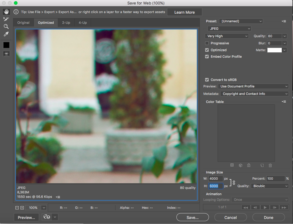
Desperately need your help on this one. So I edited my pictures, saved them (tried both "save as" and "save for web" options) on my Mac and colors aren't just there, same situation when I open those images on the Iphone. They look desaturated or something (please take a look, I made screenshots of how it looks in photoshop before saving and the other one is the same picture saved and opened with Preview). The tricky part is that when I upload the same pictures on a facebook or instagram and look at them using web browser on the same laptop - the colors are exactly as I intended them to be while editing on Photoshop. This drives me crazy, please advise on how this can be fixed.
 1 Correct answer
Hi
You write:
“Does that mean the problem is with devices I use (all Apple devices in general)? Is that can be fixed somehow?”
Yes, but if your main computer screen is properly colourmanaged [vital] and you save files as sRGB, images should look fine on iPad and iPhone.
Wide gamut screens throw a spanner into the works for web viewing with non colourmanaged browsers. Currently that seems unfixable.
In the save for web windows you show, the lower one looks right because you selected use document pro
...Explore related tutorials & articles
Copy link to clipboard
Copied
This is why color management was invented.
I normally try to avoid "read-up-on-this"-answers, because it seems like a cop-out (what you're really saying is I know and you don't). Most things can be explained rather simply. But in this case the subject is just too large to cover in a forum post.
The Photoshop help files is actually a good place to start, and from there, there's a ton of good resources on the web. Just google "color management".
Just a tip: avoid those who try to make it sound complicated. They probably don't understand it. The functional principles are fairly simple.
Copy link to clipboard
Copied
...all right, I'll take a crack at it. This is just the general idea, not the specifics.
Photoshop has a color managed display path.
This means that
- the RGB numbers in the file are defined by an embedded icc profile. An icc profile is a description of a color space. Standard color spaces are sRGB, Adobe RGB and ProPhoto.
- the display has its own native color space, also described by an icc profile. This profile is normally made with a calibrator, measuring the displays's response, but the system will basically work with a generic profile that isn't too far off (although less accurate).
- the application's color management module then converts (remaps) the original RGB numbers from the source color space, to the display color space, using both these profiles. The numbers are recalculated so that color appearance remains correct.
- this is done by Photoshop on the fly, as you work, without any user intervention.
- without this recalculation, without color management, different displays will display the very same RGB numbers unpredictably, in wildly different ways. As they do in your case.
Copy link to clipboard
Copied
Hi viktormelnyk
D. Fosse is right, this is why colourmanagement was invented.
His description is helpful for you I hope. I’ll try add a bit more explanation.
D. Fosse mentions the “Standard color spaces - sRGB, Adobe RGB and ProPhoto”
Those are “document colour spaces” (in “Adobe speak” images are documents).
An idea for you to try out:
In Photoshop, convert the original to sRGB [edit/ convert to profile] then save with the sRGB profile embedded.
[saving with the sRGB profile embedded is normally the default]
I have tested that with an image of my own:
If I put that image up online and view on an iMac using Firefox or Google Chrome browsers then they look very similar to the original image when viewed in Photoshop.
Here it is: http://www.colourmanagement.net/images/uploads/products/Profile_verificationMini.jpg
When I view that same website image on my iPhone using safari or google chrome the appearance is also very similar.
Issue with Firefox an large gamut screens:
I also have a large gamut Eizo screen connected to my Mac.
With such a large gamut device the colourmanagement is vital because without it colours can get boosted (over saturated).
D. Fosse writes:
“the application's color management module then converts (remaps) the original RGB numbers from the source color space, to the display color space, using both these profiles. The numbers are recalculated so that color appearance remains correct.”
That’s what colourmanagement does.
In Firefox the image colours appear enhanced (boosted), this means that in this case Firefox is not dealing with the colour properly (colourmanagement is not being used).
I hope this helps
if so, please do mark my reply as "helpful" and if you're OK now, please mark it as "correct" below, so others who have similar issues can see the solution
thanks
neil barstow, colourmanagement
Copy link to clipboard
Copied
Thank you guys very much for spending time trying to help! I know, for some people it might be easy to understand, apparently I am not one of them. I went through a couple of articles on the internet, and one of the major points there was that color management is basically something you would need for printing your images with accurate colors (the ones you see in the Photoshop). In those articles, they refer to printers as "other devises". My "other devises" are my laptop and my phone. I tried different settings in "Color settings" section, even managed to see colors I wanted for my image in photoshop's preview while saving, using "save for web" option. Still, the image looks different when saved. I also tried the workflow you advised NB, colourmanagement, but unfortunately, it didn't help. I've made some screenshots of my workflow, maybe you could take a look at them and tell me what I do wrong? The screenshot with my settings also attached. Look forward to your reply.


Copy link to clipboard
Copied
The basic confusion in much of this, what throws people off, is that color management is basically invisible - until it stops. And that's exactly what happens when you look at your jpegs in some arbitrary browser or photo viewer. When color management stops, in applications that don't do it, or perhaps because of a broken profile - then you see it.
And then people jump to the wrong conclusion. They say color management is broken. It isn't - it was just stopped dead in its tracks, not allowed to continue doing what it does.
This isn't a problem as long as you understand what's happening, and understand what you're looking at. It's perfectly possible to work with a mix of full color management and no co color management. You just need to take some basic precautions.
The most basic precaution of all is to convert to sRGB any material that is intended for non-color managed environments. Most monitors reproduce close to sRGB already, so if you feed such a system sRGB data, it will be roughly right even without color management. Not entirely correct, but close enough. Still, it's important to remember that there will never be a perfect match. That's normal and doesn't mean something's wrong.
Copy link to clipboard
Copied
OK, I’ll try.
I’d appreciate a “helpful” my friend ’;~}
The screenshots:
1:
embedded profile mismatch:
Here it shows that your image has the embedded colourspace “Display P3”
I think the time for Dispkay P3 or similar will come as many desktop screens and handhelds are P3 gamut. However that time is not yet with us (updated in 2025) so fur now, that’s not an ideal way to work, in photoshop your images should be edited and stored in one of the standard colour spaces like sRGB or Adobe RGB for more print based workflows.
How did that pic get to be embedded with “display D3”?*
Note* you do NOT need to embed the display profile,
photoshop deals with display accuracy in the background using the image profile and the screen profile.
So do other colourmanagement savvy applications
2:
Save As:
you are using “ embed colour profile” that’s good practice
3:,Save for web;
“Embed colour profile” is checked
- that’s good IMO, even though it increases file size a tiny bit that's not really relevant these days - that policy allows browsers to do their colourmanagement thing.
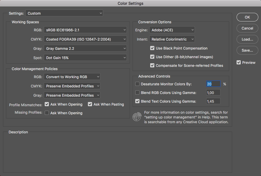
4:
Color settings:
“Working space” = sRGB, thats OK, good choice for Internet, iPad phone etc.
5:
Color Management policies:
you have “convert to working RGB”, I try avoid conversions in background, I like to know what I am doing
Generally I would have “preserve embedded profile” selected there
As you have “Profile mismatches” set to “ask when opening”
you’ll get a warning when opening files from another colourspace
I hope this helps
if so, please do mark my reply as "helpful" and if you're OK now, please mark it as "correct" below, so others who have similar issues can see the solution
thanks
neil barstow, colourmanagement
Copy link to clipboard
Copied
How did that pic get to be embedded with “display D3”?*
Probably because it's a screenshot from a new iMac or MBP. They have DCI-P3 wide gamut displays as standard, and MacOS assigns the display profile to screenshots. That's fine, as long as you convert to a standard color space afterwards.
I've been watching from the side, to see how this new Apple policy of wide gamut displays works out. Previously, people who bought wide gamut displays largely knew what they were getting into and understood the implications.
Now, everybody and his brother gets them, without any idea what it means. These customers don't know that a wide gamut display changes all the rules. They don't know that they now need to observe strict color management procedure all the way. Apple still tell their customers that "it just works". But as we see, it's not that simple.
So I repeat what I've been saying a lot lately: a wide gamut display requires full color management at all times. Applications without color management cannot be used. The display must be properly calibrated and profiled, so that these color managed applications have a valid monitor profile to work with. The profile needs to describe the display's actual, current response.
Copy link to clipboard
Copied
Hi D.Fosse,
yes, I thought it might be a screenshot, not an ideal candidate for colour tests but as you say converting to sRGB fixes that. My explanation was an attempt to describe ideal colourmanaged workflow! Normally that doesn’t start with a screen capture.
you wrote:
So I repeat what I've been saying a lot lately: a wide gamut display requires full color management at all times. Applications without color management cannot be used. The display must be properly calibrated and profiled, so that these color managed applications have a valid monitor profile to work with. The profile needs to describe the display's actual, current response.
yep, totally agree with that, the wide gamut display is quite the loaded gun.
neil b
Copy link to clipboard
Copied
ALL displays need full color management at all times!
The color gamut of a display alone doesn't change that fact.
To the OP: Tag (assign) your screen captures with your display profile, convert to sRGB or any RGB Working Space you intended to preview color managed. Done.
Copy link to clipboard
Copied
How did that pic get to be embedded with “display D3”?*
Hi guys, so this Display D3 (as I understand it) is the embedded color profile of the original image, it wasn't a screenshot that I was opening in the Photoshop - it was an original picture uploaded from my camera to laptop. NB, colourmanagement D Fosse
Copy link to clipboard
Copied
viktormelnyk wrote
it was an original picture uploaded from my camera to laptop
You should change that in ACR's workflow options. Open in sRGB, Adobe RGB or ProPhoto (although I would not recommend ProPhoto until you have some experience). Any image file should always have a standard profile embedded.
This whole DCI-P3 business is becoming rather messy. I see Adobe has now started to call this "Display P3", available as an output space in ACR. This, incidentally, is what Apple calls their display profiles.
But those two are not the same, and should not be confused! Apple's P3 displays don't match the DCI-P3 standard, any more than traditional wide gamut displays match Adobe RGB, or standard displays match sRGB. It's just a ballpark approximation, specifying the general type of display.
And in any case display profiles have no business as document profiles. The "Display P3" designation blurs that distinction.
Copy link to clipboard
Copied
Hi viktormelnyk
“Hi guys, so this Display D3 (as I understand it) is the embedded color profile of the original image, it wasn't a screenshot that I was opening in the Photoshop - it was an original picture uploaded from my camera to laptop”
that is a mistake, I feel. Display D3 is not suitable for image editing and storage unless under special circumstances.
You should be using a standard working space (such as sRGB or Adobe RGB ) for image editing and storage.
I recommend you reset the camera raw workflow to export as sRGB as that will best match across web and iPhone iPad etc..
I hope this helps
thanks
neil barstow, colourmanagement
Copy link to clipboard
Copied
Ok, I really hope this will be a solution to my problem;) So how do I reset the camera raw workflow? Do I need Adobe Bridge as it is mentioned here - Manage Adobe Camera Raw settings ?
Another question - would it be helpful if I open an original image in Photoshop, convert color profile from Display D3 to sRGB and save this image without any editing to my computer, and then open it again (with previously changed color profile, so it would match my working space) in the Photoshop for editing?
Copy link to clipboard
Copied
Just click the underlined link below the main image window in ACR. This opens the workflow options, where among other things you set output color space. Pick sRGB IEC61966-2.1 here.
This setting determines how the file will open in Photoshop, and it will always override the Photoshop working space (which is just a fallback default if no profile is already present).

Copy link to clipboard
Copied
And of course, I don't have this link) 
Copy link to clipboard
Copied
Hi,
below the image you should see the link which includes the output colorspace name

click that link and "workflow options" opens - then set sRGB here:
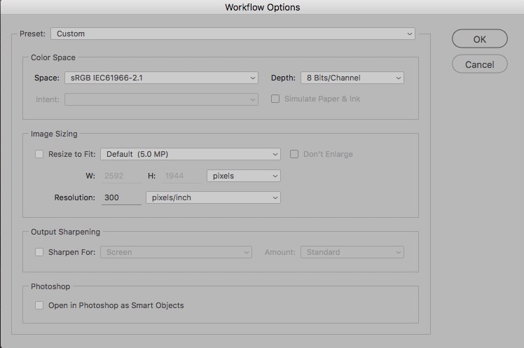
more info here: https://helpx.adobe.com/x-productkb/multi/camera-raw-color-spaces.html
Adobe Camera Raw and color spaces
I hope this helps
if so, please do mark my reply as "helpful" and if you're OK now, please mark it as "correct" below, so others who have similar issues can see the solution
thanks
neil barstow, colourmanagement
Copy link to clipboard
Copied
viktormelnyk wrote
And of course, I don't have this link
That means you're using the ACR filter on an already rendered RGB file (like a jpeg) - you're not using the ACR raw converter on a raw file.
In that case, use Edit > Convert to Profile in Photoshop. Or if you use Save For Web / Export As, check "convert to sRGB" and "embed color profile".
Copy link to clipboard
Copied
Yep,
you'll only see the RAW processing features when you are processing a RAW file.
Regards, Neil Barstow :: Apple Solutions Expert :: Colour Management Specialist
www.colourmanagement.net/
Copy link to clipboard
Copied
That's what I was doing earlier. I was converting color profile to my working space while opening the image for the first time in Photoshop. Like it is shown in this screenshot.
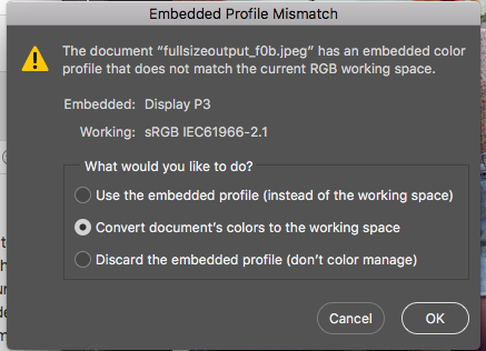
so after doing that, "Edit > Convert to Profile" section looks like this (source space and destination space are the same, so nothing can be changed here additionally I suppose)
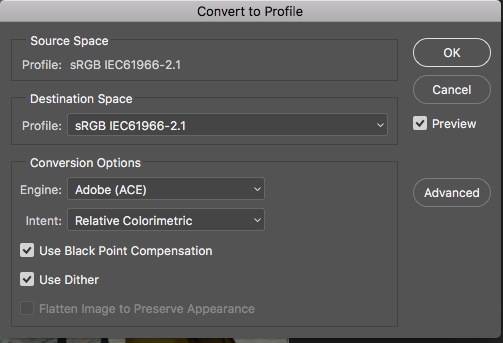
Regarding the second option (saving through "Save For Web / Export As") - as I was editing my picture and moving on to saving it, both "convert to sRGB" and "embed color profile" fields were checked - you can see this in the screenshot I attached earlier or here:

Is there another way to get to ACR workflow options?
Copy link to clipboard
Copied
As long as the file is sRGB it doesn't matter how you got there, whether convert to profile or ACR output.
This really isn't complicated. Some applications are color managed, and will always display files correctly. Monitor characteristics, whatever they are, are always compensated.
Some applications are not color managed, and then the monitor's characteristics determine how it looks. As we all know, all monitors are different. The way around that is to prepare the file in a color space that is as similar as possible to an average/generic monitor color space. This is the reason for the common practice of converting to sRGB - most standard monitors are already fairly close to sRGB.
If the monitor is not close to sRGB, such as wide gamut units, this won't work. Then you must have full color management.
Copy link to clipboard
Copied
Ok, I still have no idea what to do with different colors of my images. The image's color profile is sRGB and it looks different in photoshop and in the viewer on my computer.
Some applications are color managed, and will always display files correctly.
How does it work on Instagram? Is this application color managed? The same picture on the Instagram looks different if you look at them using the app on the phone and web-browser on the computer.
I also noticed one thing while saving the final image. As I go to "Save for web" the preview of the image, that I'm about to export, looks different as I switch the Preview option (next to "convert to sRGB" option) between "Monitor color"(wrong colors) and "Use document profile"(right colors), I also add screenshots where you can see the difference right away:
wrong colors -
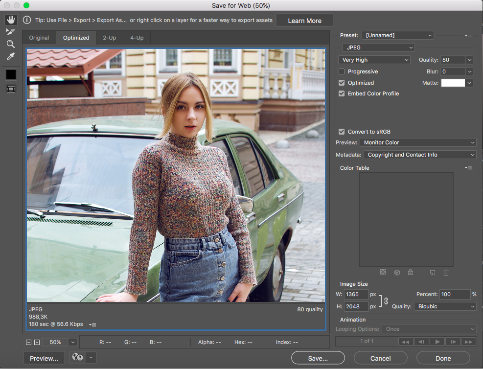
right colors -

Does that mean the problem is with devices I use (all Apple devices in general)? Is that can be fixed somehow?D Fosse NB, colourmanagement
One more thing, I'm just a beginner in the photography and photoshop, I'm not familiar with all this theoretical part, unfortunately. I would really appreciate if you could try to use the language that 5y.o. kid would understand. Maybe this way I will hopefully find a solution to my problem. Thank you for the time you are spending on this and for your efforts!
Copy link to clipboard
Copied
Nothing on a phone is color managed.
A web browser on a computer can and usually has a color management engine, which reads both the document profile and the monitor profile, and converts the data from one into the other so that it displays correctly. Policies and implementation do vary a bit between different browsers, though.
Remember that for color management to work, you need all these three components:
- a document profile that defines the colors in the file
- a monitor profile that describes the monitor's characteristics (its native color space)
- an application (program) that reads both these profiles and converts between them
If one of these is missing, the color management chain breaks down and the whole thing stops.
In Save For Web, you have different ways to preview the result. "Monitor Color" shows the file without any color management. "Use document profile" shows the file with full color management. The other two are hybrid settings of little use that can safely be ignored.
Copy link to clipboard
Copied
Hi
You write:
“Does that mean the problem is with devices I use (all Apple devices in general)? Is that can be fixed somehow?”
Yes, but if your main computer screen is properly colourmanaged [vital] and you save files as sRGB, images should look fine on iPad and iPhone.
Wide gamut screens throw a spanner into the works for web viewing with non colourmanaged browsers. Currently that seems unfixable.
In the save for web windows you show, the lower one looks right because you selected use document profile NOT “preview = monitor colour”. You are using colourmanagement there.
I am guessing the upper “wrong” save for web preview probably matches the “viewer” you mentioned. That would be because neither are doing colourmanagement.
The reason your images look different in the “viewer” and photoshop is that the viewer doesn’t do colourmanagement.
Instagram?
Can’t really answer that one, but Instagram on iOS with sRGB files looks great to me.
Otherwise, it would depend on what device you’re viewing, I guess.
If its in a web browser on a pc or Mac, there’s that in play too.
You may find this intersting:
http://cameratico.com/tools/web-browser-color-management-test/
I hope this helps
if so, please do mark my reply as "helpful"
thanks
neil barstow, colourmanagement
Copy link to clipboard
Copied
@D Fosse wrote:
Nothing on a phone is color managed.
Everything on an iPhone is color managed.
https://developer.apple.com/library/archive/technotes/tn2313/_index.html
-
- 1
- 2
Find more inspiration, events, and resources on the new Adobe Community
Explore Now

