Dashed & Dotted Lines Drive Me Crazy
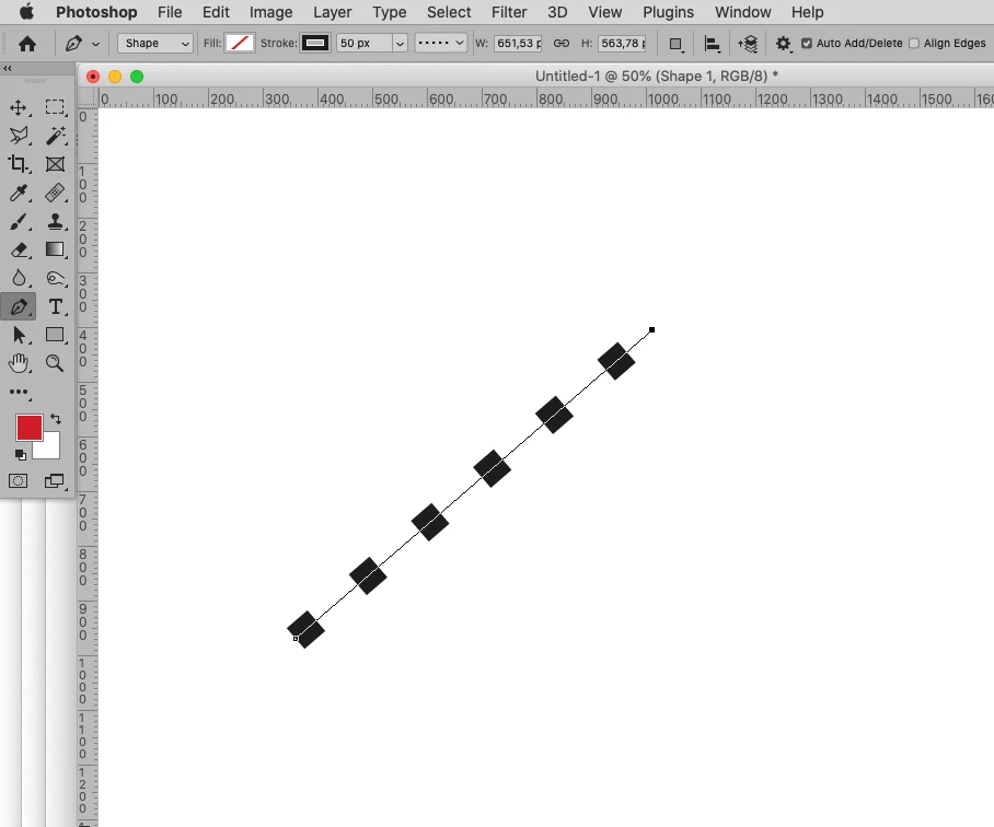
Does anyone reading this have complete mastery of dashed and dotted lines using the Line shape tool? Is there a secret relationship between the values for stroke, width and weight that will always produce perfect results with none of those annoying offsets? Should the stroke always be set to Inside or will Centre do in some circumstances? Do the Dash and Gap values have to relate to stroke, width and weight values?
It's something I still find frustrating, and if anyone says use Illustrator I am coming of your screen to get you. OK, we can stroke a path with a spaced out brush, but the vector tools exist in Photoshop and I'd like to be comfortable with them. I'd even be happy with a really good video, but The PTC does not have anything on the subject I can find. Colin Smith has a video that is half way there, but I am too distracted by his fly-away-hair to concentrate.
So who has the secrets?