Participating Frequently
June 26, 2019
Question

Decreasing layer opacity for specific area of layer

  • June 26, 2019
  • 3 replies
  • 1123 views

Hi,

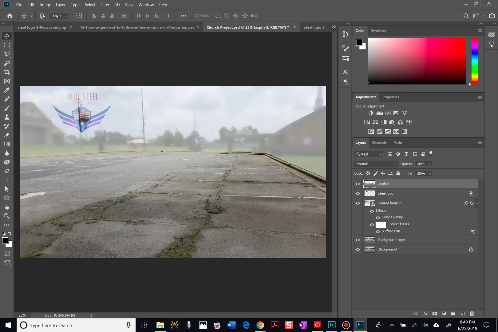
I am working on an image to the social media platforms we use for my family's asphalt business. The goal is to highlight how poor the initial state of the asphalt is on our latest job. I am working with 2 main parts of the original image: the asphalt layer (and some of the concrete is okay, too) and the background (everything that is not asphalt), which I labeled as "Blurred horizon". I chose to leave the asphalt layer in color to focus attention on the grass and cracks embedded all throughout the parking lot. Additionally, I chose to blur the horizon layer slightly and give it a white overlay. Lastly, I am placing our company's logo over the horizon layer. I used the layer styles to blend the logo to the underlying layer. However, the underlying layer is showing up through the logo rather noticeably in some areas. The best outcome would be to remove/ hide any of the underlying layer where the logo is currently occupying. How can I best achieve this from where I am now? Is there a more efficient path I could have used to reach my end result?

Thanks in advance for reading this and formulating a solution to help me...Thanks!!

This topic has been closed for replies.

3 replies

Legend
June 26, 2019

Duplicate the layer. Use a black layer mask to hide just the part needing a different opacity, then invert that mask on the second layer. Adjust the opacity of both layers to suit.

joshua17Author
Participating Frequently
June 26, 2019

Okay...give me just a bit to work on that. Thank you and I will see how that works!

Trevor.Dennis
Community Expert
Community Expert
June 26, 2019

We can see from the icons on the Logo layer that you are using Blend If.  I realise that some people like Blend if, but in reality, it is the work of the devil, and best avoided at all costs.  In fact with what is one of the most vital graphics you'll ever use in regards to your company, having the logo as a raster drawing on a white background is crazy.

Do you have the logo as a vector object with a transparent background?  If not, either create it, or paste it to this thread at a decent size, and I have a strong feeling someone will do it for you.  If you feel up to doing it yourself, use as many shape and text layers as you need, and join them as a Smart Object.  Then drag that SO to a Creative Cloud Library where you can grab it at any time.

That vector log layer should go at the top of the stack.

The way you have delineated the asphalt and concrete from the background is not looking nice, and I am not sure what you have done to get there.  I don't see any layer masks, and this situation is crying out for them.  I've used a layer mask to hide the lower part of this concrete car park.  It's a hard, stark cut off

But I can feather the mask in Mask Properties to soften the transition

I can even move where the transition is by unlinking the mask (the red highlight), and moving the mask.  This is flexible and non destructive, and can look much tidier than the way you have done it.

Overlaying with a layer filled with white, is probably not the best approach to 'whiting out' what lies below.  It can work, but I it would be rare for me to go that way.  There are infinite ways to achieve the same end with Photoshop, but what I have done below is

Add a Levels Adjustment layer

Move the highlight Input slider to the left making all pixels that fall to the right of it full white

And move the shadow Output slider to the right which lifts the shadow content.

I've split the mask so you can see before and after.  It's an approach that is flexible and non destructive, and you can mask where it has and doesn't have an effect.

Paste that logo here if you'd like some help with it.

Bojan Živković11378569
Community Expert
Community Expert
June 26, 2019

I was looking at later screenshot and it indicates (at least that is what I see) that layer with logo is surrounded with transparency.

joshua17Author
Participating Frequently
June 26, 2019

Yes, you are correct. I used the 'blend if' slider to make the logo have an opaque look. I changed it and here is the result:

That light pole is bleeding thru...how do you suggest I proceed from here? Is there any way to make the underlying layer not show up just in the area corresponding to the logo?

Bob_Hallam
Legend
June 26, 2019

Place the Logo on the top layer.  and make sure the blend mode is normal and opacity is set to 100%

ICC programmer and developer, Photographer, artist and color management expert, Print standards and process expert.
joshua17Author
Participating Frequently
June 26, 2019

This is what happened when I made those changes. The light pole is still showing thru the logo. I'm not very familiar with clipping masks, but I feel this is when one could be instrumental lol. Any suggestions?

Bob_Hallam
Legend
June 26, 2019

Sure looks like the logo is somewhat transparent.  Sometimes a solution for that is to duplicate the layer a few times and merge those duplicates to remove that.  Then add a layer mask (if needed)  and you should be good to go. 

ICC programmer and developer, Photographer, artist and color management expert, Print standards and process expert.