Participant
April 17, 2019
Question

Font looks different in Photoshop vs Word

  • April 17, 2019
  • 3 replies
  • 1509 views

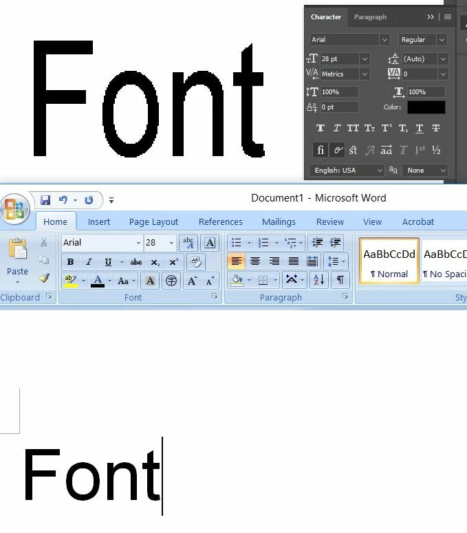
The font in Photoshop looks like it's being stretched, anyone know how to resolve this issue? I want it to looks the same as in Word.

    This topic has been closed for replies.

    3 replies

    jane-e
    Community Expert
    Community Expert
    April 17, 2019

    Hi Adam,

    I see an insertion point in the Word text, but not in the Photoshop text. Please click and insertion point with the Type  tool and post another screen shot of the text and the Character panel.

    Is it Point type or Area type?

    ~ Jane

    Participant
    April 17, 2019

    I've tried it with Horizontal Scale set to 100%, but still doesn't looks right

    Nancy OShea
    Community Expert
    Community Expert
    April 17, 2019

    To reduce the amount of space between characters (aka kerning), select the Text tool,  highlight text and hit ALT+ left direction key.  To increase kerning, use ALT+right direction key.  Move cursor between letters to fine tune your kerning.

    Nancy O'Shea— Product User & Community Expert
    Participant
    April 17, 2019

    Thank you for your reply. I will give it a try!