General critique ...
Copy link to clipboard
Copied
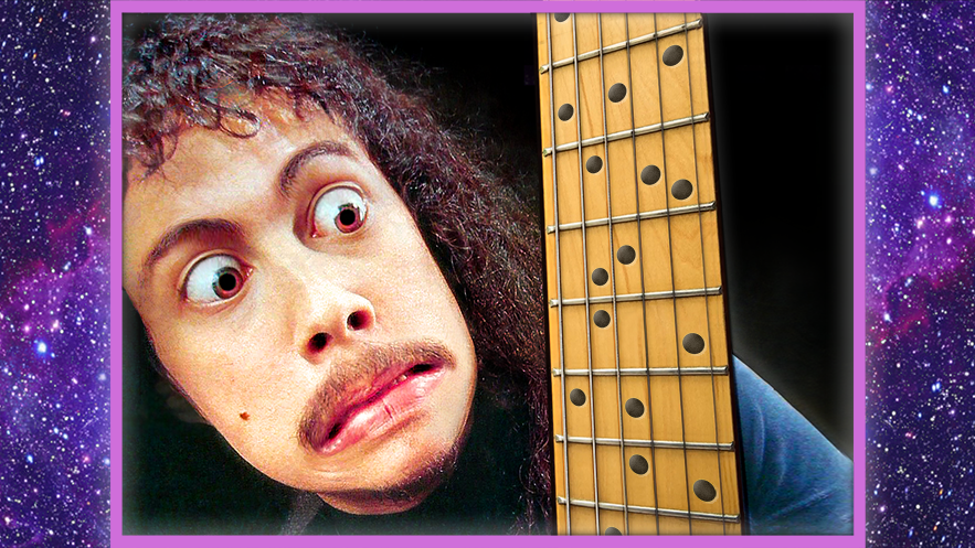
Masters of Photoshop, can anybody give me advice on how to make this image look more aesthetic/polished/professional etc? Thanks!
(If there is a more appropriate place for a post like this, please let me know!)

Explore related tutorials & articles
Copy link to clipboard
Copied
You probably were given a few set parameters to follow when creating your image. Looking at what you have done so far, I cannot recommend anything further. Not quite sure what you mean by polished and professional. Every image you create should solve a problem or two. During whatever creative brief you may or may not of had with whoever, the problem or challenge must have been brought up. Without knowing what those were, it's anyone's guess if you hit the target or not.
Copy link to clipboard
Copied
jdanek wrote
You probably were given a few set parameters to follow when creating your image. Looking at what you have done so far, I cannot recommend anything further. Not quite sure what you mean by polished and professional. Every image you create should solve a problem or two. During whatever creative brief you may or may not of had with whoever, the problem or challenge must have been brought up. Without knowing what those were, it's anyone's guess if you hit the target or not.
It's essentially a thumbnail for a video where a famous guitarist accidentally fumbles around on the guitar
Copy link to clipboard
Copied
did you shoot the image, or are you just processing it? My initial assessment has to do with the actual framing of the image. There is a large blank area to the right of the guitar neck that doesn't need to be there. It's not adding anything to the image and that heavy of just a large black space is almost weighing down that side of the image. And with that, the framing is also cutting into his forehead. I would much rather see more of his head in the shot and less of the black space.
The image also has a bit of noise in it and looks over sharpened. I'd clean those things up as well.
Hard to tell from this image, but it also looks like the highlights in his eyes are totally blown out, no detail in there at all. That would also help if those were backed off with the raw image if possible.
Copy link to clipboard
Copied
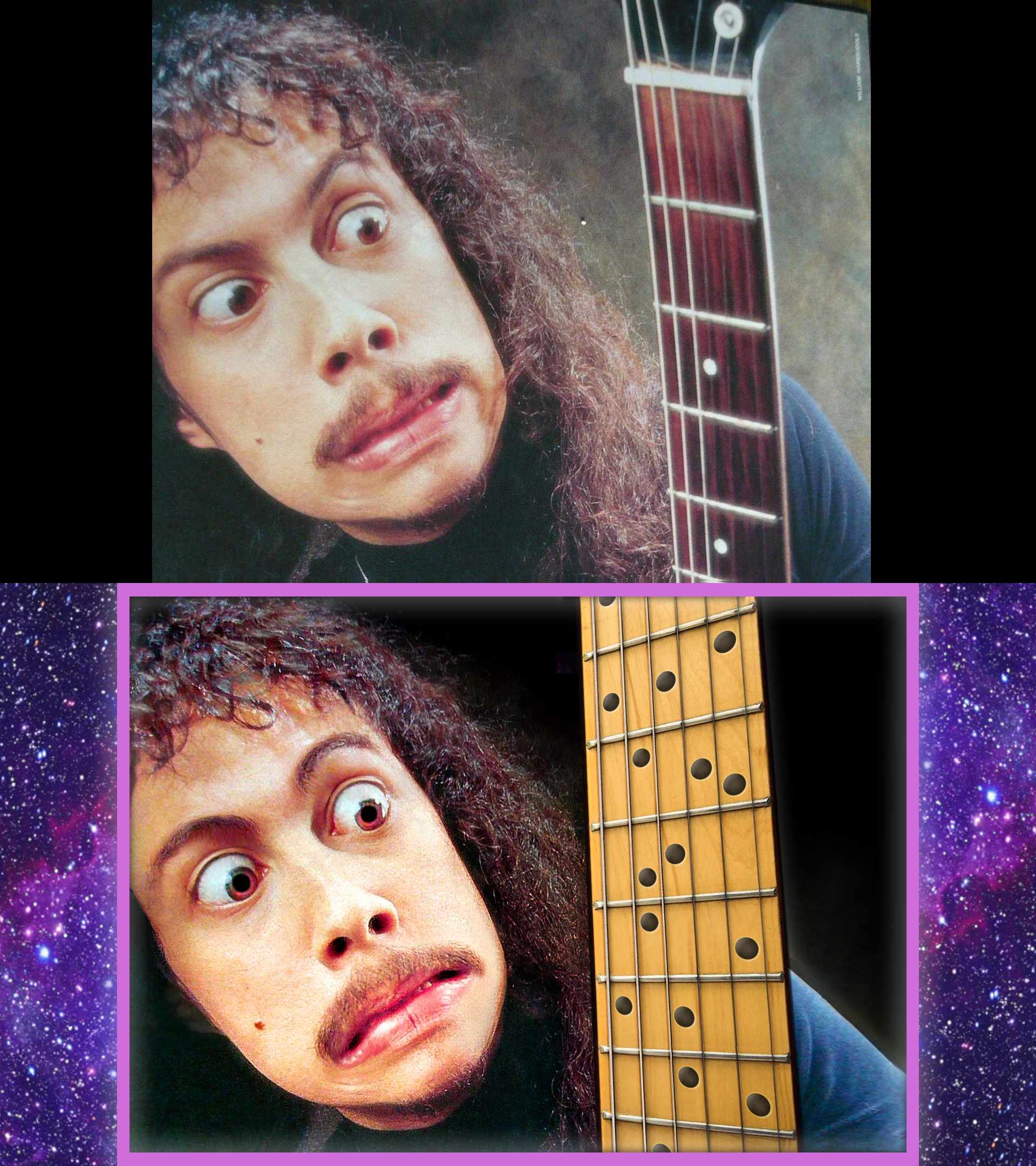
Thanks,, ya I'm just processing it.. I definitely agree with your assessment.. I wasn't sure what to do with the black space.. Where his forehead cuts off is actually my extension of the original image. I thought about making the fretboard even bigger to fill more of the black space, but it starts to look odd in the context.. I guess the other option would be scooting the fretboard to the right a bit.. As for the sharpening, I wasn't sure if I'd over-sharpened or not.. Are there any particular smart-sharpen settings you might recommend? Yes, I did blow out the highlights, I will see if I can back them off. Thanks!
for reference here is the original vs the current:

Copy link to clipboard
Copied
Somebody had fun with the Liquify Filters and Face Recognition inside Photoshop CC…
Also it looks like some basic color corrections, maybe done with Actions. You'll find tons of Filters/Actions to do so in the Internet.
The Boarder could be a vector shape with Fx (Outer/Inner Glow)
Enjoy.
Copy link to clipboard
Copied
Toughmedia wrote
Somebody had fun with the Liquify Filters and Face Recognition inside Photoshop CC…
Woah!!! And what if that's an unedited image of dmiraie ? ![]()
