

Gradient Tool Settings
I was looking at the gradient tool's settings wondering what the difference is between each visually, so I made a chart. You may not see the differences as well as I can because I shrunk it, but the top row has dither on, the bottom row has dither off, and the columns are classic, linear, and perceptual methods.
These were made with two layers. The background layer is solid black and I drew the gradient on the top layer. The gradient tool was set to foreground to transparency with red as the foreground color, and I used guides so I could snap my start and end point to the same exact place each time.
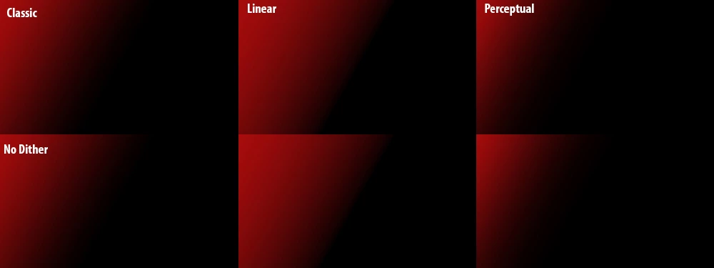
A few things stood out to me. Having dither on made no notable difference in banding. Other people swear by it and I always have dither on anyway, but I don't personally see a difference. Maybe that's my graphics settings/card or maybe it would be more obvious in print.
Classic has the softest gradient. Linear's edge is too harsh. Perceptual is closer to classic except the gradient's edge starts closer to the halfway point of where I dragged while classic's edge is closer to the end of the drag, making it look wider. Somehow I never noticed that before. Just felt like posting.