- Home
- Photoshop ecosystem
- Discussions
- Re: How do I remove watercolor paper texture?
- Re: How do I remove watercolor paper texture?
How do I remove watercolor paper texture?
Copy link to clipboard
Copied
Explore related tutorials & articles
Copy link to clipboard
Copied
Hi check the video hope it helps you...regards
Copy link to clipboard
Copied
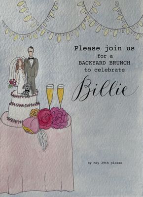
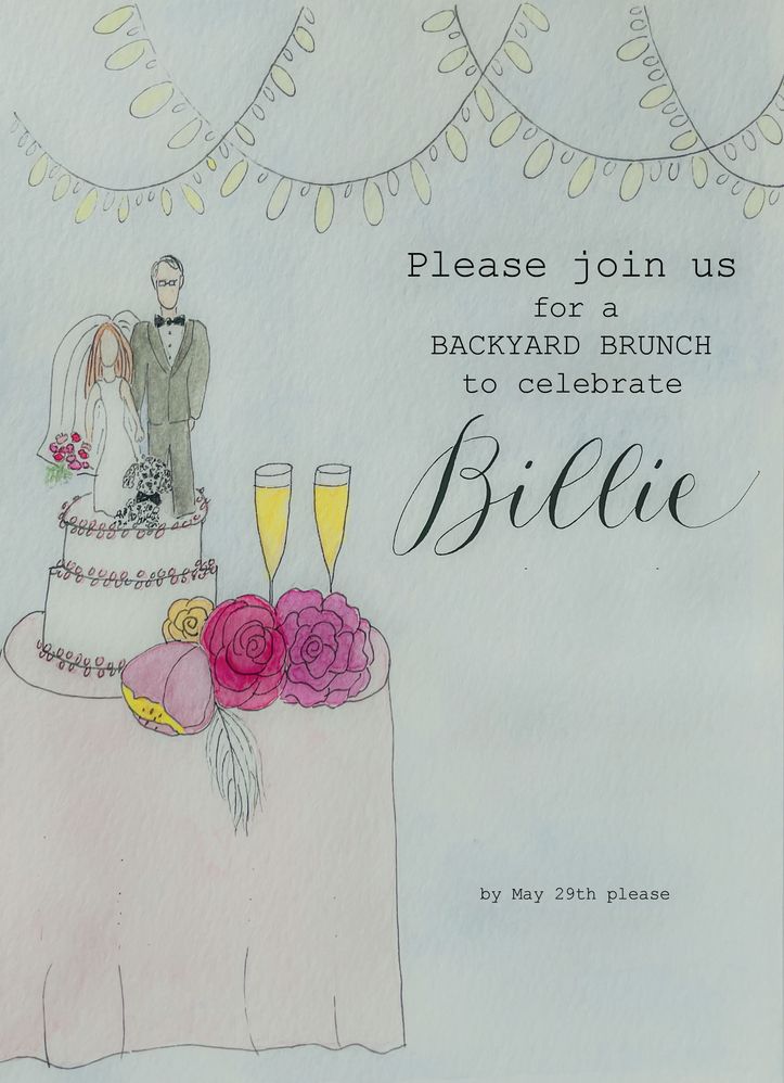
Thanks so much. I can definitely use this for other projects. Not sure if it's going to help now but will pull out of it what I can. It tried this project without painting a background but I had so many loose, almost lacey sort of details, it was really hard to isolate what I needed to. I then painted the background but can't get the underlying paper texture to smooth fully. I'll give some of those steps a try to see if it gets me closer.
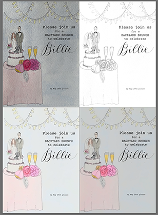
Attaching a copy of the project to help you understand my issue better. Thanks for your help!
Copy link to clipboard
Copied
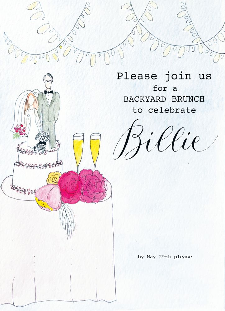
Not a particularly easy fix I'd say, and I was not totally sure what your were aiming at, but this might get you closer to what you want. Somethings, like the text, are easier to just redo, and that font was obviously Courier New, so it only took a tiny play with the kerning to get a close match. I love the illustration. One of our forum regulars Leslie does similar work, and is a total wizard at it. I might send her a PM to make sure she sees this thread.
Copy link to clipboard
Copied
THANK YOU! And what did you do to get this result? It looks great. I did play around using some of the tips in the video you shared. It did help. Off to compare your work with what I was able to manage. AND to read the rest of this thread. again, MANY THANKS! Grateful for the help!
Copy link to clipboard
Copied
Try surface blur and maybe in conjunction with frequency separation.
Copy link to clipboard
Copied
Yes! Think you meant Surface Blur and yes! Thank you, it did help. Not fully, but seems much smoother. Hoping it prints better this way. Thanks for the suggestion.
Copy link to clipboard
Copied
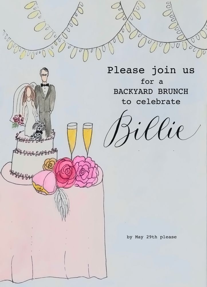
Thanks for calling me a wizard, @Trevor.Dennis haha. I got this result with Brightness/Contrast, though you might want to go back in and recolor a few things - having said that, I like the watercolor paper texure, personally:
Copy link to clipboard
Copied
Leslie I was not sure what a female wizard might be called, and there was no way I was going to risk calling you a witch! Plus your illustrations owe more to skill and raw tallent than magic. I bet you don't even realise how good you are, and think it is no big deal. 🙂
Copy link to clipboard
Copied
now I really wanna see her work! Instagram???
Copy link to clipboard
Copied
Thank you Leslie! I'm brand new to all of this....even the painting, so I appreciate all the help so much. I like the watercolor texture when I'm holding my art, but when I sent it to the printer, I didn't. I'm intuitively thinking I'd like a smooth finish on a flat paper with the watercolor showing itself thru the various transparencies that the watercolor medium gives. Thats why I'd rather not recolor if I can avoid it. I sort of feel like it loses the handmade quality and thats what I love about it. I also sort of feel like I'm a fraud and an imposter for thinking I can do any of these things! (but happy to be trying and learning so thank you for your suggestions!)
Copy link to clipboard
Copied
You're welcome! I agree re keeping the hand-drawn look, which is very current right now. I think it's some kind of reaction against the uber-slickness of Illustrator. A desire to get back to evidence of the human hand in our art, maybe. Anyway, as to your Instagram question, not sure if we're allowed to post links here, but I'm on there under @lesliemoakmurray. (Also, googling my full name brings up some stuff)
Copy link to clipboard
Copied
...as you may have seen, I stalked you and found you earlier. Thanks for liking my work. (If you ever need calligraphy help, lmk! I'd love to return the favor!)
Your work is AMAZING! May I ask you another question: do you use watercolor paper for your illustration? I was wondering if a flatter mixed media paper may have made this all easier for me. Also, is PS (and dealing with a surface blur or the brightness and contrast) the way to deal with softening the rough texture? Are there any other methods you employ? Or any other Adobe platforms? I've used Illustrator for my calligraphy and understand the paths fairly well, is there anything in there (or elsewhere) that would help me accomplish what I want to? Thank so very much!
Copy link to clipboard
Copied
Hi, thanks, and your worlk is amazing too! Great calligraphy. I did used to use d'Arches paper a lot, also Strathmore, and I loved the texture. But I only do my art digitally now, Photoshop all the way, because it's so much better for my professional art situation. But for flat paper, Bristol Board is good. So anyway, I don't have the situation of having to soften the paper texture for printing.
But as I said before, hand-drawn is the look right now, and people are actually downloading watercolor paper textures to insert into their PS art now. I have several on my computer. I think it lends a nice touch to art, and I wouldn't try to get rid of it, but I can see how it might affect the printing if it's really rough. I guess it all depends on the look you're after. So maybe for these situations, just do the art on smooth paper to begin with. I'm glad we connected!
Copy link to clipboard
Copied
thank you for all this! And thank you to @Trevor.Dennis for pulling you in, in addition to the help he gave! This is first time I reached out and I must say, all you helpers are fabulous! Many thanks 🙂
Copy link to clipboard
Copied
You may consider choosing the K channel of the CMYK set, copying it, changing the mode to Lab Color and replacing the Lightness channel with the K channel information.
Some very subtle texture generated in the a and b Lab channels still appears in the the image. so choose each of those two and apply Filter > Surface Blur : Redius 39 Threshold 33.
Tbe two bottom images show the darkening of the higlight end of the scale using Curves on the new Lighness channel.
Convert to RGB
At this point, you may alter the color locally: the flowers, adjacent object and wedding dress, for example
Copy link to clipboard
Copied
Thank you! I will try this so I learn something new. I don't know if this would work for this particular project as I am sending them to be printed but I'm eager to learn as much as I can about PS so I'm eager to play. Thanks so much!
Copy link to clipboard
Copied
If you have the original, you might want to scan it at different angles, then combine the scans and use lighten blend mode. That will help tone down the texture.
Copy link to clipboard
Copied
I actually saw this method on google but it mentioned it was for scanned items. As I used a photo of my art, I didn't think the light aspects would be the same as a scanner so I did not try. Will do so. Thanks for the suggestion and education. I feel new brain cells being formed (or maybe just old ones being resuscitated!)
Copy link to clipboard
Copied
Yea, it needs to be the original art.
Copy link to clipboard
Copied
Hey, that's a clever idea Chuck. In fact you might be able to better eliminate the texture shading by photographing with a ring light, or light tent, or some sort of cobbled up non-directional lighting. Photographing the illustration presents the problem of placing the lens axis perpendicular to the artwork, but perspective crop will fix that.
Find more inspiration, events, and resources on the new Adobe Community
Explore Now
