Exit
  • Global community
    • Language:
      • Deutsch
      • English
      • Español
      • Français
      • Português
  • 日本語コミュニティ
  • 한국 커뮤니티
0

How to create volume and glossiness on a WHITE shape?

Explorer ,
May 11, 2017 May 11, 2017

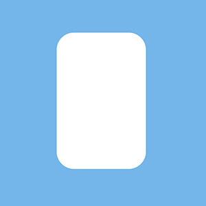
I have a white rectangular shape that looks a bit like a pillow, seen from above:

soap.jpg

I'm trying to create volume, to give the pillow a round & symmetrical shape, with the lighting coming directly from above, so shading would be symmetrical.

I tried just a Bevel & Emboss style and I got this:

pillow.jpg

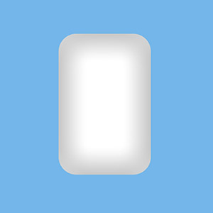
But I think this adds too much grey. How can I create volume without adding to much grey on that white shape?

Also, I would like this shape to be very glossy, with lots of reflection, just like the candies from Candy Crush.

https://www.spriters-resource.com/resources/sheets/52/55525.png

The tutorials on Youtube only show how to do it on a round shape, but I think it would be different on my rectangular shape.

How can I do this?

Ultimately, I would like to overlay very bright colours (like the Candy Crush colours) on that white shape, and get a glossy shape with volume.

677
Translate
Report
Community guidelines
Be kind and respectful, give credit to the original source of content, and search for duplicates before posting. Learn more
community guidelines

correct answers 1 Correct answer

Community Expert , May 11, 2017 May 11, 2017

Starting with full white drastically restricts what you can do with shading.  Just a few degrees off full white would make life easier (250,250,250 for instance). If you use an inner shadow or bevel & emboss layer effect, don't forget you can control the opacity of the shading.  The eye can pick up on the slightest changes in tonal values, even if you don't have Eizo monitor 😉

What I did here was to stroke the outside of the shape with black, and blur it with a high value Gaussian blur (30 to 5

...
Translate
Adobe
Community Expert ,
May 11, 2017 May 11, 2017

Starting with full white drastically restricts what you can do with shading.  Just a few degrees off full white would make life easier (250,250,250 for instance). If you use an inner shadow or bevel & emboss layer effect, don't forget you can control the opacity of the shading.  The eye can pick up on the slightest changes in tonal values, even if you don't have Eizo monitor 😉

What I did here was to stroke the outside of the shape with black, and blur it with a high value Gaussian blur (30 to 50) and clip it to the shape layer so you don't see the overspill.  I've reduced the layer opacity to 20% in this case, but you have complete control of the opacity.

Rather than make the inner shape white, a ring (layer 2) gives a better effect.

In fact I have taken the shape down to 245,245,245  and increased the outer shading layer opacity to 40%.  I have also cut off half the inner ring with a layer mask so you can clearly see the difference.

Translate
Report
Community guidelines
Be kind and respectful, give credit to the original source of content, and search for duplicates before posting. Learn more
community guidelines
Community Expert ,
May 11, 2017 May 11, 2017
LATEST

To use bright colours you need a different approach. Assuming the buttons are very shiny (reflective) they need harder shading.  The inner white shading used a stroke value of just 4 pixels and Gaussian blur 2.0.

I've also used a smaller outer shade with a stroke of 5 pixels, and Gaussian blue 10.  This time I Ctrl clicked the Shape layer to load it as a selection, and added a layer mask to the outer stroke layer

Increasing the blur value of the inner white highlight to 5 softens the highlight and makes the button look less shiny.

Incidentally, if you want to put anything on your buttons, the trick is to set the Fill value to zero which leaves just the effect like this.  The Bevel & Emboss direction is set to Down.

Translate
Report
Community guidelines
Be kind and respectful, give credit to the original source of content, and search for duplicates before posting. Learn more
community guidelines