• Global community
    • Language:
      • Deutsch
      • English
      • Español
      • Français
      • Português
  • 日本語コミュニティ
    Dedicated community for Japanese speakers
  • 한국 커뮤니티
    Dedicated community for Korean speakers
Exit
3

Icons for 2020 updates

Community Beginner ,
Nov 11, 2019 Nov 11, 2019

Copy link to clipboard

Copied

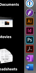
I just updated Photoshop, InDesign and Illustrator to the 2020 versions. Is it driving anyone else crazy that Photoshop has a new rounded-corner icon in the dock and the others still have the old square icons? Come on Adobe, we're designers here! You're stabbing me in the heart every time I look at my dock! 😉

Screen Shot 2019-11-11 at 10.49.43 AM.png

Views

24.8K

Translate

Translate

Report

Report
Community guidelines
Be kind and respectful, give credit to the original source of content, and search for duplicates before posting. Learn more
community guidelines

correct answers 1 Correct answer

Community Expert , Nov 11, 2019 Nov 11, 2019

It's driving EVERYONE crazy! 😄  But, the real reaso is that now, all the apps that have a mobile version are being depicted with rounded corners. you'll see the same effect on Lightroom for now, too!

Votes

Translate

Translate
Adobe
New Here ,
Nov 11, 2019 Nov 11, 2019

Copy link to clipboard

Copied

It drives me completely mad. Cant understand how company like Adobe can let something like this happpen. It makes me just a step closer to switch to Affinity.

Votes

Translate

Translate

Report

Report
Community guidelines
Be kind and respectful, give credit to the original source of content, and search for duplicates before posting. Learn more
community guidelines
Community Expert ,
Nov 11, 2019 Nov 11, 2019

Copy link to clipboard

Copied

It's driving EVERYONE crazy! 😄  But, the real reaso is that now, all the apps that have a mobile version are being depicted with rounded corners. you'll see the same effect on Lightroom for now, too!


Adobe Community Expert / Adobe Certified Instructor

Votes

Translate

Translate

Report

Report
Community guidelines
Be kind and respectful, give credit to the original source of content, and search for duplicates before posting. Learn more
community guidelines
Community Beginner ,
Nov 11, 2019 Nov 11, 2019

Copy link to clipboard

Copied

Ah, that makes sense but they need to makes them consistent for the sake of our sanity!

Votes

Translate

Translate

Report

Report
Community guidelines
Be kind and respectful, give credit to the original source of content, and search for duplicates before posting. Learn more
community guidelines
Community Beginner ,
Nov 13, 2019 Nov 13, 2019

Copy link to clipboard

Copied

Oh, who loves Ps 2020 icon? I dont care about cloud feature, I care how look my apps on dock! Why I need see everyday on dock and:


- Ps, Ai, Ar, Lr

- hm, wtf?

- hm, cloud-featured.. hm, okay


If icon was sharp corners - cloud features doesnt lost. And Photoshop for iPad not same Photoshop for Mac/PC


sad-sad

Votes

Translate

Translate

Report

Report
Community guidelines
Be kind and respectful, give credit to the original source of content, and search for duplicates before posting. Learn more
community guidelines
Community Expert ,
Nov 13, 2019 Nov 13, 2019

Copy link to clipboard

Copied

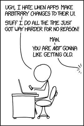
I always like this way of putting it:

1135136_CzPJt_dUoAE3Ms0.jpg

Votes

Translate

Translate

Report

Report
Community guidelines
Be kind and respectful, give credit to the original source of content, and search for duplicates before posting. Learn more
community guidelines
Contributor ,
Jun 22, 2020 Jun 22, 2020

Copy link to clipboard

Copied

Change for change sake is a pervasive disease.  It's not just "modernisation", some of it ignores (a) who uses the 'tool' and (b) how they use it. An example we might all have come across ... in order to accommodate advertising, ATM screens were converted from monochrome to colour.  That made them harder to use for users with certain vision impairments; but in particular, they are harder to see in certiain lighting conditions, such as direct sunlight, owing to the reduction in contrast.  As least Microsoft facilitated the 'old' presentation of the Windows UI when they effected a radical change.


As I have posted separately, possibly the most outrageous change Adobe has made with the new ACR is altering the positions (actual and relative) of the [Open] and [Cancel] buttons.  Muscle memory has me clicking [Done] or [Cancel] when I want to Open the image(s). Grrr!

Votes

Translate

Translate

Report

Report
Community guidelines
Be kind and respectful, give credit to the original source of content, and search for duplicates before posting. Learn more
community guidelines
Explorer ,
Jun 28, 2020 Jun 28, 2020

Copy link to clipboard

Copied

I'd find it funnier if I wasn't continuing forking out an ever-increasing monthly fee that pays these people's wages, supports their work, and gives them the ability to invest in improvement.


Dismissing people's concerns and implying that a negative experience is inevitable seems to go completely against the spirit of a community based around support.


Months later, Adobe has changed all the icons so that they "group together" better, meanwhile also creating additional problems around workflow and easy identification of apps by users.


Simply being industry-standard does not allow the attitude of "shut up and deal with it".


It only goes so far.

Votes

Translate

Translate

Report

Report
Community guidelines
Be kind and respectful, give credit to the original source of content, and search for duplicates before posting. Learn more
community guidelines
Community Beginner ,
Dec 24, 2019 Dec 24, 2019

Copy link to clipboard

Copied

Hi All,

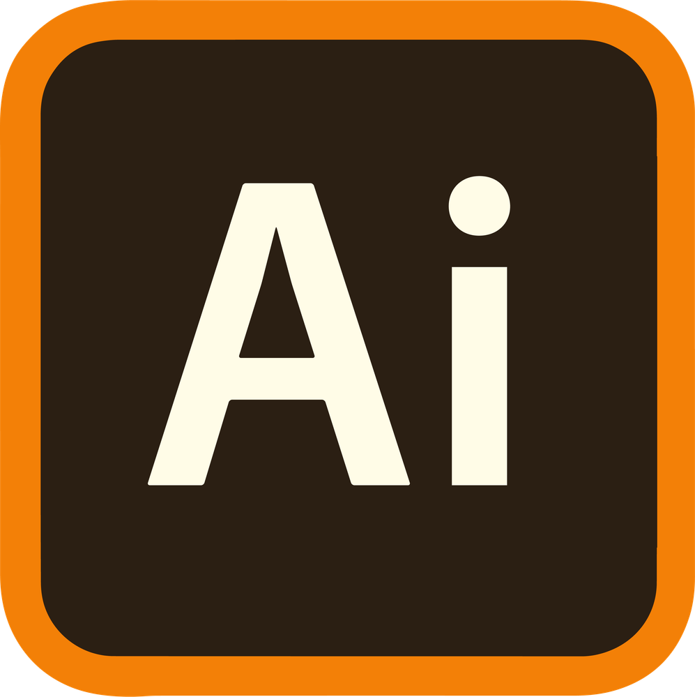
As many of you, this was stressing me out unnecessarily, so I created a quick rounded corner version to soothe my eyes.

All you have to do is open this in preview, select all, copy it, then go to "Get Info" on the AI app, click the thumbnail and paste this new one in.

Took me like 30 mins, it's frustrating that Adobe can't do little things like this. I'm open to critique as I'm relatively new to Illustrator.

Ai_Logo_v2.png

Votes

Translate

Translate

Report

Report
Community guidelines
Be kind and respectful, give credit to the original source of content, and search for duplicates before posting. Learn more
community guidelines
Community Beginner ,
Jan 10, 2020 Jan 10, 2020

Copy link to clipboard

Copied

Thank you. I feel so much better now. 

Votes

Translate

Translate

Report

Report
Community guidelines
Be kind and respectful, give credit to the original source of content, and search for duplicates before posting. Learn more
community guidelines
Community Beginner ,
Jun 18, 2020 Jun 18, 2020

Copy link to clipboard

Copied

Can you do that in Windows?

Votes

Translate

Translate

Report

Report
Community guidelines
Be kind and respectful, give credit to the original source of content, and search for duplicates before posting. Learn more
community guidelines
Explorer ,
Jun 25, 2020 Jun 25, 2020

Copy link to clipboard

Copied

Yes, but you'd have to save the image to icon format in order to use it in Windows (.ICO). Anyway, the icons changed again since your post, so never mind 😉

Votes

Translate

Translate

Report

Report
Community guidelines
Be kind and respectful, give credit to the original source of content, and search for duplicates before posting. Learn more
community guidelines
New Here ,
Jan 31, 2021 Jan 31, 2021

Copy link to clipboard

Copied

LATEST

Still it was not the same size, the border didn't match and there was no shadows... I was very frustrated and fixed the small things for my PC...


Ai_Logo_v2.png

Votes

Translate

Translate

Report

Report
Community guidelines
Be kind and respectful, give credit to the original source of content, and search for duplicates before posting. Learn more
community guidelines
Community Beginner ,
Dec 26, 2019 Dec 26, 2019

Copy link to clipboard

Copied

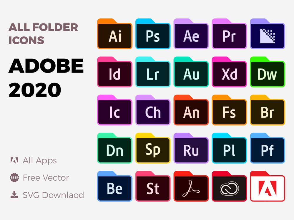
Here are some folder icons for Adobe 2020
Adobe-2020-Folder-Icons-Set-SVG 

bfdb724cd4061529288e6c7d4e20ca00

Votes

Translate

Translate

Report

Report
Community guidelines
Be kind and respectful, give credit to the original source of content, and search for duplicates before posting. Learn more
community guidelines
LEGEND ,
Dec 27, 2019 Dec 27, 2019

Copy link to clipboard

Copied

Its not driving me crazy and I think you guys are hilarious! Yes they overloaded the icon to designate apps with a mobile version which seems silly (as in, why bother) but also, who cares.

Votes

Translate

Translate

Report

Report
Community guidelines
Be kind and respectful, give credit to the original source of content, and search for duplicates before posting. Learn more
community guidelines
New Here ,
Jan 13, 2020 Jan 13, 2020

Copy link to clipboard

Copied

Hi guys. We need create same icons by ourselfs while Adobe will update it. So I do that.


adobe-2020-app-icons.pngadobe-2020-app-icons9.png

For replacing icons read this 

https://discussions.apple.com/thread/8234632

Votes

Translate

Translate

Report

Report
Community guidelines
Be kind and respectful, give credit to the original source of content, and search for duplicates before posting. Learn more
community guidelines
Community Beginner ,
Jan 19, 2020 Jan 19, 2020

Copy link to clipboard

Copied

If icons were the biggest problem of Adobe's products, guys… Inconsistent UIs, obsolete tools, slow graphic engines, incompatibility with international keyboards (when the apps simply don't respond when your current layout is not of a Latin kind) — and you complain about a little issue you can fix by yourselves. Come on.

Votes

Translate

Translate

Report

Report
Community guidelines
Be kind and respectful, give credit to the original source of content, and search for duplicates before posting. Learn more
community guidelines
Community Beginner ,
Jan 28, 2020 Jan 28, 2020

Copy link to clipboard

Copied

So you're saying that since everything else Adobe does is broken... we shouldn't complain about something they could easily fix?


Are we supposed to fix everything for Adobe?

Votes

Translate

Translate

Report

Report
Community guidelines
Be kind and respectful, give credit to the original source of content, and search for duplicates before posting. Learn more
community guidelines
LEGEND ,
Jan 28, 2020 Jan 28, 2020

Copy link to clipboard

Copied

Icons are not broken.

Votes

Translate

Translate

Report

Report
Community guidelines
Be kind and respectful, give credit to the original source of content, and search for duplicates before posting. Learn more
community guidelines
New Here ,
Feb 22, 2020 Feb 22, 2020

Copy link to clipboard

Copied

You're so right, but in fact, right now I'm working on a new Adobe icon set with rounded corners, starting with After Effects, Illustrator and Lightroom, then moving for Premiere, Animate and all the others.

Votes

Translate

Translate

Report

Report
Community guidelines
Be kind and respectful, give credit to the original source of content, and search for duplicates before posting. Learn more
community guidelines
Contributor ,
Apr 28, 2020 Apr 28, 2020

Copy link to clipboard

Copied

It's trivial yes, but a poor design decision by Adobe imo. It makes designers grind their teeth everytime they use the dock because it looks like an error. From a user perspective, I doubt any have made the differentiation between mobile and non-mobile function with the curved/straight edged icon.


I don't think desktop icons are the relevant place to signal this. It's a bit like putting a Facebook or Twitter icon on a business card.


Designers are Abobe's main audience after all. We're trained to care about these things and fix them. It makes some of us think that they've made a rookie mistake. (And it makes your dock look like a mouth of broken teeth).

🙂

Votes

Translate

Translate

Report

Report
Community guidelines
Be kind and respectful, give credit to the original source of content, and search for duplicates before posting. Learn more
community guidelines
LEGEND ,
Apr 28, 2020 Apr 28, 2020

Copy link to clipboard

Copied

Actually, its a useful designation. As for the Dock... seriously?

Screen Shot 2020-04-28 at 10.46.20 AM.png

Votes

Translate

Translate

Report

Report
Community guidelines
Be kind and respectful, give credit to the original source of content, and search for duplicates before posting. Learn more
community guidelines
Contributor ,
May 01, 2020 May 01, 2020

Copy link to clipboard

Copied

Seriously. It looks rubbish and iritates me. Serves no purpose.


Screenshot 2020-05-01 at 14.11.15.png

Votes

Translate

Translate

Report

Report
Community guidelines
Be kind and respectful, give credit to the original source of content, and search for duplicates before posting. Learn more
community guidelines
Community Expert ,
May 01, 2020 May 01, 2020

Copy link to clipboard

Copied

Then, where is Dimension tablet version?

Votes

Translate

Translate

Report

Report
Community guidelines
Be kind and respectful, give credit to the original source of content, and search for duplicates before posting. Learn more
community guidelines
Contributor ,
May 01, 2020 May 01, 2020

Copy link to clipboard

Copied

Good point.


Adobe Dimensions has the curved, light type style icon but no mobile or tablet option. Acrobat uses the square style icon, but does have a mobile and tablet version.


There is no correlation between the icons and whether or not they're Desktop, Web or Mobile.


They're a mess.


Votes

Translate

Translate

Report

Report
Community guidelines
Be kind and respectful, give credit to the original source of content, and search for duplicates before posting. Learn more
community guidelines