• Global community
    • Language:
      • Deutsch
      • English
      • EspaƱol
      • FranƧais
      • PortuguĆŖs
  • ę—„ęœ¬čŖžć‚³ćƒŸćƒ„ćƒ‹ćƒ†ć‚£
    Dedicated community for Japanese speakers
  • ķ•œźµ­ ģ»¤ė®¤ė‹ˆķ‹°
    Dedicated community for Korean speakers
Exit
0

Interface change feature???

New Here ,
Apr 19, 2023 Apr 19, 2023

Copy link to clipboard

Copied

Hello is there a way to change the interface so that it isn't just 4 options of greyscale? Maybe have theme options like eggs, cartoons like puppycat, or customize your own space with your own art type of thing? Like a *Create your own* and you draw in the space you're customizing LOL 

Views

3.4K

Translate

Translate

Report

Report
Community guidelines
Be kind and respectful, give credit to the original source of content, and search for duplicates before posting. Learn more
community guidelines
Adobe
Community Expert ,
Apr 19, 2023 Apr 19, 2023

Copy link to clipboard

Copied

which app?


. (using mobile)

Votes

Translate

Translate

Report

Report
Community guidelines
Be kind and respectful, give credit to the original source of content, and search for duplicates before posting. Learn more
community guidelines
New Here ,
Apr 19, 2023 Apr 19, 2023

Copy link to clipboard

Copied

Any? All? HAHAH mainly photoshop

Votes

Translate

Translate

Report

Report
Community guidelines
Be kind and respectful, give credit to the original source of content, and search for duplicates before posting. Learn more
community guidelines
Community Expert ,
Apr 20, 2023 Apr 20, 2023

Copy link to clipboard

Copied

In all seriousness though - the reason the interfaces are universally shades of varying grays intentionally for two reasons:

1. The colors are neutral - the human eye adjusts perceptive color when influenced by surrounding colors.

Example - the center box is the same color but appears different due to the surrounding color:


kevinstohlmeyer_1-1681994396564.png

2. The second reason is accessibility. Having the interface neutral and contrasted allows users with visual impairments to use the software without impediment.


So while it may be "fun" to allow users to have any color for an interface, or cartoon/puppycat presets the reality is it would cause issues when trying to adjust colors in your image and complaints from users. There are enough issues with users not understanding color profiles, etc. as it is.

Votes

Translate

Translate

Report

Report
Community guidelines
Be kind and respectful, give credit to the original source of content, and search for duplicates before posting. Learn more
community guidelines
Community Expert ,
Apr 20, 2023 Apr 20, 2023

Copy link to clipboard

Copied

Actually this may be an even better illustration than Dave's cube. Yes, this shows precisely why I use the light interface instead of the default dark. It also shows why Lightroom should have a light UI option, but still doesn't.

Votes

Translate

Translate

Report

Report
Community guidelines
Be kind and respectful, give credit to the original source of content, and search for duplicates before posting. Learn more
community guidelines
Community Expert ,
Apr 19, 2023 Apr 19, 2023

Copy link to clipboard

Copied

@Megan29494086poh4 


Your four screenshots are all Photoshop, so I have moved your post from Using the Community (for questions about the forums) for you.


Jane


Votes

Translate

Translate

Report

Report
Community guidelines
Be kind and respectful, give credit to the original source of content, and search for duplicates before posting. Learn more
community guidelines
Community Expert ,
Apr 20, 2023 Apr 20, 2023

Copy link to clipboard

Copied

The gray background and UI elements have a reason ā€“ human visual perception is notoriously Ā»treacherousĀ«. 

Color editing images against a colorful background will affect the perception and when the image is viewed under different conditions this can become problematic. 


Anyway, @jazz-y has provided a Script for (some) Photoshop UI customization. 

https://community.adobe.com/t5/photoshop-ecosystem-discussions/photoshop-purple-skin/td-p/11483405/p...

Votes

Translate

Translate

Report

Report
Community guidelines
Be kind and respectful, give credit to the original source of content, and search for duplicates before posting. Learn more
community guidelines
Community Expert ,
Apr 20, 2023 Apr 20, 2023

Copy link to clipboard

Copied

@Megan29494086poh4 be careful what you wish for šŸ¤£

2022-04-12_12-24-03.png

Votes

Translate

Translate

Report

Report
Community guidelines
Be kind and respectful, give credit to the original source of content, and search for duplicates before posting. Learn more
community guidelines
Community Expert ,
Apr 20, 2023 Apr 20, 2023

Copy link to clipboard

Copied

Nice @Ged_Traynor , but all the text and icons should be bright magenta, to make it easier to read... šŸ˜‰


Seriously, c.p. is right. There is a reason for the neutral interface. There was a huge commotion a while ago, over the blue "share"-button. People came up with all kinds of hacks to kill it. Finally Adobe had to add an option to mute it. 

Votes

Translate

Translate

Report

Report
Community guidelines
Be kind and respectful, give credit to the original source of content, and search for duplicates before posting. Learn more
community guidelines
Community Expert ,
Apr 20, 2023 Apr 20, 2023

Copy link to clipboard

Copied

@D Fosse that image was courtesy of @jazz-y from the share button thread šŸ˜‰

Votes

Translate

Translate

Report

Report
Community guidelines
Be kind and respectful, give credit to the original source of content, and search for duplicates before posting. Learn more
community guidelines
Community Expert ,
Apr 20, 2023 Apr 20, 2023

Copy link to clipboard

Copied

If a customer should see somebody working on such a workspace ā€“ what opinion would they be likely to form? 

Votes

Translate

Translate

Report

Report
Community guidelines
Be kind and respectful, give credit to the original source of content, and search for duplicates before posting. Learn more
community guidelines
Community Expert ,
Apr 20, 2023 Apr 20, 2023

Copy link to clipboard

Copied

@c.pfaffenbichler "what opinion would they be likely to form?" they'd probably ask, can I have some of what you're taking šŸ¤£

Votes

Translate

Translate

Report

Report
Community guidelines
Be kind and respectful, give credit to the original source of content, and search for duplicates before posting. Learn more
community guidelines
Community Expert ,
Apr 20, 2023 Apr 20, 2023

Copy link to clipboard

Copied

šŸ˜„

Votes

Translate

Translate

Report

Report
Community guidelines
Be kind and respectful, give credit to the original source of content, and search for duplicates before posting. Learn more
community guidelines
Community Expert ,
Apr 20, 2023 Apr 20, 2023

Copy link to clipboard

Copied

Once you get used to that , you'll be needing this:

Interface.gif


Dave

Votes

Translate

Translate

Report

Report
Community guidelines
Be kind and respectful, give credit to the original source of content, and search for duplicates before posting. Learn more
community guidelines
Community Expert ,
Apr 20, 2023 Apr 20, 2023

Copy link to clipboard

Copied


No, no, no! Not the Big Blue Share Button again Dave, I thought we were rid of that ugly thing! šŸ¤£

Jane


Votes

Translate

Translate

Report

Report
Community guidelines
Be kind and respectful, give credit to the original source of content, and search for duplicates before posting. Learn more
community guidelines
New Here ,
Apr 20, 2023 Apr 20, 2023

Copy link to clipboard

Copied

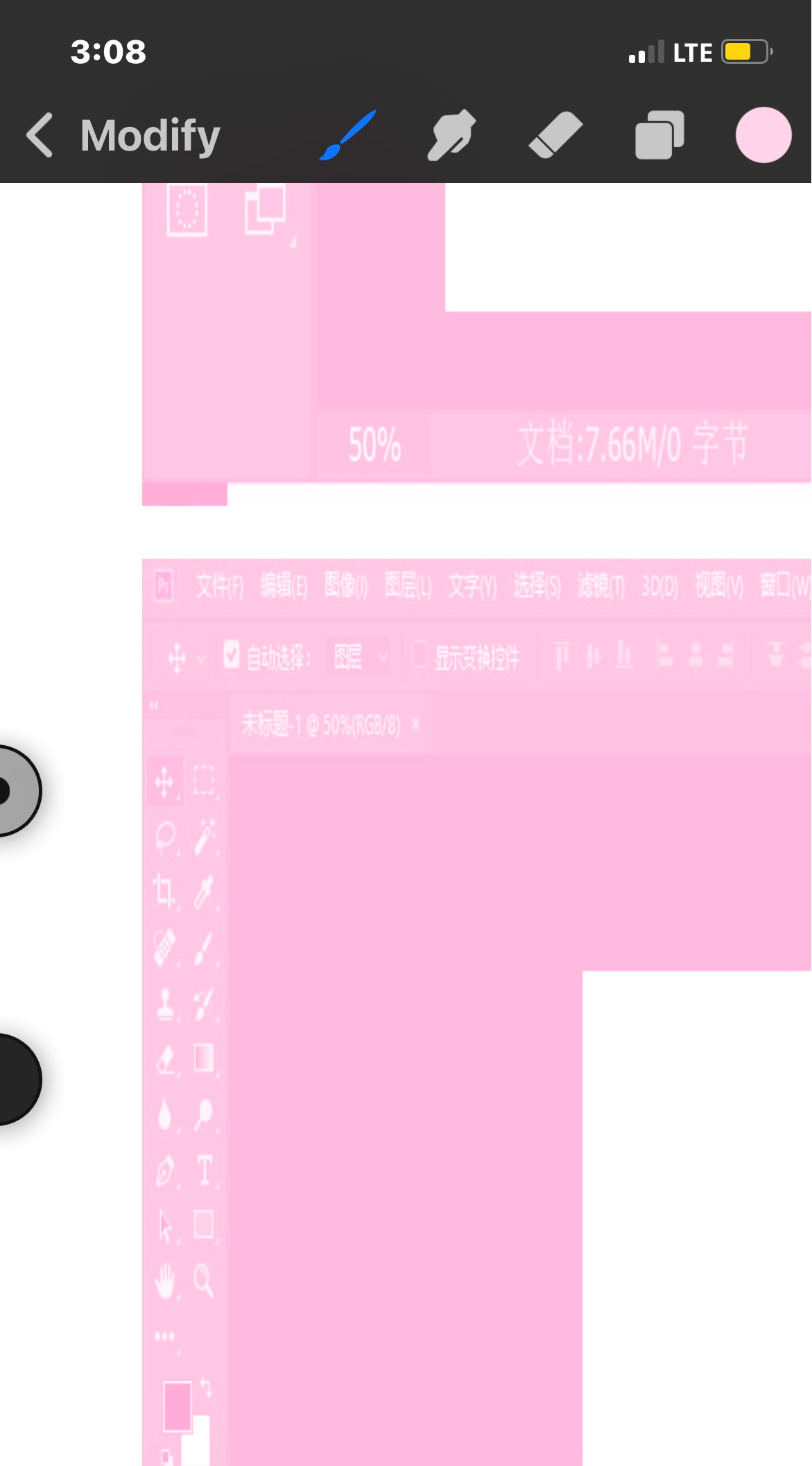
The light pink and purple on that is so cute I want my interfact to look like this so bad HAHA aside from the blue share button

Votes

Translate

Translate

Report

Report
Community guidelines
Be kind and respectful, give credit to the original source of content, and search for duplicates before posting. Learn more
community guidelines
Community Expert ,
Apr 20, 2023 Apr 20, 2023

Copy link to clipboard

Copied

The light pink and purple on that is so cute 

By @Megan29494086poh4


Cute and dreadful all at once, Megan. Most folks who use Photoshop make their screen and interface a neutral gray, and many also paint their walls a neutral gray and control the room lighting so nothing, absolutely nothing, interferes with the color corrections they are making in Photoshop.


Thank you for the entertainment value of your post!


Jane


Votes

Translate

Translate

Report

Report
Community guidelines
Be kind and respectful, give credit to the original source of content, and search for duplicates before posting. Learn more
community guidelines
Community Expert ,
Apr 20, 2023 Apr 20, 2023

Copy link to clipboard

Copied

That's right, Jane. Actually, I can't even look at the image anymore, it interferes with my highly tuned color vision. So I'm covering the whole monitor with a gray cloth, while I lie on the floor with a bag of ice cubes over my eyes. Then I use pure mind-power to manifest the image as I want it.


People don't realize how hard it is to be a true artist...pure spirituality, no dirty physics.


Here's one of my recent works, a subtle and minimalist still life titled "  ". I considered giving it some punch, but decided against it. Less is more:

still_life.png


Lately I've also started to use a special filter on my camera. It wasn't cheap, but it blocks not only visible light, but all electromagnetic radiation whatsoever. Nothing gets past it. It's exquisite.


šŸ˜„

Votes

Translate

Translate

Report

Report
Community guidelines
Be kind and respectful, give credit to the original source of content, and search for duplicates before posting. Learn more
community guidelines
Community Expert ,
Apr 20, 2023 Apr 20, 2023

Copy link to clipboard

Copied

If you get those thoughts from your mind power, connected into AI it will produce the image for you so no need to look at all Dag šŸ™‚

Dave

Votes

Translate

Translate

Report

Report
Community guidelines
Be kind and respectful, give credit to the original source of content, and search for duplicates before posting. Learn more
community guidelines
New Here ,
Apr 20, 2023 Apr 20, 2023

Copy link to clipboard

Copied

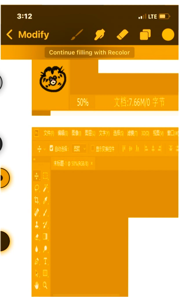
I can see why the colour change would be uncomfortable but like my suggestion was basically adding an option to change the outer parrs for people who want to draw stuff with the pink or purple instead of the dark or light modes on the tool bars heheh the change wouldn't be applied to everyone just an added selection in settings 

Votes

Translate

Translate

Report

Report
Community guidelines
Be kind and respectful, give credit to the original source of content, and search for duplicates before posting. Learn more
community guidelines
Community Expert ,
Apr 20, 2023 Apr 20, 2023

Copy link to clipboard

Copied

@davescm I like that, it's like the current strobe light effect some people are seeing with older GPU's, without the techno colour effect šŸ¤£

Votes

Translate

Translate

Report

Report
Community guidelines
Be kind and respectful, give credit to the original source of content, and search for duplicates before posting. Learn more
community guidelines
Community Expert ,
Apr 20, 2023 Apr 20, 2023

Copy link to clipboard

Copied

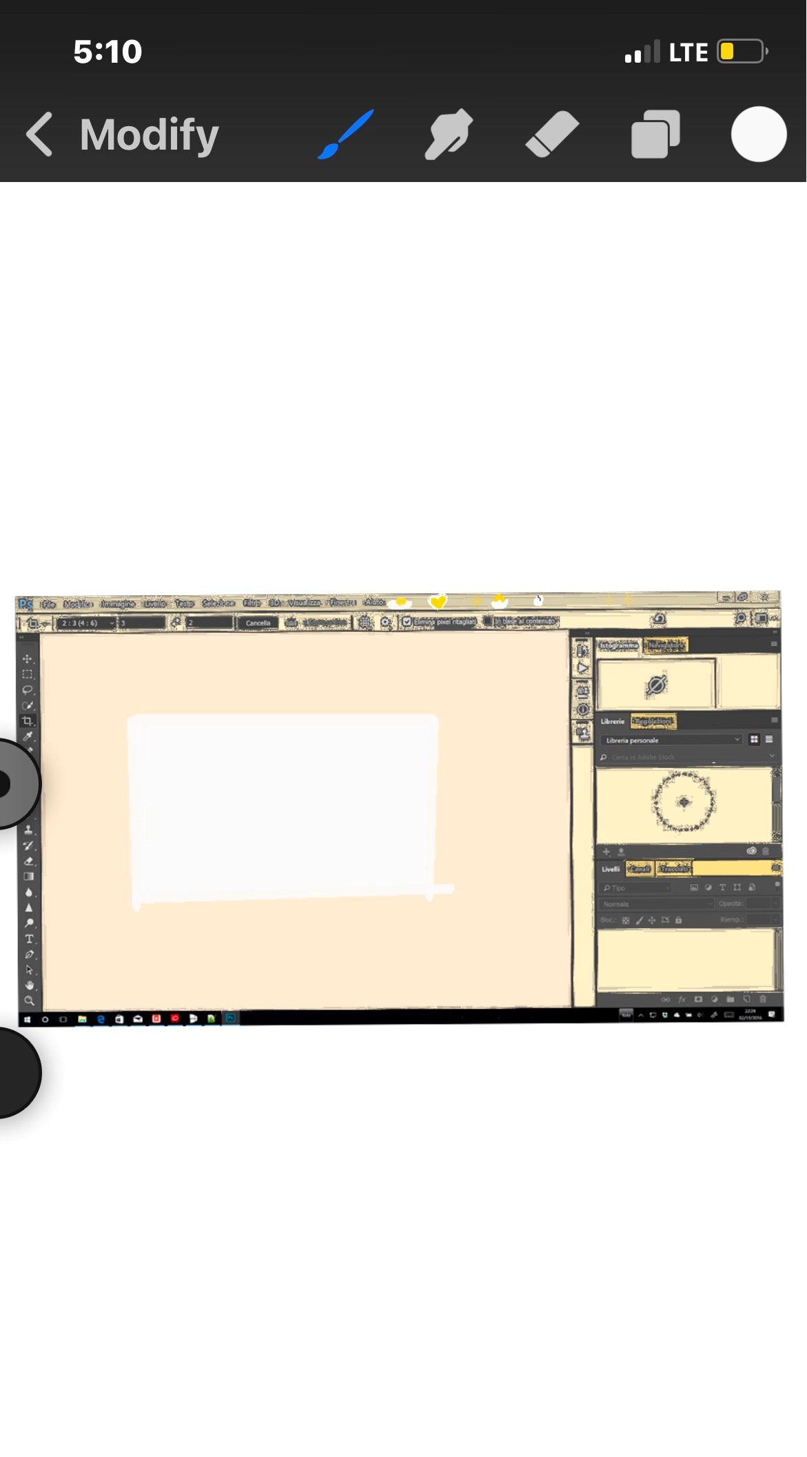
On a serious note this image from here : https://www.moillusions.com/color-tile-illusion-new-aspect/ shows how a neutral background is important in colour adjustment. The two circled centre squares are the same colour - measure them in Photoshop if you don't believe your eyes.

davescm_0-1682019253023.jpeg

Dave

Votes

Translate

Translate

Report

Report
Community guidelines
Be kind and respectful, give credit to the original source of content, and search for duplicates before posting. Learn more
community guidelines
Community Expert ,
Apr 20, 2023 Apr 20, 2023

Copy link to clipboard

Copied

Yes, that's a strikingly effective illustration. Color is relative to the colors around it.

Votes

Translate

Translate

Report

Report
Community guidelines
Be kind and respectful, give credit to the original source of content, and search for duplicates before posting. Learn more
community guidelines
New Here ,
Apr 20, 2023 Apr 20, 2023

Copy link to clipboard

Copied

Yes and if I wanted to I could press f or tab to hide the tools with the pink and purple if I needed to šŸ¤Ø

Votes

Translate

Translate

Report

Report
Community guidelines
Be kind and respectful, give credit to the original source of content, and search for duplicates before posting. Learn more
community guidelines
Community Expert ,
Apr 20, 2023 Apr 20, 2023

Copy link to clipboard

Copied

@Megan29494086poh4 

There is one thing you can do in Photoshop, Megan, to get your bright colors that will interfere with the work you are doing. Right-click in the area outside of the image and choose "Select Custom Color" from the shortcut menu.


A7776729-FEB8-40AC-88EA-4AD9699B0578.jpeg


Jane


Votes

Translate

Translate

Report

Report
Community guidelines
Be kind and respectful, give credit to the original source of content, and search for duplicates before posting. Learn more
community guidelines