- Home
- Photoshop ecosystem
- Discussions
- Re: Low Resolution Mode in Photoshop 2022
- Re: Low Resolution Mode in Photoshop 2022
Low Resolution Mode in Photoshop 2022
Copy link to clipboard
Copied
How do I run Photoshop in Low Resolution mode to view images how they will appear on the internet? The setting used to be in the GET INFO for the application under General. There was a check box for LOW RESOLUTION. How do I get the resuts that caused when I had that option? I am running this in the latest system of Mac, on a MacBook Pro.
Explore related tutorials & articles
Copy link to clipboard
Copied
Just look at images at 100% on your computer to get an idea of how they will look on a web page, most people seem to have hi resolution computers and devices these days.
Copy link to clipboard
Copied
As previously mentioned, your best bet is to resize your images properly for web use, and then preview at 100%. I also suggest ensuring that your image's color space is set to sRGB.
warmly/j
Copy link to clipboard
Copied
I am after this option also which seems to have been removed?
Viewing images at 100% in photoshop does not view the same as in safari, chrome or email clent.
It's roughly 200% in Photoshop if you havnt worked it out already. Perhaps this is a better option, it was frustrating to have to shut photoshop and re-open evertime you want to change/change back the resolution.
Copy link to clipboard
Copied
Images displayed online are, in general, at their 100% size if the app is maximized, unless resized by that app because they overfill the page, or if the html is poorly written. So no, looking at an image at 200% does not emulate "how they look online." Of course actual physical size in inches changes according to screen resolution, for instance desktop icons get smaller on higher res monitors, but they are the same "resolution."
That said, your post is unclear so it's hard to address your concern, for instance "... does not view the same as in safari, chrome or email clent" could mean color, size, etc. You don't say. In any case you create an image X by X pixels, that's it's
Copy link to clipboard
Copied
That option in "Get Info" has nothing to do with how images will or can appear on the net. Nor can you control how others see your images on their browsers.
Maybe you mean this?
Copy link to clipboard
Copied
All phones and tablets these days have high res screens. Yes some desktops/laptops are still low res, but more and more desktops/laptops are getting high res screens and some day they all will be.
Here's how to see images as they will appear on the internet:
If viewing a high res image on a high res screen, view it at 100%.
If viewing a low res image on a high res screen, view it at 200%.
— Adobe Certified Expert & Instructor at Noble Desktop | Web Developer, Designer, InDesign Scriptor
Copy link to clipboard
Copied
Thanks for the clarification Dan.
Where I am still a little confused though is the same image I drag into photoshop looks smaller than when I drag it in safari or chrome. When I drag it into Illustrator it looks bigger than the browser so needs to be scalled to around 50% to look the same.
Regardless of resolution should it look the same across all programs at 100%?
Copy link to clipboard
Copied
The reality is that the way Photoshop displays it is the same as in other photo editing applications. The reason is the definition of “100%” doesn’t mean “actual size.” In photo applications, that means “one image pixel to each pixel on the display.”
The “problem” is that today’s Retina (Mac) or HiDPI (Windows) displays have twice the pixel density (resolution) as old displays, which means display pixels are half the height or width, which means 100% on Retina/HiDPI displays is half the height/width as it used to be. In all photo applications.
@raymondc6035064 wrote:
Where I am still a little confused though is the same image I drag into photoshop looks smaller than when I drag it in safari or chrome.
That is because web browsers make an automatic 2x scaling adjustment for all images, when displayed on Retina/HiDPI displays. If they did not, images would look…you guessed it…half as big as expected. In other words, web browsers apply an automatic size compensation that photo applications do not.
Don’t believe it? Try this exercise if you are working on a Retina/HiDPI display. Draw a 600 x 400 pixel rectangle in Photoshop, and open that in a web browser where it will appear twice as big. Now take a screen shot of that and open it in Photoshop (or any other image editor). Then measure the pixel dimensions of the rectangle in the screen shot. It will be 1200 x 800 px (600 x 400 px at 2x browser scaling). Because the web browser scaled it 2x.
The workaround is to simply choose View > 200% in Photoshop to simulate what a web browser does, and if you need to do that all the time, assign a keyboard shortcut to it.
@raymondc6035064 wrote:
When I drag it into Illustrator it looks bigger than the browser so needs to be scalled to around 50% to look the same.
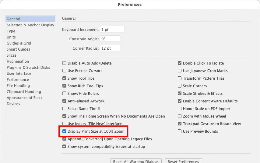
Yes, again attention needs to be paid as to how 100% is defined, and again different programs sometimes have different definitions. Illustrator is not pixel-based, so it’s biased toward print and calculates 100% differently. And that definition depends on how a preference is set. For example, if Illustrator is set to “Display Print Size at 100% Zoom,” that is a different definition of 100% than Photoshop or a web browser, so it can’t match either.
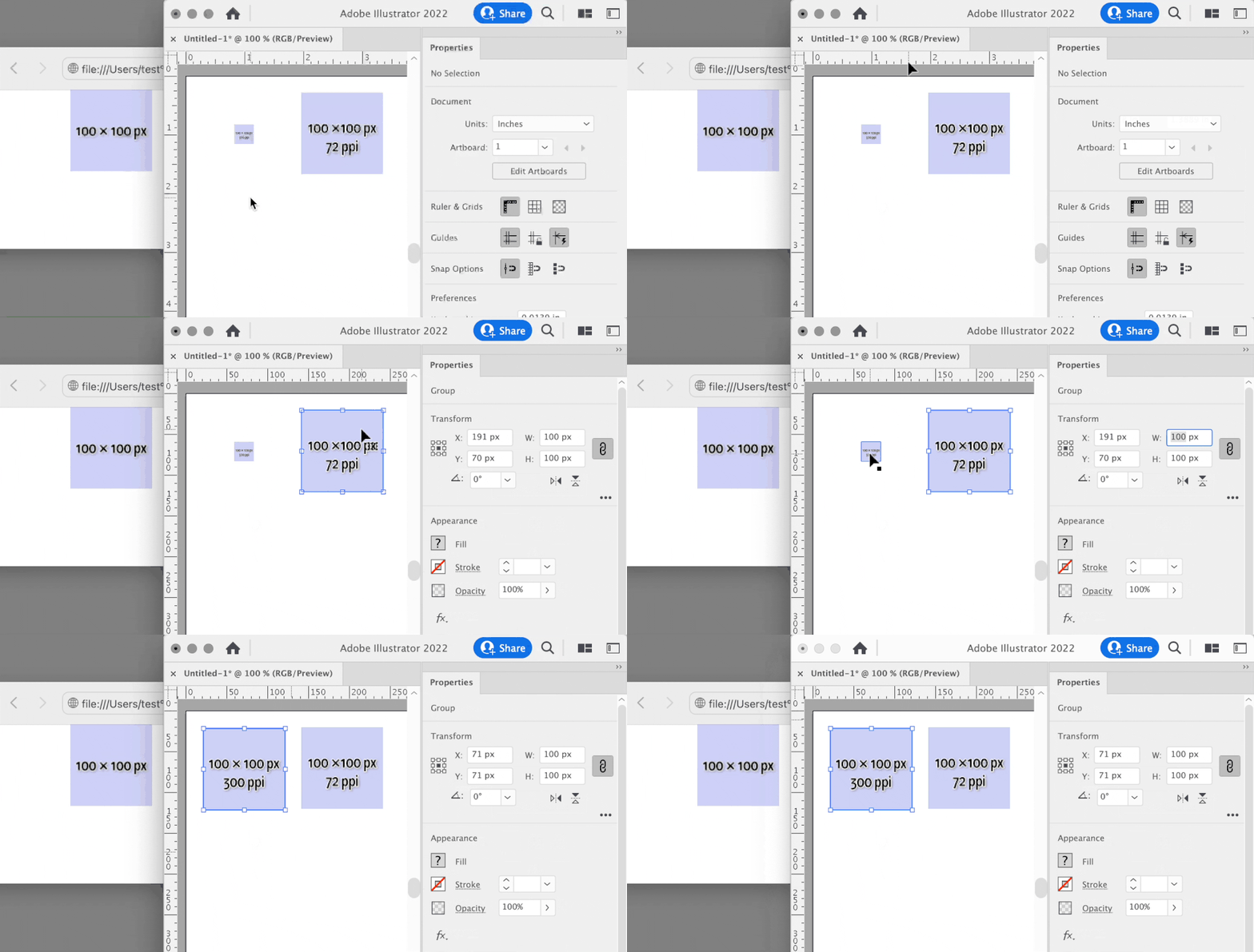
Below, the reason the square is the same size in Illustrator and Photoshop is that I specifically made sure the view was the same technical definition in both applications: In Illustrator it is set to 100% with “Display Print Size at 100% Zoom” enabled, and in Photoshop I chose View > Actual Size (not 100%) because that command also simulates real world print size. But this is not something that’s obvious.
If this sounds complicated…it is. We shouldn’t have to do the math for these inconsistencies. It’s because different applications sometimes prioritized different media (print vs web), which have different “actual size” definitions and different application defaults, so a good designer has to try and stay on top of how different applications think. But it would be better if the applications could resolve this for us.
Copy link to clipboard
Copied
That's a good review of the issues relating magnified display size to pixel dimension for those who are confused (and it is confusing for many many people).
1. I would add as (I hope) clarification that "print size" in Photoshop (zoom tool right click "print size" or View/print size) is the magnification at which your Photoshop rulers, when set to inches, will match a physical ruler held up to the monitor. It's purpose is to gauge edits of files intended for printing at print output size. It connects what you do in Photoshop to the physical world. (And it should help avoid moire patterns in printed material.)
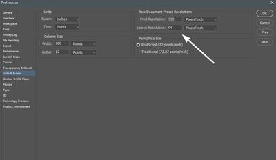
2. On a Windows install, the true "print size" is not displayed accurately (a physical ruler will not match the Photoshop rulers) unless the screen resolution has the correct value entered in the preferences. Thus in, Edit/preferences/Units & Rulers, then under New document preset resolutions, screen resolution should be (Known monitor resolution/monitor physical width in inches). As example, my 24" (diagonal) Dell monitor runs at 1920px wide and it is physically 20.5 inches wide. 1920(px)/20.4(in) = 94. So I enter 94 in that box. My screen rulers set to inches now match a physical ruler if the magnification is "print size."
Copy link to clipboard
Copied
I forgot to fully answer your question about Illustrator vs the browser. When I disable “Display Print Size at 100% Zoom” in Illustrator, a Photoshop graphic dragged into Illustrator matches the size in the browser the next time I set Illustrator zoom to 100%. (When that print-oriented preference is enabled, web graphics can paste too large, as you found.)
Also, watch out if pasting between Photoshop and Illustator, because the pasted size is adjusted for the ppi of the Photoshop document. This can make the pasted graphic the wrong size in pixels in Illustrator. If you disable “Display Print Size at 100% Zoom” and a graphic still doesn’t match a web browser, check the dimensions of the graphic in Illustrator in pixels, and if it’s wrong set it to the pixel dimensions it should be. Then it should match the web browser. The web browser is on the left, in the demo below.
@Beachcolonist wrote:
1. I would add as (I hope) clarification that "print size" in Photoshop (zoom tool right click "print size" or View/print size) is the magnification at which your Photoshop rulers, when set to inches, will match a physical ruler held up to the monitor.
View > Print Size was the old way we used to do it. It was old because we had to manually measure and calculate the display ppi and then enter it. It was inaccurate for anyone who used the command without setting it up. Fortunately, you know how to set it up, but a lot of people don’t know that’s necessary.
The new View > Actual Size command is like an automatic version of the Print Size command. Using newer tech in displays, Windows, and macOS, it is now possible for Photoshop to query the ppi resolution of a connected display, and calculate the real world size from there. All you have to do is choose View > Actual Size and it should match a real world ruler right away. Much easier and simpler than Print Size. But because it is based on inches, Actual Size does not work properly for web/mobile design.
Actual Size doesn’t make Print Size useless. Because you can enter a custom ppi in the Units preference, you can do that to use Print Size to simulate the ppi of any device that is not connected. For example if you enter the ppi of a 326 ppi phone, Print Size should make the document window match the real world size of that phone screen.
For this reason, Adobe should rename Print Size as “Output Size” because it is now useful for simulating a lot of print and non-print outputs. And we can now instead use Actual Size to make the document window automatically match real world print size.
Copy link to clipboard
Copied
I did not ask you a "question about Illustrator vs the browser." In fact I did not ask you any question at all. You are replying to the wrong person.
Copy link to clipboard
Copied
@Beachcolonist wrote:
I did not ask you a "question about Illustrator vs the browser." In fact I did not ask you any question at all. You are replying to the wrong person.
If you are viewing the forum in “threaded view,” you’ll see that both your replies and mine are indented from the parent post we were both replying to. So you’re right, I wasn’t replying to you, I was replying to the parent post. If you mean you got an email about it, that’s because everyone subscribing to the post gets an email whether or not they were being replied to directly.
Copy link to clipboard
Copied
What I meant is; your post is labeled "In response to Beachcolonist." Me.
I was not replying to the parent post, I was replying to you. As such my post is labeled "In Response To Conrad C." Pardon me for taking the leap that the labels mean what they say. I'm not here often. For the record, your original post is labeled: "In Response To raymondc6035064."
And nothing is indented here, I don't get email notices.
Copy link to clipboard
Copied
Just refering to size. I was trying to design a simple gif animation in photoshop for an emailer.
Both email client and web browser are the same size but in photoshop and illustrator there does not appear to be a simple way/setting to alow you to view the size correctly for web similar to the print size or actual size option.
Unless I am missing something?
I agree it is complicated. You have cleared a few things up that I have forgotton though thanks.
Copy link to clipboard
Copied
.
Copy link to clipboard
Copied


