Inspiring
June 25, 2020
Answered

Need help with matching this exact pink colour

  • June 25, 2020
  • 5 replies
  • 1553 views

Hi to all,


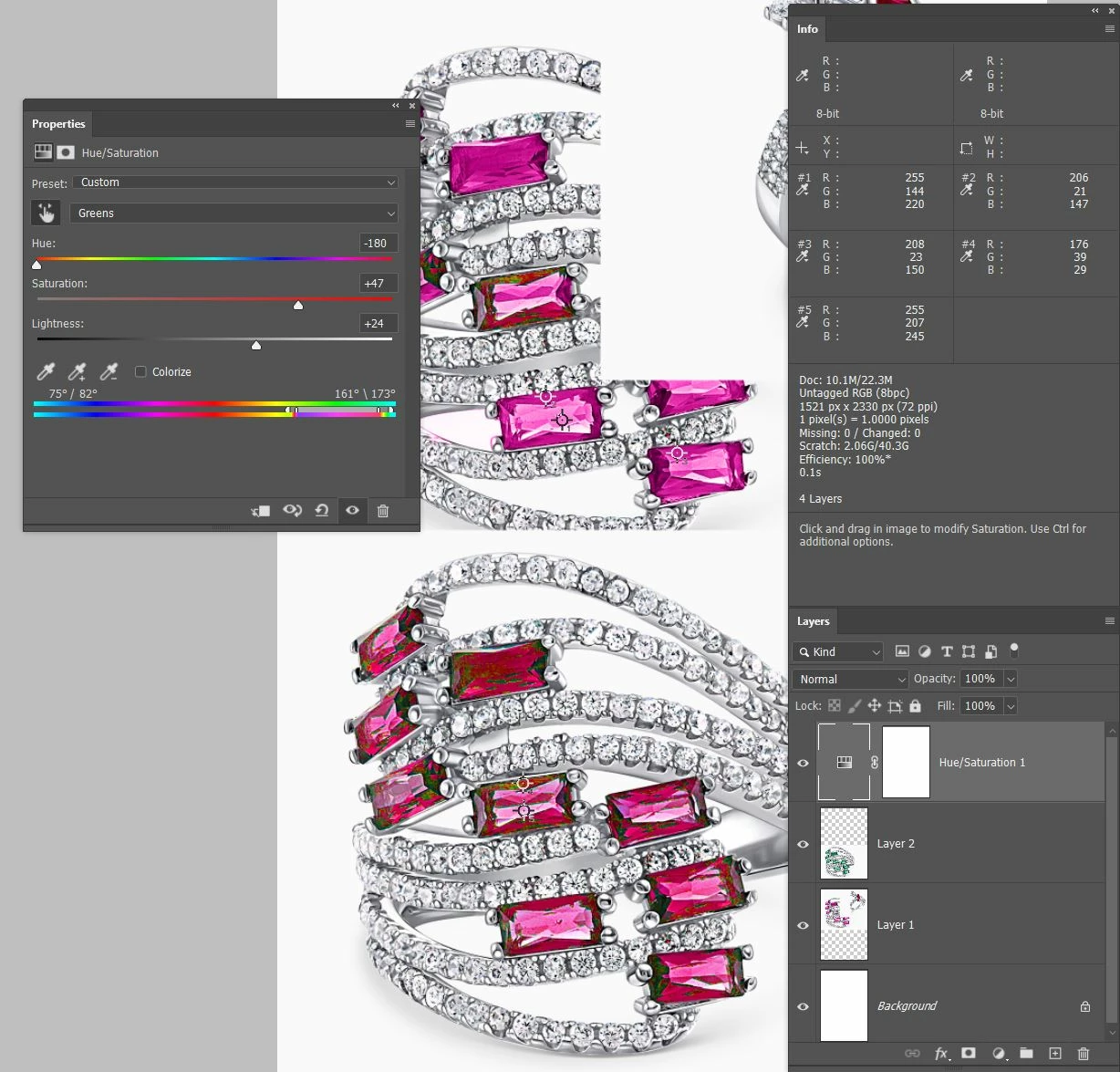
I am a relative beginnner to Photoshop and exact colour matching is something that I have been struggling with for quite a while.

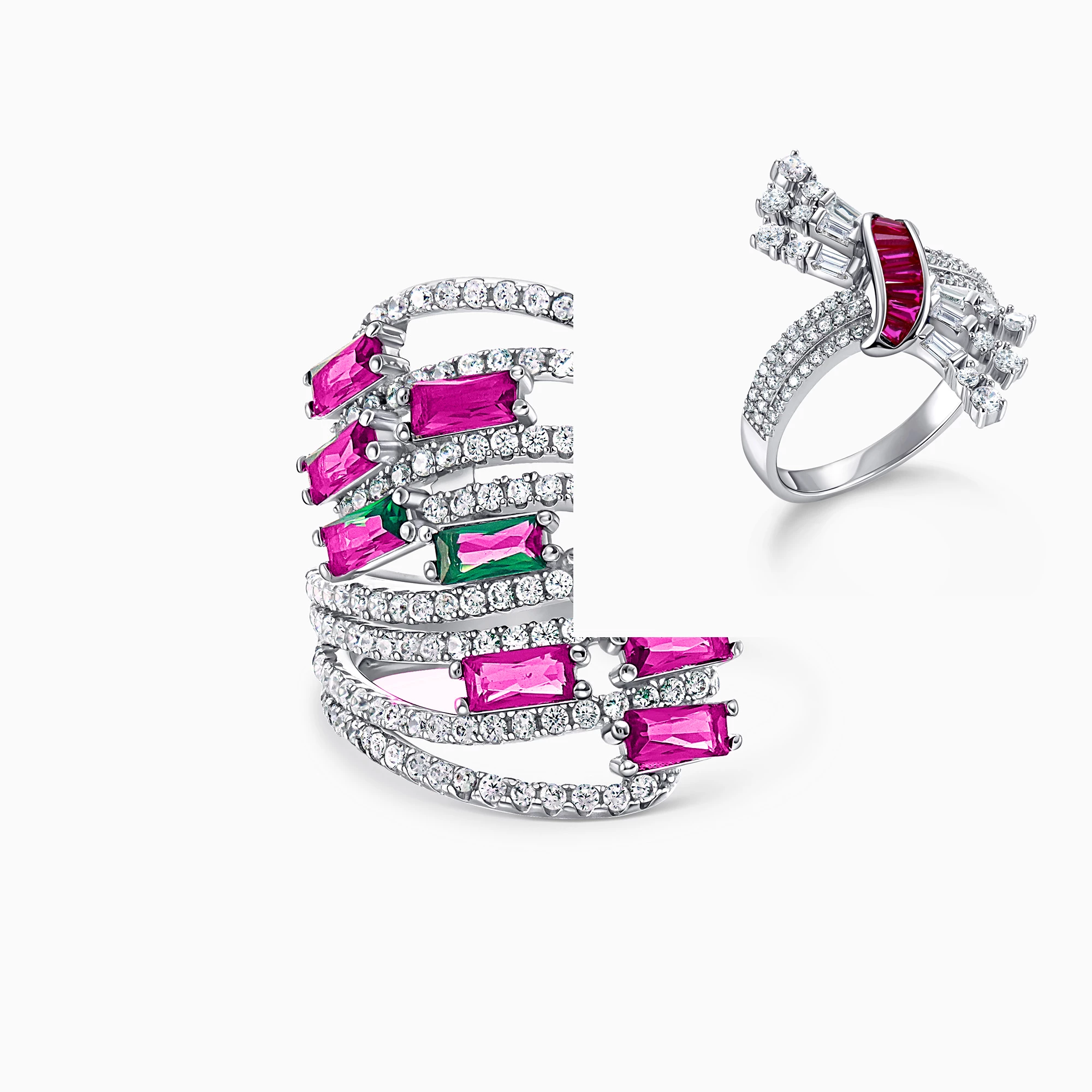
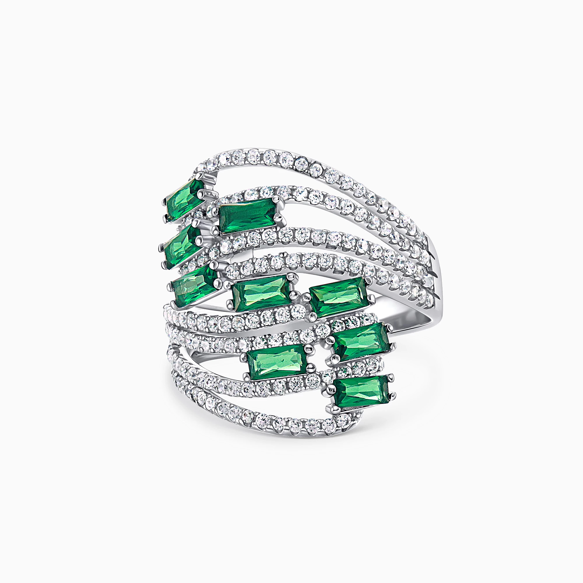
In these practice photos, I am attempting to change the rings stones on the left (originally green) to look exactly the same as the rings stone on the right.

However, I am unable to produce this exact "depth" of Fuschia tone.


I have tried every tool that I know.

Ie: First I tried the replace colour tool and that was just awful.

Then instead I used a new colour solid colour fill layer, changed the blend mode to colour, and tried to refine the colour by using--

-hue/saturation layers

-curves

-vibrance

-contrast

-levels

-selective color

-colour balance

-even tried adding a filter

and stilll nothing will make the colur depth/tone exactly the same.


I thought saturation etc would help but it just turns the ring stones from one artificial looking colour to another.


I would greatly appreciate any assistance or any before/after photos of how your results look.

I have also attached the original ring with the green stones prior to changing their colour to fuschia.


(please ignore the bits of green still left on the left ring from my lazy selecting).


Thank you,

Jenny


This topic has been closed for replies.
Correct answer Trevor.Dennis

I like to take the guess work out situations like this so I use the Color Sampler tool and lay down some points in relevant positions.  Do the same thing with the pixels you want to edit, and drage the Info panel to somewhere convenient. 


There are various ways of matching the colour, but all I did here was use a Hue/Saturation layer and use the little hand icon to sample the colour range I want to edit.  (I had to expand it by dragging out the sliders on the colour bars at the bottom of the properties panel).  Then use the three sliders to change the colour and try to match the values for the colour sample points.  I am sorry that the points are not terribly clear in this screen shot, but you can see well enough to get the idea.


The point here is that whatever method you use, these values update in real time and provide a useful guide. 

5 replies

Trevor.Dennis
Community Expert
Trevor.DennisCommunity ExpertCorrect answer
Community Expert
June 27, 2020

I like to take the guess work out situations like this so I use the Color Sampler tool and lay down some points in relevant positions.  Do the same thing with the pixels you want to edit, and drage the Info panel to somewhere convenient. 


There are various ways of matching the colour, but all I did here was use a Hue/Saturation layer and use the little hand icon to sample the colour range I want to edit.  (I had to expand it by dragging out the sliders on the colour bars at the bottom of the properties panel).  Then use the three sliders to change the colour and try to match the values for the colour sample points.  I am sorry that the points are not terribly clear in this screen shot, but you can see well enough to get the idea.


The point here is that whatever method you use, these values update in real time and provide a useful guide. 

D Fosse
Community Expert
Community Expert
June 26, 2020

c.p. is right; gradient map is the way to go here.


The thing is, you can't just change color. You also need to change the tone curve, and gradient map does that. With that deep saturated red the tonal relationships are different.

c.pfaffenbichler
Community Expert
Community Expert
June 26, 2020

Curves and Gradient Map Layers could be useful. 

Inspiring
June 26, 2020

Thanks for the suggestion. I didn't know that was an option. I though gradent map was only for creating an "ombre" like effect to backgrounds.

c.pfaffenbichler
Community Expert
Community Expert
June 26, 2020

What’s »ombre«? 

didiermazier
Community Expert
Community Expert
June 25, 2020

try this… (excuse my french UI)


Inspiring
June 26, 2020

Thanks Didier. I think the colour still needs some depth somehow...

didiermazier
Community Expert
Community Expert
June 26, 2020

Yes for sure. I did it in half minute. Have to be more precise and maybe duplicat the layer and play a little with blending modes… But this may be a way to explore…

You could alos play withe the replace color brush, directly painting…

Mylenium
Legend
June 25, 2020

A simple correction likely isn't going to cut it. You may need to extract the individual tonal ranges and colorize them separately. Easily done with Image --> Calculations and tweaking the resulting custom channels/ masks/ selections with Levels or Curves adjustments to clip out the unwanted parts and restrict the levels. Also simply consider a ton of duplicate layers with reduced opacities and slightly different colorations. The whole point of most gem stones is that they produce highly variable colors depending on light incidence and blending together a slightly more bluish pink and a more yellowish one might still give a correct "solid" color in the medium ranges, but also capture the slight deviations/ chromatic abberations in the brighter and darker ranges. Again, a "dumb" approach with just slapping on a single adjustment is unlikely to give you the realistic results you are looking for.


Mylenium