- Home
- Photoshop ecosystem
- Discussions
- Re: Something for the weekend - Part 30 - Keeping ...
- Re: Something for the weekend - Part 30 - Keeping ...
Something for the weekend - Part 30 - Keeping us on track.
Copy link to clipboard
Copied
Hi
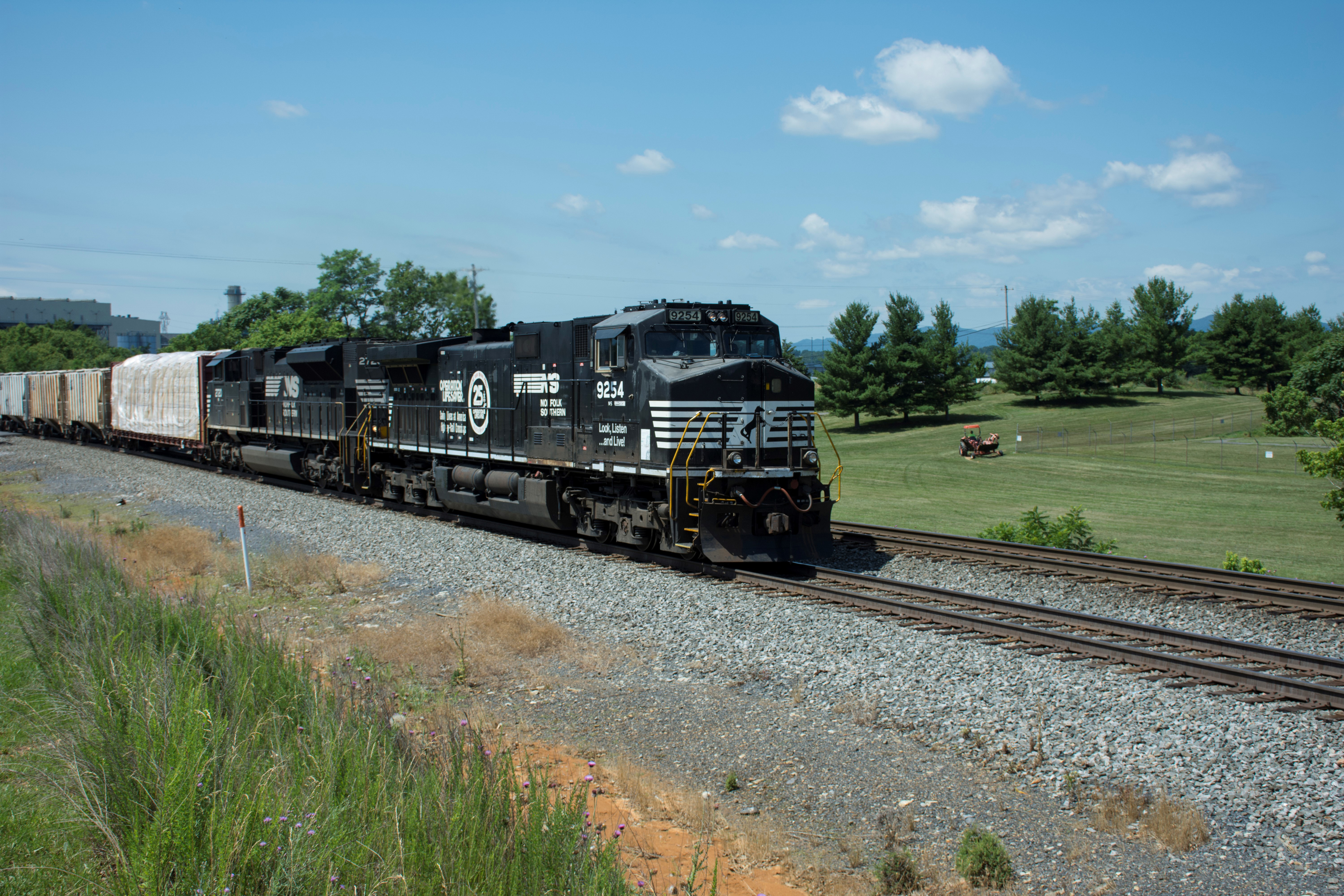
This weeks starting image is brought to us by ACP Jane-E and was photographed by Dirck Harris. It was taken in Hagerstown , Maryland.
We have a heavy train as the subject but also, wild nature in the foreground, trimmed grass in the background as well as a wire fenced "compound", some industrial buildings to the left and distant hills to the right. I wonder how you will use some, or all of these elements to tell us a story?
As always, anything goes as long as it meets the forum rules on decency, copyright etc.
Anyone is welcome to have a go - whether you are a complete beginner or a Photoshop expert.
There are no prizes - just the chance to practice, show off, or bring a bit of humour and fun.
When posting back your edited images please use jpeg and downsize to 1200px on the long side.
To download the image below in jpeg format with ICC color profile (sRGB) and without the forum scaling artefacts , right click and then use Save Image As /Save Target As (or similar depending on your browser).
Have fun
Dave
Explore related tutorials & articles
Copy link to clipboard
Copied
It's been so much fun seeing one of Dirck's train photos come to life in so many amazing ways. Thank you all! I have to share that the eight-year-old let out squeals of delight as the new ones came in. She has been totally amazed and enchanted!
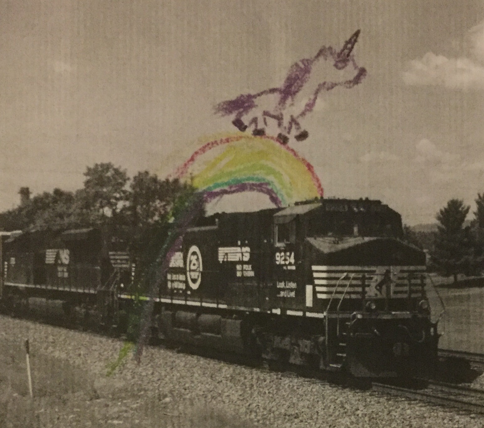
She did hers first in crayon, then with Adobe Sketch. All I did was show her how the tools worked and how to use the layers.
Here is the crayon version with the rainbow bridge. She assured me that everyone already knows that unicorns walk across rainbow bridges. The cotton-candy clouds are not in this version.
Copy link to clipboard
Copied
jane-e wrote
Here is the crayon version with the rainbow bridge. She assured me that everyone already knows that unicorns walk across rainbow bridges.
Magic ! ![]()
Dave
Copy link to clipboard
Copied
Trans-Pacific Railways:
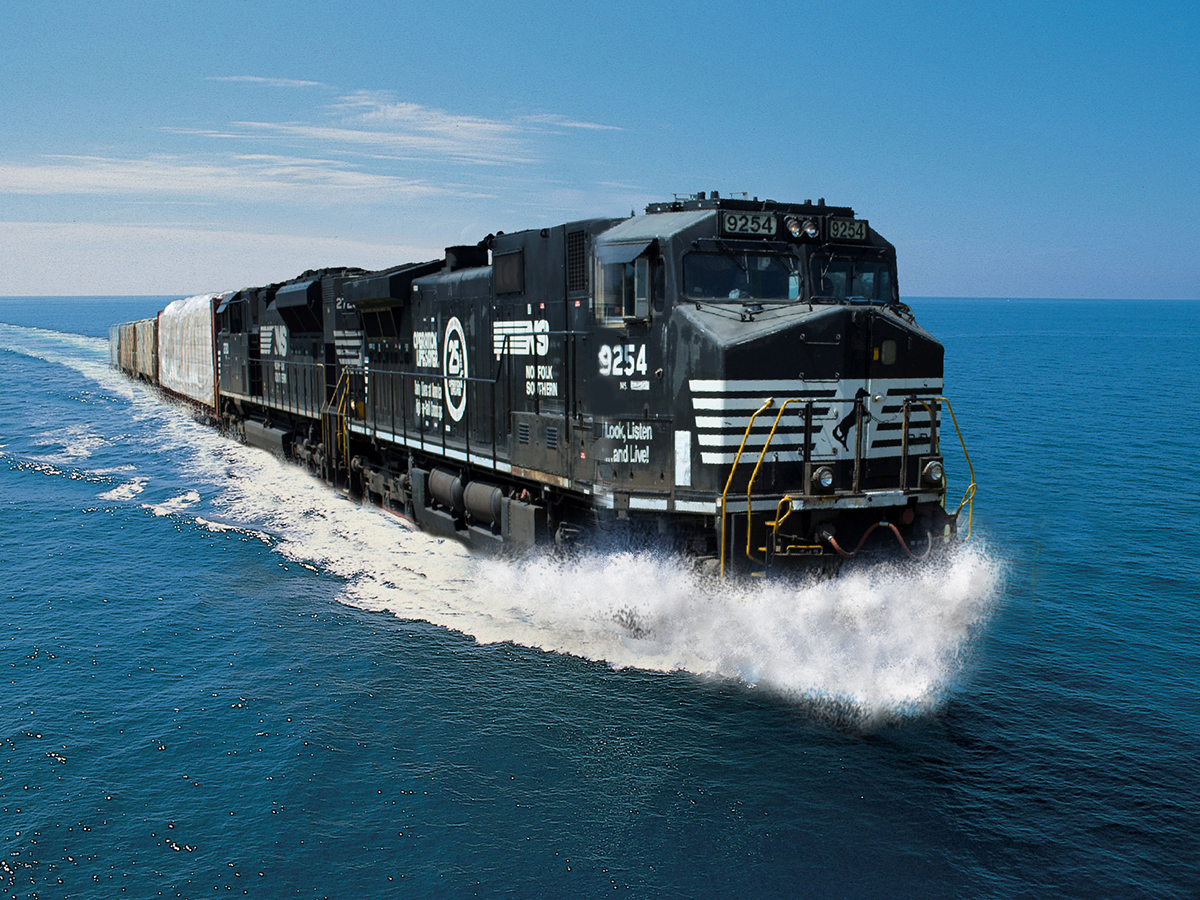
I'd really like to re-work the perspective on this, but it's getting late . . .
Copy link to clipboard
Copied
Cool one Semaphoric
Exactly what I had in mind. ![]()
Pierre
Copy link to clipboard
Copied
Nice job of the spray at the front there.
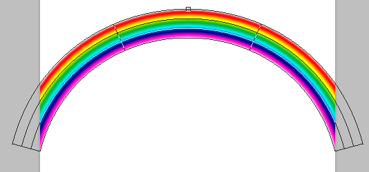
Jane, that is such a lovely story. Did you show her how easy Photoshop can make rainbows with Free Transform > Warp?
And out of interest, was she using a tablet?
Copy link to clipboard
Copied
Trevor.Dennis wrote
Did you show her how easy Photoshop can make rainbows with Free Transform > Warp?
But does it do unicorns Trevor ? ![]()
Dave
Copy link to clipboard
Copied
Hi Trevor and Dennis,
After the crayon drawing, I found a vector image of a unicorn on a rainbow from Adobe Stock and opened it in Illustrator. "But the colors are in the wrong order!" she exclaimed. So we made swatches for the current colors and got the colors right. We worked on layers—creating, moving things, hiding, showing. The rainbow needed to be lenghthed on the left, and there were extra things she didn't want.
It was a great lesson in Illustrator, and she was catching on quickly. I also realized as I was going to sleep Friday night that even if she started from scratch, it would might be mostly me, whereas she knew exactly what she wanted.
I woke up Saturday morning and figured out how to use Adobe Sketch on my iPad as she still slept so I could teach her how to choose brushes, colors, opacity, and layers. And the eraser and Undo. Then she could draw with her finger. She loved the project and dictated even what I should write as the introduction when we posted it.
Copy link to clipboard
Copied
How about the Unicorns of the ocean? Narwhals are just plain bizarre
Copy link to clipboard
Copied
Trevor.Dennis wrote
How about the Unicorns of the ocean? Narwhals are just plain bizarre
Fascinating!
Copy link to clipboard
Copied
Nice one Semaphoric - the spray is spot on!
Dave
Copy link to clipboard
Copied
This project showed me the problem with being a long time user of Photoshop. After doing the perspective the way I did it back in the day, I laboriously cloned in the spray on a few separate layers. Finally, I had to touch up the nose of the engine cab, to hide the seams from the multiple free transforms I'd done.
Unhappy with the perspective (especially around the cab), I thought, "There has to be a way to adjust two sides at once". And then: "Oh, yeah. Perspective Warp . . ." DOH! I quickly set up some stroked paths to get the vanishing point for the underlying ship image, and getting the train right was a snap. But then the spray was all wrong, and I didn't feel like doing it all over, and I'd already posted it ![]() .
.
I started thinking about how many tools in Photoshop I never properly learned how to use, because I would gravitate to the tools I was familiar with. So now, I've decided to "Re-learn" Photoshop - you're never too old.
Copy link to clipboard
Copied
That's been one of the interesting things about the SFTW projects, Semaphoric — running into a "problem" and then finding a new way to solve it and learning something new in the process. I'm so glad davescm started this.
Copy link to clipboard
Copied
Great work! It is fun to see how people re-imagine a picture!
Copy link to clipboard
Copied
Weekend? only Tuesday out here...but I could use a drink
.png)
Copy link to clipboard
Copied
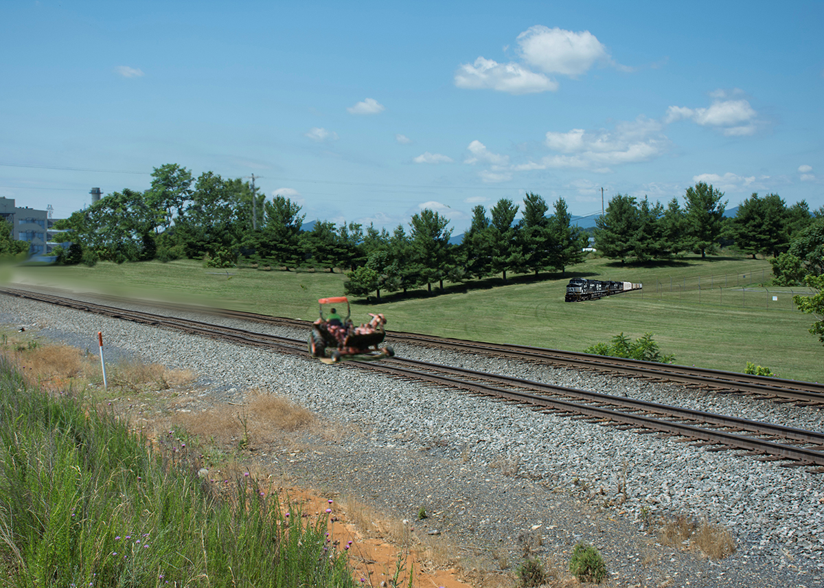
It's late, and I ran out of gas, especially on the left side, but you get the idea:
Copy link to clipboard
Copied
Hi
It's nice to see them still coming in.
Chana, I'll try a drop if that.
Semaphoric, I see the train driver and tractor driver are trying a job swap.
Keep them coming, our weekend runs all the way through to Friday when the next weekend starts.
Dave
Copy link to clipboard
Copied
I said I'd summarise the Steve Caplin / Retouch Pro webinar, and having watched the entire 90 minutes, it turned out that the good stuff was near the beginning, so to save people having to trawl through it all, a lot of his tips revolved around the Hard Light blend mode. It turns out that I did not fully understand Hard light, despite having used it hundreds of time, but what it essentially does is knock out the mid-tones, and that can be useful.
One of his tricks was creating a beard, or stubble. He starts by painting in the beard with a mid grey on a new layer
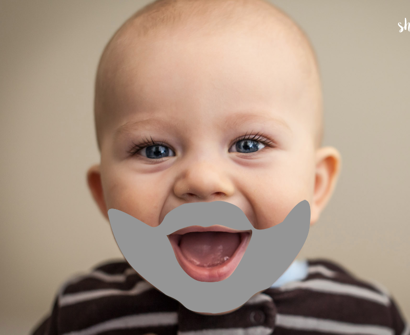
Next add a tone of noise. This because we are going to use Radial Blur, and we need to give it something to work on. I add a step to what Steve did by blurring the grey layer before adding the noise, to soften the outline.

We need to define the central point for the Radial Blur to work from, so we make a square selection from the point of the nose
(Ctrl Alt drag from the centre point, for those that don't know)
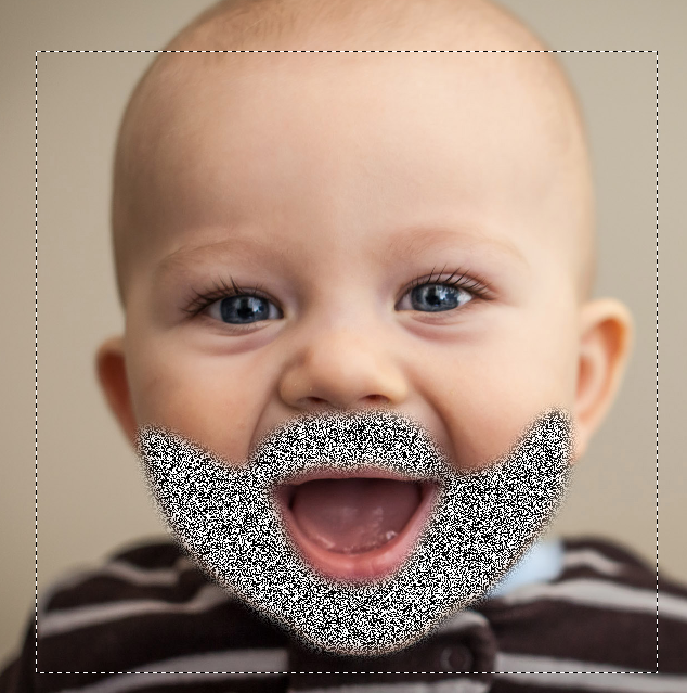
Now the Radial Blur with it set to Zoom. Steve used Best, and it only takes a second so no reason not to
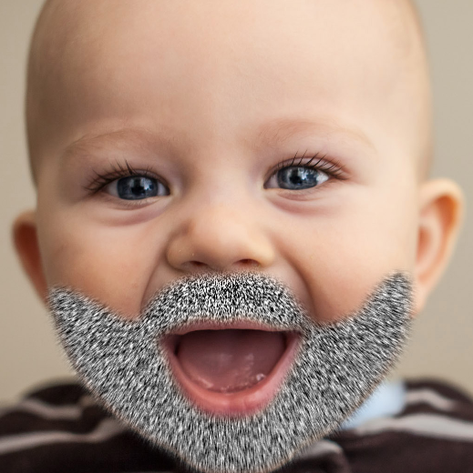
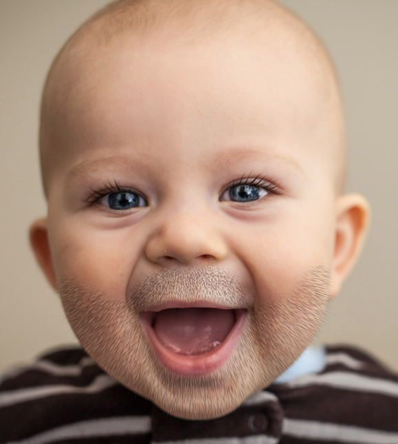
We have now given the noise some direction radiating out from the end of the nose, so now the entire point of this exercise, which is to set the layer to Hard Light, which knocks out all the mid tones.

I've also reduced layer opacity to 70% because the effect was a bit dense for my liking. You can see how blurring the outline of the grey before applying noise has softened the beard outline. It looks to sharp and unreal without that step IMO. You could pull down the white beard strands with Curves or Layers, or alternatively, use some Smart Sharpen which will do much the same thing.
Steve's other interesting use of Hard Light was with the Plastic Wrap filter. The thing to remember with Plastic Wrap, is that we have to give it some tonal variation to work with, similar to how we make a Displacement Map or Lighting Effects — lighter tones are raised, and darker tones are depressed.
So I have started with an illustration of a sphere, and painted some mid grey on a new layer, that is going to become a translucent goo. (who needs Kai Power Tools? ![]() ).
).
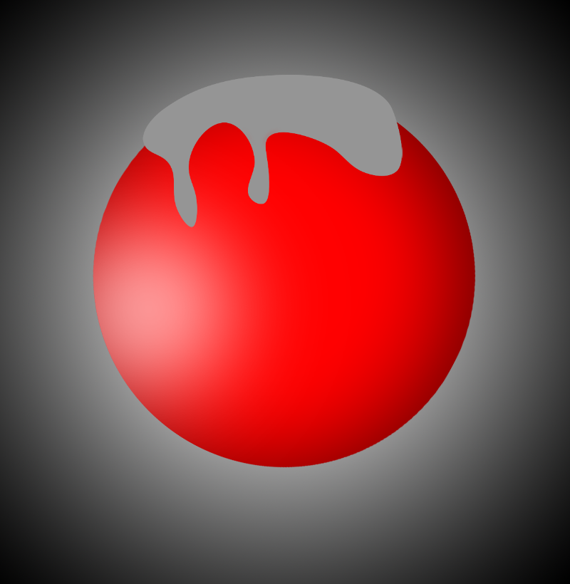
Now we need to give the grey layer some depth with the Dodge and Burn tools. This has to be done directly to the grey layer, but you can use a copy if you want to try it different ways. I had brush opacity set to 30% and built this up with multiple strokes. It already has the appearance of depth, and I think you can see the Displacement Map similarity, (apart from the outline).
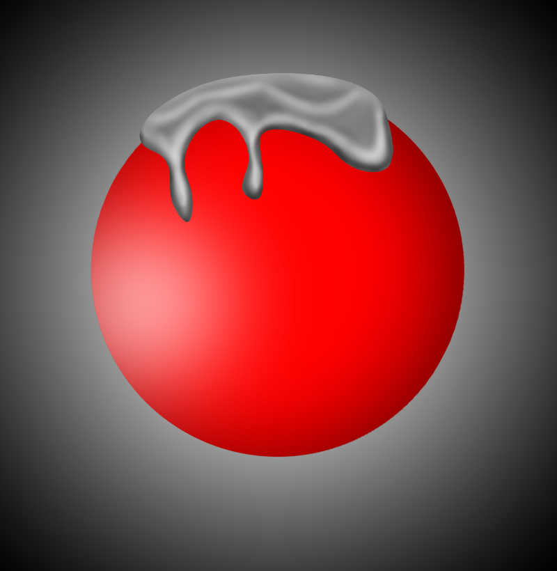
Now use Plastic Wrap. You can set the layer to a Smart Object if you want to experiment with the settings.
The settings make a lot of difference, so don't just go with the defaults
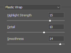
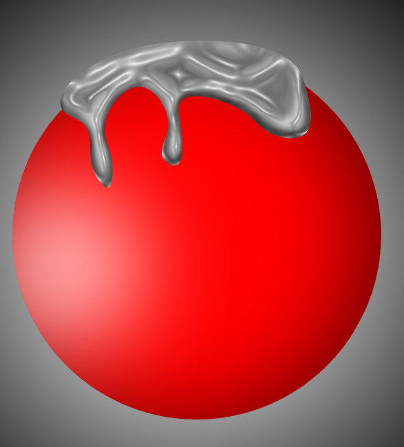
Now it's back to Hard Light again, to knock out those mid-tones, and here's our goo
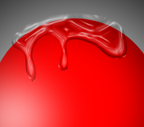
You'll no doubt be thinking that you can do some of this with a layer style and Fill Opacity set to very low or zero, but Bevel & Emboss can only effect the outline of the object, and not the interior. I got a better understanding of Hard Light out of this, and I also now have a better understanding of Plastic Wrap. It's a really cool tool when you know how it works.
Copy link to clipboard
Copied
So that's how the stubble appears each morning ![]()
You make a very good point Trevor, no matter how much we think we are familiar with the various tools , there is always something new to pick up. That's one of the advantages of these forums. The questions force you to think out of the box.
Dave
Copy link to clipboard
Copied
ths is why I like PS - never stop learning...
-
- 1
- 2


