New Participant
May 9, 2017
Answered

Text Opacity Different Color Than Shape & Smart Object Opacity?

  • May 9, 2017
  • 3 replies
  • 2609 views

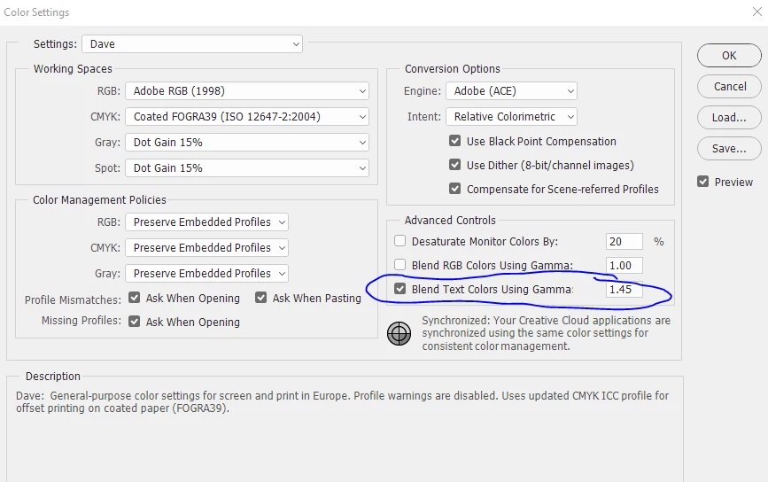
The above image has a smart object (Left), Text Layer (Mid), and Shape Layer (Right) all with the same base color and all with 45% opacity, and a solid color behind them. Why does the text have a drastically different color than the smart object and shape which are exactly the same color? Any input would be greatly appreciated. Thanks

Rob

This topic has been closed for replies.
Correct answer davescm

Hi

It is due to your colour setting for blending text. By default this is set to a different gamma to the colorspace gamma used for pixels.

Uncheck it and it will look the same

Dave

3 replies

davescm
Community Expert
May 17, 2018

This was discussed a long time ago with one of the developers who used to post on here. The default is set to give the best antialiasing for text. So there are good reasons for it. Like many things in digital imaging, this is about choosing the right settings for the image concerned.

Dave

AE-FTW
Inspiring
May 17, 2018

The end result is to artificially multiply the rendered opacity value of the entire text layer just to improve the rendering quality of its edges.

That make sense to anyone?

Isn't that the same as reviewing my layer at 50% and thinking, "oh, that anti-aliasing looks poor, I'll bump it to 65%".

The whole layer is affected... so why make a secret rule?

And why enable it by default so that this behaviour applies to every historical file I open??

This seems really wrong to me.

Glad I've found it and disabled.

davescm
Community Expert
May 17, 2018

Hi

As long as you are aware of the impact you can set it to whatever works for you.

Here is the discussion with Chris Cox, who was the Adobe engineer I referred to:

Re: Why would I not want to Blend RGB and Text Colors Using Gamma 1.00?

Dave

AE-FTW
Inspiring
May 17, 2018

I've been using Photoshop for 25 years as a web designer and I've never seen this behaviour before.

It is batsh|t insane to have this setting enabled. It is especially crazy to enable it automatically.

Why would I want rendered opacity to vary between type layers and everything else?

Smart vector objects, Shapes, and pixels all behave normally, but my type is the wrong colour?! Who would want that?

If I rasterise the type, the colour changes to to match the non-type opacity too!

Totally nuts functionality.

Thanks for the solution Davescm, I would have never found it without your tip!

davescm
davescmCorrect answer
Community Expert
May 9, 2017

Hi

It is due to your colour setting for blending text. By default this is set to a different gamma to the colorspace gamma used for pixels.

Uncheck it and it will look the same

Dave

neulionrkAuthor
New Participant
May 9, 2017

Awesome, thanks Dave really appreciate it

Rob

davescm
Community Expert
May 9, 2017

You're welcome

Dave

Edit to add : Whilst unchecking it solves your issue (i.e. the blends will match)  - I would not uncheck it permanently for all images. The gamma was chosen to give the best anti-aliasing on text. You may see issues in other fonts/documents if you uncheck permanently. I guess it's all about knowing the best settings for your image.