- Home
- Photoshop ecosystem
- Discussions
- Re: What is the Image P3 color space in Photoshop ...
- Re: What is the Image P3 color space in Photoshop ...
Copy link to clipboard
Copied
Does it have anything to do with DCI-P3, or Display P3?
 1 Correct answer
My article discusses the gamut in general, but doesn’t help much in differentiating the variations of P3 except for this one sentence:
The DCI-P3 color gamut started out as a standard for digital cinema because it’s based on the color range reproduced by the type of digital projector you’d find at a movie theater. Apple created their own version called Display P3, adapting it for computer displays and making some aspects of it more consistent with sRGB.
But that’s not detailed enough. D Foss
...Explore related tutorials & articles
Copy link to clipboard
Copied
DCI-P3 is a standard for digital cinema projectors.
When Apple introduced their wide gamut displays, they for some reason rejected the standard wide gamut panels that had been successfully in use for years by other manufacturers. They went for this cinema specification instead.
DCI-P3 has no history or particular relevance for photography. But since Apple started using it, it has become a standard color space on its own, along with Adobe RGB (which it's quite similar to), sRGB and ProPhoto.
Copy link to clipboard
Copied
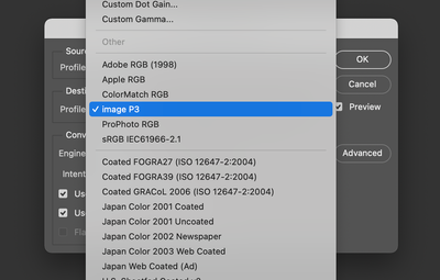
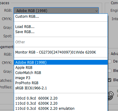
Thank you, but I'm specifically interested in what the "image P3" color space is. Note that it does not say "DCI-P3", or "Display P3", the latter of which is a separate option lower in the list.
Copy link to clipboard
Copied
I would assume it's a "normalized" version of Display P3, which is Apple's standard/generic monitor color space/profile with these panels.
Display P3 is somewhat different from the original DCI-P3 specification, which has a 2.6 gamma, and a greenish white point to compensate for xenon lamp projectors. Instead, Display P3 uses the sRGB tone curve and D65.
The primaries are the same throughout. But whether Image P3 also uses the sRGB tone curve, or a regular gamma 2.2 curve, I don't know.
EDIT: did some quick tests, and Image P3 appears to use the sRGB curve too. Which is all a bit surprising, because the sRGB tone curve applied to CRT monitors, but doesn't quite match modern LCD panels. In any case, the difference between Display P3 and Image P3 can't be much. Maybe the names just signify intended use.
Copy link to clipboard
Copied
What do you mean by "normalized"?
Would you have any idea where to find more information on it? "image P3" is such a tricky search phrase. I've found absolutely nothing.
Copy link to clipboard
Copied
@Taipalus wrote:
Would you have any idea where to find more information on it?
See this helpful article by @Conrad_C on the Creative Pro website:
https://creativepro.com/how-do-p3-displays-affect-your-workflow/
Jane
Copy link to clipboard
Copied
My article discusses the gamut in general, but doesn’t help much in differentiating the variations of P3 except for this one sentence:
The DCI-P3 color gamut started out as a standard for digital cinema because it’s based on the color range reproduced by the type of digital projector you’d find at a movie theater. Apple created their own version called Display P3, adapting it for computer displays and making some aspects of it more consistent with sRGB.
But that’s not detailed enough. D Fosse and thedigitaldog have filled in more specific details about the difference, like the white point shift.
This is one way to summarize the differences:
- DCI-P3: This industry standard is specifically intended for cinema display, because of its white point optimized for cinema projectors, and because its luminance is so low. According to Wikipedia and color.org, DCI-P3 uses a white luminance of 48 cd/m2… which is absurdly dark for computer use. But it’s perfectly reasonable for projection in a dark room like a movie theater, which is what it’s for.
- Display P3: This Apple derivative uses the DCI-P3 gamut, but to be appropriate for use on common computer and mobile displays, this standard does not limit the luminance to 48 cd/m2. According to the display presets for the Apple Pro Display XDR and the Liquid Retina XDR screens which both use P3, luminance is limited to 160 cd/m2, which is appropriate for SDR consumer/mobile/web viewing (the largest market by far), but too bright for print or SDR cinema (OK for SDR TV viewing).
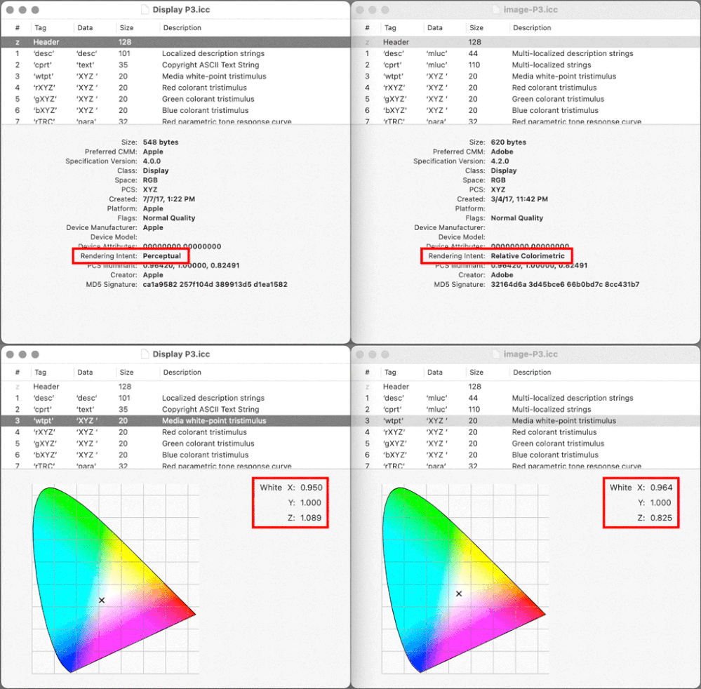
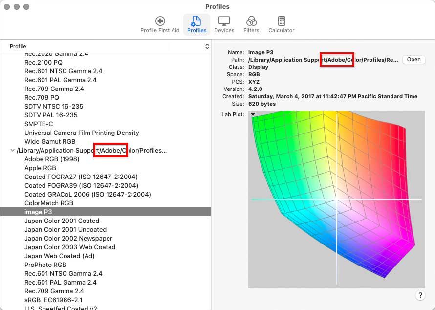
- Image P3: I’m less sure as to what this Adobe variation is about. The Image P3 profile is installed inside a folder that’s accessible only to Adobe applications, so Image P3 might be an Adobe-only thing. If you compare Image P3 to Display P3 in Apple ColorSync Utility, Image P3 uses the same RGB primaries, but a different white point, and a different rendering intent (see below). At this point someone else (ideally from Adobe) is going to have to explain why they chose those differences because I don’t know.
What we do know is that while all three standards use the P3 color gamut, the reason they’re different is because of variations in other specs like white point, luminance, TRC/gamma, and rendering intent.
Copy link to clipboard
Copied
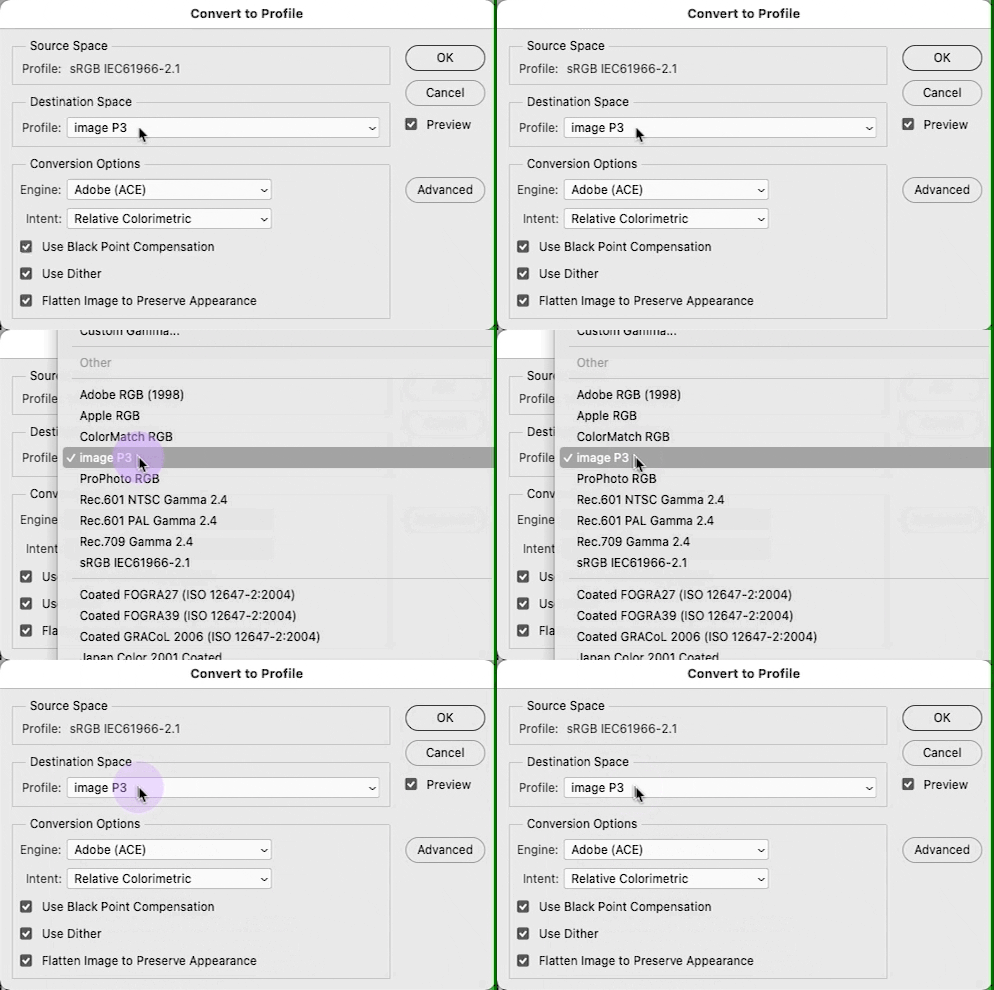
Despite what the ColorSync utility show, no, Display P3 doesn't appear have a Perceptual Rendering intent. You can see this as well in Photoshop: open an image in another color space (I'd recommend ProPhoto RGB), select this profile in Convert to Profile, toggle between RelCol and Perceptual; no difference whatsoever.
I have two profiles on my Mac, one from Apple (Display P3) and one from Adobe (DCI-P3).The WP's do differ as expected. Apple's is indeed a V4 profile (Adobe's a V2). I converted my Gamut Test File (ProPhoto RGB) using the Apple profile, one doc RelCol, a duplicate Perceptual, subtracted the two: zero difference. Pixel for pixel identical.
Copy link to clipboard
Copied
Thanks, I was hoping you would comment on whether the rendering intent meant anything. Where would that come into play?
Copy link to clipboard
Copied
@Conrad_C wrote:
Thanks, I was hoping you would comment on whether the rendering intent meant anything. Where would that come into play?
It doesn't.
Copy link to clipboard
Copied
A 'default rendering intent' instruction from the profile may be obeyed by some software.
neilB
Copy link to clipboard
Copied
Standard working RGB profiles don't support rendering intents (sRGB/Adobe RGB/ProPhoto). Whatever you choose, relative colorimetric is what you get.
So Image P3 would be an exception to the rule if it did.
Copy link to clipboard
Copied
@NB, colourmanagement wrote:
A 'default rendering intent' instruction from the profile may be obeyed by some software.
neilB
If it has such a table. Not sure if it does, nor why PS when set to use it doesn't.
At this point, I think this is “bogus” metadata but I could be wrong.
Copy link to clipboard
Copied
I think what Taipalus specifically wants to know, is how Image P3, as listed in Photoshop among the standard color spaces, relates to Display P3, the monitor profile.
As Andrew implies, a standard RGB color space is quite simple to characterize. It's basically defined by its primaries, its tone response curve, and its white point. And from what I can tell, all three parameters are known and identical between Image P3 and Display P3. In other words, they're apparently one and the same.
When I wrote above that Image P3 is probably a "normalized" version of Display P3, I assumed that the Display version had some tweaks to the tone curve to better describe the actual behavior of a real-world physical display. A monitor profile should have that, and if you make one with a calibrator it will. But a standard color space doesn't need it. It can have a perfectly regular gamma curve (like Adobe RGB or ProPhoto).
So I was highly surprised when I learned that Display P3 has simply adopted the sRGB curve.
We all agree that you should never use your monitor profile on document level (or vice versa). They serve different purposes. So from a purely pedagogical standpoint, it makes sense to name them Image and Display respectively.
Copy link to clipboard
Copied
To add, none of these color spaces are based or designed on any print output color spaces. They are all based on real or theoretical displays/emissive devices. Their shapes are nothing like print output spaces. No printer can contain the full color gamut of even sRGB.
These simple matrix profiles of RGB working spaces when plotted 3 dimensionally illustrate that they reach their maximum saturation at high luminance levels. The opposite is seen with print (output) color spaces. Printers produce color by adding ink or some colorant, while working space profiles are based on building more saturation by adding more light due to the differences in subtractive and additive color models.
Adobe RGB (1998) was the result of a mistake made by Adobe when they were trying to include a space called SMPTE-240M in Photoshop 5. Unfortunately Adobe got the chromaticity values (the numbers that define the RGB primaries) off a web site that had errors in those specific numeric values. After the release of PS5, the SMPTE contacted Adobe and made them aware of this error. So Adobe had to change the name; it simply wasn't SMPTE-240M. The good news was the space worked well so they remained it "Adobe RGB (1998)" for
Photoshop 5.5 and has been such since then. It was never designed for anyting to do with printing like all other RGB Working Spaces.
More for the OP here: https://www.adobe.com/digitalimag/pdfs/phscs2ip_colspace.pdf
Copy link to clipboard
Copied
Is "Image P3" an actual icc profile? please share it here, it's not on my mac.
Display P3 is the iPhone (iMac/Macbook) color space, also said to be the colour space of many modern handheld devices. It seems to be "THE NEW sRGB in it's universality.
[Apple state that: this color space uses the DCI P3 primaries, a D65 white point, and the sRGB transfer function.]
- so its close to, but not identical to DCI-P3 (DCI = Digital Cinema Initiatives)
[DCI-P3 uses a simple 2.6 gamma curve, a white luminance of 48 cd/m2, and a whitepoint with a correlated daylight temperature of ~6300K]
[Display P3 is a color space created by Apple Inc. It uses the DCI-P3 primaries but with a D65 white point which is much more common among computer-display colorspaces (sRGB and AdobeRGB both use D65).
Also unlike DCI-P3's 1/2.6 pure gamma curve, Display P3 uses the sRGB transfer curve (EOTF and thus display referred), which, for comparison purposes, could be approximated to a 1/2.2 gamma curve.]
In some areas DCI P3 is a larger colourspace than AdobeRGB1998
I hope this helps
neil barstow, colourmanagement net :: adobe forum volunteer
google me "neil barstow colourmanagement" for lots of free articles on colour management
[please only use the blue reply button at the top of the page, this maintains the original thread title and chronological order of posts]
Copy link to clipboard
Copied
@NB, colourmanagement wrote:
Is "Image P3" an actual icc profile? please share it here, it's not on my mac.
You don’t see Image P3 on your Mac at all? On my Mac, it’s clearly inside an Adobe-installed folder of profiles (see figure below).
Installing it there means Image P3 shows up in the Adobe section of profiles in profile conversion menus in Photoshop etc.:
If some of us see the Adobe Image P3 profile and others don’t, Adobe might be installing it for specific applications only. For example, because I also install and use Adobe video applications, my profile menus include many Adobe-installed video-oriented profiles that many print-centric folks are largely unaware of.
And so we end up with discussions like these, where all the answers discussing only DCI-P3 vs Display P3 are completely not answering the original question about the Image P3 profile apparently installed by Adobe.
Copy link to clipboard
Copied
I do not see "image P3" on this end either (sorry if I jumped the gun in a post I deleted). So no, it isn't installed by Photoshop, Lightroom Classic, Bridge or Acrobat which I have installed on my Mac.
Copy link to clipboard
Copied
Conrad, thanks, not on my mac with Photoshop 22.5.2.
neilB
Copy link to clipboard
Copied
DCI-P3, is bascially Display P3 and Photoshop doesn't care as long as you have a profile that defines it, PS is basically color space agnostic. Display P3 is DCI-P3 primaries and thus gamut with the D65 white point together with the sRGB TRC (tone curve)
Copy link to clipboard
Copied
Andrew, thanks for the droiopbox file, as you concluded it's "ImageP3 " I cant find.
As neither of us have it, that’s a little strange?
neil barstow, colourmanagement net :: adobe forum volunteer
Copy link to clipboard
Copied
I suppose although I have zero need for it.
I also suppose some other Adobe software installed it, but again, I'm running Photoshop, Lightroom Classic, Acrobat, InDesign and Muse; it isn't there.
Maybe Lightroom cloudy?
Copy link to clipboard
Copied
I don't have anything particular installed aside from CC (no cloud apps), and it's been in the standard list for several versions. I've never used it, but noticed it when it first appeared:
Copy link to clipboard
Copied
Generally it would seem that working space profiles are based on the 'monitor profile' structure:
Display profile:
(Working Space profiles - are also very simple matrix type profiles)
A: Profile description
B: Media White Point
C: Copyright
D: Chromatic Adaptation
Matrix data and reproduction curve tags for Red Green and Blue
Or, in the case of an LUT type display profile, a Look Up Table.
A2B0 = device to PCS lookup table (theoretically Perceptual but does not work that way)
B2A0 = PCS to device lookup table
So perhaps the Input P3 colour space includes more tags?
Or maybe someone got the B2A0 tag actually working for perceptual?
I hope this helps
neil barstow, colourmanagement net :: adobe forum volunteer
google me "neil barstow colourmanagement" for lots of free articles on colour management
[please only use the blue reply button at the top of the page, this maintains the original thread title and chronological order of posts]
Copy link to clipboard
Copied
Ive read this a few times... so image P3 (Adobe profile) is slightly different but close to Display P3 (Apple)?
ANd what is the difference if anyone knows?
-
- 1
- 2
