Taipalus
Known Participant
December 16, 2021
Answered

What is the Image P3 color space in Photoshop meant for?

  • December 16, 2021
  • 4 replies
  • 34396 views

Does it have anything to do with DCI-P3, or Display P3?

Correct answer Conrad_C

@Taipalus wrote:

Would you have any idea where to find more information on it?


See this helpful article by @Conrad_C  on the Creative Pro website:

https://creativepro.com/how-do-p3-displays-affect-your-workflow/


Jane


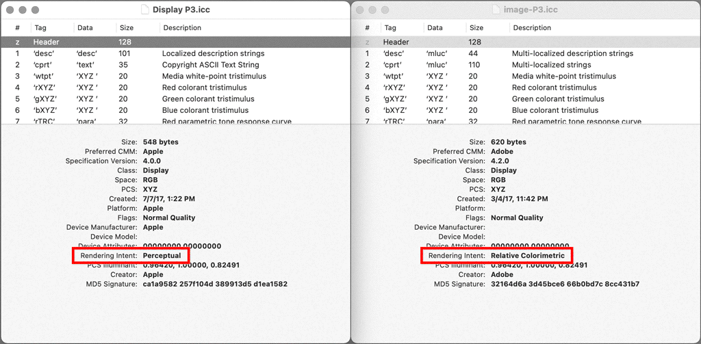
My article discusses the gamut in general, but doesn’t help much in differentiating the variations of P3 except for this one sentence:


The DCI-P3 color gamut started out as a standard for digital cinema because it’s based on the color range reproduced by the type of digital projector you’d find at a movie theater. Apple created their own version called Display P3, adapting it for computer displays and making some aspects of it more consistent with sRGB.


But that’s not detailed enough. D Fosse and thedigitaldog have filled in more specific details about the difference, like the white point shift.


This is one way to summarize the differences:

  • DCI-P3: This industry standard is specifically intended for cinema display, because of its white point optimized for cinema projectors, and because its luminance is so low. According to Wikipedia and color.org, DCI-P3 uses a white luminance of 48 cd/m2… which is absurdly dark for computer use. But it’s perfectly reasonable for projection in a dark room like a movie theater, which is what it’s for. 
  • Display P3: This Apple derivative uses the DCI-P3 gamut, but to be appropriate for use on common computer and mobile displays, this standard does not limit the luminance to 48 cd/m2. According to the display presets for the Apple Pro Display XDR and the Liquid Retina XDR screens which both use P3, luminance is limited to 160 cd/m2, which is appropriate for SDR consumer/mobile/web viewing (the largest market by far), but too bright for print or SDR cinema (OK for SDR TV viewing). 
  • Image P3: I’m less sure as to what this Adobe variation is about. The Image P3 profile is installed inside a folder that’s accessible only to Adobe applications, so Image P3 might be an Adobe-only thing. If you compare Image P3 to Display P3 in Apple ColorSync Utility, Image P3 uses the same RGB primaries, but a different white point, and a different rendering intent (see below). At this point someone else (ideally from Adobe) is going to have to explain why they chose those differences because I don’t know. 


What we do know is that while all three standards use the P3 color gamut, the reason they’re different is because of variations in other specs like white point, luminance, TRC/gamma, and rendering intent.


4 replies

Participating Frequently
October 30, 2024

Display P3 and image P3 have the same color gamut volume.

The Display P3 was created by Apple and was intended to be based on the display.

In other words, it is used for mobile phones and other high-resolution displays.

So Whitepoint is 6508.6K.

The rendering intent compresses the color based on the perceptual.

I created image P3 for print-based use in Adobe on Display P3.
It has the same color area as Display P3.
Since it is built on a print basis, the white point is 5002.9K.

The rendering intent compresses out-of-area colors in a relative coloratrix manner.

NB, colourmanagement
Community Expert
Community Expert
October 30, 2024

@jonadan kim if you are describing an issue you have, please explain what that issue is? 

You mention rendering intents both perceptual and Relative Colorimentric, is that part of your issue? 


I hope this helps
neil barstow, colourmanagement net - adobe forum volunteer - co-author: 'getting colour right'
google me "neil barstow colourmanagement" for lots of free articles on colour management
Help others by clicking "Correct Answer" if the question is answered.
Found the answer elsewhere? Share it here. "Upvote" is for useful posts.

Participating Frequently
December 27, 2024
NB, colourmanagement
Community Expert
Community Expert
December 20, 2021

Generally it would seem that working space profiles are based on the 'monitor profile' structure:

Display profile:

(Working Space profiles - are also very simple matrix type profiles)

A: Profile description

B: Media White Point

C: Copyright

😧 Chromatic Adaptation

Matrix data and reproduction curve tags for Red Green and Blue

Or, in the case of an LUT type display profile, a Look Up Table.

A2B0   = device to PCS lookup table (theoretically Perceptual but does not work that way)

B2A0   = PCS to device lookup table


So perhaps the Input P3 colour space includes more tags?

Or maybe someone got the B2A0 tag actually working for perceptual?


I hope this helps
neil barstow, colourmanagement net :: adobe forum volunteer
google me "neil barstow colourmanagement" for lots of free articles on colour management
[please only use the blue reply button at the top of the page, this maintains the original thread title and chronological order of posts]


Participant
February 21, 2022

Ive read this a few times... so image P3 (Adobe profile) is slightly different but close to Display P3 (Apple)? 

ANd what is the difference if anyone knows? 

NB, colourmanagement
Community Expert
Community Expert
February 21, 2022

Mysterious that ImageP3 - its not installed on my Mac despite many installed Adobe apps 

Conrad C's post & linked article above gives a fair bit of info.

It would help to know specifically why you are asking?


I hope this helps
neil barstow, colourmanagement net :: adobe forum volunteer:: Co-Author:Getting Colour Right
google me "neil barstow colourmanagement" for lots of free articles on colour management


TheDigitalDog
Inspiring
December 18, 2021

DCI-P3, is bascially Display P3 and Photoshop doesn't care as long as you have a profile that defines it, PS is basically color space agnostic. Display P3 is DCI-P3 primaries and thus gamut with the D65 white point together with the sRGB TRC (tone curve)

Author “Color Management for Photographers" & "Photoshop CC Color Management/pluralsight"
NB, colourmanagement
Community Expert
Community Expert
December 23, 2021

Andrew, thanks for the droiopbox file, as you concluded it's "ImageP3 " I cant find.

As neither of us have it, that’s a little strange?


neil barstow, colourmanagement net :: adobe forum volunteer

TheDigitalDog
Inspiring
December 23, 2021

I suppose although I have zero need for it.

I also suppose some other Adobe software installed it, but again, I'm running Photoshop, Lightroom Classic, Acrobat, InDesign and Muse; it isn't there.

Maybe Lightroom cloudy?

Author “Color Management for Photographers" & "Photoshop CC Color Management/pluralsight"
D Fosse
Community Expert
Community Expert
December 16, 2021

DCI-P3 is a standard for digital cinema projectors.


When Apple introduced their wide gamut displays, they for some reason rejected the standard wide gamut panels that had been successfully in use for years by other manufacturers. They went for this cinema specification instead.


DCI-P3 has no history or particular relevance for photography. But since Apple started using it, it has become a standard color space on its own, along with Adobe RGB (which it's quite similar to), sRGB and ProPhoto.


Taipalus
TaipalusAuthor
Known Participant
December 17, 2021

Thank you, but I'm specifically interested in what the "image P3" color space is. Note that it does not say "DCI-P3", or "Display P3", the latter of which is a separate option lower in the list.

D Fosse
Community Expert
Community Expert
December 17, 2021

I would assume it's a "normalized" version of Display P3, which is Apple's standard/generic monitor color space/profile with these panels.


Display P3 is somewhat different from the original DCI-P3 specification, which has a 2.6 gamma, and a greenish white point to compensate for xenon lamp projectors. Instead, Display P3 uses the sRGB tone curve and D65.


The primaries are the same throughout. But whether Image P3 also uses the sRGB tone curve, or a regular gamma 2.2 curve, I don't know.


EDIT: did some quick tests, and Image P3 appears to use the sRGB curve too. Which is all a bit surprising, because the sRGB tone curve applied to CRT monitors, but doesn't quite match modern LCD panels. In any case, the difference between Display P3 and Image P3 can't be much. Maybe the names just signify intended use.