- Home
- Photoshop ecosystem
- Discussions
- Re: Wrote two texts with identical color and setti...
- Re: Wrote two texts with identical color and setti...
Copy link to clipboard
Copied
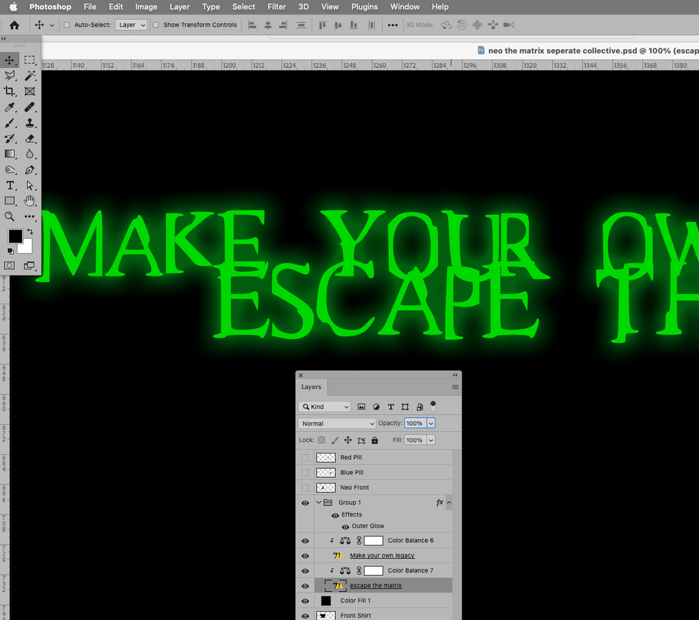
Hey there, I was making a design for my clothing brand and I wrote two different texts:
"MAKE YOUR OWN LEGACY " & " ESCAPE THE MATRIX ".
With these colors and settings on them:
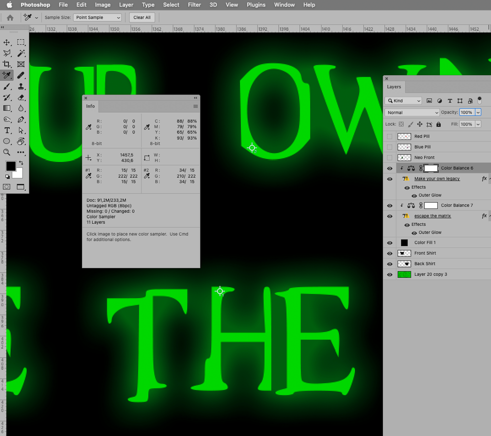
Color: #22d222
Outer Glow: opacity- 49% spread- 10% size- 43%
But when I was putting them side by side I noticed a slight difference in the green texture of the words.
 1 Correct answer
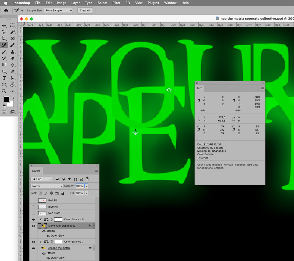
That’s because the Layer Style of the top one works on everything below – including the lower Type Layer.
You could put both Type Layers into one Group and apply the Layer Style to the Group instead of the individual Type Layers.
Edit:
Explore related tutorials & articles
Copy link to clipboard
Copied
Could you please provide the file.
What is the Blend Mode of the Outer Glow?
Copy link to clipboard
Copied
Thanks for the reply.
The blend mode is screen. I've sent you the file in a private message.
Copy link to clipboard
Copied
Thank you.
The color of the Type Layer seems to be identical.
When you compared the two Layers could it be you moved them so close that the Outer Glow of the top one affected the lower one?
Edit:
Copy link to clipboard
Copied
Yes the colors are the same but as you can see in the second picture you provided, when you put the letters O and E near each other, you can see that there is a slightly more darker texture on O then on E.
Do you know how to fix that?
Copy link to clipboard
Copied
That’s because the Layer Style of the top one works on everything below – including the lower Type Layer.
You could put both Type Layers into one Group and apply the Layer Style to the Group instead of the individual Type Layers.
Edit:
Copy link to clipboard
Copied
That seemed to work. Thank you for your help.
Find more inspiration, events, and resources on the new Adobe Community
Explore Now


