Open for Voting
Uniform UI
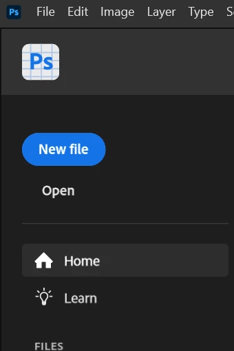
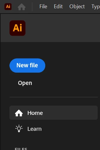
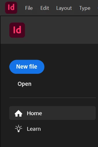
Photoshop, AI, inDesign, and Premiere share a similar UI, but not quite uniform. The Logo and Menu bars varry in size and thinckness, different space between options , and the colors are slightly different (darkest interface in PS is different from AI's darkest interface). It's a bit offputting and feels unsatisfying, as if the developers themselves don't know what they want.
If some consistency could be added that would be great.