New Participant
January 21, 2019
Answered

How to create multiple strokes around text?!

  • January 21, 2019
  • 5 replies
  • 1765 views

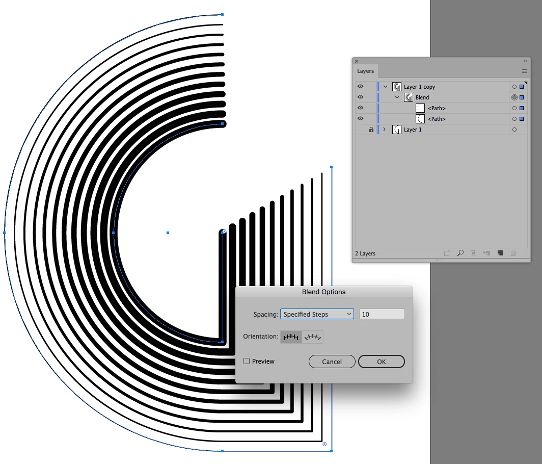
I am looking to create a design that has the same look as a logo I saw but I can't seem to find out how it was made. Most of my searches have led me to videos on "Stroke Offset" & "Offset Path" but I don't think either of these are what was done. If anyone could please help me I'd really appreciate it! Below is the logo. Does anyone know the steps on how to make this?

This topic has been closed for replies.
Correct answer c.pfaffenbichler

Illustrators’s Blend feature might prove useful.

5 replies

January 21, 2019

OP posted on the Illustrator forum as well

How to add multiple strokes to text?!

New Participant
January 21, 2019

yes, that was me as well.

Myra Ferguson
Adobe Expert
January 21, 2019

Also in Illustrator, you could make a set of the lines then turn them into an art brush. Apply that brush to the letter.

c.pfaffenbichler
c.pfaffenbichlerCorrect answer
Adobe Expert
January 21, 2019

Illustrators’s Blend feature might prove useful.

jane-e
Adobe Expert
January 21, 2019

Hi Cleveland,

...and if the Blend in Illustrator doesn’t give the right effect, another approach is that multiple strokes can be added to the object in Illustrator using the Appearance panel. An Effect can be added for each stroke for Offset Path to control the distance, and each stroke can be formatted with a separate dashed line or a brush stroke (Art brush) to make it look exactly like the first picture.

This can be done with live text or text that has been converted to an outline. A graphic style can be created for reuse.

Ask if you want / need more details.

~ Jane

JJMack
Adobe Expert
January 21, 2019

You would want something better than that.   Something that will scale well.  The logo even at the size is crude the black D and G ruff and the girl soft and the strokes so so.

JJMack
c.pfaffenbichler
Adobe Expert
January 21, 2019

Generally Logos that contain sharp elements should be created as vector content if possible and that effectively means using Illustrator (or the like) instead of Photoshop.

Breaking the lines might be more conveniently done in Photoshop admittedly but the output quality might not be what it should be.