

- Home
- Photoshop ecosystem
- Discussions
- Why do photos on my phone look different from my c...
- Why do photos on my phone look different from my c...

Copy link to clipboard
Copied
Alright, I can't seem to find any definitive information about this topic...why do pictures look great on my computer - in Photoshop and in browser - and look completely different when I view them on my phone (Galaxy S5)? I know color calibration is going to be different on every device, but there's got to be some more info about it somewhere. I feel like my computer is right, because when I order prints, they come out perfect, so it's got to be a phone issue. I'm just worried that my photos aren't looking so great to potential customers when they view my website/social media on their phones?


 1 Correct answer

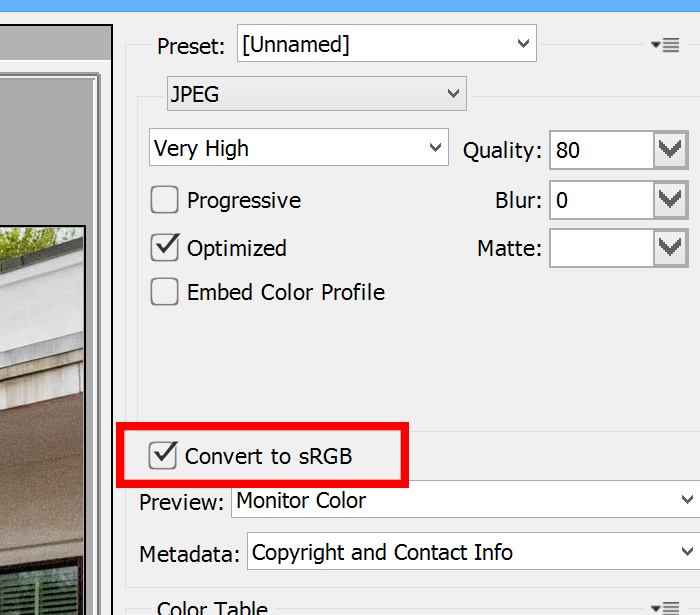
In the save for web dialog box:
Explore related tutorials & articles
 18
Replies
18
18
Replies
18
Copy link to clipboard
Copied
Phones just aren't color calibrated, so you're going to get a difference there. I think there is little you can do, other than making a set of images that you need to show on your phone and color balance them so they look good on your phone - kind of a PIA. Frankly, unless your customers have experience with correct color balance, I doubt anyone would notice, unless they're really off.
Copy link to clipboard
Copied
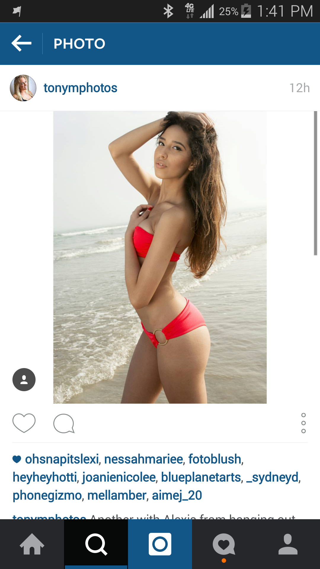
Yeah, it's pretty off, as you may see from the exmples here. One is directly from my computer and the other is a screenshot from my phone...it's a relatively simple edit, but you can tell the drabby looking color in the screenshot, or at least, I hope you can.

Copy link to clipboard
Copied
The image from your computer looks like it might be Adobe RGB and the phone sRGB - at least it has that look from your samples.
Copy link to clipboard
Copied
How would I go about correcting that?
By the way, I should note that I literally am just now trying Lightroom/PS for the first time, so I'm definitely a newbie. Been an old Corel PSP user for years, but I'm enjoying the experience. Definitely a bit of learning, though.

Copy link to clipboard
Copied
Try the Standard mode - if it's anything like Basic on my tablet, it'll be close to sRGB.
Copy link to clipboard
Copied
I've tried all the modes with no difference, really. I believe Chuck Uebele hit it on the head with regards to the color profile of the photo, but I just need to know how to correct that, since I'm not really familiar with PS and how it exports photos.
Copy link to clipboard
Copied
The image is Adobe RGB - it should be sRGB for best results on the web.
Use Save for web under File > Export, and check Convert to sRGB.
You should also resize the image to smaller pixel dimensions - 4000 x 6000 is way too much.
Copy link to clipboard
Copied
To do that, you would open a photo on your desktop, put a curves adjustment layer or other adjustment layer above your image and over correct in the direction the image needs correcting on the phone. Save a image that you can view on your phone, but don't flatten the one on your desktop. Once you get it dialed in, you save those adjustment layer settings as a default, the apply them to other images.
What color space are your using on your desktop? And how are your saving the images for your phone? Are you using save for web that will convert the image to sRGB? If you color space is Adobe RGB, that might do the trick for you to make sure you save or convert them to sRGB.
Copy link to clipboard
Copied
The Galaxy S5 has several display modes, have you tried setting it to Professional Photo Mode?
I don't have this phone, but I have a Galaxy Tab S, which I believe uses similar display type and technology, and it's very accurate when set to Basic. Take a look at this article: Samsung Galaxy S5 Display Technology Shoot-Out
Copy link to clipboard
Copied
Yes, I tried that, but it didn't seem to make a difference.
Copy link to clipboard
Copied
Under the edit meun<convert to profile:

Copy link to clipboard
Copied
In the save for web dialog box:

Copy link to clipboard
Copied
Thanks for all the info, Chuck and Per! Yes, that was helpful. It definitely helped clear up the color profile issues for me; however, I also discovered a color adjustment thing on my phone itself, which also seemed to make that problem better. I appreciate the help!

Copy link to clipboard
Copied
Maybe it changed when you transfer photos from phone to your computer. Here is a video about transferring photos from Samsung Galaxy phones to a computer with original quality
[Android] How to Transfer Photos from Samsung Galaxy S4/S5/S6 to PC ? - YouTube

Copy link to clipboard
Copied
I have the same exact problem. When I edit pictures on Photoshop, it looks great on my PC but then when I share it to places like Instagram and look at my phone, the picture looks much more saturated and there's more contrast. I figured out that it has everything to do with the position your PC screen. When you look at the screen head-on, the colors will be different than if you tilt the screen up. So what I do now is finish my work in Photoshop, then tilt my screen up to see how it will look on the phone. At that point, I can adjust the saturation, add to the exposure or whatever. The truth is that the phone is always correct. I know this because I checked the image on my husband's phone and it looked the same on his phone as it looked on mine. It has everything to do with the tilt of the PC screen.

Copy link to clipboard
Copied
OK, I just have to reply to that 
That just means you have a TN-type display, generally considered unsuitable for photographic work for precisely this reason. High-quality IPS monitors don't change with viewing angle.
TN panels are used in office and gaming monitors - and most laptops - because they are inexpensive and accuracy isn't needed. IPS panels are rather more expensive.
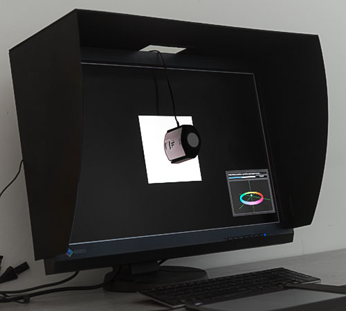
As for reliable colors, you get that by using a calibrator that measures the display and creates a monitor profile. Then you need to use color managed software that will actually use the profile. Phones don't support color management at all and don't qualify here.
Copy link to clipboard
Copied
Cool. Thanks for the tip! I need to get one.

Copy link to clipboard
Copied
A big factor in this is also the quality of the screen you're editing on. For instance if you're ordering for print, a matte screen is a great point of reference. But if you're editing for web, a glossy, IPS screen is ideal because that is also what phones are. I'm sitting here referencing the same image on a benq matte monitor, my laptop which is also matte, and an atomos reference monitor with a 10 bit screen and glossy display, and the colors are waaayyy out of line on the glossy display, just like they are on my phone. So, lesson learne . Stick with mac. Lo . Windows doesnt have any available options in this department

Find more inspiration, events, and resources on the new Adobe Community
Explore Now
 AdChoices