Exit
  • Global community
    • Language:
      • Deutsch
      • English
      • Español
      • Français
      • Português
  • 日本語コミュニティ
  • 한국 커뮤니티
0

Bad UI design - Premiere CC 2017 & 2018

Explorer ,
Nov 30, 2017 Nov 30, 2017

Hi.

I just encountered this crazy UI design in Premiere CC 2018 (it's the same in 2017 too).

Is this a feature (someone please explain) or a flaw?

See gif file.

PremiereWHAT.gif

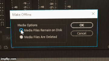
I'm basically clicking the same radio button, and this does not select the button, it changes state between the two options.

And the blue on the top button indicates... nothing, other than confusion that is.

1. They make a badly designed radio button(hard to see intuitively which choice is selected)

2. They add some mediterranian blue for no reason. ooooh, flashy!

3. They make button into a switch so know one knows what the heck is going on

Hooray Adobe!

Here, take more of my money!

1.9K
Translate
Report
Community guidelines
Be kind and respectful, give credit to the original source of content, and search for duplicates before posting. Learn more
community guidelines

correct answers 1 Correct answer

Jan 12, 2018 Jan 12, 2018

Thanks for letting us know. We'll fix it ASAP.

Translate
Community Expert ,
Nov 30, 2017 Nov 30, 2017

If Premiere is acting weird trash preferences and plugin cache.

Hold down shift + alt while opening Premiere.

Translate
Report
Community guidelines
Be kind and respectful, give credit to the original source of content, and search for duplicates before posting. Learn more
community guidelines
Explorer ,
Nov 30, 2017 Nov 30, 2017

Hi Ann.

Thanks for your quick reply.

Unfortunately your suggestion does nothing to fix this problem.

I guess this is just a sweet feature, like russian roulette!

Translate
Report
Community guidelines
Be kind and respectful, give credit to the original source of content, and search for duplicates before posting. Learn more
community guidelines
LEGEND ,
Nov 30, 2017 Nov 30, 2017

I recommend not changing the default (top) selection and doing all your file management with a proper file manager like Windows Explorer or Finder.

Translate
Report
Community guidelines
Be kind and respectful, give credit to the original source of content, and search for duplicates before posting. Learn more
community guidelines
Explorer ,
Nov 30, 2017 Nov 30, 2017

Thanks for your reply Jim.

I understand what you mean, but what if you don't know if the greyed out circle OR the grey circle with a hole in it is the active one?

Then you're not sure if you're changing it or not.

This bug (I call it a bug rather than a feature) is not hindering me from doing my work, but I still think the design is flawed and left hand work (if you're left handed it'll be right hand work to you) that should never have been approved. What's wrong with normal check/tick boxes?

In Premiere, if you go into Preferences - Graphics and look at the similar radio buttons there. They are still a poor design, but at least they can't be misunderstood.

If you want to try it out for yourself, you can make a clip offline and then press the top selection a few times. Don't tell me this is not really poor design.

The only right answer to my question from Adobe would be:

Thanks for letting us know. We'll fix it ASAP.

Translate
Report
Community guidelines
Be kind and respectful, give credit to the original source of content, and search for duplicates before posting. Learn more
community guidelines
Jan 12, 2018 Jan 12, 2018

joakim8907​: It does seem like a confusing UI design, and it may be a bug. Screen shots are easier to read than your GIF.

Default state of the Make Offline dialog box — the gray dot should be blue:

screenshot_1597.png

After clicking the 2nd option and then the 1st option again, it is blue:

screenshot_1598.png

The UI designers may have decided that because the OK button is blue, the default option (gray) was obvious enough to indicate which option was going to be enacted upon when clicking OK.

File a bug: Feature Request/Bug Report Form

Translate
Report
Community guidelines
Be kind and respectful, give credit to the original source of content, and search for duplicates before posting. Learn more
community guidelines
Explorer ,
Jan 12, 2018 Jan 12, 2018

Hi Stefan. Thanks for your reply!

I used the gif to show that the state changes when I click the 1st option multiple times.

Because of this I can’t intuitively figure out which state is what.

Best regards,

Stian Eriksen

Translate
Report
Community guidelines
Be kind and respectful, give credit to the original source of content, and search for duplicates before posting. Learn more
community guidelines
Jan 12, 2018 Jan 12, 2018

Thanks for letting us know. We'll fix it ASAP.

Translate
Report
Community guidelines
Be kind and respectful, give credit to the original source of content, and search for duplicates before posting. Learn more
community guidelines
Adobe Employee ,
Jan 16, 2018 Jan 16, 2018

Hi Stefan,

Looks like it is fixed in an upcoming version.

Thanks,
Kevin

Kevin Monahan - Sr. Community & Engagement Strategist – Pro Video and Audio
Translate
Report
Community guidelines
Be kind and respectful, give credit to the original source of content, and search for duplicates before posting. Learn more
community guidelines
Explorer ,
Jan 17, 2018 Jan 17, 2018
LATEST

Best answer Stefan!

Thanks!

Translate
Report
Community guidelines
Be kind and respectful, give credit to the original source of content, and search for duplicates before posting. Learn more
community guidelines
Engaged ,
Jan 12, 2018 Jan 12, 2018

That looks like a glitch. I'm no pro but normally a radio button should be when you click the button you see a white or blue fill and a black dot to indicate checked. Not sure what it's flipping back and forth though hard to tell from a GIF.

Translate
Report
Community guidelines
Be kind and respectful, give credit to the original source of content, and search for duplicates before posting. Learn more
community guidelines