

- Home
- Premiere Pro
- Discussions
- Re: Export color is so different than preview
- Re: Export color is so different than preview
Export color is so different than preview

Copy link to clipboard
Copied
Hi,
When I export my video it looks VASTLY different than the preview with the color corrections I've made, and the quality of the video is quite poor.
I've seen some different posts about how the preview function doesn't match Apple's resolution settings but these look like minor differences with the video. Mine looks terrible and totally blasted out.
Here are the steps I went through:
1. Color corrected the video in the main editing window. I'm using a Lut that is supposed to help with color correction.
2. Rendered the video.
3. Exported the video with the following settings:
- Adaptive Medium Bitrate
- H.264
Am I not doing something right in my export?


 26
Replies
26
26
Replies
26

Copy link to clipboard
Copied
Check the properties for those clips in the Project panel bin ... is the color space HLG? Or are they log-encoded clips?
If either is the case ... go to the clips in the bin. Select one or all, right-click/Modify/Interpret Footage, and at the bottom are the new color management settings.
Set the Override option to Rec.709.
Neil

Copy link to clipboard
Copied
Hey Neil, having the same problem here. Unbelievably frustrating. Footage looks great in project and preview and super blown out after export. I've seen your posts about modifying footage to 709, but that makes all the clips in the project look terrible and the export is still wrong. Is there a way to just get this thing to export the way it looks in the export preview? I am so frustrated.
Copy link to clipboard
Copied
Yes. Match color management settings through the process. Then it works. If you don't, you get a mess.
There is a separate issue on Macs, which is that Apple doesn't apply the full Rec.709 standards to display video files. So the image looks lighter and less saturated outside of Pr than inside. I can give a full discusssion of that problem if needed. And that only affects the display of that file on a Mac. The same file will look correct on all non-Mac systems & screens.
SDR/HDR Workflows within Premiere
Choose whether you're working a Rec.709, SDR/standard video, or HDR. I highly recommend that most users stay in SDR at this time other than playing with HDR, as well ... I work for/with/teach pro colorists, most of whom have yet to deliver a single paid gig of HDR.
And as there are many different forms of HDR ... and some screens auto-juke the image heavily into one or the other from whatever you worked in, many sceens don't yet handle HDR at all, and the others are all over the place ... it's the Wild Wild West.
Worse than the old battle between Betacam and VHS for video tape formats.
But you can work either way, SDR or HDR, at your choice. HDR work requires HDR clips, either HLG or PQ. SDR work can be done with Rec.709, HLG, or PQ clips involved as it is a smaller space/range so the large space clips can be remapped to work within it.
SDR/Rec.709 Workflow
Input Color Management may be required!
Make sure all clips are either Rec.709 or are managed to Rec.709 in the color management settings. Check the clip Properties in the Project panel if unsure.
Any HLG or PQ clips need to have their CM setting use fixed in the Project panel.
- right-click/Modify/Intepret Footage
- at the bottom, the Override-To option, either set to Rec.709 or for many log-encoded clips, select the appropriate camera log option
- make sure the Sequence settings are set to Rec.709
- If you want auto-tonemapping of log to normalized view, set that option on in the Preferences; if you want a log image to show and normalize yourself, leave tonemapping off
- for exports, use ONLY the presets without HLG or PQ in the preset name.
Doing the above, you should be fine.
Premiere uses mathematical algorithms to remap dynamic range (DR) brightnesses to within Rec.709 limits for HLG clips, and does a pretty decent job to get a good starting point. Without clipping any highligts or crushing any blacks.
It also remaps the color volume to fit within the sRGB color space of Rec.709. Again, as a starting point. You then can use the Color workspace to control saturation to your wishes.
HDR workflows
This works only if the clips involved are HLG or PQ.
- Make sure the Sequence settings are set to HLG for most uses ... unless you know you specifically need PQ;
- make sure both your OS and your monitor are set for HDR work;
- make sure the "display color management" is set to on in the Preferences;
- make sure the scopes are showing HDR color space in the lower left corner, right-click change color space if they're not;
- use only presets with HLG or PQ in the name of the preset.

Copy link to clipboard
Copied
May I ask you for a full discussion on PC MAC please? I really appreciate it. Thank you
Copy link to clipboard
Copied
What specific things do you need? There's a ton of color management, color space, or color correction you might be talking about.

Copy link to clipboard
Copied
god bless you r neil haugen

Copy link to clipboard
Copied
THANK YOU

Copy link to clipboard
Copied
Very helpful. This fixed my problem. Thank you.
Copy link to clipboard
Copied
Something I've seen on the LGG forum, for Macs, when you are working in Rec.709, is check your monitor settings.
If you see an option for HDTV/Bt.709 Bt.1886, try that. And there's another option something about apply system gamma boost that should be turned off.
This gets a fairly solid b-cast spec Rec.709 image.
Neil
Copy link to clipboard
Copied
Why is this still an issue. So many times I run into this, where my export looks different than my preview. This shouldn't even be an option. Adobe needs to get this fixed asap. Should be an automatic, default setting where the preview looks the same as the export. It's 2024... how is this an issue.
Copy link to clipboard
Copied
They've given you the choices to do anything you might want. Where's the problem?
Perhaps you didn't read anything above. If so I would ask, how is Adobe supposed to fix Apple's blunder? Other than giving the user choices of settings, as they've now done? No one else can fix this but Apple. Not BlackMagic's Resolve, Avid, not no one not no how.
As it's pretty simple that you cannot make a file that looks identical, when displayed with two widely different display transforms, as applied by the computer's operating system ... OS. Mac uses essentially a gamma 1.96, the entire rest of the universe follows the broadcast standard of gamma 2.4, or 2.2 in "bright room" vieiwing.
Note, Macs with monitors with "reference modes" can choose the HDTV setting, which does apply the full Rec.709 standards including display transform of 2.4 ... so any Mac with that option will see a different image than your Mac without it.
So clearly, the issue is how your particular Mac diplays the image. Not even all Macs display the same image ... right?
Adobe has now given you all the choices that can be made for those either using Macs without reference modes, or worried about Mac users without reference modes watching their stuff.
You probably will prefer choice 2 below, but you do need to understand what you're choosing ... and who you're choosing for.
1) Set the Display color management option on, set the display gamma to 2.4 broadcast. And ignore the blunder Apple made in displaying Rec.709 video with a camera transform function as the display transform function via the Mac ColorSync utility.
This is actually the more common among pro colorists, those delivering to wider audiences, as ... that's the way all broadcast and streaming programs are graded. No professionally produced media is graded for a 1.96 display gamma. Period.
This will produce an image to match device expectations, and be seen correctly by all correctly set Rec.709 system, including most PCs and Android devicees, TVs, and all broadcast compliant systems.
Being as (generally) all non-Mac screens display the Rec.709 signal more accurately than the subset of Mac users without Reference modes, this makes a certain amount of sense. Most Mac users never realize that nearly all the pro produced media they watch on their Mac is displayed quite differently than it was graded anyway. Nor do people with green TVs normally realize their TV is off to the green side, as it's what they are used to seeing.
2) You can set your Premiere color management so you see the same image inside and outside Premiere on your Mac. Set Premiere's display gamma setting to QuickTime 1.96, make sure Display Color Management is on, and what you see on your Mac, say in QuickTime player outside of Premiere, will be the same as inside Premiere.
That's your choice if you want it.
But understand, when making that choice, you are also choosing to send me a file that has crushed blacks when displayed on any and all full-on broadcast compliant Rec.709 systems.
That choice is available to you, and you are welcome to it. Again, just first undersand the full implications and results of that choice.
3) Use the gamma 2.2 "web" display gamma option in Premiere and kinda split the difference.
This is used by some, including some colorists when producing 'web content' for commercial sites. It produces a bit lighter image, within Premiere as it seems ... and ... therefore, the export looks a bit dark when displayed on a full on b-cast Rec.709 system. And looks a bit light when displayed on a Mac at gamma 1.96.
So ... somewhat in-between.
Pick your poison. And complain to Apple, not Adobe. I work for/with/teach pro colorists, nearly all HUGE Mac geeks, most of them work in Resolve or Baselight, and they are FURIOUS with Apple about this. As this it totally and completely an issue of Apple's creation.

Copy link to clipboard
Copied
QQ - I'm sitting here in premiere 24, and in the program window, I have my colors the way I want. When I go to the export window (still within premiere) the colors are totally in a different color space, whites blown out, etc. If I toggle the effect option in the export window, everyone looks like my original footage again (but I lose all my grading, color correcting, etc). if I drop down into the effects section on export, nothing is checked.
If its apple's problem, why does it show two different ways within premiere? This is like the 5000th bug I've found in premiere 24 it feels like.
Copy link to clipboard
Copied
And I'm sitting here noting you haven't provided one thing usable to troubleshoot your issues.
Such as the useful image, which would be the Lumetri panel, Settings tab, the one named Settings. So we could see your color management settings.
Because you clearly do not have everything set correctly ... as has been discussed in this and other threads.
It's not a bug ... it's a user issue. You gotta use the app correctly, and yea, color management is a lot different than it used to be.
Copy link to clipboard
Copied
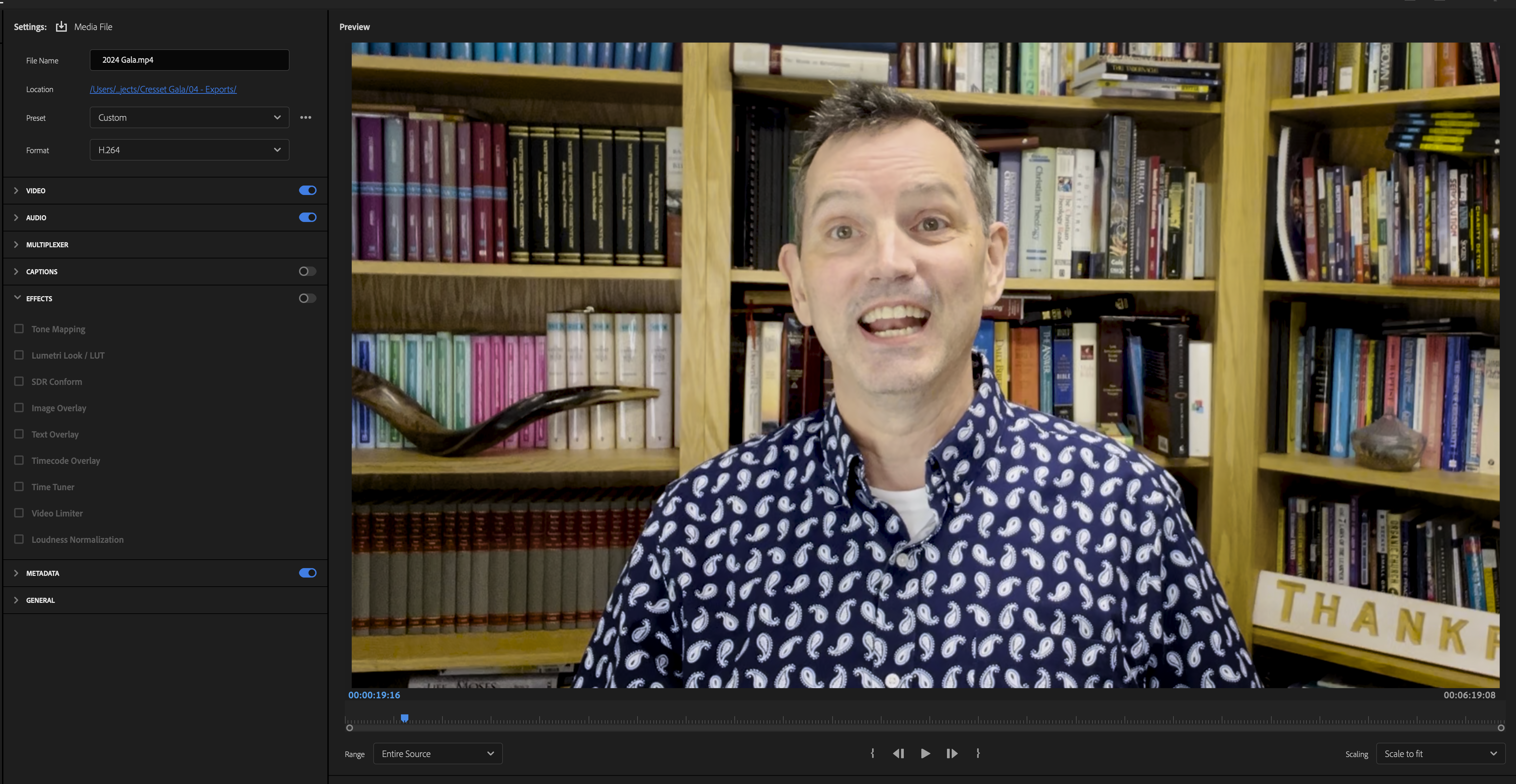
Here's a screenshot series including the exported video using the settings shown in the screenshot I sent. I mean, blame me for not setting my system up correctly, but with nearly 20 yrs experience using Pp (I know you have more, but 20 yrs aint nothing), I can usually tell the different between my settings being off, and there being yet another adobe bug causing issues.
Say what you will about setup, but as far as UX goes, its not unreasonable to expect
- The program monitor window (in edit) and the preview window (in export) to look the same (unless you have applied post-edit effects in the export tab)
- toggling the effects switch in the export tab wouldnt have any effect if nothing under "effects" is selected.
- The exported video will generally look the same as whats in the preview window in the export tab (im not talking about minor gamma differences - I mean the example I showed in the attachment)
Copy link to clipboard
Copied
Actually, although you might expect the program to be omnisicient, it can't be.
Why?
Because it has to be capable of allowing the user to set it to do all sorts of different things than what most users would use. Because different workflows require the ability to change things.
What you're expecting, what you are asking for, is the program to, by default, override the user settings ... I don't think that would be popular with a fair number of users.
It isn't difficult at all to ge the CM things set correctly. And they are "sticky", so once set, they stay that way unless you change them.
Is it different than the past? Hades yes! Because we have different media, monitors, and workflow needs now. A wider variety of them, and they've made the app capable of handling that wider variety of user needs.
Yea, it does require users to learn more about color management. Yup. And that can be a bit confusing at first, yup.
Copy link to clipboard
Copied
Asking adobe to set the default color management to export the same color as the program shouldn't be asking for much.. I'm not asking it to be omnisicient, I'm asking it a very simple thing... to be like it used to, where the exported colors matched the program colors. Why is this so difficult to grasp? It's not overriding user settings. It used to be able to handle this quite nicely for the 15 years I've been using it. And then all of a sudden it decided to just not work.. because there's different media monitors and workflows? I don't care about all that. The program colors should always match the exported colors. Period. We have incredible AI capabilites where we can literally replace buildings and people from scenes.. but our colors can't match the program monitor? Come on now....
Copy link to clipboard
Copied
Back then, the app was hard coded to work in Rec.709 assumptions. Including that the user had a correctly set Rec.709 viewing situation.
Those days are LONG GONE.
There isn't any possible assumed, hard-coded default anymore. There are too many user needed variables.
And again, IF you gave only one need, it takes 30 seconds to a minute to set the CM to what you need.
One time. DONE.
Copy link to clipboard
Copied
--
Copy link to clipboard
Copied
Neil. Listen. Adobe has every opportunity to make things easy for it's users.. like making the default settings for every user, be "the program colors match the exported colors" Shouldn't matter if it's a mac, or PC.. pretty sure adobe has every means to know and detect what monitor or computer you're using. The program should never show different colors from what you're exporting. Yeah sure the user can go in and change the settings so that it'll match, but that's not the issue Neil... Why does the user need to change anything... Why isn't the default settings matching the program color upon export. Not everybody is as smart as you Neil.
Copy link to clipboard
Copied
What your're expecting, like I answered to the user above, is for the program ... by default! ... to override the user's color management settings, on account of it knows better than the user what they need or want.
Really?
What precise default behavior do you expect? There are a wider range of media types in use today, and uses for the exported files, than there used to be. Unless you wanna say "well, this one ain't needed by me, so nobody needs that as a default ... "
There are now a full range of CM controls, because, depending on user needs, the users need to be able to set the controls to meet their specific needs. And yea, that means we all have to learn how to use them.
As we have to learn anything else about using a professional application like this.
As a professional app, Premiere must allow users to meet those differing needs. It takes actually very little time to set things correctly for what any user needs. And once set, they are sticky.
Yea, you have to actually learn a small about new. Ah well. It's pretty simple, really. I've covered it over and over here. Plenty of posts about the few, simple steps to sort out what you need and set the app up.
Copy link to clipboard
Copied
Thank you Neil, this defintely helped me export out a more accurate video. See screenshot

Copy link to clipboard
Copied
Getting that close is actually pretty amazing. I never expect much between apps especially if the OS gets involved.
And "out there" ... it's just gonna be whatever. And no one will ever know they're not seeing the same as someone else.

Copy link to clipboard
Copied
Copy link to clipboard
Copied
And yea, that will work ... if ... you're on a Mac, but only if on a Mac without Reference modes.
As on those computers, Apple uses a bizarre display transform for Rec.709, not used by any other screen.
The long-established standard for Rec.709 display transform requires the device use a response similar to gamma 2.4. Apple, only on that set of computers, uses roughly gamma 1.96.
So you should also view the export on VLC and Potplayer on that Mac, which will probably use closer to the standard Rec.709 display transform, to see what everyone not on a Mac without Reference modes will see.
As that will be a much darker, more saturated image.
And no pro colorist ever grades anything for professional display/broadcast, while working with a display gamma of 1.96
So all professional media you watch on that computer was graded in a professional suite, full-on Rec.709 setup.
Most users should use gamma 2.2 "web" ... because unless you are in a darkened room, that is the required gamma for performing image modifications.
Gamma 2.4 is the display gamma transform for use in a properly darkened, neutral room. Gamma 2.2 is the display gamma for working in a 'normal' brightness room.
-
- 1
- 2

Find more inspiration, events, and resources on the new Adobe Community
Explore Now
 AdChoices