


Copy link to clipboard
Copied
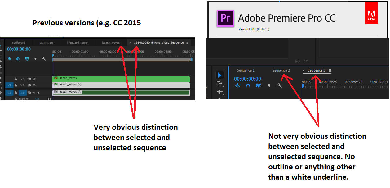
Dear all, I just upgraded from CC 2015 to CC 2019. I am using Premiere Pro, and one of the things I noticed is that on the timeline, if I open up multiple sequences, there is hardly any distinction between which sequence I have selected. Please see the attached image of a before and after comparison to see what I mean.
Was this a conscious choice in newer versions of the interface, or is something wrong with my PC or installation?
In previous versions, unselected tabs had a faded out/shaded sort of appearance as if they appear in the "background." But now, the design is very "flat" with hardly any distinction.
Thank you for your help!
Arjun


 1 Correct answer

The difference between CC2015 and CC2019 is much more evident in my opinion.
The white underline against the dark background is far easier on the eye especially in a edit studio thats dark.
A lot of thought went into this by Adobe who, in my opinion, has come up with an elegant solution to differentiate multiple timeline sequences.
However a lot of users get used to something and find it difficult to adapt to something new.
Give it some time...it will grow on you 
 8
Replies
8
8
Replies
8

Copy link to clipboard
Copied
You can go into the preferences and change that.
Neil
Copy link to clipboard
Copied
Dear Neil,
Thank you for the quick reply! I forgot to mention - I did check the preferences section. I checked all the tabs under Preferences, and I can't find the specific setting. Do you know what the name of that setting is? Perhaps I just don't know what it's supposed to be called. The "appearance" tab did not have any settings that affected it either.
Thank you!
Arjun
Copy link to clipboard
Copied
You can set the darkness of the background gray and the intensity of the blues separately for highlighted text options and highlighted bounds.
I found adjusting those three got my items more easily visible.
Neil
Copy link to clipboard
Copied
The difference between CC2015 and CC2019 is much more evident in my opinion.
The white underline against the dark background is far easier on the eye especially in a edit studio thats dark.
A lot of thought went into this by Adobe who, in my opinion, has come up with an elegant solution to differentiate multiple timeline sequences.
However a lot of users get used to something and find it difficult to adapt to something new.
Give it some time...it will grow on you 

Copy link to clipboard
Copied
I actually find the latter image more obvious.
Copy link to clipboard
Copied
Its all user preference really. Sitting in a blacked out edit suite for hours at a time I find the underlined white easier on the eye
Copy link to clipboard
Copied
Thank you everybody for your replies! Mo answered my original question - I was mainly trying to identify if there was a bug/glitch when I upgraded, or if the software was intended to look more flat.
I agree that it is a personal preference, and it does make sense to me that having a more flat design with less going on would be easier on the eyes especially during long sessions in the dark.
It seems like this was a conscious design choice, and as Neil mentioned one could try to adjust some of the color settings to make them more distinguishable. I think the default settings are fine for me, it’ll probably grow on me. What was most important to me was that the interface was functioning correctly.
Thank you!
Copy link to clipboard
Copied
Always a pleasure to assist Arjun. Hope you are on your way to great editing pieces.
Please feel free to post any other questions/suggestions you have in the future
Mo

Find more inspiration, events, and resources on the new Adobe Community
Explore Now
 AdChoices