

- Home
- Premiere Pro
- Discussions
- Re: Matching saturation and contrast between Premi...
- Re: Matching saturation and contrast between Premi...

Copy link to clipboard
Copied
Hi everyone,
I've read previous chains that somewhat relate to this topic (and thank you to all for the info already provided) - I'm no expert though unfortunately, and I couldn't see whether there was a potential export setting or file format that I could use that would enable QT and Safari to more closely match what I'm seeing in Premiere Pro CC (2017.1.2), without compromising the results I get in other, seemingly more faithful playback tools.
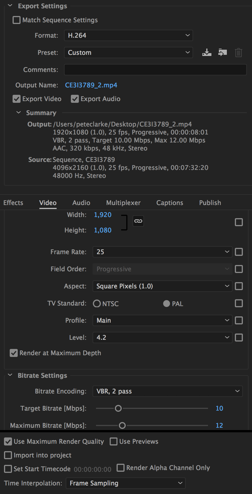
Basically when I export from Premiere with the below settings (H.264) and view the resulting .mp4 file in VLC (or on Firefox after having uploaded to Vimeo) - it looks pretty much the same as it did in the Program Monitor panel in Premiere. I'm happy with the colours, saturation and contrast, and it's in line with what I was expecting.
When I look at *the same file* via QT, or on Vimeo-via-Safari, or via the iPhone app for Vimeo, the colours look washed out, and there's less contrast.
Is there any setting or workflow adaptation I can be using to help get more consistent results across the various playback tools? To be clear, I'm very happy with how things look in Premiere, and with how they play back in VLC or Vimeo-via-Firefox, but the majority of the people I'm sharing files with are Apple users who view them on Vimeo-via-Safari and the iPhone Vimeo app.
I've previously tried to address by adding an adjustment layer for saturation and contrast (so that the Safari-Vimeo or iPhone-Vimeo files look more like the ones in Premiere), but obviously this makes things look way over the top in VLC or Firefox, and it seems from what I've read that the shortfall is really in how these Apple tools are interacting with the file (so seems wrong to compensate for this to the detriment of the other, seemingly more accurate playback approaches).
Not sure if there's a format or approach that will help the files be treated more consistently via the various playback mechanisms?
Thanks very much,
Pete


 1 Correct answer

basically, no, there's nothing you can do to make every playback platform look the same as what you have in your timeline and what you see in your PPro program monitor.
It's complicated.
Don't waste your time on this issue. Nobody in the whole world can make web stuff, broadcast TV stuff, and movie projection stuff " look the same ".
Web is sRGB, broadcast is Rec 709, and projection is some other animal.
They all have different color spaces.
 9
Replies
9
9
Replies
9
Copy link to clipboard
Copied
basically, no, there's nothing you can do to make every playback platform look the same as what you have in your timeline and what you see in your PPro program monitor.
It's complicated.
Don't waste your time on this issue. Nobody in the whole world can make web stuff, broadcast TV stuff, and movie projection stuff " look the same ".
Web is sRGB, broadcast is Rec 709, and projection is some other animal.
They all have different color spaces.
Copy link to clipboard
Copied
Plus, it's changing fast... the specs ...due to new things being developed all the time ( like 4k TV and changes in IRE ( 8 bit to 10 bit and beyond ))
If you figure something out that works for everything, write a white paper on it and get the nobel prize
Copy link to clipboard
Copied
mostly people export for every different thing.
one for web
one for computer ( vlc type stuff)
one for broadcast
one for theatre
one for NTSC
one for PAL
etc. etc.

Copy link to clipboard
Copied
Rodney has it accurately. You cannot create a file that plays "accurately" to one color-space/profile and all others.
And no one else can either.
Your best practice is like anyone else: produce as close to specs as possible, that being (generally) sRGB Rec.709, which is the major world-wide broadcast standard. Then your material will look relatively like most other pro produced materials on any device. It will never ever look like it did on yours.
No colorist has ever accomplished what you seek either.
Neil
Copy link to clipboard
Copied
Thanks for the quick replies all.
Points very well taken around the natural compromise required between e.g. web vs broadcast, and it makes total sense to focus on just controlling what you can so that you’ll at least match other pro produced materials. Appreciate the advice on the broader balancing act required across different viewing mechanisms (similar to what I’ve experienced in audio mixing and mastering, where you need to optimise across a wide range of playback devices).
The thing I still find surprising/annoying/unecessary though is that viewing the *same* web files via Safari gives such different results to those *same* web files viewed in say Firefox. I’m happy with what Firefox have done (it seems to more closely match what I’ve calibrated to) - what are the chances of Safari or the iPhone Vimeo app bringing their approach closer? I’d have thought that we could hope for at least all web files to be treated consistently.
As with many content producers, I suffer from the fact that many of the people viewing my files do so on Apple devices, and it seems crazy at the moment that I have to tell everyone to download Firefox (and avoid the iPhone Vimeo app) in order to the see the files as intended.
Thanks again for your patience everyone, really great forum...
Copy link to clipboard
Copied
" ... as intended."
Well, they watch movies graded to be seen in dark theaters with specific brightness/contrast/sound levels/channels in bright sunlight on an iPhone with earbuds.
Does that sound like it is as intended? Ha.
Now, there always is a bit of edutraining of clients involved. Just never argue with them.
We've had a portrait studio over 40 years, specializing in large beautiful wall portraits. Until we went digital, we had our own full service wet lab printing for us and other picky studios.
The light illuminating a displayed image can change dramatically during a day, from direct sunlight to bright "shade" sky lighting to tungsten and now other bulbs at night. We set one standard lighting to check color/density in, for all deliveries.
Occasionally had a client want something different and took a few minutes to explain our krocess/reasoning so it was clear we weren't just arbitrary, and people accept that.
When I got into video post, color naturally became my emphasis and I fell in with some major colorists off the bat. They can deliver for theater, TV/satellite, and web as the client needs.
Web, it's either video sRGB/Rec.709, or sometimes just standard sRGB. The variety of devices and spaces and environments that web material will be displayed on is just another irritant in the process. And one you can't ever totally anticipate.
You say your clients are all on Apple using P3 monitors. You may be correct, but understand, that's an incredibly small niche. What, something well under 10% of screens out there.
Neil
Copy link to clipboard
Copied
All points well taken Neil - thanks very much again for taking the time to reply.
Good to know that I'm not missing something obvious, and I can live in hope of closer convergence/standardisation of browser platforms in the years to come...
Cheers all,
Pete
Copy link to clipboard
Copied
Ah, but the future is rapidly bringing HDR ... the very high dynamic-range black-to-white to a screen near you ... and wider color gamuts ... so we're going to get wilder/woolier rather than more standardized.
Oh joy ... 
Neil
Copy link to clipboard
Copied
Let's not get too nuts about the tech stuff... when it comes to shooting real pro stuff for delivery to TV and Theatre. Most pro digital cameras have a slightly different 'look' via the output of the image it captures, but it is minimal. Is why some editing programs have luts and color spaces you can choose for ingesting the media. When monitors are calibrated and all that stuff, you can import (ingest, whatever) and be close to the raw or S log or basic color space you are importing, to the extent that when you go into timeline and export, you have more control than ever before. Usually this is limited for pro-sumer stuff to what we know as rec 709, etc. from arri alexa, red, sony, and so on.
What matters is what you SEE on your calibrated monitor and what you SEE in video monitor out of SDI, and do the best you can.
And, most importantly, if a pro job, you are lighting it, with a crew and lots of equipment ( tons of stuff and lots of people).
THEN, the most important thing is ( believe it or not ) the 'relationships' between your closed blacks and your blown out whites.
It really all boils down to shooting what will look pretty or the way you want... according to those relationships of light which 'model' the real world and people you are shooting.
So, for go pro users, try to keep the sun behind your back. It's really not that hard to do.
Thank you Neil, for making this such an understandable process due to your experience !


Find more inspiration, events, and resources on the new Adobe Community
Explore Now
 AdChoices