christopherm13668766
Known Participant
March 12, 2020
Question

Trouble getting accurate dynamic range and tones in exported file

  • March 12, 2020
  • 1 reply
  • 308 views

Hi, can someone help me figure out what I'm doing wrong? 

My export settings are h.264 and match source (high bitrate) - source is A7III SLOG2 4k60 file - so theoretically that should give me the highest quality attainable? I am losing a lot of detail in the window, and the skin tones are innacurate in the final mp4 file. 

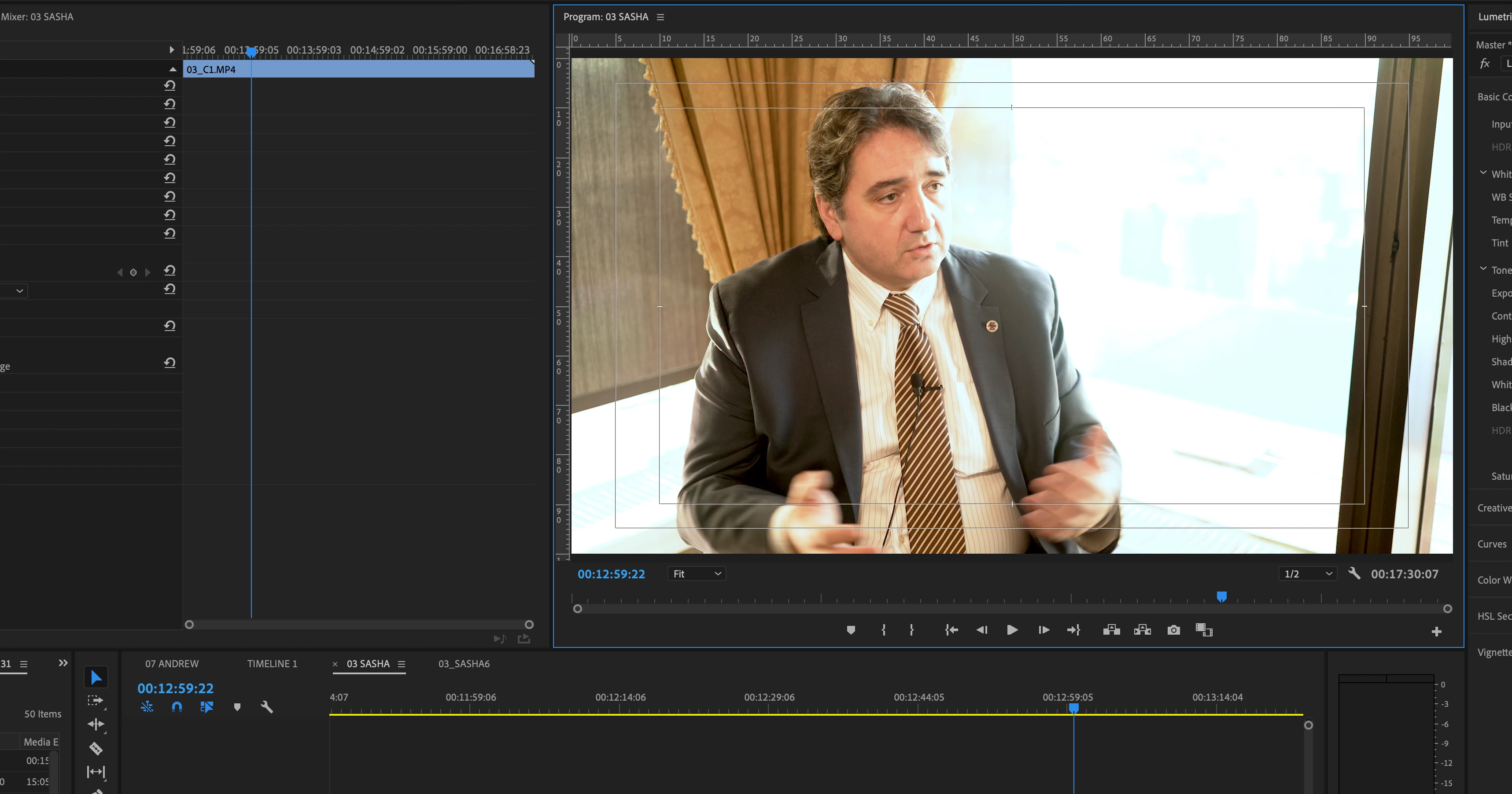
screenshot from my computer (27" retina iMac):

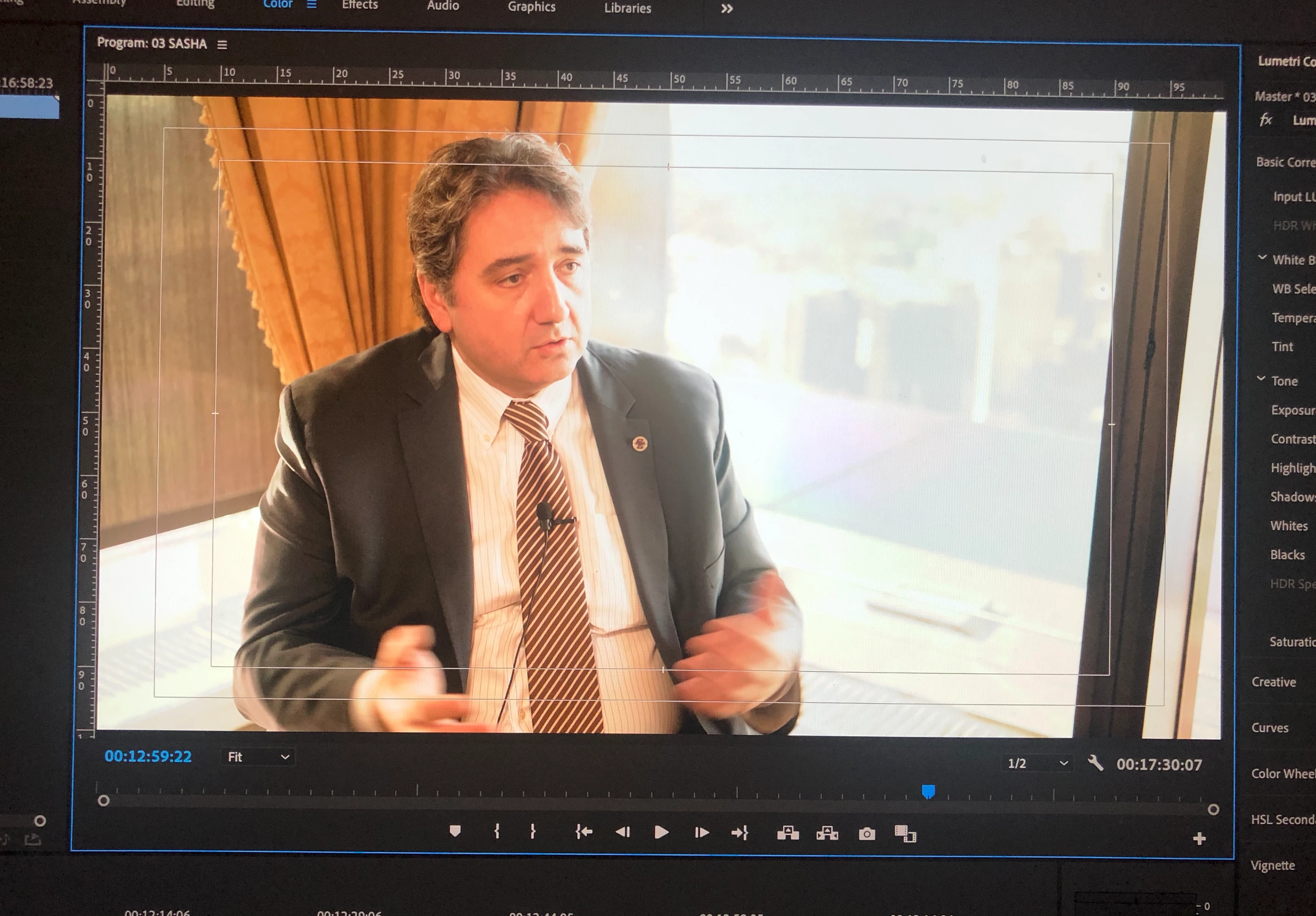
 I took an iphone photo of the screen because even on the screenshot it wasn't showing all the window detail? I can't figure out why. But this is more of what I'm actually seeing (not the orange skin tones)

 The exported mp4 file: - even less highlight detail, skin tones are gross


    This topic has been closed for replies.

    1 reply

    R Neil Haugen
    Legend
    March 12, 2020

    Color management is something all users need to attend to ... as no computers come setup with completely proper color management for video work, and no monitors meet standards without some checking. However ... your Mac system is ... special.


    The Retina's are beautiful monitors to look at ... but neither they nor the Mac OS ColorSync utility are designed to work well with video media without a bit of work and knowledge on the user's part. Why?


    Let's start with the expected standards for color management.


    Video ... probably over 90% still ... including yours ... is 'designed' to be displayed and viewed within the pro standards for broadcast/web use:

    • video sRGB color primaries;
    • Bt.(Rec) 709 profile, including both the camera and display transform functions;
    • gamma 2.4, though 2.2 is allowable for bright-room viewing or web material;
    • brightness of the monitor set at 100 nits for darkened room work, 120 nits for moderately bright room, or 80 nits for dark room.

    Premiere is designed to be used on systems meeting those pro standards, and is internally tightly color managed assuming the user takes care in setting up their system. The Source, Reference, Program, and Transmit Out monitors will show a very 'tight' to standards image when the program is used with such monitors properly calibrated and profiled.


    The Mac OS ... between the ColorSync utility and the Retina monitors ... exists in a very different, and very unique color space. Apple chose to create their own color space, one not used by any professional system, and while it "works" within the computer it doesn't mesh well outside the Mac-o-shere.


    Mac color settings ...

    • Retina monitors are native P3 color primaries, a fair bit larger on the green side and some larger on the red, and so are slightly skewed from the video sRGB color primaries; and between the larger differently-shaped color space and the color management, not all Rec.709 colors/tones are mapped correctly to the monitor;
    • when working with Rec.709 media, the ColorSync color managmenent utility only applies the first half ... the camera transform function ... and does not apply the also required display transform function, so the application of the Bt.(Rec) 709 profile is flawed;
    • Apple says it applies 'sRGB gamma' ... but in reality, the gamma used is mostly but not exactly close to 1.96, with "an odd flat shape near the bottom";
    • the Retina monitors are set to run somewhere up close to 500 nits brightness.


    There's such a difference that the Adobe engineers created an option in the Preferences, called "Display Color Management" ... that tells Premiere to look at the ICC profile used by the OS for the monitor, and attempt to remap Premiere's internal monitors to show appropriate Rec.709 pixel values on that monitor. Apparently, this can work decently well to get on with ... but only within Premiere.


    Premiere cannot control how other apps nor the OS color management handle Rec.709 media outside of Premiere. So even with Display Color Management enabled ... and you should have that on! ... depending on the app and browser, outside Premiere the media can look very different one app/browser to the next.


    There's a thread to discuss this problem started by a very informative post by support staffer Caroline Sears and then-color engineer Francis Crossman. I include a link to it here, and note, Francis is now co-Product Manager for Premiere.


    Why does my color look different?


    Now a very informative and easy to read article by Steve Shaw, noted color management expert with LightIllusions.com, one of the two major color calibration/profiling softwares used by pro colorists. Colorists spend thousands to ensure color accuracy of their computer/monitor systems. He includes a section dealing directly with the Apple color managmenent questions.


    Why Master On A Calibrated Display?


    Now, a look at pro editors and their color management needs by noted editor/blogger Johnny Elwyn ... and down a ways, this actually references a tutorial I made on Premiere's color management ...


    Color Management for Video Editors


    And finally, my tutorial for MixingLight, a subscription teaching website for pro colorists. Adobe doesn't do a great job of documentation for their applications, and putting this together was a slog. This has much material never gathered in one place before. It took several hours with Francis via screenshare and phone calls, many emails ... and was delivered at NAB 2019 in the Flanders/MixingLight booth. Then to pass muster with the colorists founders of MixingLight, many more emails with Patrick Inhofer, Robbie Carman, and Francis to pore over every detail.


    The final result is here, and is outside the MixingLight paywall, free for anyone to view.


    How Do You Finish at the Highest Possible Quality in Premiere Pro CC?


    Neil


    Everyone's mileage always varies ...