Hallo zusammen,
es für ist für mich wirklich nicht nachvollziehbar welcher Art die Qualitätsprobleme bei der Serie der eingereichten Bildern sein soll... Unschärfe? Artefakte? Rauschen? Falsche Belichtung? Nein!!!
Woran liegt es denn?
Es kommt mir so vor, als ob hier manchmal reine Willkür am Werk ist, je nachdem wer die Bilder überprüft. Es ist nicht das erste Mal, dass wirklich gute Bilder wegen seltsamer Begründung abgelehnt wurden.
By @seven157
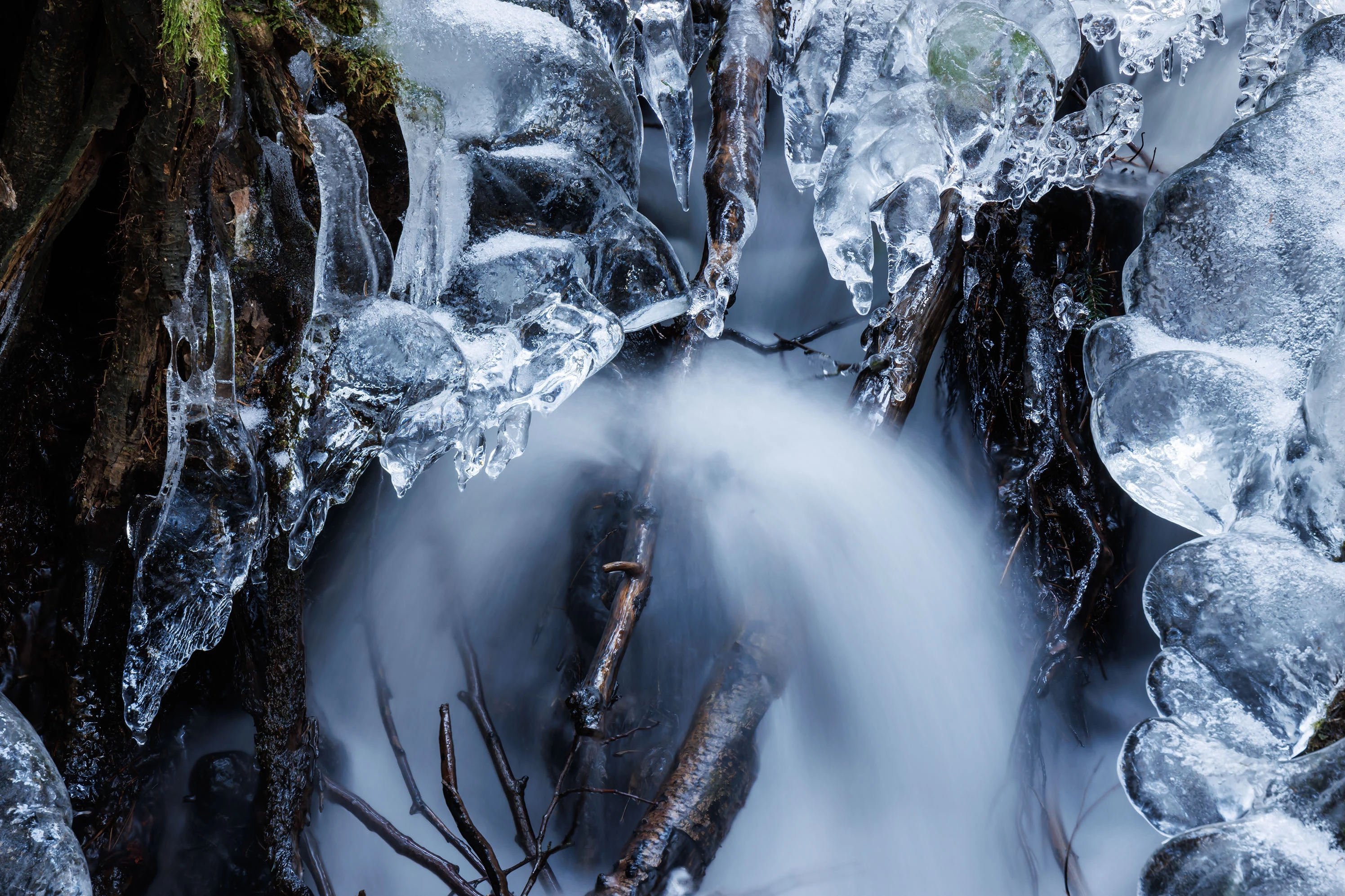
Hello!
One can argue that the quality is good - you have good focus, good composition, no artifacts, etc.
BUT, there is one problem, unfortunately - and bear in mind that this is for stock purposes - is your colour/white balance. It can also be argued that your colour balance is rather blue. I understand that it is more for effect, that it is ice, and so cold, and the blue tones enhance this feeling. But, just maybe it would be better to have a neutral tone and have the ice white.
This makes it better for stock and more marektable!
So perhaps this look:
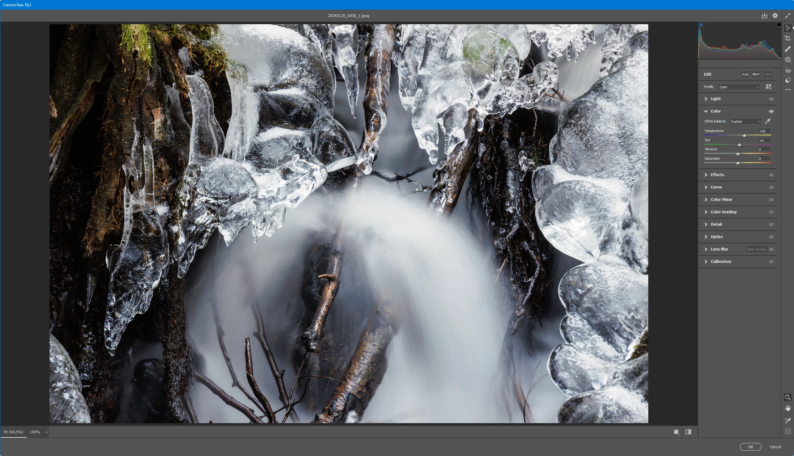
The ice and water are white! A more balanced tone, don't you think?
The downloader then can choose their own mood to fit their own purposes.
Therefore, I think the rejection reason is based on this factor. When uploading take care about your white balance!😊
