- Home
- Stock Contributors
- Discussions
- Re: Image rejected - don't want to make same mista...
- Re: Image rejected - don't want to make same mista...
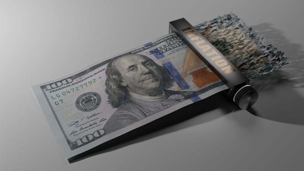
Image rejected - don't want to make same mistake(s) in future submissions.
Copy link to clipboard
Copied
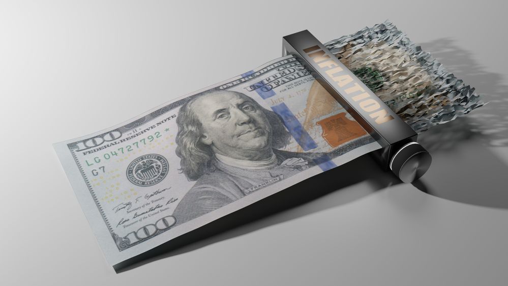
Wondering why this image was rejected. Want to avoid whatever issue the rejection reason was in future submissions. Thanks for your time.
Copy link to clipboard
Copied
What reason was given? Technical issues? It appears to be underexposed.
Copy link to clipboard
Copied
Correct - "technical issues." Underexposed could be it - fortunately that's easy to fix and re-submit... I just don't want to spend any more time on it if it's something else.
Copy link to clipboard
Copied
Hmm - looking at a post submitted close to the same time as mine (very timely). It appears images of US money have all kinds of issues, legal and otherwise, and perhaps that has something to do with my rejection...? I can easily fix the exposure - I can't fix the rejected subject matter content, if that's indeed the case.
Copy link to clipboard
Copied
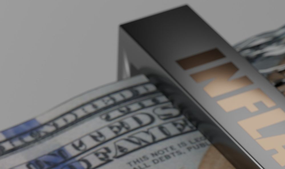
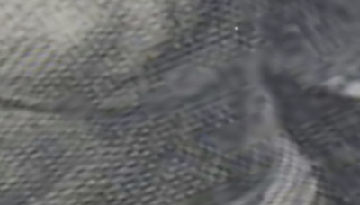
It is underexposed and the white balance is a bit off. It really needs some brightness to make it "pop" more. The biggest issue however, is lack of focus. Take a look at this section viewed at 100% magnification.
I don't think you need to worry about the IP violations as the other contributor was discussing regarding US banknotes. In your case, the whole banknote is not visible so it isn't an issue for unscrupulous individuals who would want to counterfeit the money.
On a side note, I like the concept and think this would be a good seller for you.
Rob R, Photographer
Copy link to clipboard
Copied
Excellent - thanks Rob and Jill for your responses. I'll make the suggested corrections and give it a resubmit!
Copy link to clipboard
Copied
Great picture, great idea. If I'm correct, this is a 3D render. But it will be vetted like a photo. So, you should watch your histogram for exposure. And you need to tweak sharpness and noise. And as @reedesign1912 , I do not think that you should expect IP problems for this one. If yes, shredder more of your bill...
If you are new to stock, you should consider these resources: https://helpx.adobe.com/stock/contributor/tutorials.html
Please read the contributor user manual for more information on Adobe stock contributions: https://helpx.adobe.com/stock/contributor/user-guide.html
See here for rejection reasons: https://helpx.adobe.com/stock/contributor/help/reasons-for-content-rejection.html
and especially quality and technical issues: https://helpx.adobe.com/stock/contributor/help/quality-and-technical-issues.html
Copy link to clipboard
Copied
Thanks for the guidance Abambo. You are correct - this is a rendered image. I'll consider it a compliment if it was difficult to tell :).
I had gone over the Adobe resources cited prior - but I am indeed new to this process and still learning. Hopefully I can tweak my ways enough until I get things exactly how you'd prefer.
For future projects I'll pay more attention to the histogram and verify exposure - as well as focus. For sharpness and focus - that can be a bit tricky with renders. On this submission I was a bit too "agressive" with the aperture and you guys justifiably called that out. Funny thing with 3D renders is that if you do not introduce some type of depth of field, the entire image will be tack sharp but it will also be "too perfect" and consequently "look fake." So - I suppose the trick is to find that exact balance. There is a similar issue with motion blur - which I had to use on another submission. Hope that one is OK.
Thanks again - really appreciate the feedback.
Copy link to clipboard
Copied
Some tricks I learned when I was doing 3D (a long time ago):
- If you output a depth map, you can modify the DOF in Photoshop. It's basically a post-processing function.
- By rendering at a higher bit rate (i.e., 12 or 16 bits per pixel) you will have more leverage to adjust the "exposure".
- 3D Programs tend to simulate real cameras, so working in real dimensions will help. In the real world, the more macro you are, the less DOF you get.
- It's probably better to render without DOF (and having a 3D render look) than having an out of focus look.
- Your textures (like the 5-Dollar-Bill) need to be sharp as the program tends to transform the texture and as such introducing most likely some unsharpness.
At the time, we did use all those fancy features like ray tracing, shadows, DOF, fog sparsely, because of the increased rendering time. I remember a rusty blast furnace that we rendered took days for a SD-sequence of a second or two. That's now done in the graphics card in a few seconds for a minute long 4k sequence…
Copy link to clipboard
Copied
Thanks again for the tips. I'll look into the depth map. I have used depth as a render pass for other compositing purposes but at the moment I have depth of field applied at render time. As you mentioned it can also be a post-render compositing function - I just haven't tried it that way before.
Copy link to clipboard
Copied
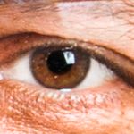
The underexposure can easily be addressed in Photoshop or Camera Raw; however, your picture exposes some weird aliasing (at 200%).
That will make it difficult to sharpen in ACR or Photoshop and resubmit.
There is also kind of moiré in the bill (here Franklin's coat):

I would also increase the geometric accuracy of the cylinder:
Copy link to clipboard
Copied
The resubmission was rejected 😞
This image is cursed.. lol..
However - I think this second time I screwed it up by submitting in PNG format. Will images be automatically rejected due to this? I'm asking because not sure if I should give up at this point or give it another go. My assumption at the moment is yes (rejected due to PNG) - but I'm surprised it didn't outright reject it at upload time.
Outside of that screw-up on my part, I had adjusted lighting, exposure, and DOF. I've not made any changes noted in your very last post above but more than happy to dive in with those as well and resub. The one that concerns me most is the moire artifacts - the rest are simple to correct. The moire might be a jpg artifact of the included resource image - but not sure, will investigate. Not a fan of lossy compression formats..!
That all said - I might just need to abandon this one and move on. Lessons learned.
Here's what the last submission looked like (converted to jpg this time):
As prior - super appreciate all the scrutiny and feedback!
Copy link to clipboard
Copied
Verified - the moire on Ben's coat is indeed in the source image I used for the UV unwrap to create the model. Totally missed that - good eye! I may just abandon this submission. Again - super appreciate the scrutiny.
Copy link to clipboard
Copied
The resubmission was rejected 😞
This image is cursed.. lol..
However - I think this second time I screwed it up by submitting in PNG format. Will images be automatically rejected due to this?
By @DarkClearSky
You can't submit PNG files. Only JPEG, AI, EPS and SVG (and ZIP for vector with JPEG preview embedded).
This time it's sharp, but it's still underexposed:
You should correct this with Photoshop or similar.
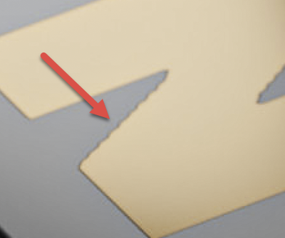
What I thought to be aliasing is probably a bad vectorization (outlining...) of the font:
This happens when the curves are converted to polygons and the software makes errors or is not working with the required accuracy.
And then the bill scan definitely exposes some errors (look around the chin):
You need definitely redo that scan. However, programs like Photoshop or scan programs may limit you in how you can rework that.
I'm still convinced that this is a great idea! Maybe you should go for a symbolic $ representation, if you cannot lay your hand on a clean texture.
Copy link to clipboard
Copied
No excuse on the PNG thing.. I knew JPG but dragged the wrong file to the browser.. stupid mistake.
I can pretty easily fix everything except the artifacts related to the JPG compression in the source image that I used for the hundred dollar bill texture. I took a closer look at that file and upon further inspection - it's a real mess - no possibility of salvage. It was too highly compressed when it was made a JPG. I need to get another scan.. My scanner won't scan money (this is somewhat of a relief) so I need to get a nice clean snap of a new $100 bill and then rework this. I can do this myself (once I find a clean enough bill) with my camera or perhaps I can dig up a public domain image that's high quality enough.
Good suggestion on perhaps using some type of symbolic $ substitute as a workaround but I kinda liked the visual impact a high denomination bill getting shredded provides.
Ok - once I sort out another source scan - I'll give this another go. Give me a bit. I hope the reviewers don't get tired of seeing this over and over.. Again - thanks for the feedback and I also appreciate the encouragement.
Copy link to clipboard
Copied
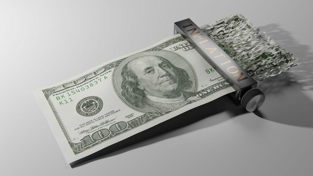
... and it's now re-re-submitted 🤞. I did manage to find a decent high resolution public domain hundred dollar bill scan on wikimedia for the UV texture - so this saved me a lot of trouble. It was a 1999 issue and I do like the look of the newer bills better, but this'll have to do. Fixed all the other issues - the weird zig-zags on the "Inflation" lettering were due to flaws in the font I used to create that bump map and I applied a subdivision modifier to the knob - effectively tripling its geometry while also smoothing it out in the shader.
One thing I did not do was increase the exposure. I know all three of the reviewers here pointed out the exposure - which I did up considerably after the first pass (that was definitely too dark!) - but after some experimenting with higher exposures on this last render I just felt any more exposure started to wash out the image. The contrast between the bill and the white surface under it becomes more non-existent and other details start to go away (including shadow contrast). I played with the lighting as well - both intensity and location and just came to the conclusion that I liked it best as it was. 🤷:male_sign: There probably is a better way and I maybe just haven't found it.
If this doesn't make it - I'll probably give it up as cursed and move on. Either way - many lessons learned.
Here's the latest submitted render:
Copy link to clipboard
Copied
This one is much better. However, the fat INFLATION was more pleasant. The font is, however, good outlined. Thirty years ago, we did outline fonts and logos like this with a tablet and a crosshair mouse… ;-).
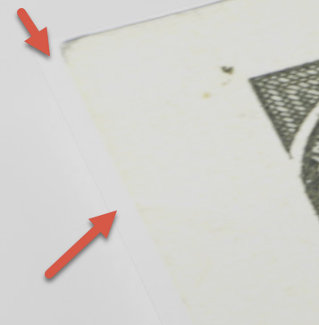
I still have found a small error, that may get you a refusal, if the moderator is picky:
(It may well be, that this is in your scan.)
n.b. I also like the first 100-dollar-note better because of the colours, however, this one is the classical green Dollar.
Copy link to clipboard
Copied
I share the same thoughts.. liked the other bill better - bigger Ben, more color... just more interesting looking. Also liked the other font on the shredder more - but it was a bitmapped font (I didn't realize this when I first started) and when blown up to the required resolution to make that bump map, that's where those weird lines on diagonals started popping up. Hard to find a similar "fat" substitute without the same issues... so went with this wide one.
I did also notice the tiny marks around the perimeter of the scan... contemplated "fixing" them but I thought they also looked a bit like worn edges like you'd have on a used bill - which it might actually be.. so I held off. There are some similar tiny specks here and there (you can see one in your blow-up above) and, I'm hoping, will provide a similarly minor "worn" effect. Trying to fix all of those might have ultimately made it look too retouched.
Overall though - agree that this version looks much much better. I appreciate all the suggestions.
It's still in the review queue.. 🤞.. we shall see..
Copy link to clipboard
Copied
I mean the white border. Not the worn effect.
Copy link to clipboard
Copied
I mean the white border. Not the worn effect.
By @Abambo
🤦:male_sign:Oh snap!
I went to go delete it from the queue so I can requeue a fix but I don't see a way to remove it.
Copy link to clipboard
Copied
I mean the white border. Not the worn effect.
By @Abambo
(smh....) I've removed the image from the queue. Will fix and resubmit.
Copy link to clipboard
Copied
Back in the queue - hopefully all good now.. I feel like a spammer.
Copy link to clipboard
Copied
Last resubmit did the trick - it was accepted into the collection.
Thanks for your encouragement and help!
Copy link to clipboard
Copied
You're welcome. I'm happy that we could help. It's a great image and a nice work you've done. May I ask what tools you used?
Copy link to clipboard
Copied
You're welcome. I'm happy that we could help. It's a great image and a nice work you've done. May I ask what tools you used?
By @Abambo
Thanks Abambo!
I'm a little shy about the tools because I didn't use any Adobe products (although I do use Photoshop, After Effects, Lightroom, and Premiere Pro on a regular basis).. For these images though - I've been using Blender and the Cycles render engine. I'm just getting started at this - but all the images and animations (so far) submitted in my portfolio were modeled, rendered, and composited with Blender / Cycles.
