 Adobe Community
- Home
- Using the Community
- Discussions
- Re: Vastly improved and easily customizable in Fir...
- Re: Vastly improved and easily customizable in Fir...
Vastly improved and easily customizable in Firefox

Copy link to clipboard
Copied
The new forum is a vast improvement in terms of performance—it screams in comparison to the Jive molasses we had been putting up with and it's very easily customizable in Firefox through a number of scripts and AdBlock Plus.
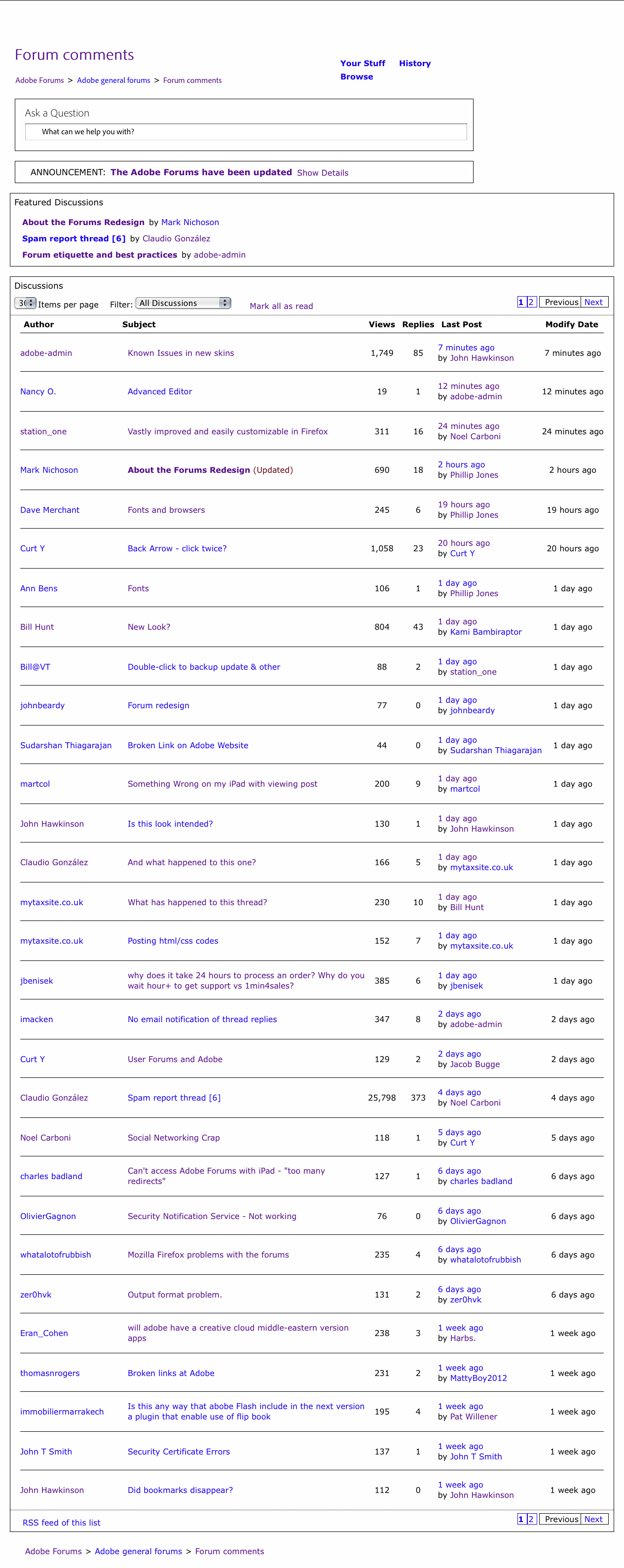
The images below show what a customized topic index page and an customized open thread page look like in Firefox 3.6.28 (the last Firefox release to support a Power Mac PPC) look like, respectively. OS is 10.4.11.


These are very welcome changes.

Copy link to clipboard
Copied
Remaining to be fixed are a few things already noted elsewhere:
• the User Bar breaking up in the open thread page;
• badly needed sequential post numbers;
• an indication of which post is being replied to;
etc.
In all, very satisfying. ![]()

Copy link to clipboard
Copied
In connection with the subject of customization, I'll note the intrusive scripts that I've managed to block with the Ghostery add-on:

This has also helped with some performance issues and it does away with some annoying twitter pop=ups discussed in another thread.

Copy link to clipboard
Copied
Also worth noting, the Advanced Editor is back when you edit a post. ![]()

![]()
Copy link to clipboard
Copied
Interesting. Can't say I've noticed any speed improvement. With IE9 it was interactive for me before, and it's still interactive.
-Noel

Copy link to clipboard
Copied
Noel Carboni wrote:
…it was interactive for me before, and it's still interactive…
![]()
I have no idea what that means; but I'll take your word for it. ![]() I see a vast improvement. Opening pages and/or going to a different forum is almost like changing channels on the TV, as opposed to the one-or-two to ten seconds I was seeing in the best and worst days respectively.
I see a vast improvement. Opening pages and/or going to a different forum is almost like changing channels on the TV, as opposed to the one-or-two to ten seconds I was seeing in the best and worst days respectively.
Copy link to clipboard
Copied
Perhaps it's a difference between IE and Firefox then. By "interactive" it's been a while since I noticed any delay here at all. Click-done is what I've been seeing, and what I still see.
-Noel
Copy link to clipboard
Copied

Copy link to clipboard
Copied
Of course. But the fact that it is there when editing means it should be a trivial undertaking to add it as a button to the Reply Editor, like before.
Copy link to clipboard
Copied
Should be there as a matter of course. Whether createing a new post, replying or editing.

Copy link to clipboard
Copied
Phillip Jones wrote:
Should be there as a matter of course. Whether createing a new post, replying or editing.
Thats why I said "of course".
Copy link to clipboard
Copied
It's still Running on Jive, R.

Copy link to clipboard
Copied
Thanks for the timely reminder, but I think everyone realizes the forums are still running on Jive. That's no surprise.
The performance, however, is better than what was being delivered by Jive under the old design, comparable to the best performance observed before Adobe switch to Jive a few years ago. In some of the other threads Adobe staff was saying that performance gains were expected due to less excess baggage, and they are right. Pages load faster now.
Copy link to clipboard
Copied
station one,
I have been against customizing, preferring to know what others saw, but your screenshots look very tempting, quite a bit like the fair forums that fell into the abyss just over three years ago.
So maybe when the dust has settled, if it is not offered as a one click/default solution (maybe it would be more likely to see the sun rise in the west).
What did you actually do (I have Firefox 12 so it should be possible there, too)?
Copy link to clipboard
Copied
Jacob, what are you seeing in the screen grabs up above that isn't what you're seeing when you're browsing the forum directly?
I'm using a lower zoom level than what station_one has shown, but I don't sense the customization.
-Noel
Copy link to clipboard
Copied
Noel,
It is rather the reverse, what is absent from the screenshots which only contain the core matter.
The forum/thread takes up about 5/7 of the space to the left, the 2/7 to the right contains
Thread:
A row of buttons starting with facebook,
Actions,
More like this,
Bookmarked by.
Forum:
Actions,
Notifications,
Popular discussions,
Top participants.
The OP screenshots led me to believe, maybe wrongly, that it was easy to get the forum/thread to fill the whole screen, and get rid of the other stuff.
Copy link to clipboard
Copied
I see. Yes, that big empty space on the right is kind of useless, but I have a fairly large number of pixels (1600) horizontally on each monitor so it's just a minor inconvenience. Since the stuff on the left doesn't work very well when it's compressed too much horizontally, I agree that being able to reduce or eliminate the dark gray area on the right might be handy, though it's always been there.
-Noel

Copy link to clipboard
Copied
Jacob Bugge wrote:
…What did you actually do (I have Firefox 12 so it should be possible there, too)?
It's still a work in progress, Jacob. These two new screen shots show a further refinement that brings the current forums much closer to what you refer to as "the fair forums" in your post.
You are correct in your assumption:
Jacob Bugge wrote:
The OP screenshots led me to believe, maybe wrongly, that it was easy to get the forum/thread to fill the whole screen, and get rid of the other stuff.
The page does fill the whole screen.
Of course you can do all this in Firefox 12, as a matter of fact I have Ff 12 on a Mac-Intel box and it's customized exactly like this one here.
Once they finish the to-do list here, I'll send you a list of the page elements blocked by AdBlock and the scripts to modify the styles, all of which can be done with standard Firefox Add-ons like Stylish and Greasemonkey.
Here's the index page as it looks to me right now:

and here's this open thread:

Copy link to clipboard
Copied
Once they finish the to-do list here, I'll send you a list of the page elements blocked by AdBlock and the scripts to modify the styles, all of which can be done with standard Firefox Add-ons like Stylish and Greasemonkey.
Thank you, station one, I look forward to your posting it, whenever it may be.
It's still a work in progress, Jacob. These two new screen shots show a further refinement that brings the current forums much closer to what you refer to as "the fair forums" in your post.
Indeed; it gets better and better. And I am not the only one still using that term.
Copy link to clipboard
Copied
Is there an add-on like this for Internet Explorer? I'd like to recover that screen real estate that has been seized by this new design
But that's really the wrong approach. The forum design should simply add a button to close the panel -- every multipanel interface I'm familiar with has this as a matter of initial design -- e.g., Adobe Acrobat's left navigation panel This is a forum defect that should be fixed by Adobe, not by users having to add yet more cruft to their browsers to compensate for bad design.
-- Roy Zider
P.S. this reply editor is faster than before, but still a noticeable delay between keystroke and on-screen glyph.
Message was edited by: FUBARinSFO
Copy link to clipboard
Copied
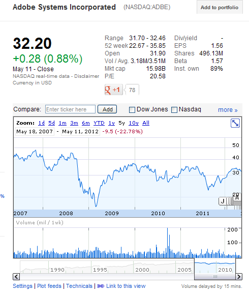
That's what Adobe/Jive fail to understand: if a lot of users are complaining about things like lack of readability, waste of space and the like, perhaps these users are right and they are wrong. In my experience, Adobe will never admit such a thing.
Copy link to clipboard
Copied
Claudio:
Very interesting. So I'm not the only one who's noticed that, besides the whole stock market. Thanks.
-- Roy

Copy link to clipboard
Copied
In fact, it is not clear why this forum exists except for us to blow steam. They have never seemed to listen to any of the comments and often seem to make things worse after we have commented. That is the irritation. The new skin wastes so much space it is pitiful. If you could change panel size or turn them off, that would help a lot. On my wide screen, the discussion list seems to only cover half the space. The rest is taken by panels I never really use or could at least be much smaller. I can only imagine what the forum must look like on a 4:3 screen size.
Copy link to clipboard
Copied
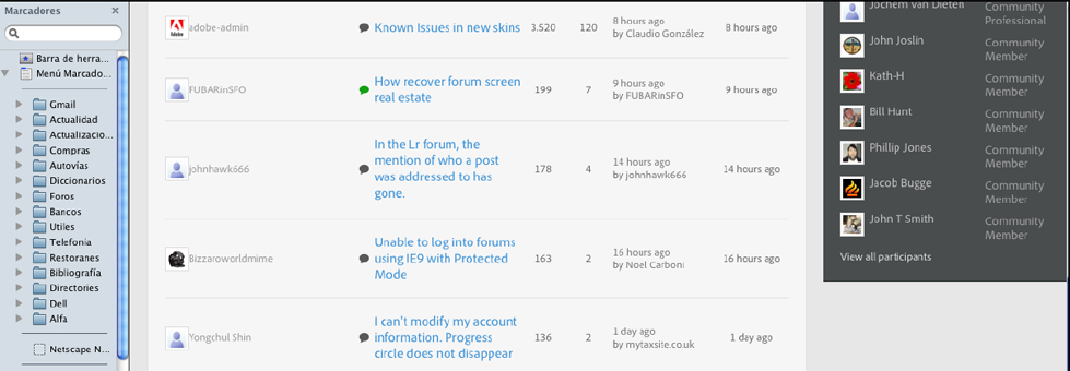
This is what it looks like in my old fashioned 3:4 screen with a narrow bookmarks sidebar (after 60 years of taking photographs in 4:3, I have been unable to get used to the widest formats):

Message was edited by: Claudio González. Reason: important addition
Copy link to clipboard
Copied
Bill@VT wrote:
In fact, it is not clear why this forum exists except for us to blow steam. They have never seemed to listen to any of the comments and often seem to make things worse after we have commented. That is the irritation…
Very well put!
-
- 1
- 2

