mattchristensen
Community Manager
Community Manager
August 22, 2025
Question

Now in Beta: Cleaner, More Organized Menus Across Premiere Pro

  • August 22, 2025
  • 36 replies
  • 6709 views

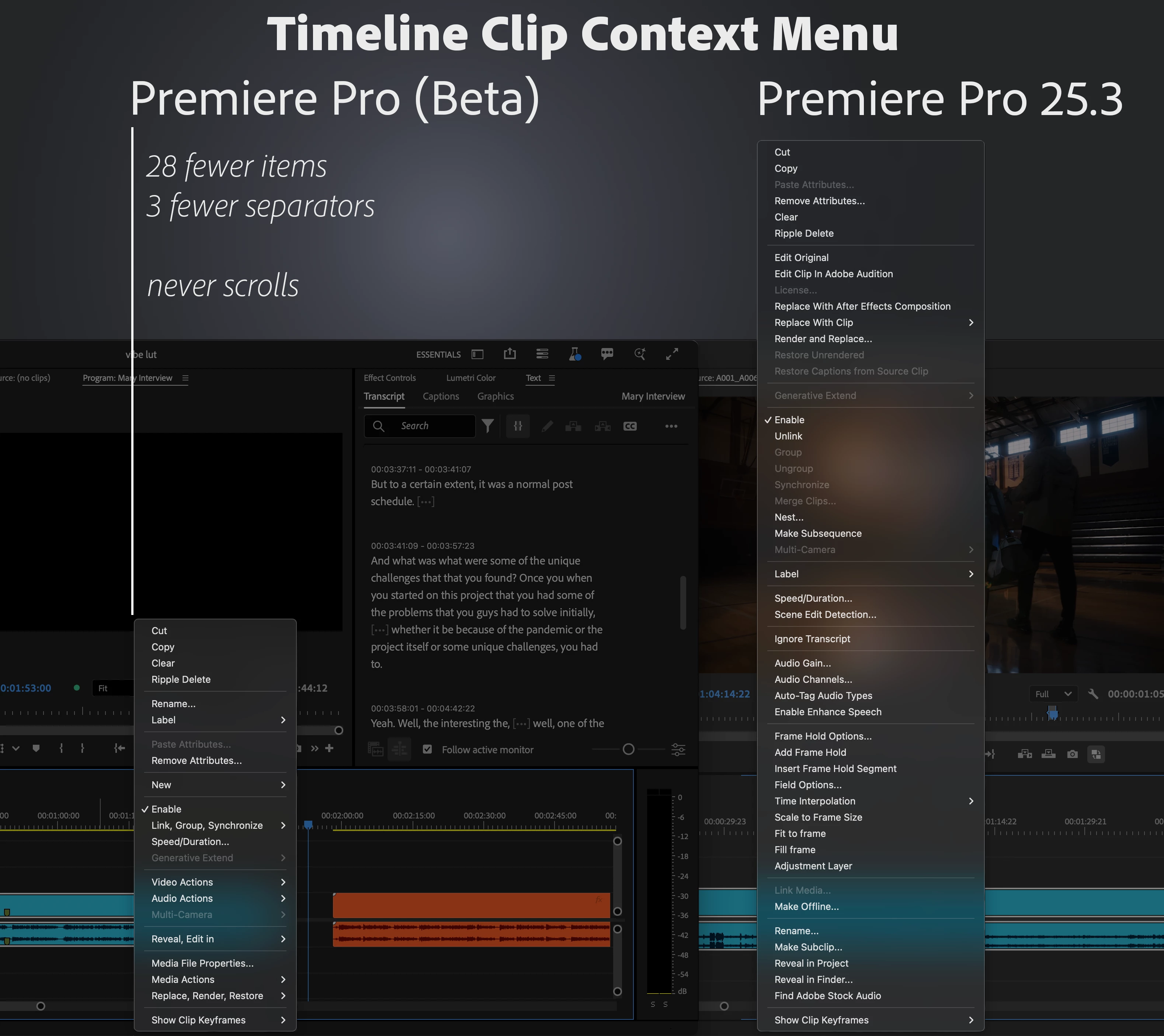
We’ve taken a fresh look at the application, panel, and context menus across Premiere Pro and developed a new organizational system to bring editors all the same functionality in a more concise and discoverable way. Even on a 13-inch laptop, you’ll never have to scroll a menu to get your work done.


Our approach to organizing the menus:

  1. Aggressively organize into submenus. Commands stay in the same menu as before, but the submenus mean the menu stays short and readable.
  2. Give useful names to the new submenus. Editors new to Premiere Pro can more quickly learn what the menu items do.
  3. Be consistent when similar items appear in different menus. Whether in the Project or Timeline panel, common items like “Label” or “Media File Properties” appear in the same parts of menus.


Across the application, menus that were updated average a 40% reduction in height, with some menus shrinking by half.


This is a big change to the feel of using Premiere Pro, and while we took time and care with these new menus, some parts may still need more work. Try them out while they’re in beta [version 25.6 build 39 or later] and let us know how they are working for you. Thank you!


36 replies

Known Participant
October 15, 2025

I really don't understand why adobe engineers spend their time working on unrequested features, messing up our workflow.
As an adobe long time pro user (and developer), may you Adobe guys focus on features requested by the community?

Or work on something useful, like Blackmagic did with all the AI groundbreaking stuff pushed into Davinci 20 (intelliscript, multicam smartswitch, relight, depth map etc).

yeah, I know you just dropped the new AI mask tools, but it took ages and it is still in beta, while Davinci and other edit apps got this feature 1 or 2 years ago.

MyerPj
Community Expert
Community Expert
October 14, 2025

The context menus still feel difficult. I'm thinking put all the options with submenus at the top, maybe just put them alphabetically. Then the direct options below it. 

Known Participant
October 15, 2025

While working with the beta version, I eventually switched back to the original menu—and honestly, I felt relieved. 

hellopaul4
Inspiring
October 15, 2025

I often find that, too. Take for example the time a couple of years ago when Adobe ruined the whole Export process. In the beta version, I struggled along, like many others, with the awful (still awful) "new system". When I switched to the old version, it was like a breath of fresh air and rays of sunshine entering my life.

We quickly "adapt" to crap new interfaces, and forget how much better everything used to be before Adobe broke it instead of working on customer feedback and bugs. It must feel SO underwhelming, working at Adobe, knowing you're being forced to do stupid crap that nobody wants, instead of improving a product for its fee-paying users.

Inspiring
September 26, 2025

Hey, at LEAST let's separate SAVE from SAVE AS.  Out of habit I frequently mouse to File | Save and expect it to do its thing.  All of a sudden it brings up a submenu and I have to focus my stupid bifocals to find Save. (It's hard enough navigating the menus.) I don't want a submenu, I just want it to save. It won't stretch that menu out much.  Keeping Save as a one-stop menu item is a common convention you do not want to break. Adding a Save As won't extend that menu by much.

R Neil Haugen
Legend
September 26, 2025

Different strokes. For me that's too much time. Bap Ctrl-S and done. Mousing to menus that have keyshorts is so much faster.

Everyone's mileage always varies ...
Ann Bens
Community Expert
Community Expert
September 25, 2025

Please make it less buried


Stan Jones
Community Expert
Community Expert
September 25, 2025

I am very accommodating; I can get used to anything (almost). I hate this change. Ann's example is one of the most inconvenient, but EVERY distraction to a workflow is time wasted. And there are JUST TOO MANY shortcuts needed to avoid the mouse.


I really like @_nicdean's suggestions. It's a much better solution for laptop users than resizing for all.

https://community.adobe.com/t5/premiere-pro-beta-discussions/now-in-beta-cleaner-more-organized-menus-across-premiere-pro/m-p/15475388#M11966


Or a preference setting for the new vs longer menus.


I did take a look at the Beta on my Surface Pro, which I edit on when on vacation. Yes, the new menus fit fine, really TOO abbreviated even there. After all, the bigger problem is the UI font scaling issue. And yes, making it easier for users to see the UI text on a laptop works in the opposite direction to getting menu options on the screen. But if it meant giving up the convenience of longer menus on my 4K monitor, I'd rather have a mouse scroll option to facilitate menus on a laptop rather than the tiny up/down arrows.


Does the new iPhone interface mean the menus will get reduced even further? (tongue in cheek)


I hope you can rethink this and NOT roll this out to a Release without an alternative.


Stan


Ann Bens
Community Expert
Community Expert
September 25, 2025

I going for a preference.

This new menu is so aggravating.

umutizgi
Participant
September 22, 2025

How can I turn off this ridiculous feature? Do I have to navigate ten different menus to get the video size to fit within the workspace? This is pure dictatorship!

alexanderb2812866
Participant
September 18, 2025

I hate this. Making me press more buttons just to get to things. Scrolling was simpler. I knew where my cursor had to be and how much I had to scroll. With all due restpect and kindness and not targeted toward anyone specifically, whoever pushed for this should be fired because they obviously have more OCD panic attacks than they've ever used this program in their life. 

R Neil Haugen
Legend
September 18, 2025

And to the users that love this, you say ... ?


As there are many. We all work differently. That's always a troublesome thing for designing apps, as what one dislikes will overjoy another.


Hard decisions, always.


I think a toggle or preference would be a good thing to add.

Everyone's mileage always varies ...
Participant
September 18, 2025

This is awful. Making us press more buttons just to reveal a clip in finder or project, who thought this was a good idea? 

It's simplicity without thinking of the user interface, aesthetic over pragmatism. Awful.

Participant
September 16, 2025

Where the hell did they put the masks??? I can't mask my filters/fx anymore.

R Neil Haugen
Legend
September 16, 2025

Not sure what you're referring to ... masks as part of an effect always show in the Effects Control Panel, which hasn't changed.

Everyone's mileage always varies ...
AndrewTheGreat
Known Participant
September 9, 2025

Hi, Adobe. The problem with people not liking this update can be simply resolved - add a preference item to toggle it on and off.

Known Participant
September 8, 2025

At first I was surprised, but I'm getting used to this new layout. All in all, it's quickly becoming a habit.