Francis-Crossman17221443
Community Manager
Principal Product Manager
August 23, 2024
Question

Now in Beta: Rounded corners in the timeline

  • August 23, 2024
  • 56 replies
  • 19351 views

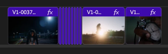
Starting with Premiere Pro (Beta) version 25.0, build 32, all clips in the timeline have rounded corners!


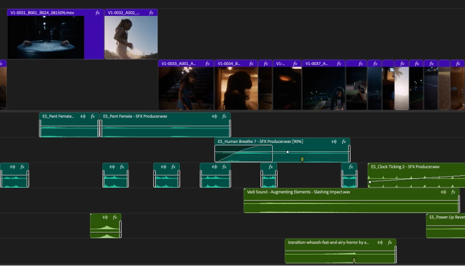
As part of the New Spectrum UI updates, we are now adding rounded corners to all of the clips in the timeline UI. Rounded corners are easier to look at all day long, require less cognitive load to parse and understand, make it easier to see the boundaries between clips, and are just plain friendlier! There is a lot of psychology behind rounded corners. Just look at any object within sight right now, and you will start to see rounded corners everywhere.


Here are a few interesting reads on Medium that explain the concept rather well.


Rounded edges are “friendlier”

The human brain is conditioned to process sharp objects as potentially harmful and dangerous. A human neuroimaging study has shown that it is natural behaviour to lean towards objects with curved contours compared to sharper objects.

(Benjamin Tey, The current obsession with rounded edges in user interfaces)


The Effect

A complete lack of sharp edges and sudden transitions eradicates the manufactured feel that we’re so used to in mass-produced goods. Instead of reminding us of industrial supply chains, automobile production, and chemical laboratories, these softer shapes evoke succulents, pine trees, and rocks that have tumbled through mountain streams. There’s an organic quality that just feels healthy and warm.

(Arthur Van Siclen, Rounded corners in the Apple Ecosystem)


The radius will reduce as the clip gets very small to avoid the timeline looking too “bubbly” and there is a threshold width below which clips will revert to 90° angles entirely. We have tested with very large timelines and we are confident in our settings, but we want to know what you think.  We encourage you to post screenshots of your timeline if you wish.


We want to know what you think.  Please join the conversation below.

56 replies

DJP2014
Inspiring
August 24, 2024

I agree with the poster above - "it adversely affects the feeling of clips being joined". It is also one of the things I instictively disliked when using FCP after it's redesign.


For example I find it much easier to quickly spot the 1 frame gap in the first timeline.


Shebbe
Community Expert
Community Expert
August 24, 2024

I totally agree.
Yet another UI design update that simply degrades readability for no reason. Just like the removal of FX badge colors and greyification of certain buttons snap/link select and those in the program monitor which could simply be kept blue.

I hope this genius Spectrum UI design can be re-considered for both Premiere Pro and After Effects. There are just so many issues.

Participant
August 25, 2024

I couldn't agree more.

The over simplification of the timeline feels as though it's being catererd too a broader user experience and in my opinion losing it's "Pro" feel. It's a shame really. I can barely make out anything with this UI.

Ann Bens
Community Expert
Community Expert
August 24, 2024

The end marker is hardly visible on non-selected clips.

End marker is still missing on clips with transition added (This bug been reported ages ago and acknowledged).


Francis-Crossman17221443
Community Manager
Principal Product Manager
August 24, 2024

Thanks, @Ann Bens .  We are aware of this problem and we're working with Design to come up with a fix.  I agree with you that the media extend markers get lost now. 

Inspiring
August 24, 2024

Updates like this beats all the ai-stuff by miles. Keep this up! 

Participant
August 24, 2024

As long as this is merely an Option and not the default.


i would personally hate to see rounded corners in my timeline - it adversely affects the feeling of clips being joined and I see no need for it at all - it's one of the things I dislike most about FCP for example 

Francis-Crossman17221443
Community Manager
Principal Product Manager
August 24, 2024

Our plan is that this is the new look of the app.  We do not plan to provide an option to turn it off.  I ask that you give it a chance.  Try working for a few hours with this new treatment.  My very first impression of this was like you "ew, I don't like it."  I was a professional editor for 10 years before joining Adobe as a Product Manager on PPro, so I have a LOT of muscle memory and opinions about what a pro app should look like, as I'm sure you do.  I fully acknowledge that changes like this can be disruptive at first.  But I've been running this treatment for several weeks now, and I have to admit that when I go back to the old version, it looks very old-fashioned to me now.  

Shebbe
Community Expert
Community Expert
August 24, 2024

There's nothing wrong with the desire to 'facelift' software UI but we need to be careful that it doesn't influence readability and ease of access which can heavily infulence how fast a user can move around and trust what is going on on the screen. For a lot of aspects this has been, according to many users here and also pretty much all my team members, a major step backwards in all these recent updates from the new export window all the way to this Spectrum UI and despite all good intentions the new design imo just sort of sucks. The only thing I've liked about it so far is only the new mechanism for audio crossfades making them more in line with what you expect from DAWs.


Most professionals do not care much about the visual presentation of a UI. They care about how quickly they can recieve information to make informed decisions. I would rather see that the UI always responds at 60fps minimum over any visual changes.

Amitzi Photography
Known Participant
August 24, 2024

I still don't understand why the audio in the timeline is green on green, or some light color on green. I really wish there was at least a way to change the colors of the different audio timeline elements so I wouldn't have to zoom in as much all the time just to know how load my audio is at any point. This is way more important to me and possibly other editors than not having sharp corners. I know lots of people won't think red on green is PRO, but I don't care, as long as I don't have to strain my eyes or spend more time than neccessary on zooming in and out.

Francis-Crossman17221443
Community Manager
Principal Product Manager
August 24, 2024

We recently increased the contrast of the clip colors to help with this very issue.  You can customize Label colors presets here: Preferences > Labels.  You can also change the default color for different types of clips.  If the default green for audio is not to your liking you can choose a different color preset or customize a brighter color.   What you can't do is choose the individual colors.  So you can't have Red waveforms on a green background for example.  You might also like the new themes and high contrast (Accessible color contrast mode.) Preferences > Appearance.

Participant
August 26, 2024

Is there a reason why the waveforms are so much smaller? You can even see it in the examples you give above, you can hardly see any waveform information.


I literally have to squint my eyes to see anything with this UI, rounding corners doesn't really help either.  


Premiere 24.3


Beta Build


Participating Frequently
August 24, 2024

I think the human brain would also appreciate not having to deal with a coss-platform Adobe UI as well as the native UI of the OS they are accustomed to. I expect your UI research knows that Adobe versions of buttons and palettes on macOS that are inconsistent with other macOS applications maintain uneeded cognative load. However the needs of your marketing team to establish and maintain a cross-platform ‘Adobe reality’ is too valuable to ignore.

Participating Frequently
August 25, 2024

SO TRUE!

The complete disregard for macOS GUI rules are one of THE most frustrating thing about any and every Adobe product! Thinking they can somehow reinvent the wheel and, once again, do an absolutely horrible job at it! Pure, misguided arrogance and disregard for even the most basic UX principles, regardless of the platform!

Participating Frequently
August 25, 2024

And even these completely random, superfluous, shoe-horned changes can't distract from the fact that the entire GUI still looks like some 80's Microsoft clipart CD puked all over it. And that from a supposed DESIGN company. Just plain embarrassing!