
Participant
July 9, 2026
공지사항

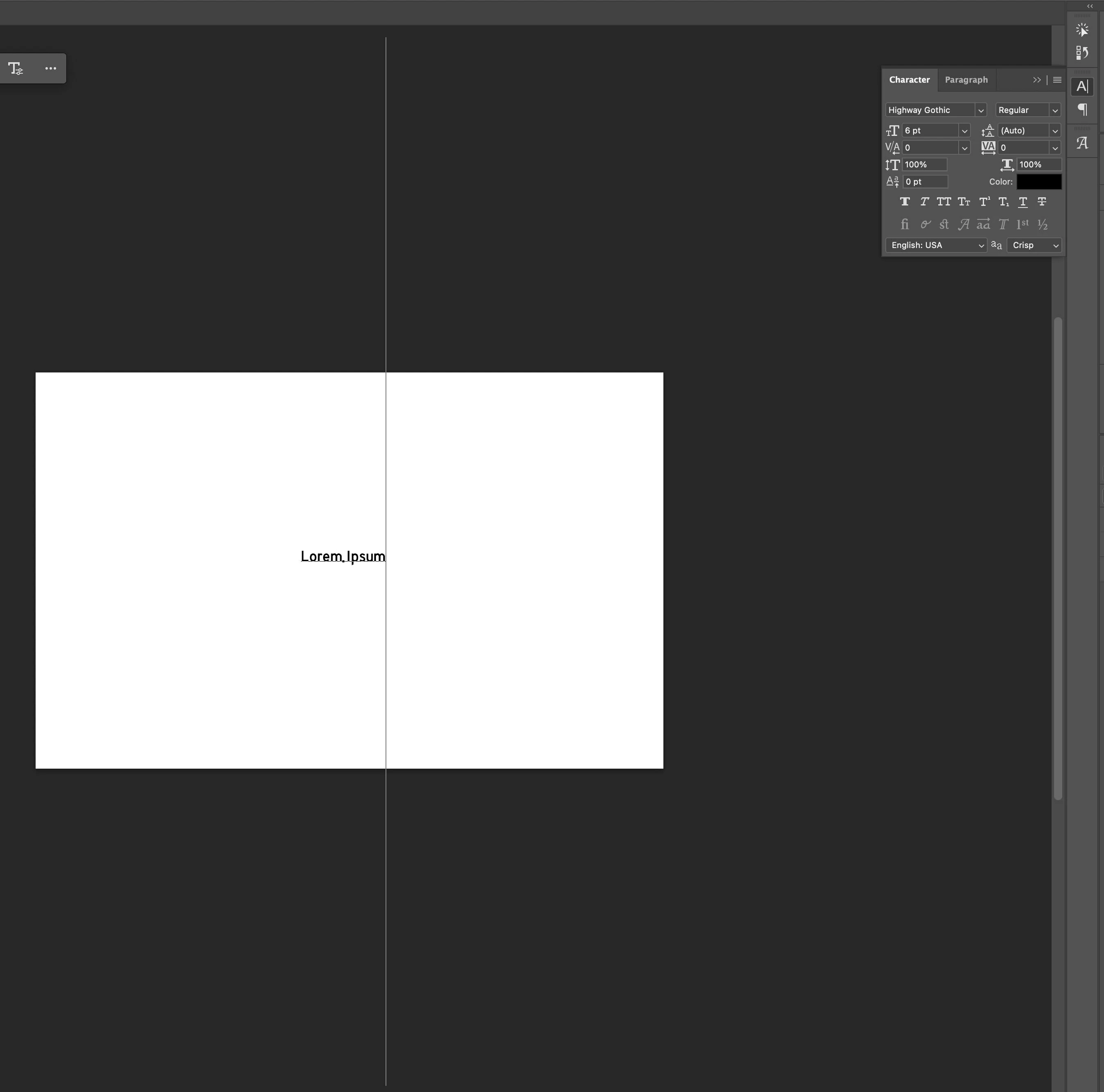
Text cursor for a particular font is gigantic, making it unusable. Even at 6 pt the cursor spans the entire screen. Font was used daily for 2 years without issue. Tried reinstalling, removing cache, resetting settings, resetting character panel.

  • July 9, 2026
  • 1 답변
  • 17 조회

One particular font on my system (Highway Gothic) suddenly has a bug on Photoshop. I’ve used it daily for 2 years and it continues to work without issue on other applications (including Adobe Animate).


On Photoshop, this particular font resizes the text cursor so ridiculously large it’s unusable. This began last week randomly. See the attached screenshot – default settings, 6 pt at 300 DPI, the cursor is more than double the size of the canvas.


Have tried deleting/reinstalling the font, deleting Photoshop’s font cache, the settings file, updating, resetting the character panel, and restarting my computer. I can’t get this font to go back to working normally.


    1 답변

    Anshul_Saini
    Community Manager
    Community Manager
    August 12, 2026

    Hi ​@Grinch89,

    Thanks for your patience with this and for all the troubleshooting you've already tried. I've investigated this on my end with Highway Gothic Regular and can confirm the behavior you're seeing.


    What I Found:

    • The oversized cursor with this font does not occur in Photoshop 25.x. It displays normally there.
    • The behavior starts in Photoshop 26 and later (including the current 27.9.1).

    Photoshop 26 introduced an updated text engine that changed how cursor/selection height is calculated using a font's internal metrics. The older engine was more lenient; the newer one reads these values more precisely. Highway Gothic Regular (the free versions available online) has inflated vertical metric values baked into the font file, and the updated engine now honors those values where the old one did not.

    So this is a behavior change on Photoshop's side, but incorrect data inside the font file itself triggers it.

    • The oversized cursor is cosmetic only. It doesn't affect your actual rendered text. The output will still be the correct size, so you can continue using the font if you can work past the visual distraction.
    • Look for a different digitization of Highway Gothic. Since it's a public-domain typeface (based on the U.S. Federal Highway Administration's Standard Alphabets for Highway Signs). Since it is a public-domain typeface, there are multiple digitizations:
      Overpass: a Google Fonts family inspired by Highway Gothic, with correct metrics
      Interstate (on Adobe Fonts): the professional commercial version with proper font engineering


    I hope this clarifies things for you. Thanks for taking the time to report it!

    Best,
    Anshul Saini